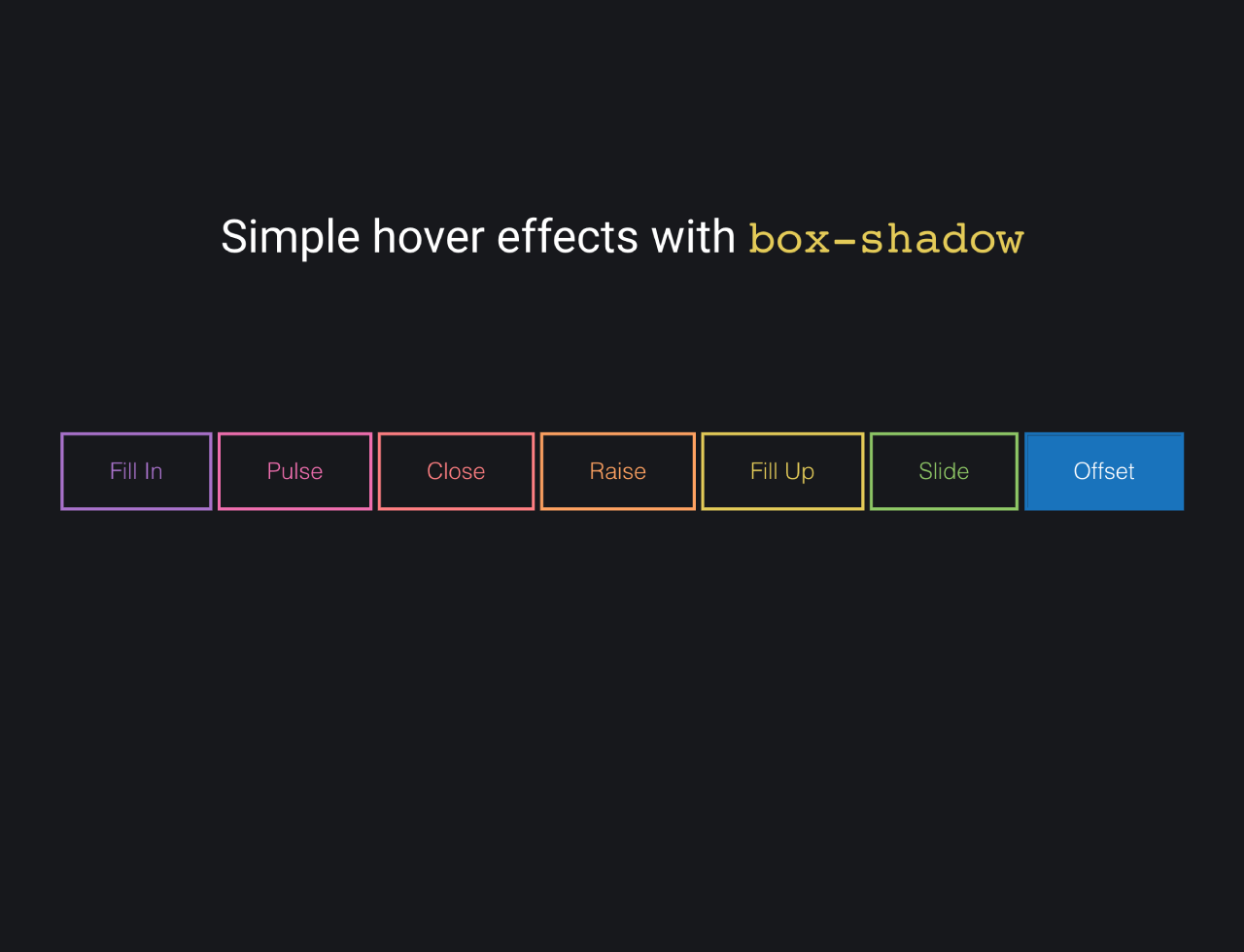

This HTML and CSS code snippet helps you to create button element with hover effects using box-shadow property. When you hover over or focus on a button, experience effects like filling in, pulsating, closing, raising, filling up, sliding, and offsetting. The magic lies in the CSS box-shadow property, bringing your buttons to life with smooth transitions. Each button has a unique color scheme, adding a vibrant touch to your webpage.
How to Create HTML Button Hover Effects With Box-shadow
1. First of all, load the Normalize CSS and Google Fonts by adding the following CDN link into the head tag of your HTML document.
<link href="https://fonts.googleapis.com/css?family=Fira+Sans:300" rel="stylesheet">
<link rel="stylesheet" href="https://cdnjs.cloudflare.com/ajax/libs/normalize/5.0.0/normalize.min.css">
2. Create a container with buttons, each having a specific class for different effects. Customize each button by selecting a class from the provided options: fill, pulse, close, raise, up, slide, or offset.
<div class="buttons">
  <h1>Simple hover effects with <code>box-shadow</code></h1>
  <button class="fill">Fill In</button>
  <button class="pulse">Pulse</button>
  <button class="close">Close</button>
  <button class="raise">Raise</button>
  <button class="up">Fill Up</button>
  <button class="slide">Slide</button>
  <button class="offset">Offset</button>
</div>
3. Style the buttons using the following CSS code. It is responsible for creating captivating hover effects using the box-shadow property. Adjust the colors and transitions by modifying the CSS variables under each button’s class.
/*
  https://developer.mozilla.org/en/docs/Web/CSS/box-shadow
  box-shadow: [inset?] [top] [left] [blur] [size] [color];

  Tips:
    - We're setting all the blurs to 0 since we want a solid fill.
    - Add the inset keyword so the box-shadow is on the inside of the element
    - Animating the inset shadow on hover looks like the element is filling in from whatever side you specify ([top] and [left] accept negative values to become [bottom] and [right])
    - Multiple shadows can be stacked
    - If you're animating multiple shadows, be sure to keep the same number of shadows on hover/focus as non-hover/focus (even if you have to create a transparent shadow) so the animation is smooth. Otherwise, you'll get something choppy.
*/
.cd__main{
     background: #17181c !important;
    min-height: 640px;
}

.fill:hover,
.fill:focus {
  box-shadow: inset 0 0 0 2em var(--hover);
}

.pulse:hover,
.pulse:focus {
  -webkit-animation: pulse 1s;
          animation: pulse 1s;
  box-shadow: 0 0 0 2em transparent;
}

@-webkit-keyframes pulse {
  0% {
    box-shadow: 0 0 0 0 var(--hover);
  }
}

@keyframes pulse {
  0% {
    box-shadow: 0 0 0 0 var(--hover);
  }
}
.close:hover,
.close:focus {
  box-shadow: inset -3.5em 0 0 0 var(--hover), inset 3.5em 0 0 0 var(--hover);
}

.raise:hover,
.raise:focus {
  box-shadow: 0 0.5em 0.5em -0.4em var(--hover);
  transform: translateY(-0.25em);
}

.up:hover,
.up:focus {
  box-shadow: inset 0 -3.25em 0 0 var(--hover);
}

.slide:hover,
.slide:focus {
  box-shadow: inset 6.5em 0 0 0 var(--hover);
}

.offset {
  box-shadow: 0.3em 0.3em 0 0 var(--color), inset 0.3em 0.3em 0 0 var(--color);
}
.offset:hover, .offset:focus {
  box-shadow: 0 0 0 0 var(--hover), inset 6em 3.5em 0 0 var(--hover);
}

.fill {
  --color: #a972cb;
  --hover: #cb72aa;
}

.pulse {
  --color: #ef6eae;
  --hover: #ef8f6e;
}

.close {
  --color: #ff7f82;
  --hover: #ffdc7f;
}

.raise {
  --color: #ffa260;
  --hover: #e5ff60;
}

.up {
  --color: #e4cb58;
  --hover: #94e458;
}

.slide {
  --color: #8fc866;
  --hover: #66c887;
}

.offset {
  --color: #19bc8b;
  --hover: #1973bc;
}

button {
  color: var(--color);
  transition: 0.25s;
}
button:hover, button:focus {
  border-color: var(--hover);
  color: #fff;
}

body {
  color: #fff;
  background: #17181c;
  font: 300 1em "Fira Sans", sans-serif;
  justify-content: center;
  align-content: center;
  align-items: center;
  text-align: center;
  min-height: 100vh;
  display: flex;
}

button {
  background: none;
  border: 2px solid;
  font: inherit;
  line-height: 1;
  margin: 0.5em;
  padding: 1em 2em;
}

h1 {
  font-weight: 400;
}

code {
  color: #e4cb58;
  font: inherit;
}
Engage users with interactive and visually appealing buttons, creating a modern and dynamic user interface.
That’s all! hopefully, you have successfully created the HTML buttons with hover effects with box-shadow property. If you have any questions or suggestions, feel free to comment below.
Similar Code Snippets:

- Horizontal News Scroller HTML Code
- HTML Table Row Color Based on Value
- Skeuomorphic Toggle Buttons Using CSS
- Confetti Animation in CSS on Button Click
- Simple Invoice Template HTML CSS
- HTML5 Canvas Examples with Source Code


I code and create web elements for amazing people around the world. I like work with new people. New people new Experiences.
I truly enjoy what I’m doing, which makes me more passionate about web development and coding. I am always ready to do challenging tasks whether it is about creating a custom CMS from scratch or customizing an existing system.