
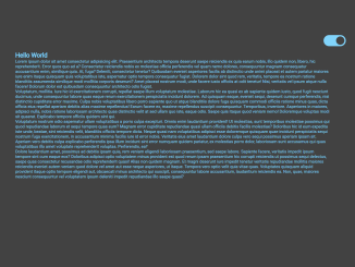
This code creates scroll-driven animations using pure CSS. It animates various sections of a webpage. The header transforms on scroll, and sections have smooth transitions. It’s helpful for adding engaging visual effects to websites.
Furthermore, you can use this code on any website to enhance its visual appeal without relying on JavaScript. It adds interactive animations triggered by scrolling, improving user engagement. Plus, it’s lightweight and easy to implement, ensuring a smooth browsing experience.
How to Create Scroll-driven Animations In Pure CSS
1. First of all, load the Google Fonts by adding the following CDN links into the head tag of your HTML document.
<link rel='stylesheet' href='https://fonts.googleapis.com/css2?family=Righteous&display=swap'>
2. Set up the HTML structure of your webpage. Define sections that you want to animate upon scrolling. Ensure each section has a unique ID.
<header>
<label class="menu" for="burger">
<input id="burger" type="checkbox"/>
<svg class="burger" viewBox="0 0 100 100" width="64">
<path class="line top" d="m 30,33 h 40 c 13.100415,0 14.380204,31.80258 6.899646,33.421777 -24.612039,5.327373 9.016154,-52.337577 -12.75751,-30.563913 l -28.284272,28.284272"></path>
<path class="line middle" d="m 70,50 c 0,0 -32.213436,0 -40,0 -7.786564,0 -6.428571,-4.640244 -6.428571,-8.571429 0,-5.895471 6.073743,-11.783399 12.286435,-5.570707 6.212692,6.212692 28.284272,28.284272 28.284272,28.284272"></path>
<path class="line bottom" d="m 69.575405,67.073826 h -40 c -13.100415,0 -14.380204,-31.80258 -6.899646,-33.421777 24.612039,-5.327373 -9.016154,52.337577 12.75751,30.563913 l 28.284272,-28.284272"></path>
</svg>
</label>
<nav>
<ul>
<li><a href="#masthead" title="masthead" style="--an:--masthead;--at:--masthead-s;">masthead</a></li>
<li><a href="#tiles" title="tiles" style="--an:--tiles;--at:--tiles-s;">tiles</a></li>
<li><a href="#text" title="text" style="--an:--text;--at:--text-s;">text</a></li>
<li><a href="#two-columns" title="two-columns" style="--an:--two-columns;--at:--two-columns-s;">two-columns</a></li>
<li><a href="#subscribe" title="subscribe" style="--an:--subscribe;--at:--subscribe-s;">subscribe</a></li>
</ul>
</nav>
</header>
<main>
<section id="masthead" style="--name:--masthead-s;">
<div class="flying-squares">
<div class="square"></div>
<div class="square"></div>
<div class="square"></div>
</div>
<div class="masthead">
<h1>masthead</h1>
<p>Press on the heart if you are also a CSS Developer 😃.</p>
</div>
</section>
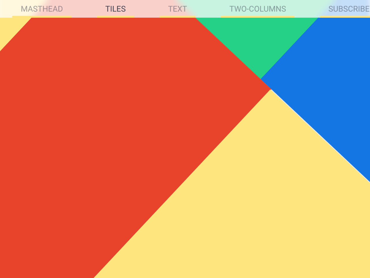
<section id="tiles" style="--name:--tiles-s;">
<div class="tile-section">
<div class="tile-container">
<div class="tile"></div>
<div class="tile"></div>
<div class="tile"></div>
<div class="tile"></div>
<div class="tile"></div>
<div class="tile"></div>
<div class="tile"></div>
<div class="tile"></div>
<div class="tile"></div>
<div class="tile"></div>
<div class="tile"></div>
<div class="tile"></div>
<div class="tile"></div>
<div class="tile"></div>
<div class="tile"></div>
<div class="tile"></div>
<div class="tile"></div>
<div class="tile"></div>
<div class="tile"></div>
<div class="tile"></div>
</div>
</div>
</section>
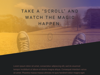
<section id="text" style="--name:--text-s;">
<div class="read">
<div>Reading progress</div>
</div>
<div class="text">
<h2>Smooth appearance of text when scrolling</h2>
<p>Lorem ipsum dolor, sit amet consectetur adipisicing elit. Culpa, tenetur deserunt! Obcaecati eius aut, facere porro amet atque laborum eos, numquam asperiores minus accusantium et tempore repellat voluptatum natus corrupti?</p>
<p>Lorem ipsum dolor, sit amet consectetur adipisicing elit. Culpa, tenetur deserunt! Obcaecati eius aut, facere porro amet atque laborum eos, numquam asperiores minus accusantium et tempore repellat voluptatum natus corrupti?</p>
<p>Lorem ipsum dolor, sit amet consectetur adipisicing elit. Culpa, tenetur deserunt! Obcaecati eius aut, facere porro amet atque laborum eos, numquam asperiores minus accusantium et tempore repellat voluptatum natus corrupti?</p>
<p>Lorem ipsum dolor, sit amet consectetur adipisicing elit. Culpa, tenetur deserunt! Obcaecati eius aut, facere porro amet atque laborum eos, numquam asperiores minus accusantium et tempore repellat voluptatum natus corrupti?</p>
<p>Lorem ipsum dolor, sit amet consectetur adipisicing elit. Culpa, tenetur deserunt! Obcaecati eius aut, facere porro amet atque laborum eos, numquam asperiores minus accusantium et tempore repellat voluptatum natus corrupti?</p>
<p>Lorem ipsum dolor, sit amet consectetur adipisicing elit. Culpa, tenetur deserunt! Obcaecati eius aut, facere porro amet atque laborum eos, numquam asperiores minus accusantium et tempore repellat voluptatum natus corrupti?</p>
<p>Lorem ipsum dolor, sit amet consectetur adipisicing elit. Culpa, tenetur deserunt! Obcaecati eius aut, facere porro amet atque laborum eos, numquam asperiores minus accusantium et tempore repellat voluptatum natus corrupti?</p>
<p>Lorem ipsum dolor, sit amet consectetur adipisicing elit. Culpa, tenetur deserunt! Obcaecati eius aut, facere porro amet atque laborum eos, numquam asperiores minus accusantium et tempore repellat voluptatum natus corrupti?</p>
<p>Lorem ipsum dolor, sit amet consectetur adipisicing elit. Culpa, tenetur deserunt! Obcaecati eius aut, facere porro amet atque laborum eos, numquam asperiores minus accusantium et tempore repellat voluptatum natus corrupti?</p>
<p>Lorem ipsum dolor, sit amet consectetur adipisicing elit. Culpa, tenetur deserunt! Obcaecati eius aut, facere porro amet atque laborum eos, numquam asperiores minus accusantium et tempore repellat voluptatum natus corrupti?</p>
<p>Lorem ipsum dolor, sit amet consectetur adipisicing elit. Culpa, tenetur deserunt! Obcaecati eius aut, facere porro amet atque laborum eos, numquam asperiores minus accusantium et tempore repellat voluptatum natus corrupti?</p>
<p>Lorem ipsum dolor, sit amet consectetur adipisicing elit. Culpa, tenetur deserunt! Obcaecati eius aut, facere porro amet atque laborum eos, numquam asperiores minus accusantium et tempore repellat voluptatum natus corrupti?</p>
<p>Lorem ipsum dolor, sit amet consectetur adipisicing elit. Culpa, tenetur deserunt! Obcaecati eius aut, facere porro amet atque laborum eos, numquam asperiores minus accusantium et tempore repellat voluptatum natus corrupti?</p>
<p>Lorem ipsum dolor, sit amet consectetur adipisicing elit. Culpa, tenetur deserunt! Obcaecati eius aut, facere porro amet atque laborum eos, numquam asperiores minus accusantium et tempore repellat voluptatum natus corrupti?</p>
<p>Lorem ipsum dolor, sit amet consectetur adipisicing elit. Culpa, tenetur deserunt! Obcaecati eius aut, facere porro amet atque laborum eos, numquam asperiores minus accusantium et tempore repellat voluptatum natus corrupti?</p>
</div>
</section>
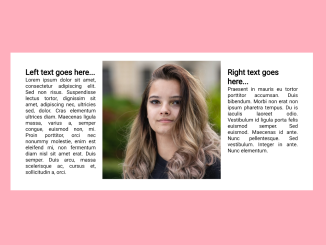
<section id="two-columns" style="--name:--two-columns-s;">
<div class="two-columns">
<h2>Picture arrived on the right</h2>
<div class="content">
<div class="cards">
<div class="card">
<h3 class="title">Card title</h3>
<div class="subtitle">Subtitle</div>
<p>Lorem ipsum dolor, sit amet consectetur adipisicing elit. Culpa, tenetur deserunt! Obcaecati eius aut, facere porro amet atque laborum eos, numquam asperiores minus accusantium et tempore repellat voluptatum natus corrupti?</p>
</div>
</div>
<div class="preview">
<div class="img"></div>
</div>
</div>
</div>
</section>
<section id="subscribe" style="--name:--subscribe-s;">
<div class="subscribe">
<h2>Subscribe now</h2>
<p>Lorem ipsum dolor, sit amet consectetur adipisicing elit. Culpa, tenetur deserunt! Obcaecati eius aut, facere porro amet atque laborum eos, numquam asperiores minus accusantium et tempore repellat voluptatum natus corrupti?</p>
<form action="" method="POST">
<input type="email" placeholder="Enter your email"/>
<button class="btn" type="submit"><span>Subscribe</span></button>
</form>
</div>
</section>
<div class="scroll"><span>scroll</span>
<div class="divider"></div><span>down</span>
</div>
</main>
<footer><a href="https://twitter.com/intent/follow?screen_name=andrejsharapov" target="_blank"><span>X</span></a></footer>
3. Now, copy the following CSS code into your stylesheet or HTML file within a <style> tag. This CSS code contains animation rules for different sections of your webpage.
:root {
	--text-color: hsl(230 16% 28%);

	/* header */
	--header-bg: hsl(0 0% 100% / 75%);

	/* section */
	--section: hsl(0 0% 93%);
	--section-even: hsl(210deg 15% 92%);

	/* tiles */
	--red: hsl(10 83% 52%);
	--green: hsl(157 91% 43%);
	--blue: hsl(210 100% 45%);
	--purple: hsl(266 100% 67%);
	--yellow: hsl(49 100% 73%);
	--black: hsl(0 0% 0%);

	/*  */
	--cubic: cubic-bezier(0.25, 0.1, 0, 2.05);
}

* {
	box-sizing: border-box;
}

html {
	scroll-behavior: smooth;
}

body {
	margin: 0;
	display: grid;
	overflow-x: hidden;
	font-family: "Righteous", sans-serif;

	/* scope */
	timeline-scope:
		--masthead-s,
		--tiles-s,
		--text-s,
		--two-columns-s,
		--subscribe-s;
}

header {
	--show: none;
	--position: relative;
	--b: 0;
	--s: 10%;
	--nav-bg: var(--yellow);

	position: sticky;
	top: 0;
	z-index: 2;
	inline-size: 100%;
	transition: all 200ms linear;

	/* animation */
	animation: height-resize both linear;
	animation-timeline: scroll();
	animation-range: entry 0% exit 20%;

	.menu {
		position: fixed;
		top: 0.25rem;
		left: 0.25rem;
		z-index: 2;
		cursor: pointer;

		& input[type="checkbox"] {
			display: none;
		}

		.burger {
			display: var(--show);
      background-color: var(--header-bg);

			& path {
				fill: none;
				stroke: currentcolor;
				stroke-width: 3;
				transition: stroke-dasharray 400ms, stroke-dashoffset 400ms;

				&.top {
					stroke-dasharray: 40 172;
				}

				&.middle {
					stroke-dasharray: 40 111;
				}

				&.bottom {
					stroke-dasharray: 40 172;
				}
			}
		}

		&:has(input[type="checkbox"]:checked) {
			.burger {
				& path {
					&.top {
						stroke-dashoffset: -132px;
					}

					&.middle {
						stroke-dashoffset: -71px;
					}

					&.bottom {
						stroke-dashoffset: -132px;
					}
				}
			}
		}
	}

	& nav {
		position: var(--position);
		inline-size: inherit;
		display: flex;
		align-items: center;
		justify-content: center;

		/* blur background */
		background-color: var(--header-bg);
		backdrop-filter: blur(6px);

		& ul {
			list-style-type: none;
			display: flex;
			padding: 0;
			grid-column-gap: 3rem;

			& li {
				position: relative;
				padding: 0.5rem 1rem;
				text-transform: uppercase;
				color: var(--text-color);
				transition: transform 0.25s var(--cubic);

				&::after {
					position: absolute;
					content: "";
					left: 0;
					bottom: var(--b);
					z-index: -1;
					inline-size: 100%;
					block-size: var(--s);
					background-color: var(--nav-bg);
					transition: all 0.25s var(--cubic);
				}

				&:has(a:hover) {
					--b: 10%;
					--s: 70%;
				}
			}
		}
	}
}

@media (width <= 48rem) {
	body {
		&:has(input[id="burger"]:checked) {
			scrollbar-gutter: stable;
			overflow-y: hidden;
		}
	}

	header {
		--position: absolute;
		--translateY: -100%;
		--show: block;
		--nav-bg: var(--green);

		& nav {
			top: 0;
			translate: 0 var(--translateY);

			inline-size: 100%;
			block-size: 100dvh;
			padding-inline: 1rem;
			transition: all 200ms ease-in-out;

			& ul {
				block-size: 100%;
				flex-direction: column;
				justify-content: space-evenly;
			}
		}

		& .menu {
			&:has(input[type="checkbox"]:checked) {
				& ~ nav {
					--translateY: 0;
				}
			}
		}
	}
}

@keyframes height-resize {
	to {
		padding-block: 0;
	}
}

:is(h1, h2) {
	margin: 0;
	font-size: calc(2rem + 0.25vw);
}

a {
	text-decoration: none;
	color: currentColor;

	/* animation */
	animation: avtive-link both linear;
	anchor-name: var(--an);
	animation-timeline: var(--at);

	&:not(:hover) {
		opacity: calc(0.5 + var(--active, 0));
	}
}

section {
	min-block-size: 100vh;
	background-color: var(--section);

	/* for animation */
	view-timeline-name: var(--name);

	&:nth-child(even) {
		--section: var(--section-even);
	}
}

.flying-squares {
	position: absolute;
	z-index: 1;

	.square {
		position: inherit;
		width: 15vw;
		height: 15vw;
		rotate: 0.4turn;
		background-color: var(--square-color);
		top: var(--y);
		left: var(--x);
		opacity: 0.3;
		rotate:  var(--rx) var(--ry) var(--rz) 0.55turn;
		animation: flying 2s infinite alternate both;

		&:nth-of-type(1) {
			--y: 17vh;
			--x: 8vw;
			--rx: 0.5;
			--ry: 2.1;
			--rz: 1.6;
			--square-color: var(--red);

			animation-delay: 1s;
		}

		&:nth-of-type(2) {
			--y: 8vh;
			--x: 76vw;
			--rx: 1.7;
			--ry: 2.3;
			--rz: 2.1;
			--square-color: var(--purple);
		}

		&:nth-of-type(3) {
			--y: 60vh;
			--x: 40vw;
			--rx: 1.75;
			--ry: 3.5;
			--rz: 2.7;
			--square-color: var(--green);

			animation-delay: 0.5s;
		}
	}
}

@keyframes flying {
	to {
		translate: 0 -5vh;
	}
}

.masthead {
	max-inline-size: 100vw;
	block-size: 100vh;
	overflow: hidden;
	display: grid;
	place-content: center;
	padding-inline: 1rem;

	& h1 {
		position: fixed;
		top: 50%;
		left: 50%;
		translate: -50% -50%;
		text-transform: uppercase;

		/* 	animation	 */
		animation: scale-up both linear, fade-away both linear;
		animation-timeline: var(--name);
		animation-range: entry-crossing 70% exit 90%, exit 10% exit 70%;
	}
}

@keyframes scale-up {
	100% {
		top: 0;
		scale: 5;
	}
}

@keyframes fade-away {
	100% {
		opacity: 0;
	}
}

.tile-section {
	position: sticky;
	top: 0;
	max-inline-size: 100vw;
	block-size: 200vh;
	overflow: hidden;

	& .tile-container {
		position: absolute;
		top: 50%;
		left: 50%;
		translate: -50% -50%;
		scale: 3;
		inline-size: 100%;
		block-size: 100vh;
		display: grid;
		grid-template: repeat(4, 1fr) / repeat(5, 1fr);
		rotate: 0.12turn;

		& .tile {
			inline-size: 100%;
			block-size: 100%;
			background-color: var(--tile);

			/* animation */
			animation: tile both linear;
			/* 			animation-timeline: scroll(root); */
			animation-timeline: var(--name);
			animation-range: entry 100% exit 0%;

			&:nth-of-type(5n + 2),
			&:nth-of-type(5n + 4) {
				--tile: var(--green);
				--vertical: 100%;
				--horizontal: 100%;

				&:nth-of-type(odd) {
					--tile: var(--red);
					--vertical: 100%;
					--horizontal: -100%;
				}
			}

			&:nth-of-type(5n + 1),
			&:nth-of-type(5n + 3),
			&:nth-of-type(5n + 5) {
				--tile: var(--blue);
				--vertical: -100%;
				--horizontal: 100%;

				&:not(:nth-of-type(odd)) {
					--tile: var(--yellow);
					--vertical: -100%;
					--horizontal: -100%;
				}
			}
		}
	}
}

@keyframes tile {
	0% {
		translate: 0 0;
	}

	50% {
		translate: 0 var(--vertical);
	}

	100% {
		translate: var(--horizontal) var(--vertical);
	}
}

.text {
	max-inline-size: 80ch;
	margin-inline: auto;
	padding: 3rem 1rem;
	counter-reset: chapter 0;

	& > *:not(h2) {
		text-wrap: pretty;
		counter-increment: chapter 1;

		/* animation */
		animation: show-text both linear;
		animation-timeline: view(y 80vh auto);

		&::before {
			content: counter(chapter, upper-roman) ". "; /* lower-alpha */
		}
	}
}

/* :has(.text) {
	counter-reset: chapter 0;

	& p {
		counter-increment: chapter 1;
	}

	.read > * {
		&::after {
			content: ' ' counter(chapter) '%';
		}
	}
} */

@keyframes show-text {
	from {
		opacity: 0;
	}

	to {
		opacity: 1;
	}
}

.read {
	position: fixed;
	top: 68px;
	left: 0;
	z-index: 3;
	inline-size: 0;
	max-inline-size: 100%;
	text-align: right;
	white-space: nowrap;
	padding-block: 0.125rem;
	padding-inline-end: 0.5rem;
	background-image: linear-gradient(
		0.25turn,
		var(--red),
		var(--yellow),
		var(--green),
		var(--blue),
		var(--purple)
	);
	opacity: 0;
	transition: opacity 200ms linear;

	/* animation */
	animation: read-text both linear;
	animation-timeline: var(--name);
	animation-range: entry 100% exit 100%;

	& div {
		filter: invert(100%);
	}
}

@keyframes read-text {
	1% {
		opacity: 1;
	}

	99% {
		inline-size: 100%;
		opacity: 1;
	}

	100% {
		opacity: 0;
	}
}

.two-columns {
	--columns: 1;
	--translateX: 0;

	max-inline-size: 80ch;
	margin-inline: auto;
	block-size: 100%;
	padding: 3rem 1rem;

	.content {
		display: grid;
		grid-template-columns: repeat(var(--columns), 1fr);
		place-content: center;
		gap: 2rem;

		.cards {
			margin-block-start: 2rem;
			display: flex;
			flex-direction: column;
			justify-content: space-between;

			.card {
				box-shadow: inset 0 0 0.125rem var(--text-color);

				/* animation */
				animation: show both linear;
				animation-timeline: var(--name);
				animation-range:  entry-crossing var(--range-start);

				&:nth-of-type(1) {
					--range-start: 10%;
				}

				&:nth-of-type(2) {
					--range-start: 40%;
				}

				&:nth-of-type(3) {
					--range-start: 70%;
				}

				&:not(:last-of-type) {
					margin-block-end: 2rem;
				}

				& * {
					margin: 0;
					padding-inline: 1rem;
				}

				.title {
					padding-block-start: 1rem;
				}

				.subtitle {
					padding-block-start: 0.25rem;
					padding-block-end: 1rem;
					opacity: 0.5;
				}

				& p {
					padding-block-end: 1rem;
				}
			}
		}
	}

	.preview {
		position: relative;
		margin-block: 2rem;
		block-size: calc(100% - 1rem);

		.img {
			left: var(--translateX);
			block-size: inherit;
			min-block-size: 24rem;
			object-fit: cover;
			background: var(--red);
		}
	}
}

@media (width >= 48rem) {
	.two-columns {
		--columns: 2;
		--translateX: 150%;

		.preview {
			.img {
				position: absolute;
				top: 0;
				aspect-ratio: 0.5;

				/* animation */
				animation: fade-right both linear;
				animation-timeline: scroll(root);
				animation-range: entry 5% exit 90%;
			}
		}
	}
}

@keyframes fade-right {
	to {
		left: 0;
	}
}

@keyframes show {
	from {
		opacity: 0;
	}

	to {
		opacity: 1;
	}
}

.subscribe {
	max-inline-size: 80ch;
	margin-inline: auto;
	block-size: 100vh;
	padding: 3rem 1rem;
	display: grid;
	place-content: center;
	text-align: center;

	& form {
		position: relative;
		margin-block-start: 2rem;

		/* animation */
		animation: slide-up both linear;
		animation-timeline: var(--name);
		animation-range:  entry-crossing 40%;

		& input {
			inline-size: 100%;
			border: 0;
			min-block-size: 3rem;
			margin-block-end: 1rem;
			padding-inline: 0.5rem;
			font-size: calc(1rem + 0.25vw);
			box-shadow: 0 0 0.125rem var(--text-color);

			&:focus {
				outline: thin solid var(--purple);
			}
		}

		& button {
			padding: 0.75rem 1rem;
			text-transform: uppercase;
			cursor: pointer;
			background-color: var(--purple);
			border: 0;

			&:focus {
				outline: thin solid var(--purple);
			}

			& span {
				font-weight: 700;
				filter: invert(100%);
			}
		}
	}
}

@keyframes slide-up {
	from {
		scale: 0;
	}

	to {
		scale: 1;
	}
}

.scroll {
	position: fixed;
	top: 50%;
	left: 0.35rem;
	translate: 0 -50%;
	writing-mode: vertical-lr;
	rotate: 0.5turn;
	display: flex;
	align-items: center;
	gap: 0.5rem;
	opacity: 0.5;

	& .divider {
		inline-size: 2rem;
		block-size: 2px;
		background-color: currentColor;
		opacity: 0.5;
	}

	& span {
		text-transform: lowercase;
		font-weight: bold;
	}
}

@keyframes avtive-link {
	50% {
		--active: 1;
	}
}

footer {
	display: grid;
	place-content: center;
	padding-block: 1rem;

	& a {
		--active: 1;

		padding: 0.5rem 1rem;
		background-color: var(--black);

		& span {
			filter: invert(75%);
		}
	}
}
Feel free to customize animation properties such as duration, timing, and effects to suit your website’s design and theme.
That’s all! hopefully, you have successfully created Scroll-driven Animations on your website. If you have any questions or suggestions, feel free to comment below.
Similar Code Snippets:
 Skew Header with Background Image CSS
- 9+ Simple Speech Bubble in CSS
- Wrap Text Around Centered Image CSS
- Easy Dark Mode Using CSS
- Toggle Button in CSS With Stretchable Elastic Effect


I code and create web elements for amazing people around the world. I like work with new people. New people new Experiences.
I truly enjoy what I’m doing, which makes me more passionate about web development and coding. I am always ready to do challenging tasks whether it is about creating a custom CMS from scratch or customizing an existing system.