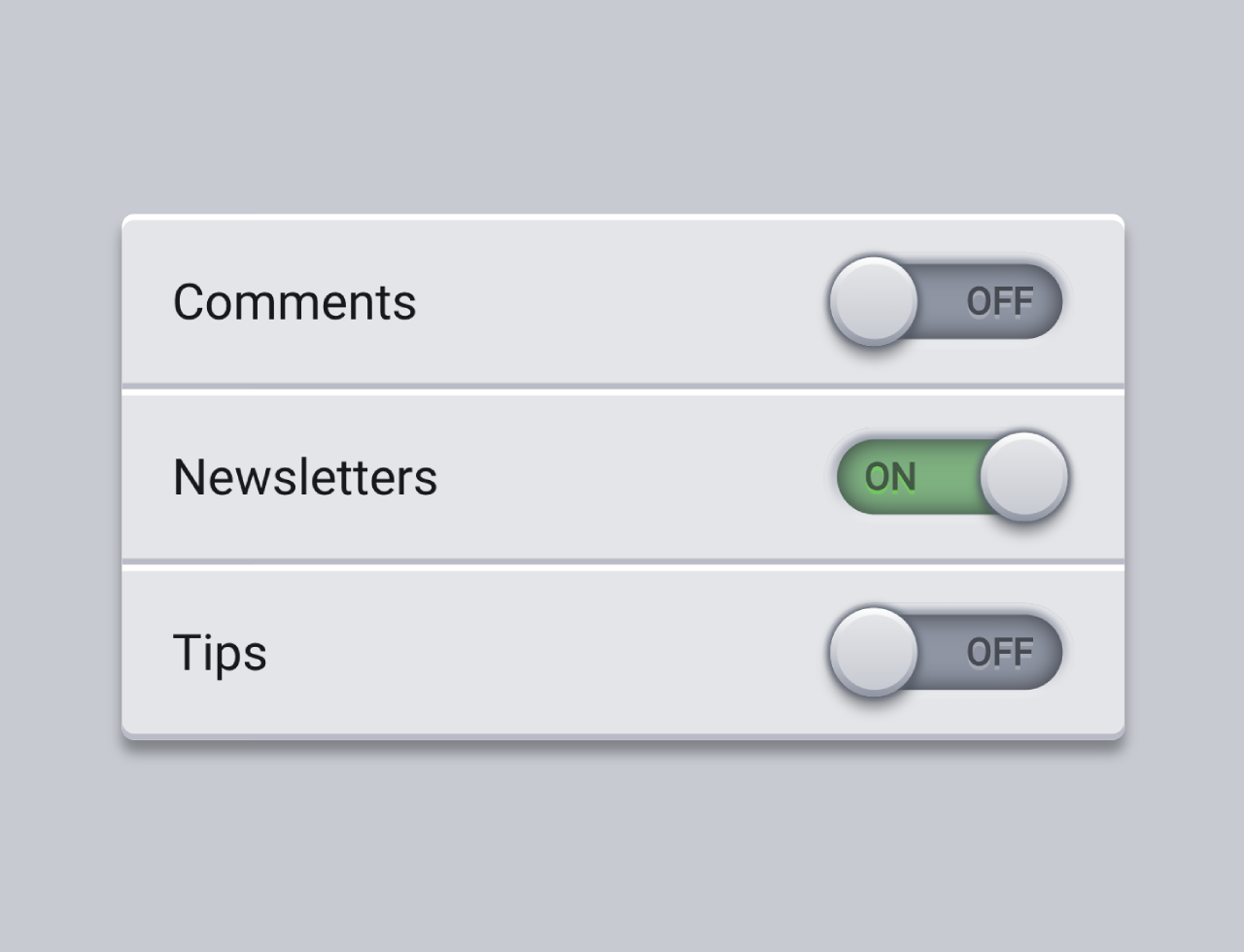

This code creates toggle buttons styled with CSS. It switches ON/OFF states for various settings. Using checkboxes, it simulates toggle switches for different options. This design helps manage and visually toggle settings like comments, newsletters, and tips without using default switches.
You can use this code on websites needing stylish toggle buttons. It offers a sleek way to control settings visually.
How to Create Skeuomorphic Toggle Buttons Using Css
1. Start with the HTML structure. Wrap each toggle switch in a <label> tag containing a <span> for the label text and a structure for the switch itself, using <input> and <span> elements. Modify the labels within the <span class="setting__label"> to suit your settings.
<form>
	<label class="setting">
		<span class="setting__label">Comments</span>
		<span class="switch">
			<input class="switch__input" type="checkbox" role="switch" name="switch1">
			<span class="switch__fill" aria-hidden="true">
				<span class="switch__text">ON</span>
				<span class="switch__text">OFF</span>
			</span>
		</span>
	</label>
	<label class="setting">
		<span class="setting__label">Newsletters</span>
		<span class="switch">
			<input class="switch__input" type="checkbox" role="switch" name="switch2">
			<span class="switch__fill" aria-hidden="true">
				<span class="switch__text">ON</span>
				<span class="switch__text">OFF</span>
			</span>
		</span>
	</label>
	<label class="setting">
		<span class="setting__label">Tips</span>
		<span class="switch">
			<input class="switch__input" type="checkbox" role="switch" name="switch3" checked>
			<span class="switch__fill" aria-hidden="true">
				<span class="switch__text">ON</span>
				<span class="switch__text">OFF</span>
			</span>
		</span>
	</label>
</form>
2. Apply CSS styles to customize the appearance of the toggle switches. The following CSS code includes styles for the switches, labels, and their animations.
* {
	border: 0;
	box-sizing: border-box !important;
	margin: 0;
	padding: 0;
}
:root {
	--hue: 223;
	--hue-success: 103;
	--bg: hsl(var(--hue),10%,80%);
	--fg: hsl(var(--hue),10%,10%);
	--primary: hsl(var(--hue),90%,50%);
	--primary-t: hsla(var(--hue),90%,50%,0);
	--trans-dur: 0.3s;
	--trans-timing: cubic-bezier(0.65,0,0.35,1);
	font-size: calc(16px + (32 - 16) * (100vw - 320px) / (2560 - 320));
}


body,
input {
	font: 1em/1.5 "DM Sans", sans-serif;
}
body {
	background-color: var(--bg);
	color: var(--fg);
	display: flex;
	height: 100vh;
}
form {
	background-color: hsl(var(--hue),10%,90%);
	border-radius: 0.25em;
	box-shadow: 0 0.25em 0.25em hsla(var(--hue),10%,10%,0.4);
	margin: auto;
	width: calc(100% - 3em);
	max-width: 20em;
}
.setting {
	box-shadow:
		0 0.125em 0 hsl(var(--hue),10%,100%) inset,
		0 -0.125em 0 hsl(var(--hue),10%,75%) inset;
	display: flex;
	justify-content: space-between;
	align-items: center;
	padding: 0.75em 1em;
}
.setting:only-child {
	border-radius: 0.25em;
}
.setting:first-child {
	border-radius: 0.25em 0.25em 0 0;
}
.setting:last-child {
	border-radius: 0 0 0.25em 0.25em;
}
.setting__label {
	margin-right: 1em;
}
.setting,
.switch__input {
	-webkit-tap-highlight-color: transparent;
}
.switch,
.switch:before,
.switch:after {
	display: block;
}
.switch {
	background-image: linear-gradient(hsl(var(--hue),10%,60%),hsl(var(--hue),10%,95%));
	box-shadow: 0 0 0.125em 0.125em hsl(var(--hue),10%,90%) inset;
	border-radius: 1em;
	flex-shrink: 0;
	position: relative;
	width: 5em;
	height: 2em;
}
.switch:before,
.switch:after {
	border-radius: 0.75em;
	content: "";
	position: absolute;
	top: 0.25em;
	left: 0.25em;
	width: 4.5em;
	height: 1.5em;
}
.switch:before {
	background-color: hsl(var(--hue),10%,60%);
}
.switch::after {
	box-shadow: 0 0 0.5em hsl(var(--hue),10%,20%) inset;
	z-index: 1;
}
.switch__fill {
	border-radius: 0.75em;
	overflow: hidden;
	position: absolute;
	top: 0.25em;
	right: 0;
	left: 0.25em;
	width: 4.5em;
	height: 1.5em;
	z-index: 1;
}
.switch__input {
	border-radius: 1em;
	box-shadow: 0 0 0 0.125em var(--primary-t);
	cursor: pointer;
	outline: transparent;
	position: relative;
	width: 100%;
	height: 100%;
	transition: box-shadow calc(var(--trans-dur) / 2) var(--trans-timing);
	z-index: 2;
	-webkit-appearance: none;
	appearance: none;
}
.switch__input:focus-visible {
	box-shadow: 0 0 0 0.125em var(--primary);
}
.switch__input:before,
.switch__input:after {
	border-radius: 50%;
	content: "";
	display: block;
	position: absolute;
	transition: transform var(--trans-dur) var(--trans-timing);
}
.switch__input:before {
	background-image: linear-gradient(hsl(0,0%,100%),hsl(var(--hue),10%,60%));
	box-shadow:
		0 0 0.125em 0.0625em hsl(var(--hue),10%,40%),
		0 0.25em 0.25em hsla(var(--hue),10%,10%,0.4);
	top: 0.125em;
	left: 0.125em;
	width: 1.75em;
	height: 1.75em;
}
.switch__input:after {
	background-image: linear-gradient(hsl(var(--hue),10%,90%),hsl(var(--hue),10%,80%));
	top: 0.25em;
	left: 0.25em;
	width: 1.5em;
	height: 1.5em;
}
.switch__text {
	background-color: hsl(var(--hue-success),90%,50%,0.5);
	color: hsl(var(--hue-success),90%,10%);
	display: block;
	font-size: 0.75em;
	font-weight: 700;
	line-height: 2;
	opacity: 0.6;
	padding: 0 0.75em;
	position: absolute;
	top: 0;
	left: 0;
	width: 100%;
	height: 100%;
	text-shadow: 0 0.0625rem 0 hsl(var(--hue-success),90%,55%);
	transform: translateX(-4.25em);
	transition: transform var(--trans-dur) var(--trans-timing);
	z-index: -1;
}
.switch__text + .switch__text {
	background-color: hsla(0,0%,0%,0);
	color: hsl(var(--hue),10%,10%);
	text-shadow: 0 0.0625rem 0 hsl(var(--hue),10%,75%);
	text-align: right;
	transform: translateX(0);
}
.switch__input:checked:before,
.switch__input:checked:after {
	transform: translateX(3em);
}
.switch__input:checked + .switch__fill .switch__text {
	transform: translateX(0);
}
.switch__input:checked + .switch__fill .switch__text + .switch__text {
	transform: translateX(4em);
}

/* Dark theme */
@media (prefers-color-scheme: dark) {
	:root {
		--bg: hsl(var(--hue),10%,20%);
		--fg: hsl(var(--hue),10%,90%);
		--primary: hsl(var(--hue),90%,70%);
		--primary-t: hsla(var(--hue),90%,70%,0);
	}
	form {
		background-color: hsl(var(--hue),10%,30%);
	}
	.setting {
		box-shadow:
			0 0.125em 0 hsl(var(--hue),10%,40%) inset,
			0 -0.125em 0 hsl(var(--hue),10%,20%) inset;
	}
	.switch {
		background-image: linear-gradient(hsl(var(--hue),10%,15%),hsl(var(--hue),10%,35%));
		box-shadow: 0 0 0.125em 0.125em hsl(var(--hue),10%,30%) inset;
	}
	.switch:before {
		background-color: hsl(var(--hue),10%,40%);
	}
	.switch:after {
		box-shadow: 0 0 0.5em hsl(0,0%,0%) inset;
	}
	.switch__input:before {
		background-image: linear-gradient(hsl(var(--hue),10%,50%),hsl(var(--hue),10%,20%));
		box-shadow:
			0 0 0.125em 0.0625em hsl(var(--hue),10%,10%),
			0 0.25em 0.25em hsla(var(--hue),10%,10%,0.4);
	}
	.switch__input:after {
		background-image: linear-gradient(hsl(var(--hue),10%,40%),hsl(var(--hue),10%,30%));
	}
	.switch__text {
		text-shadow: 0 0.0625rem 0 hsl(var(--hue-success),90%,45%);
	}
	.switch__text + .switch__text {
		color: hsl(var(--hue),10%,10%);
		text-shadow: 0 0.0625rem 0 hsl(var(--hue),10%,55%);
	}
}
Adjust the colors, sizes, or animations by modifying the variables in the CSS code, such as hue, background, or text colors. Ensure the toggle buttons are accessible by adding appropriate roles and labels.
Easily integrate these buttons into any web page where stylish toggle switches are needed.
That’s all! hopefully, you have successfully created Skeuomorphic Toggle Buttons Using CSS. If you have any questions or suggestions, feel free to comment below.
Similar Code Snippets:


I code and create web elements for amazing people around the world. I like work with new people. New people new Experiences.
I truly enjoy what I’m doing, which makes me more passionate about web development and coding. I am always ready to do challenging tasks whether it is about creating a custom CMS from scratch or customizing an existing system.