

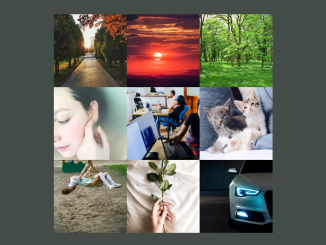
This code creates an animated grid layout with images. On hovering, columns shrink and expand smoothly. It helps add interactive visual effects to web pages.
You can use this code in website headers or featured sections to showcase images dynamically. It adds visual appeal and interactivity, enhancing user engagement. Additionally, it’s easy to implement and customize according to your design needs.
How to Create Animating Grid-column On Hover Using CSS
1. Begin by setting up the HTML structure. Create a div with the id of “grid”, and inside it, add three more div elements with classes “left”, “middle”, and “right”.
<div id="grid">
	<div class="left"></div>
	<div class="middle"></div>
	<div class="right"></div>
</div>
2. Next, style your grid and images using CSS. Set basic styles for elements, such as padding and margin adjustments, and define transitions for smooth animations.
Define the grid layout using CSS grid properties. Set the grid-template-columns property to distribute space evenly between the columns.
Utilize CSS hover selectors to trigger the animation effect on the grid when hovered over. Adjust grid-template-columns property values to manipulate column widths.
* {
	padding: 0;
	margin: 0;
	box-sizing: border-box;
	transition: 0.75s ease;
}

body {
	min-height: 100vh;
	display: grid;
	place-items: center;
	gap: 4rem;
	background: #b8860b;
}
#grid {
	width: calc(100% - 20vmin);
	aspect-ratio: 16 / 7;
	background: linen;
	display: grid;
	grid-template-columns: 1fr 0fr 1fr;
	place-items: center;
	outline: 2px solid #804a00;
	border-radius: 5vmin;
	box-shadow: 0 1rem 2rem -1rem rgba(68 50 4 / 1);
	overflow: hidden;
}
.left,
.right,
.middle {
	width: 100%;
	height: 100%;
	background-size: cover;
	background-position: center;
	transform-origin: center;
}
.left {
	background-image: url("https://assets.codepen.io/4787486/hamster-3.jpg");
	border-right: 1px solid #804a00;
}
.middle {
	font-size: 0rem;
	background-image: url("https://assets.codepen.io/4787486/hamster-4.jpg");
}
.right {
	background-image: url("https://assets.codepen.io/4787486/hamster-2.jpg");
	border-left: 1px solid #804a00;
}

#grid:hover {
	grid-template-columns: 0fr 1fr 0fr;
}
Test your animation and make adjustments as needed. Experiment with different transition durations and easing functions to achieve the desired effect.
That’s all! hopefully, you have successfully created an Animating Grid-column On Hover Using CSS. If you have any questions or suggestions, feel free to comment below.
Similar Code Snippets:
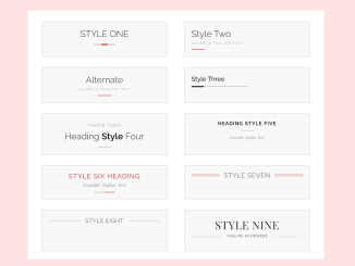
 15+ CSS Heading Styles Examples
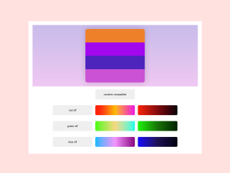
- Color Palette Generator From Hex Code
- Arched Toggle Switch Using HTML & CSS
- Slide Image on Hover Using a CSS Transition
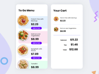
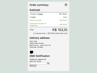
- Order Summary Report UI Using HTML CSS
- 3x3 Image Grid In HTML and CSS
- Pricing Table with CSS Switch Toggle


I code and create web elements for amazing people around the world. I like work with new people. New people new Experiences.
I truly enjoy what I’m doing, which makes me more passionate about web development and coding. I am always ready to do challenging tasks whether it is about creating a custom CMS from scratch or customizing an existing system.