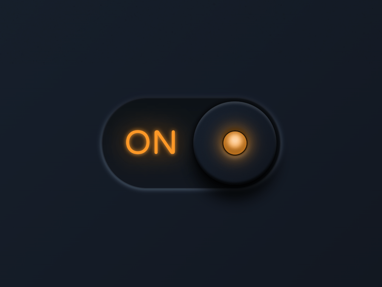

This code implements a toggle button in CSS with a stretchable elastic effect. The button switches between ON and OFF states. It works by using CSS animations to stretch the button’s thumb. Helpful for creating interactive UI elements.
Moreover, you can use this code to create stylish toggle buttons on your website or web application. It adds interactivity and enhances user experience. Plus, it’s easy to implement and customize according to your design needs.
How to Create Toggle Button in CSS with Stretchable Elastic Effect
1. First, let’s set up the HTML structure. We’ll need a <div> element with a class of “toggle” containing an <input> element with a unique ID and a <label> element with a “for” attribute linked to the input.
<div class="toggle">
	<input type="checkbox" id="btn">
	<label for="btn">
		<span class="thumb"></span>
	</label>
</div>
2. Next, we’ll add CSS to style our toggle button. We’ll define colors, sizes, and animations for the button and its thumb.
@import url('https://fonts.googleapis.com/css2?family=Varela+Round&display=swap');

:root {
	--sz: 10vmin;
	--on: #FF9800;
	--off: #243747;
	--bg: linear-gradient(135deg, #17212f, #11151e);
	--tr: all 0.5s ease 0s;
	--elastic: linear(0 0%, 0.22 2.1%, 0.86 6.5%, 1.11 8.6%, 1.3 10.7%, 1.35 11.8%, 1.37 12.9%, 1.37 13.7%, 1.36 14.5%, 1.32 16.2%, 1.03 21.8%, 0.94 24%, 0.89 25.9%, 0.88 26.85%, 0.87 27.8%, 0.87 29.25%, 0.88 30.7%, 0.91 32.4%, 0.98 36.4%, 1.01 38.3%, 1.04 40.5%, 1.05 42.7%, 1.05 44.1%, 1.04 45.7%, 1 53.3%, 0.99 55.4%, 0.98 57.5%, 0.99 60.7%, 1 68.1%, 1.01 72.2%, 1 86.7%, 1 100%);
}

* {
	box-sizing: border-box !important;
	transition: var(--tr);
	animation-play-state: paused;
}

body {
	margin: 0;
	padding: 0;
	width: 100vw;
	height: 100vh;
	overflow: hidden;
	display: flex;
	align-items: center;
	justify-content: center;
	background: var(--bg) !important;
}

body:before, body:after {
	content: "";
	position: absolute;
	width: 100%;
	height: 100%;
	background:
		repeating-conic-gradient(#0002 0.000095%, #fff0 .0005%, #fff0 .005%, #fff0 .0005%),
		repeating-conic-gradient(#0002 0.00001%, #fff0 .00009%, #fff0 .00075%, #fff0 .000025%);
	opacity: 0.75;
	filter: blur(0.75px);
}

.toggle  {
	position: relative;
	width: calc(var(--sz) * 4);
	height: calc(var(--sz) * 2);
	display: flex;
	align-items: center;
	justify-content: center;
}

input {
	display: none;
}

label[for=btn] {
	position: absolute;
	width: calc(var(--sz) * 4);
	height: calc(var(--sz) * 2);
	background: linear-gradient(0deg, #121720, #0d1217);
	border-radius: var(--sz);
	box-shadow: 0 0 calc(var(--sz) / 50) calc(var(--sz) / 50) #0006, 0 calc(var(--sz) * -0.05) calc(var(--sz) / 10) calc(var(--sz) / 500) #0b0b10, 0 0 calc(var(--sz) / 10) calc(var(--sz) / 50) #b9e1ff88, 0 calc(var(--sz) * -0.05) calc(var(--sz) / 5) calc(var(--sz) / 50) #15182fcc;
}

.thumb {
	position: absolute;
	height: calc(calc(var(--sz) * 2) - calc(var(--sz) / 8));
	top: calc(calc( var(--sz) / 10) + calc(var(--sz) / -20));
	background:
		repeating-conic-gradient(#0002 0.000095%, #fff0 .0005%, #fff0 .005%, #fff0 .0005%),
		repeating-conic-gradient(#0002 0.00001%, #fff0 .00009%, #fff0 .00075%, #fff0 .000025%),
		var(--bg);
	border-radius: var(--sz);
	box-shadow:
		0 calc(var(--sz) * -0.05) calc(var(--sz) * 0.05) 0 #000c inset, 0 calc(var(--sz) * 0.05) calc(var(--sz) * 0.05) 0 #fff2 inset,     0 0 calc(var(--sz) / 10) calc(var(--sz) / 50) #000c,     0 calc(var(--sz) / 3) calc(var(--sz) / 3) 0 #000d;
	cursor: pointer;
	display: flex;
	align-items: center;
	justify-content: flex-start;
	z-index: 1;
	overflow: hidden;
	padding: calc(var(--sz)* 0.65);
	transition: var(--tr);
	animation: go-left 1s ease 0s;
	width: calc(var(--sz)* 1.875);
	right: calc(var(--sz)* 2.05);
}

#btn:checked + label .thumb {
	transition: var(--tr);
	animation: go-right 1s ease 0s;
	width: calc(var(--sz)* 1.875);
	right: calc(var(--sz)* 0.075);
	justify-content: flex-end;
}


@keyframes go-left {
	0%   {
		width: calc(var(--sz)* 1.875);
		right: calc(var(--sz)* 0.075);
	}
	40%, 60%  {
		width: calc(var(--sz)* 3.85);
		right: calc(var(--sz)* 0.075);
	}
	100% {
		width: calc(var(--sz)* 1.875);
		right: calc(var(--sz)* 2.05);
	}
}


@keyframes go-right {
	0%   {
		width: calc(var(--sz)* 1.875);
		right: calc(var(--sz)* 2.05);
	}
	40%, 60%  {
		width: calc(var(--sz)* 3.85);
		right: calc(var(--sz)* 0.075);
	}
	100% {
		width: calc(var(--sz)* 1.875);
		right: calc(var(--sz)* 0.075);
	}
}


label[for=btn]:before,
label[for=btn]:after {
	--clr: var(--on);
	content: "ON";
	color: #fff;
	font-family: 'Varela Round', serif;
	width: 50%;
	float: left;
	text-align: center;
	display: flex;
	justify-content: center;
	height: 100%;
	font-size: calc(var(--sz)* 0.75);
	padding: 0 0 0 calc(var(--sz)* 0.2);
	box-sizing: border-box;
	transform-origin: 100% 50%;
	animation: muelle-on 1.5s var(--elastic) 0.5s;
	color: var(--clr);
	text-shadow: 0 0 calc(var(--sz) * 0.1) var(--clr), 0 0 calc(var(--sz) * 0.3) #000, 0 0 calc(var(--sz) * 0.5) var(--clr), 0 calc(var(--sz) * 0.0125) calc(var(--sz) * 0.05) #233443, 0 calc(var(--sz) * -0.0125) calc(var(--sz) * 0.05) #000;
	align-items: center;
	line-height: calc(var(--sz) * 0.55);
}

label[for=btn]:after {
	content: "OFF";
	padding: 0 calc(var(--sz) * 0.325) 0 0;
	transform-origin: 0% 50%;
	--clr: var(--off);
	text-shadow: 0 calc(var(--sz) * 0.0125) calc(var(--sz) * 0.05) #233443, 0 calc(var(--sz) * -0.0125) calc(var(--sz) * 0.05) #000;
}

#btn:checked + label[for=btn]:before {
	animation-name: muelle-off;
}

#btn:checked + label[for=btn]:after {
	animation: muelle-off 1.5s var(--elastic) 0.5s;
}

@keyframes muelle-on {
	0% { transform: scaleX(0.35); }
	100% { transform: scaleX(1); }
}

@keyframes muelle-off {
	0% { transform: scaleX(0.35); }
	100% { transform: scaleX(1); }
}


/* light */
span.thumb:before {
	content: "";
	background: #121212;
	position: relative;
	width: calc(var(--sz) / 1.75);
	height: calc(var(--sz) / 1.75);
	border-radius: var(--sz);
	box-shadow: 0 0 calc(var(--sz) / 50) calc(var(--sz) / 50) #0008, 0 calc(var(--sz) * -0.05) calc(var(--sz) / 10) calc(var(--sz) / 500) #000, 0 calc(var(--sz) * 0.025) calc(var(--sz) / 10) calc(var(--sz) / 500) #fff8, 0 0 calc(var(--sz) / 20) calc(var(--sz) / 25) #000;
}

span.thumb:after {
	content: "";
	transition: var(--tr);transition: var(--tr);
	width: calc(var(--sz) / 1.75);
	height: calc(var(--sz) / 1.75);
	position: absolute;
	border-radius: var(--sz);
	--clr: var(--off);
	--shn: #fff8;
	box-shadow:
		0 0 0 calc(var(--sz) * 0.025) #000c inset,
		0 0 calc(var(--sz) / 2.5) 0 var(--clr),
		0 0 calc(var(--sz) / 3) calc(var(--sz) / 20) var(--clr) inset,
		0 calc(var(--sz) / -20) calc(var(--sz) / 10) calc(var(--sz) / 10) #000c inset;
	background: radial-gradient(circle at 50% 32%, var(--shn) 0 calc(var(--sz) / 20), var(--clr) calc(var(--sz) / 3) calc(var(--sz) / 3));
}

#btn:checked + label span.thumb:after {
	--clr: var(--on);
	--shn: #fff;
}
Feel free to customize the CSS variables and styles to match your design preferences. You can adjust colors, sizes, and animation durations to suit your project’s theme.
That’s all! hopefully, you have successfully created a Toggle Button with a Stretchable Elastic Effect on your website. If you have any questions or suggestions, feel free to comment below.
Similar Code Snippets:
 Vertical Scrolling Timeline Template in CSS3
- Color Palette Generator From Hex Code
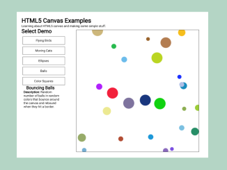
- HTML5 Canvas Examples with Source Code
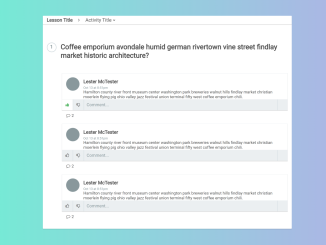
- HTML Code For Discussion Forum
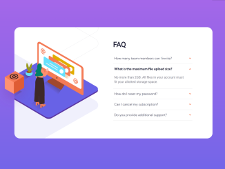
- FAQ Page Design in HTML with Source Code
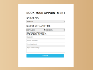
- Appointment Booking Form in HTML CSS
- Animating Grid-column on Hover Using CSS

I code and create web elements for amazing people around the world. I like work with new people. New people new Experiences.
I truly enjoy what I’m doing, which makes me more passionate about web development and coding. I am always ready to do challenging tasks whether it is about creating a custom CMS from scratch or customizing an existing system.