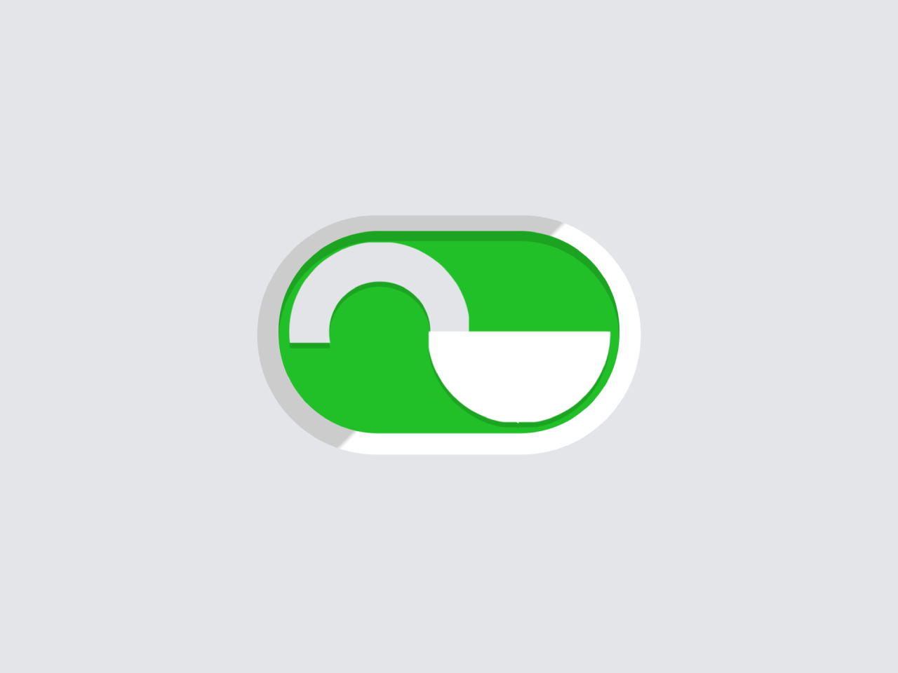

This code creates a toggle switch resembling a padlock using HTML and CSS. The switch changes its appearance when toggled. It helps add interactive switches to web pages.
You can use this code on websites or web applications to enhance user experience. It provides an interactive way for users to toggle options. Additionally, it adds visual appeal and functionality to your website’s design.
How to Create Padlock Toggle Switch In Css
1. Begin by setting up the basic HTML structure for the toggle switch. Use the <label>, <input>, and <span> elements to create the switch components.
<label class="switch">
	<span class="switch__wrapper">
		<input class="switch__input" type="checkbox" role="switch">
		<span class="switch__handle">
			<span class="switch__handle-top"></span>
			<span class="switch__handle-side"></span>
			<span class="switch__handle-bottom"></span>
			<span class="switch__handle-bottom"></span>
			<span class="switch__handle-bottom">
				<span class="switch__keyhole"></span>
			</span>
		</span>
	</span>
	<span class="switch__label">Power</span>
</label>
2. Next, apply CSS styles to design the toggle switch. Customize colors, shadows, and transitions to achieve the desired look and feel.
* {
  border: 0;
  box-sizing: border-box;
  margin: 0;
  padding: 0;
}

:root {
  --hue: 223;
  --bg: hsl(var(--hue),10%,90%);
  --fg: hsl(var(--hue),10%,10%);
  --primary: hsl(var(--hue),90%,50%);
  --trans-dur: 0.3s;
  --trans-timing: cubic-bezier(0.65,0,0.35,1);
  font-size: calc(56px + (120 - 56) * (100vw - 280px) / (3840 - 280));
}

body,
input {
  font: 1em/1.5 sans-serif;
}

body {
  background-color: var(--bg) !important;
  color: var(--fg);
  display: flex;
  height: 100vh;
  transition: background-color var(--trans-dur), color var(--trans-dur);
}

.switch {
  display: flex;
  align-items: center;
  margin: auto;
}
.switch, .switch__input {
  -webkit-tap-highlight-color: transparent;
}
.switch__handle, .switch__input, .switch__wrapper {
  display: block;
}
.switch__handle {
  filter: drop-shadow(0 0.0625em rgba(0, 0, 0, 0.15));
  pointer-events: none;
  top: 0.1875em;
  left: 0.1875em;
  width: 1.125em;
  height: 1.125em;
  transform-style: preserve-3d;
  perspective: 19.5em;
}
[dir=rtl] .switch__handle {
  right: 0.1875em;
  left: auto;
}
.switch__handle, .switch__handle-top, .switch__handle-bottom, .switch__handle-side {
  position: absolute;
}
.switch__handle-top, .switch__handle-bottom {
  border-radius: 50%;
  top: 0;
  left: 0;
  width: 100%;
  height: 100%;
}
.switch__handle-top {
  box-shadow: 0 0 0 0.25em hsl(var(--hue), 10%, 90%) inset;
  clip-path: polygon(0 0, 100% 0, 100% calc(50% + 1px), 0 calc(50% + 1px));
}
.switch__handle-bottom, .switch__handle-side {
  background-color: white;
  transition: transform var(--trans-dur) var(--trans-timing);
}
.switch__handle-bottom {
  clip-path: polygon(0 50%, 100% 50%, 100% 100%, 0 100%);
  transform: rotateY(0) translateZ(-0.125em);
  transform-origin: calc(100% - 0.125em) 0;
}
[dir=rtl] .switch__handle-bottom {
  transform-origin: 0.125em 0;
}
.switch__handle-bottom ~ .switch__handle-bottom {
  transform: rotateY(0) translateZ(0.125em);
}
.switch__handle-side {
  display: block;
  top: 50%;
  left: 0.875em;
  width: 0.25em;
  height: 50%;
  transform: rotateY(-90deg) translateZ(0.4375em);
}
[dir=rtl] .switch__handle-side {
  right: 0.875em;
  left: auto;
  transform: rotateY(90deg) translateZ(0.4375em);
}
.switch__input {
  background-color: white;
  background-image: linear-gradient(-45deg, rgba(0, 0, 0, 0) 49%, rgba(0, 0, 0, 0.2) 50%);
  border-radius: 0.75em;
  cursor: pointer;
  position: relative;
  width: 2.375em;
  height: 1.5em;
  -webkit-appearance: none;
  appearance: none;
}
.switch__input, .switch__input:before {
  transition: background-color var(--trans-dur);
}
.switch__input:before {
  background-color: hsl(var(--hue), 10%, 80%);
  border-radius: 0.625em;
  box-shadow: 0 0.0625em 0 rgba(0, 0, 0, 0.15) inset;
  content: "";
  display: block;
  position: absolute;
  top: 0.125em;
  left: 0.125em;
  width: 2.125em;
  height: 1.25em;
  transition-timing-function: var(--trans-timing);
}
.switch__input:checked + .switch__handle .switch__handle-bottom {
  transform: rotateY(180deg) translateZ(-0.125em);
}
[dir=rtl] .switch__input:checked + .switch__handle .switch__handle-bottom {
  transform: rotateY(-180deg) translateZ(-0.125em);
}
.switch__input:checked + .switch__handle .switch__handle-bottom ~ .switch__handle-bottom {
  transform: rotateY(180deg) translateZ(0.125em);
}
[dir=rtl] .switch__input:checked + .switch__handle .switch__handle-bottom ~ .switch__handle-bottom {
  transform: rotateY(-180deg) translateZ(0.125em);
}
.switch__input:checked + .switch__handle .switch__handle-bottom:last-child {
  backface-visibility: hidden;
}
.switch__input:checked + .switch__handle .switch__handle-side {
  transform: rotateY(90deg) translateZ(0.4375em);
}
[dir=rtl] .switch__input:checked + .switch__handle .switch__handle-side {
  transform: rotateY(-90deg) translateZ(0.4375em);
}
.switch__input:checked:before {
  background-color: #0ac213;
}
.switch__keyhole {
  top: 0.625em;
  width: 0.1875em;
  height: 0.375em;
  transition: visibility calc(var(--trans-dur) / 2) steps(1, end);
}
.switch__keyhole, .switch__keyhole:before, .switch__keyhole:after {
  position: absolute;
  left: 50%;
  transform: translateX(-50%);
}
.switch__keyhole:before, .switch__keyhole:after {
  background-color: hsl(var(--hue), 10%, 50%);
  content: "";
  display: block;
}
.switch__keyhole:before {
  border-radius: 50%;
  width: 0.1875em;
  height: 0.1875em;
}
.switch__keyhole:after {
  border-radius: 0 0 0.125em 0.125em;
  top: auto;
  bottom: 0;
  width: 0.1em;
  height: 0.25em;
}
.switch__input:checked + .switch__handle .switch__keyhole {
  visibility: hidden;
}
.switch__label {
  overflow: hidden;
  margin-inline-start: 0.625em;
  position: absolute;
  width: 1px;
  height: 1px;
}
.switch__wrapper {
  position: relative;
}

/* Dark theme */
@media (prefers-color-scheme: dark) {
  :root {
    --bg: hsl(var(--hue),10%,10%);
    --fg: hsl(var(--hue),10%,90%);
  }

  .switch__input {
    background-color: hsl(var(--hue), 10%, 30%);
  }
  .switch__input:before {
    background-color: hsl(var(--hue), 10%, 40%);
  }
}
Test the padlock toggle switch in various browsers to ensure compatibility. Integrate it into your website or web application by including the HTML and CSS code in your project files.
That’s all! hopefully, you’ve successfully created a padlock toggle switch on your website. This engaging element enhances user experience and adds a touch of creativity to your web projects. Experiment with different styles and functionalities to tailor it to your specific needs.
Similar Code Snippets:

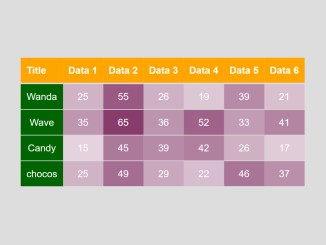
- HTML Table Row Color Based on Value
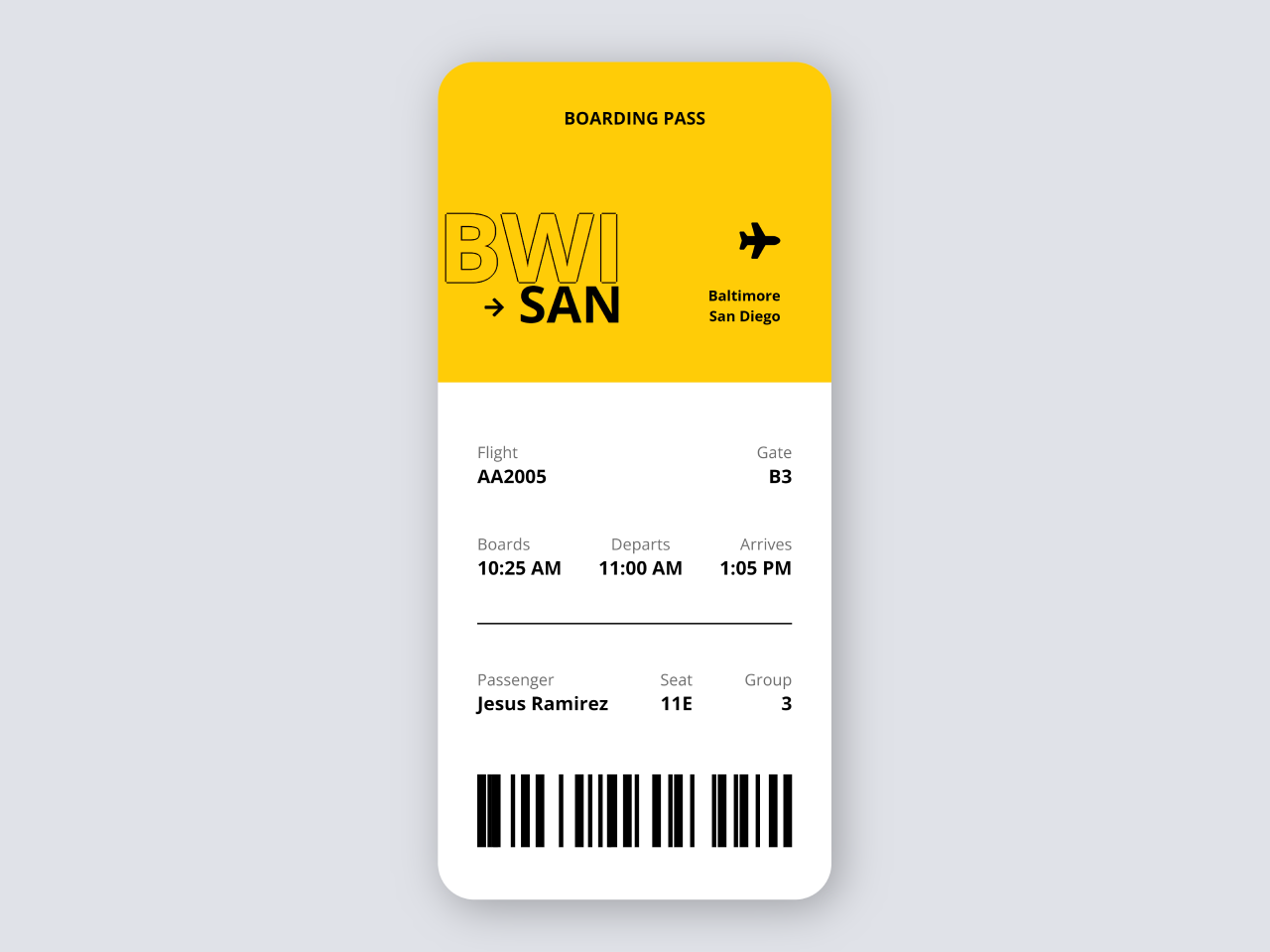
- International Airline Ticket in HTML CSS
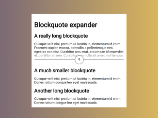
- Expandable Blockquote in HTML CSS
- HTML Code For Discussion Forum

I code and create web elements for amazing people around the world. I like work with new people. New people new Experiences.
I truly enjoy what I’m doing, which makes me more passionate about web development and coding. I am always ready to do challenging tasks whether it is about creating a custom CMS from scratch or customizing an existing system.