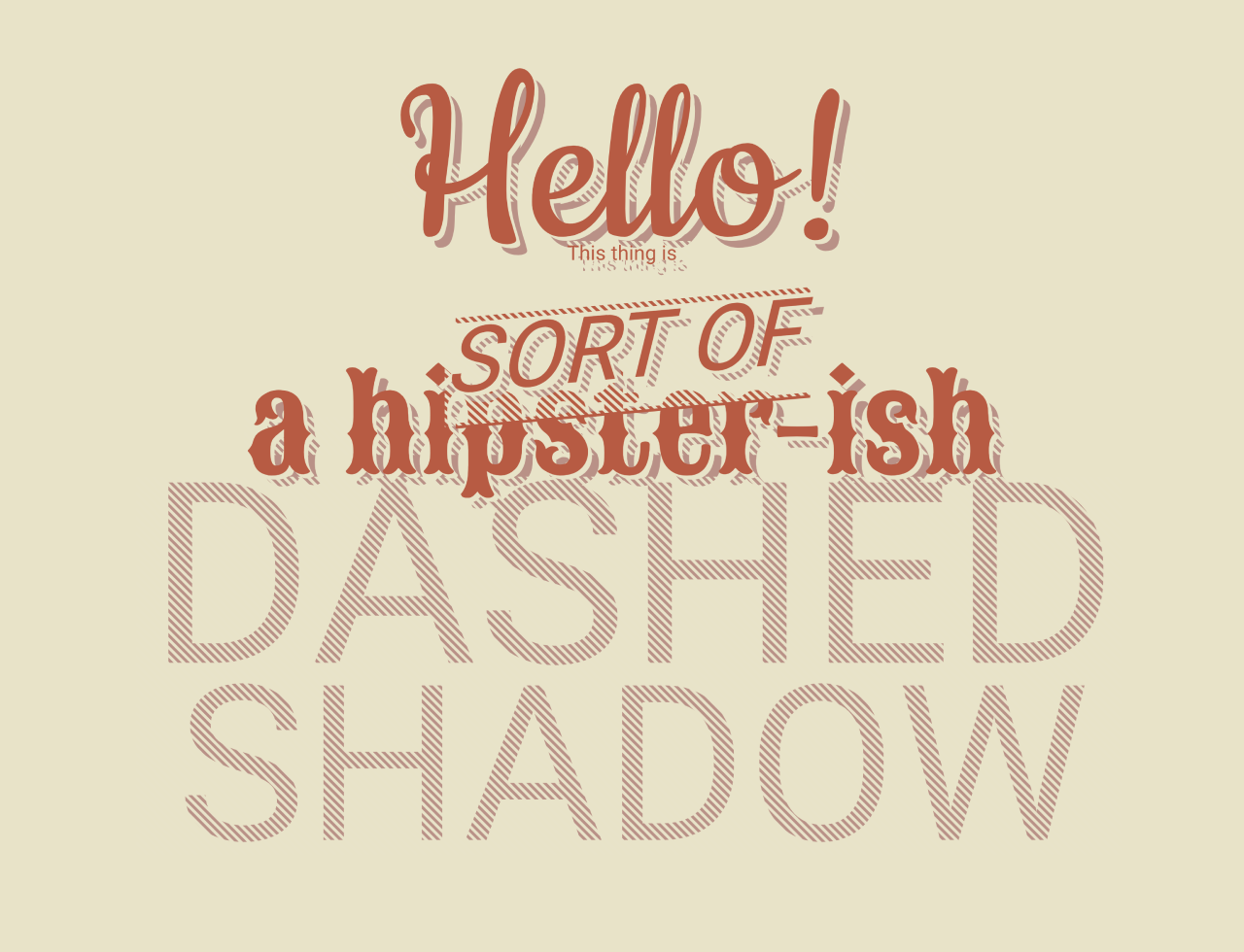

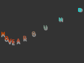
This code creates dashed text shadow using CSS. It positions text with a colorful dashed outline. It’s helpful for adding decorative text effects. The code animates the shadows on hover, enhancing visual appeal.
Apply this code to headings or elements needing a decorative touch. Enhance your webpage with dynamic dashed text shadows for eye-catching aesthetics. The benefit lies in engaging visual appeal.
How to Create Dashed Text Shadow Using CSS
1. First of all, load the Prefixfree JS and Google Fonts for different typography by adding the following CDN link into the head tag of your HTML document.
<script src="https://cdnjs.cloudflare.com/ajax/libs/prefixfree/1.0.7/prefixfree.min.js"></script>
<link href='https://fonts.googleapis.com/css?family=Cookie' rel='stylesheet' type='text/css'>
<link href='https://fonts.googleapis.com/css?family=Open+Sans+Condensed:700' rel='stylesheet' type='text/css'>
<link href='https://fonts.googleapis.com/css?family=Sancreek' rel='stylesheet' type='text/css'>
2. Use the span and div elements with the class dashed-shadow to apply the dashed shadow effect.
<span data-text="Hello!" class="dashed-shadow hello">Hello!</span>
<br />

<div data-text="This thing is" class="dashed-shadow">This thing is</div> <br />
<div class="sorta-block">
  <div data-text="sort of"class="dashed-shadow sorta">sort of</div>
</div>
<div data-text="a hipster-ish" class="dashed-shadow hipsterish">a hipster-ish</div> <br />
<div class="dashed-shadow dashed-shadow-text">DASHED<br /><span class="shadow">SHADOW</span></div> <br />
3. Customize the appearance in the CSS section, adjusting properties like color, font size, and animation duration. Enhance interactivity by animating the dashed shadow on hover.
body {
  font-family: 'Open Sans Condensed', sans-serif;
  font-size: 85pt;
  background-color: #e8e3c7;
  text-align: center;
  line-height: 1.2em;
  padding-top: 70px;
}

.dashed-shadow {
  position: relative;
  top: 8px;
  left: 8px;
  display: inline-block;
  color: #ba9186;
}

@keyframes dash-animation {
  0% {
    background-position: 0 0;
  }
  100% {
    background-position: 100% 0;
  }
}
.dashed-shadow:before {
  content: " ";
  display: block;
  position: absolute;
  top: -8px;
  left: -8px;
  bottom: -2px;
  right: -2px;
  z-index: 1;
  background-image: url('data:image/svg+xml;base64,PD94bWwgdmVyc2lvbj0iMS4wIiBlbmNvZGluZz0idXRmLTgiPz4gPHN2ZyB2ZXJzaW9uPSIxLjEiIHhtbG5zPSJodHRwOi8vd3d3LnczLm9yZy8yMDAwL3N2ZyI+PGRlZnM+PGxpbmVhckdyYWRpZW50IGlkPSJncmFkIiBncmFkaWVudFVuaXRzPSJvYmplY3RCb3VuZGluZ0JveCIgeDE9IjAuMCIgeTE9IjEuMCIgeDI9IjEuMCIgeTI9IjAuMCI+PHN0b3Agb2Zmc2V0PSIxMi41JSIgc3RvcC1jb2xvcj0iI2U4ZTNjNyIvPjxzdG9wIG9mZnNldD0iMTIuNSUiIHN0b3AtY29sb3I9IiNlOGUzYzciIHN0b3Atb3BhY2l0eT0iMC4wIi8+PHN0b3Agb2Zmc2V0PSIzNy41JSIgc3RvcC1jb2xvcj0iI2U4ZTNjNyIgc3RvcC1vcGFjaXR5PSIwLjAiLz48c3RvcCBvZmZzZXQ9IjM3LjUlIiBzdG9wLWNvbG9yPSIjZThlM2M3Ii8+PHN0b3Agb2Zmc2V0PSI2Mi41JSIgc3RvcC1jb2xvcj0iI2U4ZTNjNyIvPjxzdG9wIG9mZnNldD0iNjIuNSUiIHN0b3AtY29sb3I9IiNlOGUzYzciIHN0b3Atb3BhY2l0eT0iMC4wIi8+PHN0b3Agb2Zmc2V0PSI4Ny41JSIgc3RvcC1jb2xvcj0iI2U4ZTNjNyIgc3RvcC1vcGFjaXR5PSIwLjAiLz48c3RvcCBvZmZzZXQ9Ijg3LjUlIiBzdG9wLWNvbG9yPSIjZThlM2M3Ii8+PC9saW5lYXJHcmFkaWVudD48L2RlZnM+PHJlY3QgeD0iMCIgeT0iMCIgd2lkdGg9IjEwMCUiIGhlaWdodD0iMTAwJSIgZmlsbD0idXJsKCNncmFkKSIgLz48L3N2Zz4g');
  background-size: 100%;
  background-image: -moz-linear-gradient(45deg, #e8e3c7 12.5%, rgba(232, 227, 199, 0) 12.5%, rgba(232, 227, 199, 0) 37.5%, #e8e3c7 37.5%, #e8e3c7 62.5%, rgba(232, 227, 199, 0) 62.5%, rgba(232, 227, 199, 0) 87.5%, #e8e3c7 87.5%);
  background-image: -webkit-linear-gradient(45deg, #e8e3c7 12.5%, rgba(232, 227, 199, 0) 12.5%, rgba(232, 227, 199, 0) 37.5%, #e8e3c7 37.5%, #e8e3c7 62.5%, rgba(232, 227, 199, 0) 62.5%, rgba(232, 227, 199, 0) 87.5%, #e8e3c7 87.5%);
  background-image: linear-gradient(45deg, #e8e3c7 12.5%, rgba(232, 227, 199, 0) 12.5%, rgba(232, 227, 199, 0) 37.5%, #e8e3c7 37.5%, #e8e3c7 62.5%, rgba(232, 227, 199, 0) 62.5%, rgba(232, 227, 199, 0) 87.5%, #e8e3c7 87.5%);
  background-size: 6px 6px;
}

.dashed-shadow:hover:before {
  animation: dash-animation 30s infinite linear;
}

.dashed-shadow:after {
  z-index: 2;
  content: attr(data-text);
  position: absolute;
  left: -8px;
  top: -8px;
  color: #b85b3f;
  text-shadow: 3px 3px #e8e3c7;
}

.hello {
  font-family: 'Cookie',cursive;
  font-size: 140pt;
}

.sorta-block {
  font-size: 50pt;
  line-height: 1.1em;
  -moz-transform: skew(0, -5deg);
  -ms-transform: skew(0, -5deg);
  -webkit-transform: skew(0, -5deg);
  transform: skew(0, -5deg);
  z-index: 3;
  position: relative;
  margin-top: 20px;
  margin-bottom: 10px;
}

.sorta {
  border-top: 4px solid #b85b3f;
  border-bottom: 4px solid #b85b3f;
  text-transform: uppercase;
  z-index: 3;
  font-style: italic;
}

.hipsterish {
  font-family: 'Sancreek', cursive;
  font-size: 70pt;
}

.dashed-shadow-text {
  font-size: 140pt;
  line-height: 0.7em;
}

.shadow {
  font-size: 120pt;
  line-height: 0.8em;
}
Feel free to customize the code further to suit your specific design preferences and requirements. Experiment with various Google Fonts and styles to achieve the desired look.
That’s all! hopefully, you have successfully created the Dashed Text Shadow effect on your webpage. If you have any questions or suggestions, feel free to comment below.
Similar Code Snippets:
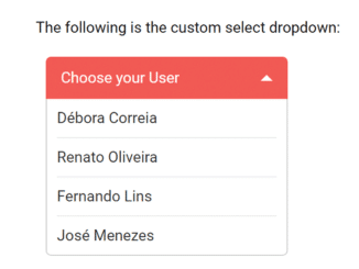
 Custom Select Dropdown CSS Only
- Animated Text Using CSS and JavaScript
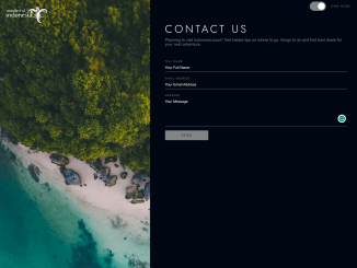
- Contact Us Page Template With Dark Mode
- Caesar Cipher Encrypt and Decrypt in JavaScript


I code and create web elements for amazing people around the world. I like work with new people. New people new Experiences.
I truly enjoy what I’m doing, which makes me more passionate about web development and coding. I am always ready to do challenging tasks whether it is about creating a custom CMS from scratch or customizing an existing system.