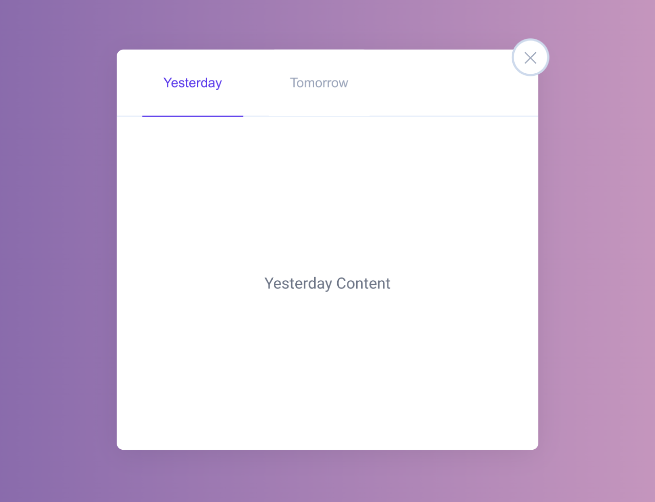

This Pure CSS code snippet helps you to show hide div content without using JavaScript. The core method involves utilizing checkboxes and labels to toggle the visibility of content. The menu icon rotates on click, triggering the display or concealment of tabs. Helpful for creating a sleek, JavaScript-free show/hide functionality in your web projects.
You can use this code to create collapsible content sections on your website. It’s handy for FAQs, product descriptions, or lengthy text. One benefit is its lightweight nature—no need for JavaScript, making pages load faster.
How to Create CSS Show Hide Div On Click Without Javascript
1. First, create the HTML structure for your collapsible content. Here’s an example:
<div class="container">

  <input type="checkbox" id="checkTab" name="checkTab" checked/>
  <label class="menu" for="checkTab">
      <span class="icon"></span>
  </label>
  <div class="tabs">
    <div class="nav-box">
      <button class="nav-a">Yesterday</button>
      <button class="nav-b">Tomorrow</button>
      <div class="content-box">
        <div class="content-a">Yesterday Content</div>
        <div class="content-b">Tomorrow Content</div>
      </div>
    </div>
  </div>

</div>
Modify the HTML content within the .container to suit your specific content needs. You can change the button texts, content sections, and styles to match your website’s design.
2. Now, apply the following CSS code to your project. This CSS contains the necessary styles to create the show/hide functionality and the design for the toggle button. Modify the CSS styles to match your website’s design.
body {
  background: #CDD9ED;
}

.container {
  position: relative;
  width: 380px;
  margin: 50px auto;
}
.menu {
  z-index: 1;
  position: absolute;
  top: -8px;
  right: -8px;
  display: block;
  width: 30px;
  height: 30px;
  cursor: pointer;
  color: #99A3BA;
  border-radius: 50%;
  box-shadow: 0 0 0 2px #CDD9ED;
  background: #fff;
  transition: all .3s ease;
}
#checkTab {
  display: none;
}
.menu .icon {
  position: absolute;
  top: 15px;
  left: 8px;
  width: 12px;
  height: 1px;
  background: currentColor;
  transition: width .3s ease;
}
.menu .icon:before {
  content: '';
  position: absolute;
  top: -5px;
  left: 0;
  width: 14px;
  height: 1px;
  background: currentColor;
  transition: width .3s;
}
.menu .icon:after {
  content: '';
  position: absolute;
  top: 5px;
  left: 0;
  width: 12px;
  height: 1px;
  background: currentColor;
  transition: width .3s;
}
#checkTab:checked ~ .menu:hover {
  transform: rotate(45deg);
}
#checkTab:not(:checked) ~ .menu {
  box-shadow: 0 2px 12px -2px rgba(18, 22, 33, .1);
}
#checkTab:not(:checked) ~ .menu:hover .icon,
#checkTab:not(:checked) ~ .menu:hover .icon::before,
#checkTab:not(:checked) ~ .menu:hover .icon::after {
  width: 14px;
  transition: all .3s ease;
}
#checkTab:not(:checked) ~ .menu:hover .icon {
  background: currentColor;
}
#checkTab:not(:checked) ~ .tabs {
  display: none;
}
#checkTab:checked ~ .menu .icon {
  background: transparent;
}
#checkTab:checked ~ .menu .icon:before {
  width: 14px;
  position: absolute;
  top: 0px;
  transform: rotate(45deg);
  transition: all .3s ease;
}
#checkTab:checked ~ .menu .icon:after {
  width: 14px;
  position: absolute;
  top: 0px;
  transform: rotate(-45deg);
  transition: all .3s ease;
}

.tabs {
  width: 380px;
  border-radius: 6px;
  box-shadow: 0 4px 24px -2px rgba(18, 22, 33, .1);
  background: #fff;
  color: #6C7486;
}
.nav-box {
  font-size: 0;
}
button {
  z-index: 10;
  position: relative;
  width: 24%;
  height: 60px;
  margin-left: 6%;
  margin-bottom: -1px;
  box-sizing: border-box;
  outline: none;
  background: #fff;
  border: 0;
  border-radius: 6px 6px 0 0;
  font-size: 12px;
  font-weight: 500;
  color:  #99A3BA;
  cursor: pointer;
}
button:focus-within {
  border-bottom: 1px solid #5628EE;
  color: #5628EE;
  transition: color .3s ease;
}
.content-box {
  position: relative;
  width: 100%;
  height: 300px;
  border-top: 1px solid #E4ECFA;
  border-radius: 0 0 6px 6px;
  background: #fff;
  font-size: 14px;
}
.content-box > div {
  position: absolute;
  top: 50%;
  left: 50%;
  transform: translate(-50%, -50%);
  display: none;
}
.nav-box:not(:focus-within) .nav-a {
  border-bottom: 1px solid #5628EE;
  color: #5628EE;
}
.nav-box:not(:focus-within) .content-a {
  display: block;
}
.nav-a:focus-within ~ .content-box .content-a {
  display: block;
}
.nav-b:focus-within ~ .content-box .content-b {
  display: block;
}
That’s all! hopefully, you have successfully created CSS Show Hide Div On Click Without Javascript. If you have any questions or suggestions, feel free to comment below.
Similar Code Snippets:
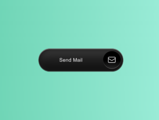
 HTML Button Hover Effects with Box-shadow
- 15+ Background Image With Text Overlay
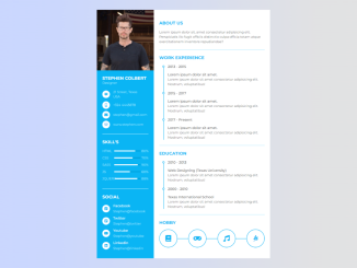
- HTML Code for Resume with Picture
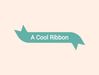
- Curved Ribbon with Hover Effect Using CSS
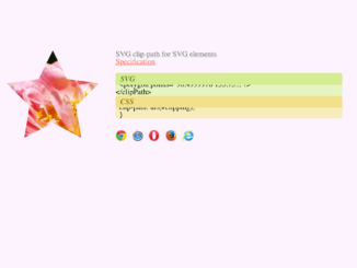
- Mask Image and Text Using CSS Clip Path and SVG
- CSS Diagonal Section Divider

I code and create web elements for amazing people around the world. I like work with new people. New people new Experiences.
I truly enjoy what I’m doing, which makes me more passionate about web development and coding. I am always ready to do challenging tasks whether it is about creating a custom CMS from scratch or customizing an existing system.