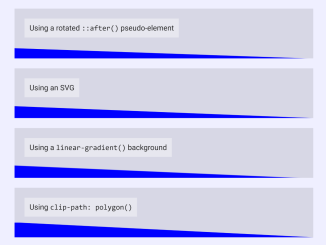
This code snippet demonstrates six different ways to create a diagonal section divider using CSS. The different methods include using borders, rotated pseudo-elements, SVGs, linear gradients, and clip paths.
Each method uses a different CSS property to create the diagonal divider. For example, the first method uses a border to create the divider, while the second method uses a rotated pseudo-element.
Likewise, these methods can be used to create visually appealing and engaging section dividers on your website. Moreover, they can be used to separate different sections of content or to add a decorative element to your page.
How to Create CSS Diagonal Section Divider
1. First of all, copy the desired HTML structure for the diagonal divider and paste it where you want to show the separator on your website. Adjust the class names and styling properties to fit your specific sections and design preferences.
<div class="angle angle-1">
  <span>Using a border</span>
</div>
<div class="angle angle-2">
  <span>Using a rotated <code>::after()</code> pseudo-element</span>
</div>
<div class="angle angle-3">
  <span>Using an SVG</span>
</div>
<div class="angle angle-4">
  <span>Using a <code>linear-gradient()</code> background</span>
</div>
<div class="angle angle-5">
  <span>Using <code>clip-path: polygon()</code></span>
</div>
<div class="angle angle-6">
  <span>Using <code>clip-path: url(#svgref)</code></span>
</div>

<svg width="0" height="0">
  <clipPath id="triangle" clipPathUnits="objectBoundingBox" >
  <polygon points="0,1 0,0 1,1"></polygon>
  </clipPath>
</svg>
2. Now, add the CSS styles to your stylesheet. Customize the dimensions, colors, and positioning according to your design preferences. The “angle” class styles apply to all sections, while the specific “angle-X” classes implement different diagonal divider techniques.
.angle {
  height: 100px;
  width: 600px;
  position: relative;
  background: rgba(0, 0, 0, 0.1);
  overflow: hidden;
  margin: auto;
  margin-bottom: 20px;
  text-align: left;
}
.angle span {
  background: rgba(255, 255, 255, 0.4);
  color: #222;
  padding: 10px;
  margin: 20px;
  display: inline-block;
}
.angle::after {
  position: absolute;
  right: 0;
  bottom: 0;
  content: "";
}

.angle-1::after {
  border: 0 solid transparent;
  height: 0;
  border-top-width: 40px;
  border-left-width: 1000px;
  border-left-color: blue;
}

.angle-2::after {
  left: -20px;
  right: -20px;
  bottom: -30px;
  height: 40px;
  transform: rotate(2deg);
  background: blue;
}

.angle-3::after {
  left: 0;
  height: 0;
  padding-top: 5%;
  background-image: url('data:image/svg+xml,<svg xmlns="http://www.w3.org/2000/svg" width="1000" height="40"><polygon points="0,1000 0,0 1000,40" style="fill:rgb(0,0,255);stroke-width:0"></polygon></svg>');
  background-position: center bottom;
  background-repeat: no-repeat;
  background-size: 100%;
}

.angle-4::after {
  padding-top: 5%;
  left: 0;
  background: linear-gradient(2.5deg, blue 43%, transparent 45%);
}

.angle-5::after {
  height: 0;
  left: 0;
  padding-top: 5%;
  background: blue;
  -webkit-clip-path: polygon(0 0, 100% 100%, 0 100%);
          clip-path: polygon(0 0, 100% 100%, 0 100%);
}

.angle-6::after {
  background: blue;
  left: 0;
  padding-top: 5%;
  height: 0;
  -webkit-clip-path: url(#triangle);
          clip-path: url(#triangle);
}

body {
  margin: 40px;
  padding: 0;
  font-family: Helvetica Neue, Helvetica, sans-serif;
  text-align: center;
}
That’s all! hopefully, you have successfully created a diagonal section divider on your website. If you have any questions or suggestions, feel free to comment below.
Similar Code Snippets:

I code and create web elements for amazing people around the world. I like work with new people. New people new Experiences.
I truly enjoy what I’m doing, which makes me more passionate about web development and coding. I am always ready to do challenging tasks whether it is about creating a custom CMS from scratch or customizing an existing system.


