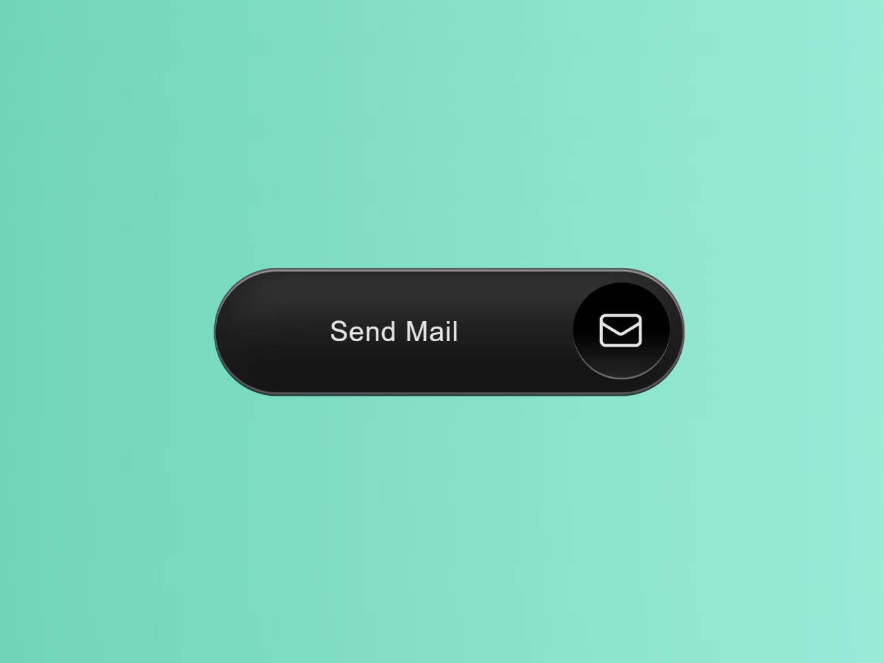

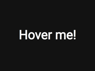
This code creates an animated send mail button using HTML and CSS. The button has an envelope icon. It has smooth hover and focus effects. The animation transitions smoothly. It provides an attractive user interface for sending emails.
How to Create Animated Send Mail Button in HTML CSS
1. First of all, load the Normalize CSS by adding the following CDN link into the head tag of your webpage.
<link rel="stylesheet" href="https://cdnjs.cloudflare.com/ajax/libs/normalize/5.0.0/normalize.min.css">
2. Create the HTML structure for your button. You’ll need a <button> element to contain the button content, including the envelope icon and text.
<button>
  <span class="backdrop">
    <span class="action"></span>
  </span>
  <span class="text">
    Send Mail
  </span>
  <span class="icon">
    <svg xmlns="http://www.w3.org/2000/svg" fill="none" viewBox="0 0 24 24" stroke-width="1.5" stroke="currentColor">
      <!-- Tray -->
      <path stroke-linecap="round" stroke-linejoin="round" d="M2.25 13.5h3.86a2.25 2.25 0 012.012 1.244l.256.512a2.25 2.25 0 002.013 1.244h3.218a2.25 2.25 0 002.013-1.244l.256-.512a2.25 2.25 0 012.013-1.244h3.859m-19.5.338V18a2.25 2.25 0 002.25 2.25h15A2.25 2.25 0 0021.75 18v-4.162c0-.224-.034-.447-.1-.661L19.24 5.338a2.25 2.25 0 00-2.15-1.588H6.911a2.25 2.25 0 00-2.15 1.588L2.35 13.177a2.25 2.25 0 00-.1.661z" />
      <!-- Envelope -->
      <path stroke-linecap="round" stroke-linejoin="round" d="M21.75 6.75v10.5a2.25 2.25 0 01-2.25 2.25h-15a2.25 2.25 0 01-2.25-2.25V6.75m19.5 0A2.25 2.25 0 0019.5 4.5h-15a2.25 2.25 0 00-2.25 2.25m19.5 0v.243a2.25 2.25 0 01-1.07 1.916l-7.5 4.615a2.25 2.25 0 01-2.36 0L3.32 8.91a2.25 2.25 0 01-1.07-1.916V6.75" />
    </svg>
  </span>
</button>
3. Now, let’s add CSS styles to make our button visually appealing and animated. We’ll define styles for the button, text, icon, and animation transitions. We’ll use CSS transitions to create smooth effects when hovering or focusing on the button:
@font-face {
  font-family: "Geist Sans";
  src: url("https://assets.codepen.io/605876/GeistVF.ttf") format("truetype");
}

* {
  box-sizing: border-box;
}

:root {
  --speed: 0.25s;
}

body {
  display: grid;
  place-items: center;
  min-height: 100vh;
  background: hsl(0 0% 4%);
  font-family: "Geist Sans", sans-serif;
}

button {
  cursor: pointer;
  position: relative;
  display: flex;
  border: 1px solid hsl(0 0% 100% / 0.25);
  border-radius: 100px;
  overflow: hidden;
  display: grid;
  grid-template-columns: auto 3.5em;
  gap: 1.5em;
  font-family: "Geist Sans", sans-serif;
  font-weight: 80;
  background:
    hsl(280 0% 12%);
  color: hsl(0 0% 90%);
  padding: 0.5em 0.5em 0.5em 1.5em;
  place-items: center;
  box-shadow:
    0 1px inset hsl(0 0% 100% / 0.5),
    0 -10px 20px 10px hsl(0 0% 0% / 0.5) inset,
    0 10px 20px 10px hsl(0 0% 50% / 0.25) inset,
    0 1px hsl(0 0% 2% / 0.75);
  letter-spacing: 0.05ch;
}

button:focus-visible {
  outline-offset: 0.5em;
  outline-color: hsl(280 80% 80% / 0.5);
}

.icon {
  width: 100%;
  aspect-ratio: 1;
  border-radius: 100%;
}

.backdrop {
  position: absolute;
  inset: 0.5em;
}

.icon {
  overflow: hidden;
}

.icon svg {
  width: 50%;
  overflow: visible !important;
}

svg path:nth-of-type(2) {
  transform-box: fill-box;
  transform-origin: 50% 50%;
  transition:
    fill var(--speed),
    rotate var(--speed),
    scale var(--speed),
    translate var(--speed);
}

svg path:nth-of-type(1) {
  translate: 5rem 0;
  transform-box: fill-box;
  transition: translate var(--speed);
  opacity: 0.75;
}

button:is(:hover, :focus-visible) svg path:nth-of-type(2) {
  translate: 0 -50%;
  rotate: 290deg;
  scale: 0.65;
  fill: hsl(0 0% 20%);
  transition-timing-function: ease, ease, cubic-bezier(.2, .7, .9, 1.5);
}

button:is(:hover, :focus-visible) svg path:nth-of-type(1) {
  translate: 0 0;
}

.action {
  position: absolute;
  right: 0;
  height: 100%;
  background:
    linear-gradient(transparent 50%, hsl(0 0% 30% / 0.5)),
    hsl(0 0% 0%);
  box-shadow: 0 -1px inset hsl(0 0% 100% / 0.35);
  width: 3.5em;
  aspect-ratio: 1;
  transition: width var(--speed);
  border-radius: 100px;
}

.icon {
  color: hsl(0 0% 90%);
  display: grid;
  place-items: center;
  z-index: 2;
}

.text {
  display: inline-block;
  z-index: 2;
  padding: 0 2rem;
}

button:is(:hover, :focus-visible) .action {
  width: 100%;
}
That’s all! hopefully, you have successfully created the Animated Send Mail Button. If you have any questions or suggestions, feel free to comment below.
Similar Code Snippets:

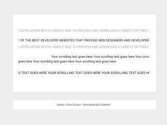
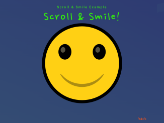
- Emoji Animation on Scroll Using CSS
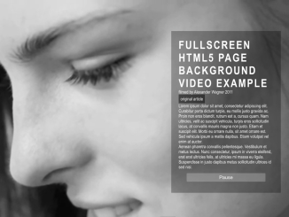
- Full Screen Video Background in HTML5
- Image Frame in HTML and CSS
- Expand Text on Hover Using CSS
- Gravity Button Using Pure CSS
- Drawing with Text Using HTML5 Canvas

I code and create web elements for amazing people around the world. I like work with new people. New people new Experiences.
I truly enjoy what I’m doing, which makes me more passionate about web development and coding. I am always ready to do challenging tasks whether it is about creating a custom CMS from scratch or customizing an existing system.