
This code showcases various techniques to apply mask on image and text using CSS clip path and SVG elements. Explore CSS clip, clip-path, SVG clip-path, SVG masks, CSS mask-image, and more. Enhance your web design with creative visual effects supported across major browsers. Unleash the power of masking for HTML and SVG elements effortlessly. Delve into the world of background-clip, CSS mask, and SVG fill properties.
How to Create Mask Image and Text Using CSS
1. To begin, include the Reset CSS and Prefixfree JavaScript files using the following CDN links in the header of your HTML document. Make sure to add the following lines:
<link rel="stylesheet" href="https://cdnjs.cloudflare.com/ajax/libs/meyer-reset/2.0/reset.min.css">
<script src="https://cdnjs.cloudflare.com/ajax/libs/prefixfree/1.0.7/prefixfree.min.js"></script>
2. The HTML structure consists of a <div> with the class “wrapper,” containing several items demonstrating different masking techniques. Each item has a demo area and explanatory text.
<svg class="svg-defs">
<defs>
<clipPath id="clipping">
<polygon points="98 153 38 185 49 118 1 70 68 61 98 1 128 61 195 70 147 118 158 185"/>
</clipPath>
<clipPath id="clipping-with-text">
<polygon points="98 153 38 185 49 118 1 70 68 61 98 1 128 61 195 70 147 118 158 185"/>
<text x="0" y="3.2em">Text</text>
</clipPath>
<linearGradient id="gradient" x1="0" y1="0" x2 ="110%" y2="0%">
<stop stop-color="#fff" offset="0"/><stop stop-color="#fff" offset="10%"/>
<stop stop-color="#AAA" offset="10%"/><stop stop-color="#AAA" offset="20%"/>
<stop stop-color="#777" offset="20%"/><stop stop-color="#777" offset="30%"/>
<stop stop-color="#333" offset="30%"/><stop stop-color="#333" offset="40%"/>
<stop stop-color="#000" offset="40%"/><stop stop-color="#000" offset="50%"/>
<stop stop-color="#fff" offset="50%"/><stop stop-color="#fff" offset="60%"/>
<stop stop-color="#AAA" offset="60%"/><stop stop-color="#AAA" offset="70%"/>
<stop stop-color="#777" offset="70%"/><stop stop-color="#777" offset="80%"/>
<stop stop-color="#333" offset="80%"/><stop stop-color="#333" offset="90%"/>
<stop stop-color="#000" offset="90%"/><stop stop-color="#000" offset="100%"/>
</linearGradient>
<mask id="masking" maskUnits="objectBoundingBox" maskContentUnits="objectBoundingBox">
<rect y="0" width="1" height="1" fill="url(#gradient)" />
<circle cx=".5" cy=".5" r=".42" fill="black" />
<circle cx="0" cy=".5" r=".32" fill="black" />
<circle cx="1" cy=".5" r=".32" fill="black" />
<circle cx="0" cy=".5" r=".3" fill="gray" />
<circle cx=".5" cy=".5" r=".4" fill="gray" />
<circle cx="1" cy=".5" r=".3" fill="gray" />
<circle cx="0" cy=".5" r=".25" fill="white" />
<circle cx=".5" cy=".5" r=".35" fill="white" />
<circle cx="1" cy=".5" r=".25" fill="white" />
</mask>
<pattern id="pattern"
patternUnits="userSpaceOnUse"
width="200" height="300"
viewbox="0 0 200 300">
<image xlink:href="https://img-fotki.yandex.ru/get/5607/5091629.6b/0_612e6_b9039c0d_M.jpg" width="200" height="300" />
</pattern>
</defs>
</svg>
<div class="wrapper">
<h1>CSS and SVG Masks</h1>
<div class="item item--clip">
<div class="demo">
<img src="https://img-fotki.yandex.ru/get/5607/5091629.6b/0_612e6_b9039c0d_M.jpg" alt="" class="has-mask"/>
</div>
<div class="text">
<h3>CSS clip</h3>
<a href="http://www.w3.org/TR/2014/WD-css-masking-1-20140213/#clip-property">Specification</a>
<br /><br />
<code class="code--css"><pre>.item {
position: absolute;
clip: rect(10px, 190px, 190px, 10px);
}</pre></code>
<ul class="browsers">
<li class="browser chrome has-support"></li>
<li class="browser safari has-support"></li>
<li class="browser opera-13 has-support"></li>
<li class="browser firefox has-support"></li>
<li class="browser ie9 has-support"></li>
</ul>
</div>
</div>
<!-- ********* -->
<div class="item item--css-clip-path">
<div class="demo">
<img src="https://img-fotki.yandex.ru/get/5607/5091629.6b/0_612e6_b9039c0d_M.jpg" alt="" />
</div>
<div class="text">
<h3>CSS clip-path</h3>
<a href="http://www.w3.org/TR/2014/WD-css-masking-1-20140213/#the-clip-path">Specification</a>
<br /><br />
<code class="code--css"><pre>.item {
<del>clip-path: circle(100px, 100px, 100px);</del>
clip-path: circle(100px at center);
}</pre></code>
Syntax for circle <a href="http://dev.w3.org/csswg/css-shapes/#20130620">was chnaged</a>, to radial gradient syntax
<ul class="browsers">
<li class="browser chrome has-support"></li>
<li class="browser safari has-support"></li>
<li class="browser opera-13 has-support"></li>
<li class="browser firefox has-support"></li>
<li class="browser ie9"></li>
</ul>
</div>
</div>
<!-- ********* -->
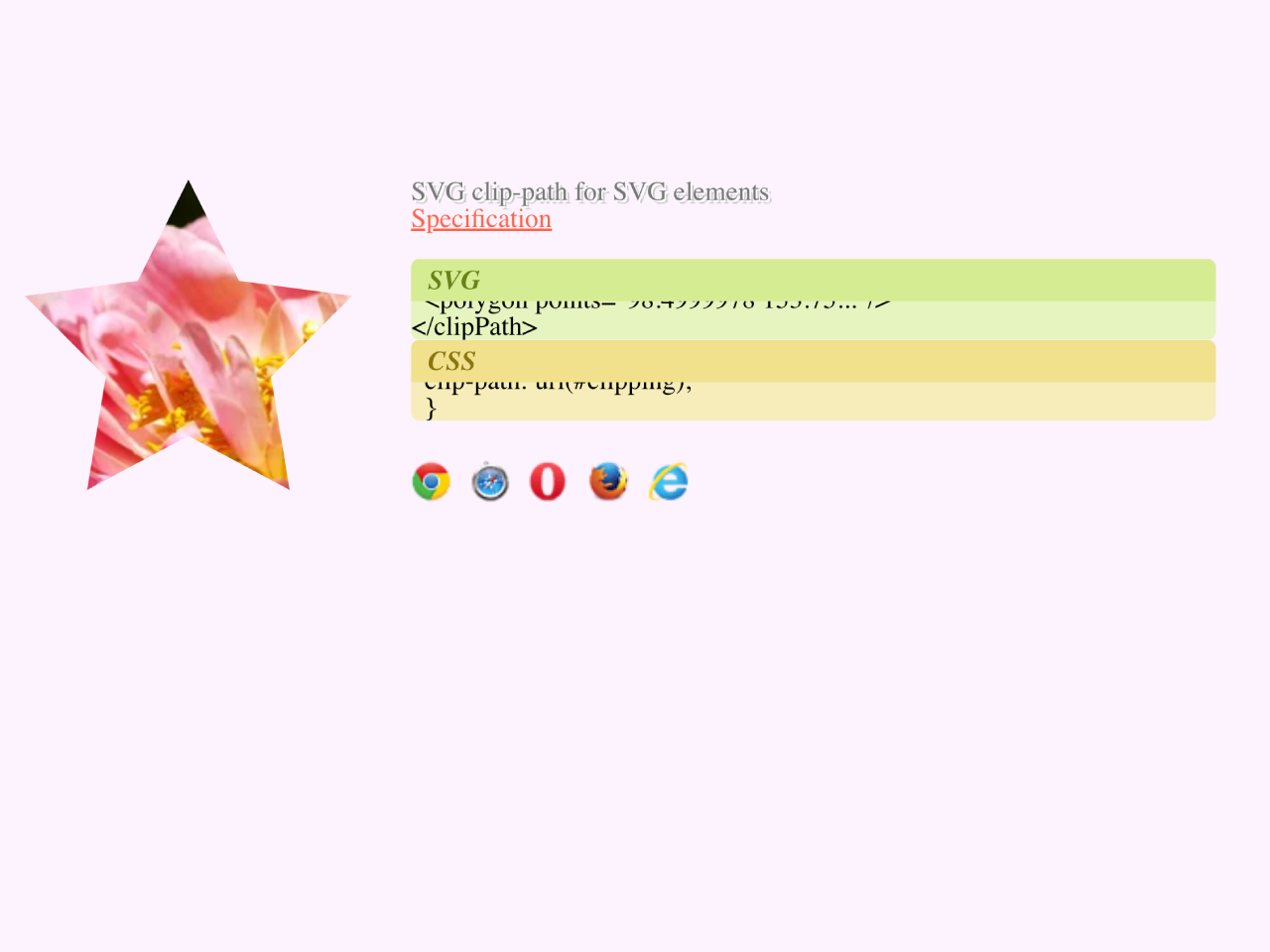
<div class="item item--svg-clip-path-svg">
<div class="demo">
<svg width="200" height="300">
<image xlink:href="https://img-fotki.yandex.ru/get/5607/5091629.6b/0_612e6_b9039c0d_M.jpg" width="200" height="300" />
</svg>
</div>
<div class="text">
<h3>SVG clip-path for SVG elements</h3>
<a href="http://www.w3.org/TR/SVG11/masking.html#EstablishingANewClippingPath">Specification</a>
<br /><br />
<code class="code--svg"><pre><clipPath id="clipping">
<polygon points="98.4999978 153.75..."/>
</clipPath></pre></code>
<code class="code--css"><pre>.item {
clip-path: url(#clipping);
}</pre></code>
<ul class="browsers">
<li class="browser chrome has-support"></li>
<li class="browser safari has-support"></li>
<li class="browser opera-13 has-support"></li>
<li class="browser firefox has-support"></li>
<li class="browser ie9 has-support"></li>
</ul>
</div>
</div>
<!-- ********* -->
<div class="item item--svg-clip-path-html">
<div class="demo">
<img src="https://img-fotki.yandex.ru/get/5607/5091629.6b/0_612e6_b9039c0d_M.jpg" alt="" />
</div>
<div class="text">
<h3>SVG clip-path for HTML elements</h3>
<a href="http://www.w3.org/TR/2014/WD-css-masking-1-20140213/#svg-clipping-paths">Specification</a>
<br /><br />
<code class="code--svg"><pre><clipPath id="clipping">
<polygon points="98.4999978 153.75..."/>
</clipPath></pre></code>
<code class="code--css"><pre>.item {
clip-path: url(#clipping);
}</pre></code>
<ul class="browsers">
<li class="browser chrome has-support"></li>
<li class="browser safari has-support"></li>
<li class="browser opera-13 has-support"></li>
<li class="browser firefox has-support"></li>
<li class="browser ie9"></li>
</ul>
</div>
</div>
<!-- ********* -->
<div class="item item--svg-clip-path-with-text-html">
<div class="demo">
<img src="https://img-fotki.yandex.ru/get/5607/5091629.6b/0_612e6_b9039c0d_M.jpg" alt="" />
</div>
<div class="text">
<h3>SVG clip-path with complex content for HTML elements</h3>
<a href="http://www.w3.org/TR/2014/WD-css-masking-1-20140213/#svg-clipping-paths">Specification</a>
<br /><br />
<code class="code--svg"><pre><clipPath id="clipping">
<polygon points="98.4999978 153.75..."/>
<text x="0" y="3.2em">Text</text>
</clipPath></pre></code>
<code class="code--css"><pre>.item {
clip-path: url(#clipping);
}</pre></code>
<ul class="browsers">
<li class="browser chrome has-support"></li>
<li class="browser safari"></li>
<li class="browser opera-13 has-support"></li>
<li class="browser firefox has-support"></li>
<li class="browser ie9"></li>
</ul>
</div>
</div>
<!-- ********* -->
<div class="item item--css-mask">
<div class="demo">
<img src="https://img-fotki.yandex.ru/get/5607/5091629.6b/0_612e6_b9039c0d_M.jpg" alt="" />
</div>
<div class="text">
<h3>CSS mask-image</h3>
<a href="http://www.w3.org/TR/2014/WD-css-masking-1-20140213/#the-mask-image">Specification</a>
<br /><br />
<code class="code--css"><pre>.item {
mask-image: url(YOUR.png),
linear-gradient(-45deg,
rgba(0,0,0,1) 20%, rgba(0,0,0,0) 50%);
mask-repeat: space;
}</pre></code>
Mask image: <a href="https://img-fotki.yandex.ru/get/9492/5091629.9d/0_80e74_9f303e3d_M.png">PNG</a>
<ul class="browsers">
<li class="browser chrome has-support"></li>
<li class="browser safari has-support"></li>
<li class="browser opera-13 has-support"></li>
<li class="browser firefox has-support"></li>
<li class="browser ie9"></li>
</ul>
</div>
</div>
<!-- ********* -->
<div class="item item--svg-mask-svg">
<div class="demo">
<svg width="200" height="300">
<image xlink:href="https://img-fotki.yandex.ru/get/5607/5091629.6b/0_612e6_b9039c0d_M.jpg"
width="200" height="300"
/></svg>
</div>
<div class="text">
<h3>SVG mask for SVG elements</h3>
<a href="http://www.w3.org/TR/SVG11/masking.html#Masking">Specification</a>
<br /><br />
<code class="code--svg"><pre><mask id="masking" maskUnits="objectBoundingBox"
maskContentUnits="objectBoundingBox">
<rect y="0" width="1" height="1" fill="url(#gradient)" />
<circle cx=".5" cy=".5" r=".4" fill="gray" />
<circle cx=".5" cy=".5" r=".3" fill="white" />
...
</mask></pre></code>
<code class="code--css"><pre>.item {
mask: url(#masking);
}</pre></code>
<ul class="browsers">
<li class="browser chrome has-support"></li>
<li class="browser safari has-support"></li>
<li class="browser opera-13 has-support"></li>
<li class="browser firefox has-support"></li>
<li class="browser ie9 has-support"></li>
</ul>
</div>
</div>
<!-- ********* -->
<div class="item item--svg-mask-html">
<div class="demo">
<img src="https://img-fotki.yandex.ru/get/5607/5091629.6b/0_612e6_b9039c0d_M.jpg" alt="" />
</div>
<div class="text">
<h3>SVG mask for HTML elements</h3>
<a href="http://www.w3.org/TR/2014/WD-css-masking-1-20140213/#the-mask-image">Specification</a>
<br /><br />
<code class="code--svg"><pre><mask id="masking" maskUnits="objectBoundingBox"
maskContentUnits="objectBoundingBox">
<rect y="0" width="1" height="1" fill="url(#gradient)" />
<circle cx=".5" cy=".5" r=".4" fill="gray" />
<circle cx=".5" cy=".5" r=".3" fill="white" />
...
</mask></pre></code>
<code class="code--css"><pre>.item {
mask: url(#masking);
}</pre></code>
<ul class="browsers">
<li class="browser chrome"></li>
<li class="browser safari"></li>
<li class="browser opera-13"></li>
<li class="browser firefox has-support"></li>
<li class="browser ie9"></li>
</ul>
</div>
</div>
<!-- ********* -->
<div class="item item--css-background-clip">
<div class="demo">
Text
</div>
<div class="text">
<h3>background-clip</h3>
<a href="https://www.webkit.org/blog/164/background-clip-text/">Documentation</a>
<br /><br />
<code class="code--css"><pre>.item {
background: url(YOUR IMAGE) no-repeat;
-webkit-text-fill-color: transparent;
-webkit-background-clip: text;
}</pre></code>
<ul class="browsers">
<li class="browser chrome has-support"></li>
<li class="browser safari has-support"></li>
<li class="browser opera-13 has-support"></li>
<li class="browser firefox has-support"></li>
<li class="browser ie9"></li>
</ul>
</div>
</div>
<!-- ********* -->
<div class="item item--svg-fill">
<div class="demo">
<svg width="200" height="200">
<text x="0" y="1em">Text</text>
</svg>
</div>
<div class="text">
<h3>SVG fill</h3>
<a href="http://www.w3.org/TR/SVG/painting.html#FillProperties">Specification</a>
<br /><br />
<div class="comment">Not real mask, but looks like <code>-webkit-background-clip: text;</code> and has much better support.</div>
<br /><br />
<code class="code--svg"><pre><pattern id="pattern" patternUnits="userSpaceOnUse"
width="200" height="300" viewbox="0 0 200 300">
<image xlink:href="YOUR IMAGE" width="200" height="300" />
</pattern></pre></code>
<code class="code--css"><pre>text {
fill: url(#pattern);
}</pre></code>
<ul class="browsers">
<li class="browser chrome has-support"></li>
<li class="browser safari has-support"></li>
<li class="browser opera-13 has-support"></li>
<li class="browser firefox has-support"></li>
<li class="browser ie9 has-support"></li>
</ul>
</div>
</div>
</div>
<!--
https://www.html5rocks.com/en/tutorials/masking/adobe/#toc-masking
http://habrahabr.ru/post/190246/
https://developer.mozilla.org/en-US/docs/Web/CSS/-webkit-mask-image
https://developer.mozilla.org/en-US/docs/Web/CSS/mask
http://thenittygritty.co/css-masking
http://stackoverflow.com/questions/18792402/css-webkit-mask-image
https://developer.apple.com/library/safari/documentation/InternetWeb/Conceptual/SafariVisualEffectsProgGuide/Masks/Masks.html
http://www.xiper.net/manuals/css-extensions/webkit/properties/webkit-mask.html
-->
3. Explore the following CSS code to understand how each masking technique is styled. The code includes specific styles for different browsers and visual effects.
b {
  font-weight: bold;
}

i {
  font-style: italic;
}

.item--clip .demo {
  width: 200px;
  height: 250px;
}

.item--clip .has-mask {
  position: absolute;
  clip: rect(10px, 190px, 190px, 10px);
}

.item--css-clip-path img {
  -webkit-clip-path: circle(100px at center);
  clip-path: circle(100px at center);
}

.item--svg-clip-path-html img {
  -webkit-clip-path: url(#clipping);
  clip-path: url(#clipping);
}

.item--svg-clip-path-svg image,
.item--svg-clip-path-with-text-html img {
  -webkit-clip-path: url(#clipping-with-text);
  clip-path: url(#clipping-with-text);
}

.item--css-mask img {
  mask-image: url(http://yoksel.github.io/Sandbox/img/tiles/tile-transparent-black.png), linear-gradient(-45deg, black 20%, transparent 50%);
  mask-repeat: space;
}

.item--svg-mask-html img,
.item--svg-mask-svg image {
  mask: url(#masking);
}

.item--css-background-clip .demo {
  width: 200px;
  height: 200px;
  background: url(https://img-fotki.yandex.ru/get/5607/5091629.6b/0_612e6_b9039c0d_M.jpg) no-repeat;
  -webkit-text-fill-color: transparent;
  -webkit-background-clip: text;
}

.item--svg-fill text {
  fill: url(#pattern);
}

.demo,
#clipping-with-text,
#masking text {
  font: bold italic 7em/1.5 Georgia;
}

/* Common
------------------------------------------- */
BODY {
  font: 12px/1.4 "Trebuchet MS", Arial, sans-serif;
}

A {
  color: tomato;
}

H1, H2, H3, H4 {
  margin-bottom: 1rem;
  font-family: Georgia, serif;
  line-height: 1.4;
}

H1 {
  position: relative;
  margin-bottom: 2rem;
  padding-bottom: 1rem;
  border-bottom: 1px solid #CCC;
  text-align: center;
  text-shadow: 1px 1px 0 white, 2px 2px 0 #555;
  font-size: 4em;
  font-style: italic;
}
H1:after {
  content: "Live demo";
  position: absolute;
  margin-left: 5px;
  padding: 1px 5px;
  vertical-align: top;
  border-radius: 5px;
  background: paleturquoise;
  white-space: nowrap;
  text-shadow: none;
  font-size: 1rem;
  color: #FFF;
}

H2 {
  padding-bottom: 0.3rem;
  border-bottom: 1px solid #333;
  font-size: 2.8em;
  color: #333;
}

H3 {
  text-shadow: 1px 1px 0 white, 2px 2px 0 #CCC;
  font-size: 2.5em;
  font-style: italic;
  color: #777;
}

H4 {
  font-size: 1.6em;
  font-style: italic;
  color: #999;
}

code {
  display: block;
  position: relative;
  margin-bottom: 1rem;
  overflow: auto;
  max-width: 90%;
  padding: 35px 10px 7px;
  border-radius: 5px;
}
.comment code {
  display: inline-block;
  margin: 0;
  padding: 2px 5px;
  vertical-align: middle;
  background: #EEE;
  color: #777;
}
code:before {
  left: 0;
  right: 0;
  top: 0;
  height: 25px;
  line-height: 25.2px;
  padding-left: 10px;
  position: absolute;
  font-weight: bold;
  font-style: italic;
}
.comment code:before {
  content: none;
}

.code--css {
  background: #f7edba;
}
.code--css:before {
  content: "CSS";
  background: #f2e18c;
  color: #8a750f;
}

.code--svg {
  background: #e6f4be;
}
.code--svg:before {
  content: "SVG";
  background: #d6ec93;
  color: #678217;
}

.svg-defs {
  position: absolute;
  width: 0;
  height: 0;
}

.wrapper {
  width: 90%;
  min-width: 500px;
  max-width: 800px;
  margin: 0 auto;
  padding: 2rem 0;
  conter-reset: mylist;
}
.wrapper:after {
  content: "";
  display: table;
  width: 100%;
  clear: both;
}

.item {
  position: relative;
  margin-bottom: 2em;
  padding-bottom: 2em;
  padding-right: 3em;
  border-bottom: 1px solid #DDD;
  counter-increment: mylist;
}
.item:before {
  content: counter(mylist);
  position: absolute;
  right: 0;
  top: 0;
  font: 2rem/1 Georgia, serif;
  color: #EEE;
}
.item:after {
  content: "";
  display: table;
  width: 100%;
}

.demo {
  position: relative;
  float: left;
  margin-right: 30px;
}
.demo:before {
  content: "";
  display: block;
  position: absolute;
  z-index: -2;
  top: 0;
  right: 0;
  bottom: 0;
  left: 0;
  background: url(https://img-fotki.yandex.ru/get/5607/5091629.6b/0_612e6_b9039c0d_M.jpg) no-repeat;
  opacity: 0;
  transition: 0.7s;
}
.item:hover .demo:before {
  opacity: 0.4;
}

.text {
  padding-left: 230px;
}

/* Browsers
------------------------------- */
.browsers {
  margin-top: 1.5rem;
}

.browser {
  display: inline-block;
  opacity: 0.2;
}

.has-support {
  opacity: 1;
}

.browser:before {
  content: "";
  display: inline-block;
  width: 24px;
  height: 24px;
  margin-right: 7px;
  background: url(https://yoksel.github.io/assets/img/sprite-browsers.png) 0 0 no-repeat;
  vertical-align: middle;
}

.firefox:before {
  background-position: 0 0;
}

.chrome:before {
  background-position: -30px 0;
}

.safari:before {
  background-position: -60px 0;
}

.ie8:before {
  background-position: -90px 0;
}

.ie9:before {
  background-position: -90px 0;
}

.opera-13:before {
  background-position: -120px 0;
}

.opera-12:before {
  background-position: -150px 0;
}

.opera-mob:before {
  background-position: -150px 0;
}

.opera-mini:before {
  background-position: -150px 0;
}
Now you’re ready to experiment and integrate these masking techniques into your web projects. Enhance your designs with visually appealing effects using CSS clip path and SVG elements!
That’s all! hopefully, you have successfully created a Mask Image And Text Using CSS Clip Path and SVG. If you have any questions or suggestions, feel free to comment below.
Similar Code Snippets:
 Wrap Text Around Centered Image CSS
- HTML5 Canvas Draw Straight Line with Mouse
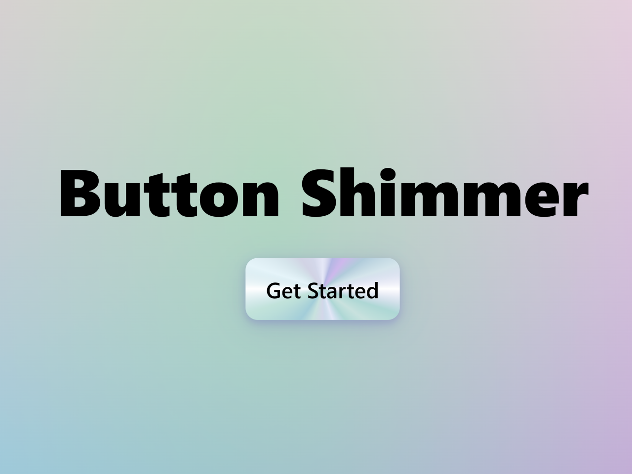
- Button Shimmer Effect on Hover Using CSS
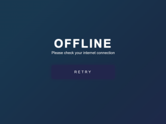
- Offline Page HTML Template
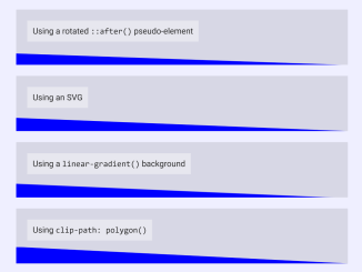
- CSS Diagonal Section Divider
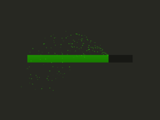
- HTML5 Canvas Loading Progress Bar Animation
- Expandable Blockquote in HTML CSS

I code and create web elements for amazing people around the world. I like work with new people. New people new Experiences.
I truly enjoy what I’m doing, which makes me more passionate about web development and coding. I am always ready to do challenging tasks whether it is about creating a custom CMS from scratch or customizing an existing system.