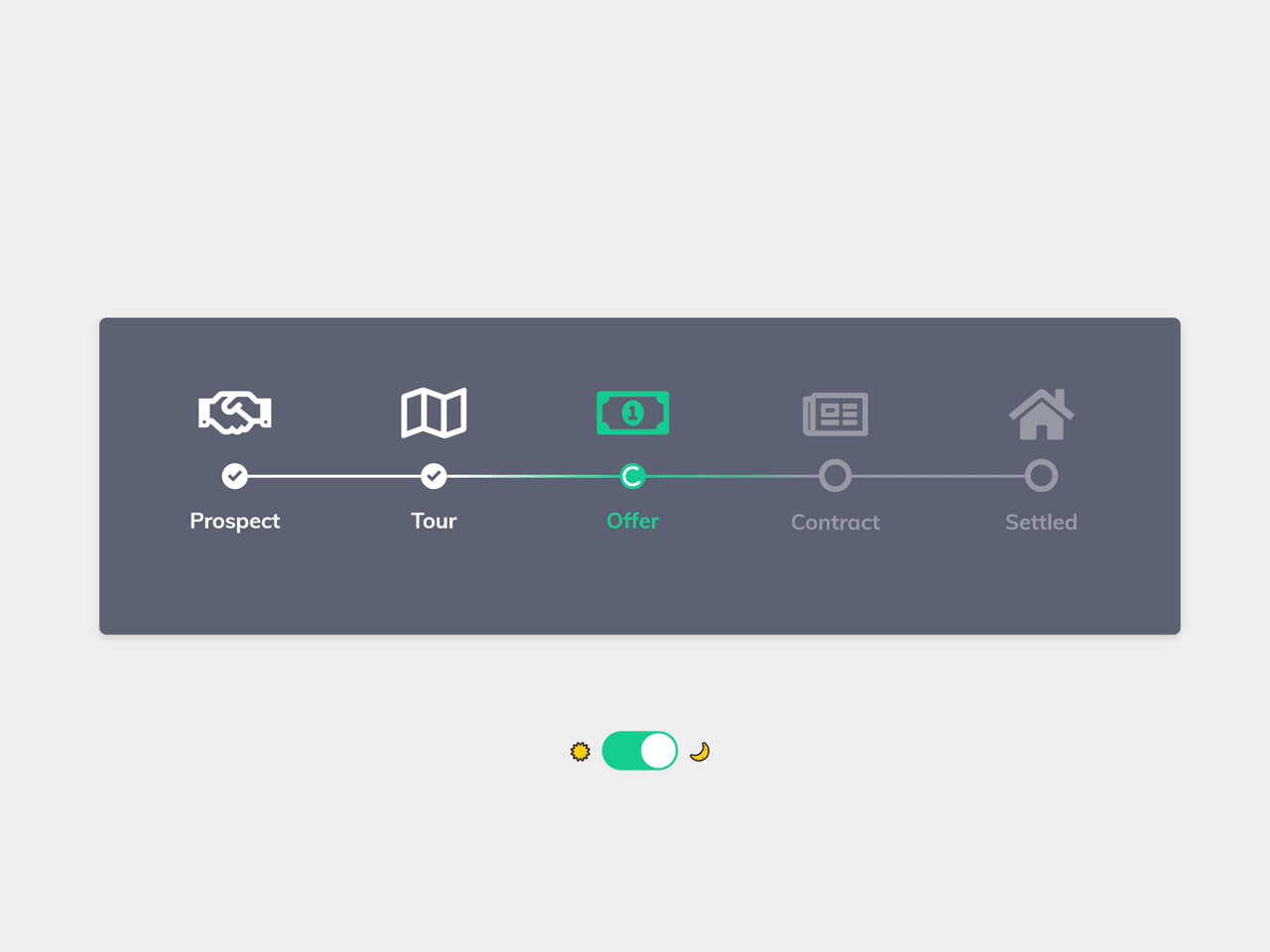

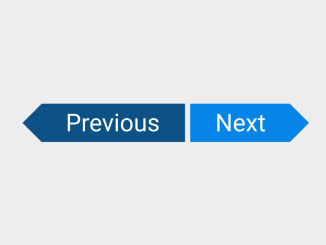
This HTML and CSS code snippet helps you to create a process steps with icons. It comes a horizontal layout icon with two color schemes, light and dark. Users can easily switch to dark mode using toggle button.
How to Create Process Steps in HTML and CSS
1. First of all, load the Font Awesome CSS into the head tag of your HTML document.
<link rel='stylesheet' href='https://cdnjs.cloudflare.com/ajax/libs/font-awesome/5.8.2/css/all.min.css'>
2. Create the HTML structure for process steps as follows:
<!-- Based on: https://dribbble.com/shots/5260798-Process -->
<div class="wrapper">
<div class="toggle">
    <span>☀️</span>
    <input type="checkbox" id="toggle-switch" />
    <label for="toggle-switch"></label>
    <span>🌙</span>
</div>
<div class="main-container">
    <div class="steps-container">
        <div class="step completed">
            <svg xmlns="http://www.w3.org/2000/svg" width="24" height="24" viewBox="0 0 24 24">
                <path d="M20.285 2l-11.285 11.567-5.286-5.011-3.714 3.716 9 8.728 15-15.285z" />
            </svg>
            <div class="label completed">
                Prospect
            </div>
            <div class="icon completed">
                <i class="far fa-handshake"></i>
            </div>
        </div>
        <div class="line completed"></div>
        <div class="step completed">
            <svg xmlns="http://www.w3.org/2000/svg" width="24" height="24" viewBox="0 0 24 24">
                <path d="M20.285 2l-11.285 11.567-5.286-5.011-3.714 3.716 9 8.728 15-15.285z" />
            </svg>
            <div class="label completed">
                Tour
            </div>
            <div class="icon completed">
                <i class="far fa-map"></i>
            </div>
        </div>
        <div class="line next-step-in-progress">
        </div>
        <div class="step in-progress">
            <div class="preloader"></div>
            <div class="label loading">
                Offer
            </div>
            <div class="icon in-progress">
                <i class="far fa-money-bill-alt"></i>
            </div>
        </div>
        <div class="line prev-step-in-progress"></div>
        <div class="step">
            <div class="label">
                Contract
            </div>
            <div class="icon">
                <i class="far fa-newspaper"></i>
            </div>
        </div>
        <div class="line"></div>
        <div class="step">
            <div class="label">
                Settled
            </div>
            <div class="icon">
                <i class="fas fa-home"></i>
            </div>
        </div>
    </div>
</div>
</div>
3. Now, style the steps using the following CSS:
@import url("https://fonts.googleapis.com/css?family=Muli:700");
:root {
  --background-modal-color: #fff;
  --body-color: #fff;
  --color-timeline-default: #D2D3D8;
  --color-step-completed: #5C6174;
  --color-checkmark-completed: #fff;
  --color-in-progress: #13CB8F;
  --color-label-default: var(--color-timeline-default);
  --color-label-completed: var(--color-step-completed);
  --color-label-loading: var(--color-in-progress);
  --color-icon-completed: var(--color-step-completed);
  --color-icon-default: var(--color-timeline-default);
}
:root.dark-mode {
  --color-checkmark-completed: #fff;
  --background-modal-color: #5C6174;
  --color-timeline-default: #9799A3;
  --color-checkmark-completed: var(--background-modal-color);
  --body-color: #fff;
  --color-step-completed: #fff;
}

* {
  box-sizing: border-box;
}

.wrapper {
  font-family: "Muli", sans-serif;
  background: var(--body-color);
  padding: 0;
  margin: 0;
  display: flex;
  width: 100vw;
  height: 100vh;
  justify-content: center;
  align-items: center;
  position: relative;
}
.toggle {
  transform: scale(0.8);
  position: absolute;
  bottom: 30px;
  display: flex;
  align-items: center;
  justify-content: space-around;
  max-width: 140px;
}
.toggle span {
  margin: 0 0.5rem;
}
.toggle input[type=checkbox] {
  height: 0;
  width: 0;
  visibility: hidden;
}
.toggle input[type=checkbox]:checked + label {
  background: #13CB8F;
}
 .toggle input[type=checkbox]:checked + label:after {
  left: calc(100% - 2px);
  transform: translateX(-100%);
}
 .toggle label {
  cursor: pointer;
  width: 75px;
  height: 34px;
  background: #D2D3D8;
  display: block;
  border-radius: 40px;
  position: relative;
}
.toggle label:after {
  content: "";
  position: absolute;
  top: 2px;
  left: 2px;
  width: 30px;
  height: 30px;
  background: #fff;
  border-radius: 40px;
  transition: 0.3s;
}
.main-container {
  display: flex;
  flex-direction: column;
  justify-content: center;
  transition: all 200ms ease;
  background: var(--background-modal-color);
  height: 220px;
  min-width: 420px;
  max-width: 750px;
  flex-grow: 1;
  border-radius: 5px;
  box-shadow: 0 2px 5px 0 rgba(0, 0, 0, 0.14);
}
.main-container .steps-container {
  padding: 40px;
  position: relative;
  display: flex;
  align-items: center;
  justify-content: center;
}
.main-container .steps-container .step {
  z-index: 1;
  position: relative;
  display: flex;
  align-items: center;
  justify-content: center;
  transition: all 200ms ease;
  flex-grow: 0;
  height: 15px;
  width: 15px;
  border: 4px solid var(--color-timeline-default);
  border-radius: 50%;
}
 .main-container .steps-container .step .preloader, body .main-container .steps-container .step svg {
  display: none;
}
.main-container .steps-container .step.completed {
  width: 18px;
  height: 18px;
  background: var(--color-step-completed);
  border: none;
}
.main-container .steps-container .step.completed svg {
  transition: all 200ms ease;
  display: block;
  height: 10px;
  width: 10px;
  fill: var(--color-checkmark-completed);
}
.main-container .steps-container .step.in-progress {
  width: 18px;
  height: 18px;
  background: var(--color-in-progress);
  border: none;
}
.main-container .steps-container .step.in-progress .preloader {
  display: block;
  height: 10px;
  width: 10px;
  border: 2px solid #fff;
  border-radius: 50%;
  border-left-color: transparent;
  animation-name: spin;
  animation-duration: 2000ms;
  animation-iteration-count: infinite;
  animation-timing-function: linear;
}
.main-container .steps-container .step .label {
  position: absolute;
  top: 30px;
  filter: none;
  z-index: 2000;
  color: var(--color-label-default);
  transition: all 200ms ease;
  font-weight: 700;
}
.main-container .steps-container .step .label.completed {
  color: var(--color-label-completed);
}
body .main-container .steps-container .step .label.loading {
  color: var(--color-label-loading);
}
.main-container .steps-container .step .icon {
  font-size: 40px;
  position: absolute;
  top: -60px;
  color: var(--color-icon-default);
  transition: color 200ms ease;
}
.main-container .steps-container .step .icon.completed {
  color: var(--color-icon-completed);
}
.main-container .steps-container .step .icon.in-progress {
  color: var(--color-in-progress);
}
.main-container .steps-container .line {
  transition: all 200ms ease;
  height: 2px;
  flex-grow: 1;
  max-width: 120px;
  background: var(--color-timeline-default);
}
.main-container .steps-container .line.completed {
  background: var(--color-step-completed);
}
.main-container .steps-container .line.next-step-uncomplete {
  background: linear-gradient(to right, var(--color-step-completed), var(--color-timeline-default));
}
.main-container .steps-container .line.next-step-in-progress {
  background: linear-gradient(to right, var(--color-step-completed), var(--color-in-progress));
}
.main-container .steps-container .line.prev-step-in-progress {
  background: linear-gradient(to right, var(--color-in-progress), var(--color-timeline-default));
}

@keyframes spin {
  from {
    transform: rotate(0deg);
  }
  to {
    transform: rotate(360deg);
  }
}
4. Add the following JavaScript function for light/dark mode switch button.
const toggleSwitch = document.getElementById('toggle-switch');

toggleSwitch.onchange = e => {
  document.documentElement.classList.toggle('dark-mode');
};
That’s all! hopefully, you have successfully created process steps. If you have any questions or suggestions, feel free to comment below.
Similar Code Snippets:
 Mix-blend-mode Fixed Button Using CSS
- HTML Tabs Example with Code
- Blog Comment Section Design
- Vertical Scrolling Timeline Template in CSS3
- Easy Dark Mode Using CSS
- Arrow Shaped Button using HTML and CSS

I code and create web elements for amazing people around the world. I like work with new people. New people new Experiences.
I truly enjoy what I’m doing, which makes me more passionate about web development and coding. I am always ready to do challenging tasks whether it is about creating a custom CMS from scratch or customizing an existing system.