
This JavaScript code provides an interactive way to create collapsible content sections on your web page. It works by allowing users to click on accordion headers to expand or collapse the associated content. It helps you organize and present information neatly, making it easy for your website visitors to access specific details.
How to Create Collapsible Content Section Using JavaScript
1. First of all, load the Normalize CSS by adding the following CDN link into the head tag of your webpage.
<link rel="stylesheet" href="https://cdnjs.cloudflare.com/ajax/libs/normalize/5.0.0/normalize.min.css">
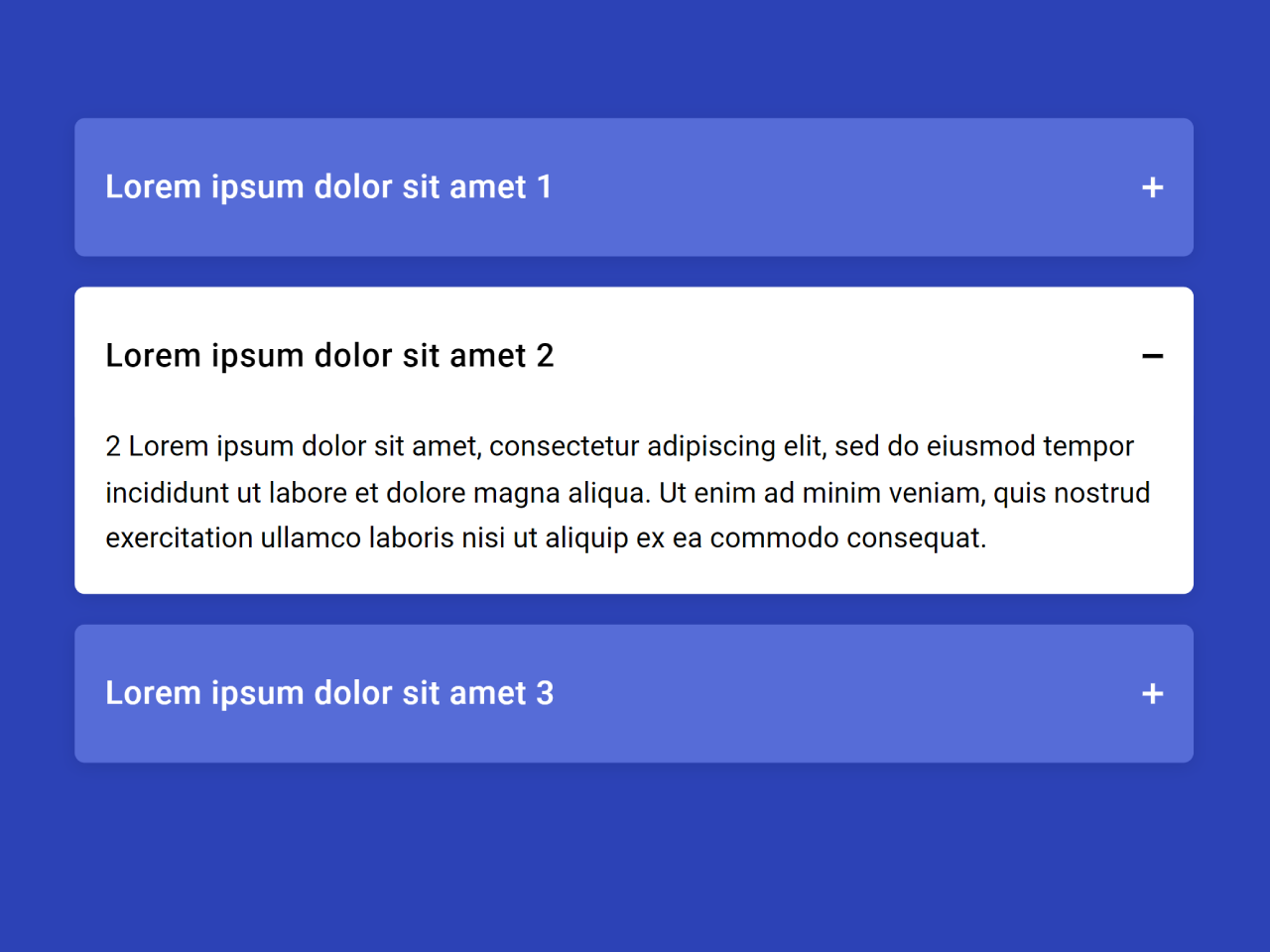
2. In your HTML file, create the structure for your collapsible content. Here’s an example of how you can structure your content:
<main>
  <div class="accordion">
    <div class="accordion-item">
      <div class="accordion-header">
        <h2>Lorem ipsum dolor sit amet 1</h2>
      </div>
      <div class="accordion-body">
        <p>1 Lorem ipsum dolor sit amet, consectetur adipiscing elit, sed do eiusmod tempor incididunt ut labore et dolore magna aliqua. Ut enim ad minim veniam, quis nostrud exercitation ullamco laboris nisi ut aliquip ex ea commodo consequat.</p>
      </div>
    </div>
    <div class="accordion-item">
      <div class="accordion-header">
        <h2>Lorem ipsum dolor sit amet 2</h2>
      </div>
      <div class="accordion-body">
        <p>2 Lorem ipsum dolor sit amet, consectetur adipiscing elit, sed do eiusmod tempor incididunt ut labore et dolore magna aliqua. Ut enim ad minim veniam, quis nostrud exercitation ullamco laboris nisi ut aliquip ex ea commodo consequat.</p>
      </div>
    </div>
    <div class="accordion-item">
      <div class="accordion-header">
        <h2>Lorem ipsum dolor sit amet 3</h2>
      </div>
      <div class="accordion-body">
        <p>3 Lorem ipsum dolor sit amet, consectetur adipiscing elit, sed do eiusmod tempor incididunt ut labore et dolore magna aliqua. Ut enim ad minim veniam, quis nostrud exercitation ullamco laboris nisi ut aliquip ex ea commodo consequat.</p>
      </div>
    </div>
  </div>

</main>
Make sure to customize the section headers and content according to your needs.
3. The following CSS code offers a basic style for your collapsible content. You can import it or integrate it into your existing CSS file. Feel free to modify the styles to match your website’s design.
@import url("https://fonts.googleapis.com/css?family=Roboto:400,500");
* {
  box-sizing: border-box;
}

body, html {
  width: 100%;
  height: 100%;
  font-family: "Roboto", sans-serif;
}

main {
  min-height: 100%;
  display: flex;
  justify-content: center;
  background: #2b42b6 !important;
  padding: 150px 30px;
}

.accordion {
  max-width: 550px;
}
.accordion-item {
  background-color: transparent;
  margin-bottom: 15px;
  border-radius: 5px;
  box-shadow: 0 2px 9px 0 rgba(0, 0, 0, 0.1);
  transition: background-color 0.2s ease-in 0.3s;
}
.accordion-item.active {
  background-color: white;
  transition: background-color 0.2s ease-in 0s;
}
.accordion-item.active .accordion-header {
  color: black;
  background-color: white;
  transition: background-color 0.2s ease-in 0s, color 0.2s ease-in 0.2s;
}
.accordion-item.active .accordion-header h2:before, .accordion-item.active .accordion-header h2:after {
  background-color: black;
  transition: background-color 0.2s ease-in 0.2s, transform 0.2s ease 0.1s;
}
.accordion-item.active .accordion-header h2:before {
  display: none;
}
.accordion-item.active .accordion-header h2:after {
  transform: rotate(90deg);
}
.accordion-item.active .accordion-body {
  max-height: 900px;
  padding: 0 15px 15px;
  transition: max-height 0.3s ease-in 0s, padding 0.2s ease-in 0s;
}
.accordion-item.active .accordion-body p {
  opacity: 1;
  transition: opacity 0.2s ease-in 0.2s;
}
.accordion-header {
  color: white;
  background-color: #566cd7;
  border-radius: 5px;
  padding: 25px 15px;
  cursor: pointer;
  transition: background-color 0.2s ease-out 0.3s, color 0.2s ease-out 0s;
}
.accordion-header h2 {
  position: relative;
  font-size: 1rem;
  font-weight: 500;
  letter-spacing: 0.025em;
  margin: 0;
}
.accordion-header h2:before, .accordion-header h2:after {
  content: "";
  position: absolute;
  background-color: white;
  transition: background-color 0.2s ease-in 0s, transform 0.2s ease 0s;
}
.accordion-header h2:before {
  width: 10px;
  height: 2px;
  right: 0;
  top: calc(50% - 1px);
}
.accordion-header h2:after {
  width: 2px;
  height: 10px;
  right: 4px;
  top: calc(50% - 5px);
  transform: none;
}
.accordion-body {
  max-height: 0;
  padding: 0 15px;
  overflow: hidden;
  transition: max-height 0.2s ease-out 0s, padding 0.1s ease-out 0.2s;
}
.accordion-body p {
  font-size: 0.875rem;
  line-height: 1.6;
  opacity: 0;
  margin: 0;
  transition: opacity 0.2s ease-in 0s;
}

.credits {
  position: absolute;
  bottom: 30px;
  right: 30px;
  font-size: 14px;
}
.credits p {
  color: #94a2e6;
  margin: 0;
}
.credits a {
  color: white;
}
4. The JavaScript code is responsible for making the content collapsible. It does this by adding and removing the ‘active’ class to the accordion sections when the user clicks on the headers. Include the following code in your HTML file:
const accordionItem = document.querySelectorAll('.accordion-item');

const onClickAccordionHeader = e => {
  if (e.currentTarget.parentNode.classList.contains('active')) {
    e.currentTarget.parentNode.classList.remove("active");
  } else {
    Array.prototype.forEach.call(accordionItem, e => e.classList.remove('active'));
    e.currentTarget.parentNode.classList.add("active");
  }
};

const init = () => {
  Array.prototype.forEach.call(accordionItem, e => e.querySelector('.accordion-header').addEventListener('click', onClickAccordionHeader, false));
};

document.addEventListener('DOMContentLoaded', init);
That’s all! hopefully, you have successfully created a Collapsible Content section on your website using this HTML, CSS, and JavaScript code. If you have any questions or suggestions, feel free to comment below.
Similar Code Snippets:

- HTML Multilevel Accordion Navigation Menu
- JavaScript FAQ Accordion Code with Example
- FAQ Page Design in HTML with Source Code


I code and create web elements for amazing people around the world. I like work with new people. New people new Experiences.
I truly enjoy what I’m doing, which makes me more passionate about web development and coding. I am always ready to do challenging tasks whether it is about creating a custom CMS from scratch or customizing an existing system.