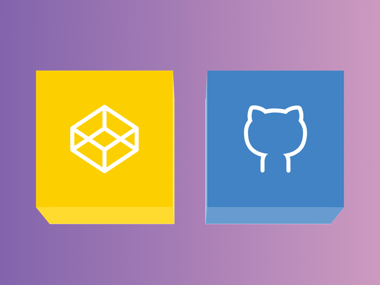

This Pure CSS code snippet helps you to create a cube box animation on hover. It generates rotating cube-like structures that animate upon hover. The cubes act as links, enhancing user interaction and engagement.
You can use this code on your website for interactive elements. It’s great for showcasing links with engaging hover effects, enhancing user experience.
How to Create Pure CSS Cube Box Animation On Hover
1. First of all, load Reset CSS by adding the following CDN links into the head tag of your HTML document.
<link rel="stylesheet" href="https://cdnjs.cloudflare.com/ajax/libs/meyer-reset/2.0/reset.min.css">
2. In your HTML file, create a structure for the cubes using unordered lists (<ul>) and list items (<li>). Each cube will contain anchor tags (<a>) that serve as links.
Adjust the href attribute in the anchor tags to link to your desired URLs. You can modify the number of cubes and their arrangement by altering the HTML and adjusting the CSS accordingly.
<ul ontouchstart>
  <li>
    <div class='link'>
      <a href='https://codepen.io/gabriellewee' target='_blank'></a>
      <a href='https://codepen.io/gabriellewee' target='_blank'></a>
      <a href='https://codepen.io/gabriellewee' target='_blank'></a>
      <a href='https://codepen.io/gabriellewee' target='_blank'></a>
      <div class='cube codepen'>
        <div></div>
        <div></div>
        <div></div>
        <div></div>
        <div>
          <svg viewbox='0 0 85 85'>
            <path d='M82.5,29.1666667 L42.5,2.5 L2.5,29.1666667 L2.5,55.8922001 L42.5,82.5 L82.5,55.8922001 L82.5,29.1666667 Z M42.5,2.9120677 L42.5,29.1666667 L42.5,2.9120677 Z M42.5,55.8922001 L42.5,82.5 L42.5,55.8922001 Z M2.5,29.1666667 L2.5,55.8922001 L42.5,29.1666667 L82.5,55.8922001 L82.5,29.1666667 L42.5,55.8922001 L2.5,29.1666667 Z'></path>
          </svg>
        </div>
        <div>/gabriellewee</div>
      </div>
    </div>
  </li>
  <li>
    <div class='link'>
      <a href='https://github.com/gabriellewee' target='_blank'></a>
      <a href='https://github.com/gabriellewee' target='_blank'></a>
      <a href='https://github.com/gabriellewee' target='_blank'></a>
      <a href='https://github.com/gabriellewee' target='_blank'></a>
      <div class='cube github'>
        <div></div>
        <div></div>
        <div></div>
        <div></div>
        <div>
          <svg viewbox='0 0 85 85'>
            <path class='fill' d='M76.7 19c1.1-4.8 0.6-10.1-1.6-15 -0.7-1.7-2.3-2.9-4.2-3 -0.5-0.1-1.1-0.1-1.6-0.1 -4.6 0-10.7 1.6-15 5C50.4 5 46.4 4.6 42.5 4.6V4.4c-3.9 0-7.9 0.4-11.8 1.3 -4.3-3.4-10.4-5-15-5 -0.5 0-1.1 0-1.6 0.1 -1.9 0.1-3.5 1.3-4.2 3C7.7 8.7 7.2 14 8.3 18.8c-3.3 4.4-5 9.6-5 15.4 0 12.5 4.2 21.4 12.5 26.4 2.6 1.6 5.6 2.9 9 3.7 -0.6 1.7-0.9 3.7-0.9 6.1v11.2h0c0 1.4 1.1 2.5 2.5 2.5s2.5-1.1 2.5-2.5l0-11c0-4.5 1.5-7.7 4.5-9.7 -1.5-0.1-3.2-0.3-5.2-0.8 -3.8-0.7-7-1.9-9.7-3.6C11.6 52.4 8.3 45.1 8.3 34.4c0-5.6 1.9-10.3 5.6-14.3 -1.7-4.4-1.4-9.6 0.6-14.3 0.4 0 0.8 0 1.2 0 4.9 0 10.8 2.2 13.5 5.5 4.5-1.2 9-1.8 13.3-1.8v0.1c4.3 0 8.8 0.6 13.3 1.8 2.7-3.3 8.6-5.5 13.5-5.5 0.4 0 0.8 0 1.2 0 2 4.7 2.3 9.9 0.6 14.3 3.7 4 5.6 8.7 5.6 14.3 0 10.7-3.3 18-10.2 22.2 -2.7 1.7-5.9 2.9-9.7 3.6 -2 0.5-3.7 0.7-5.2 0.8 3 2 4.5 5.2 4.5 9.7l0 11c0 1.4 1.1 2.5 2.5 2.5s2.5-1.1 2.5-2.5h0V70.6c0-2.4-0.3-4.4-0.9-6.1 3.4-0.8 6.4-2.1 9-3.7 8.3-5 12.5-13.9 12.5-26.4C81.7 28.6 80 23.4 76.7 19z'></path>
          </svg>
        </div>
        <div>/gabriellewee</div>
      </div>
    </div>
  </li>
</ul>
<svg class='clips' viewbox='0 0 0 0' xmlns='http://www.w3.org/2000/svg'>
  <defs>
    <clippath id='clip-right'>
      <polygon id='right' points='48 0 48 96 0 48'></polygon>
    </clippath>
    <clippath id='clip-left'>
      <polygon id='left' points='0 0 0 96 48 48'></polygon>
    </clippath>
    <clippath id='clip-bottom'>
      <polygon id='bottom' points='96 48 0 48 48 0'></polygon>
    </clippath>
    <clippath id='clip-top'>
      <polygon id='top' points='0 0 96 0 48 48'></polygon>
    </clippath>
  </defs>
</svg>
3. Paste the following CSS code into your stylesheet or within <style> tags in the HTML file. This CSS contains styles for the cubes, links, hover effects, and animations.
*, *:before, *:after {
  box-sizing: border-box;
}

* {
  -webkit-user-select: none;
     -moz-user-select: none;
      -ms-user-select: none;
          user-select: none;
  -webkit-tap-highlight-color: rgba(0, 0, 0, 0);
  transform-style: preserve-3d;
}

*:focus {
  outline: none !important;
}

body, html {
  height: 100%;
}

body {
  display: flex;
  align-items: center;
  align-content: center;
  justify-content: center;
  padding: 12px;
  background: #84c7a7;
  background: linear-gradient(135deg, #3023ae 0%, #53a0fe 50%, #b4ed50 100%);
  filter: progid:DXImageTransform.Microsoft.gradient( startColorstr="$indigo", endColorstr="$lime",GradientType=1 );
  font-family: "brandon-grotesque", "Brandon Grotesque", "Source Sans Pro", "Segoe UI", Frutiger, "Frutiger Linotype", "Dejavu Sans", "Helvetica Neue", Arial, sans-serif;
  text-rendering: optimizeLegibility;
  -webkit-font-smoothing: antialiased;
}

ul {
  perspective: 1000px;
  transform: translateZ(96px);
  display: flex;
  list-style: none;
  margin: 0;
  padding: 12px;
}
ul li {
  padding: 12px;
}

.clips {
  position: absolute;
  top: 0;
  left: 0;
  width: 0;
  height: 0;
  opacity: 0;
  z-index: -100;
}

.link {
  position: relative;
  width: 96px;
  height: 96px;
}
.link a {
  transform-origin: 48px 48px -48px;
  display: block;
  position: absolute;
  z-index: 1;
  transform: translateZ(24px);
  width: 100%;
  height: 100%;
}
.link a:nth-child(1) {
  top: 0;
  left: 0;
  height: 50%;
  -webkit-clip-path: polygon(50% 100%, 0 0, 100% 0);
          clip-path: polygon(50% 100%, 0 0, 100% 0);
}
@-moz-document url-prefix() {
  .link a:nth-child(1) {
    clip-path: url(#clip-top);
  }
}
.link a:nth-child(1):hover ~ .cube, .link a:nth-child(1):focus ~ .cube {
  transform: rotateX(-0.5turn);
}
.link a:nth-child(1):hover ~ .cube div:nth-child(6), .link a:nth-child(1):focus ~ .cube div:nth-child(6) {
  transform: rotateY(180deg) rotateZ(180deg) translateZ(96px);
}
.link a:nth-child(2) {
  top: 0;
  right: 0;
  width: 50%;
  -webkit-clip-path: polygon(100% 100%, 0 50%, 100% 0);
          clip-path: polygon(100% 100%, 0 50%, 100% 0);
}
@-moz-document url-prefix() {
  .link a:nth-child(2) {
    clip-path: url(#clip-right);
  }
}
.link a:nth-child(2):hover ~ .cube, .link a:nth-child(2):focus ~ .cube {
  transform: rotateY(-0.5turn);
}
.link a:nth-child(3) {
  bottom: 0;
  right: 0;
  height: 50%;
  -webkit-clip-path: polygon(0 100%, 50% 0, 100% 100%);
          clip-path: polygon(0 100%, 50% 0, 100% 100%);
}
@-moz-document url-prefix() {
  .link a:nth-child(3) {
    clip-path: url(#clip-bottom);
  }
}
.link a:nth-child(3):hover ~ .cube, .link a:nth-child(3):focus ~ .cube {
  transform: rotateX(0.5turn);
}
.link a:nth-child(3):hover ~ .cube div:nth-child(6), .link a:nth-child(3):focus ~ .cube div:nth-child(6) {
  transform: rotateY(180deg) rotateZ(180deg) translateZ(96px);
}
.link a:nth-child(4) {
  bottom: 0;
  left: 0;
  width: 50%;
  -webkit-clip-path: polygon(0 100%, 0 0, 100% 50%);
          clip-path: polygon(0 100%, 0 0, 100% 50%);
}
@-moz-document url-prefix() {
  .link a:nth-child(4) {
    clip-path: url(#clip-left);
  }
}
.link a:nth-child(4):hover ~ .cube, .link a:nth-child(4):focus ~ .cube {
  transform: rotateY(0.5turn);
}
.link a:nth-child(1):hover, .link a:nth-child(1):focus, .link a:nth-child(2):hover, .link a:nth-child(2):focus, .link a:nth-child(3):hover, .link a:nth-child(3):focus, .link a:nth-child(4):hover, .link a:nth-child(4):focus {
  z-index: 2;
  transform: translateZ(36px);
  width: 100% !important;
  height: 100% !important;
  -webkit-clip-path: none !important;
  clip-path: none !important;
  transition: all 100ms ease 500ms;
}

.cube {
  transform-origin: 48px 48px -48px;
  position: relative;
  z-index: 0;
  display: block;
  width: 100%;
  height: 100%;
  transition: all 300ms ease-out;
}
.cube div {
  display: flex;
  align-items: center;
  align-content: center;
  justify-content: center;
  position: absolute;
  top: 0;
  left: 0;
  width: 100%;
  height: 100%;
  color: white;
}
.cube div svg {
  width: 48px;
  height: 48px;
}
.cube div svg path:not(.fill) {
  fill: none;
  stroke: white;
  stroke-width: 5px;
  stroke-linecap: round;
  stroke-linejoin: round;
}
.cube div svg path.fill {
  fill: white;
}
.cube div:nth-child(1) {
  transform-origin: center top;
  transform: rotateX(90deg) translateY(-96px);
}
.cube div:nth-child(2) {
  transform-origin: center bottom;
  transform: rotateX(-90deg) translateY(96px);
}
.cube div:nth-child(3) {
  transform-origin: left center;
  transform: rotateY(-90deg) translateX(-96px);
}
.cube div:nth-child(4) {
  transform-origin: right center;
  transform: rotateY(90deg) translateX(96px);
}
.cube div:nth-child(5) {
  transform-origin: center center;
  transform: rotateX(0);
}
.cube div:nth-child(6) {
  transform-origin: center center;
  transform: rotateY(180deg) translateZ(96px);
}
.cube.codepen div:nth-child(1) {
  background: #fff1b0;
}
.cube.codepen div:nth-child(2) {
  background: #ffdb30;
}
.cube.codepen div:nth-child(3) {
  background: #ffe463;
}
.cube.codepen div:nth-child(4) {
  background: #ffe463;
}
.cube.codepen div:nth-child(5) {
  background: #fcd000;
}
.cube.codepen div:nth-child(6) {
  background: white;
  color: #fcd000;
}
.cube.github div:nth-child(1) {
  background: #c9dcee;
}
.cube.github div:nth-child(2) {
  background: #689cd0;
}
.cube.github div:nth-child(3) {
  background: #8fb6dc;
}
.cube.github div:nth-child(4) {
  background: #8fb6dc;
}
.cube.github div:nth-child(5) {
  background: #4183c4;
}
.cube.github div:nth-child(6) {
  background: white;
  color: #4183c4;
}
Remember to customize the code by adjusting the number of cubes, modifying links, and incorporating your design elements to fit seamlessly into your website.
That’s all! hopefully, you have successfully created a cube box animation on hover. If you have any questions or suggestions, feel free to comment below.
Similar Code Snippets:
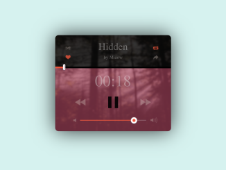
 Audio Player Widget For Website
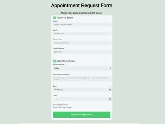
- Simple Appointment Request Form HTML
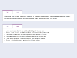
- HTML Tabs Example with Code
- Background Attachment in CSS
- Wobbly Text Effect Using CSS & SVG
- CSS Background Color Only Behind Text


I code and create web elements for amazing people around the world. I like work with new people. New people new Experiences.
I truly enjoy what I’m doing, which makes me more passionate about web development and coding. I am always ready to do challenging tasks whether it is about creating a custom CMS from scratch or customizing an existing system.