
This code provides a simple way to create a simple speech bubble in CSS. It allows you to style speech bubbles with various shapes, including square, round, and triangular, at different locations on the screen. This code is helpful for adding visually appealing speech bubbles to your web content.
You can use this code in your website’s design to create eye-catching speech bubbles for comments, tooltips, or messages. Moreover, it’s easy to customize and can improve the overall design of your web pages.
How to Create Simple Speech Bubble in CSS
1. First, include the HTML structure for your speech bubbles. You can create multiple bubbles by duplicating the provided HTML code blocks. Each code block represents a separate speech bubble.
<div class="talk-bubble">
<div class="talktext">
<p>CSS Talk Bubble configured by classes. Defaults to square shape, no triangle. Height is auto-adjusting to the height of the text.</p>
</div>
</div>
<div class="talk-bubble tri-right left-top">
<div class="talktext">
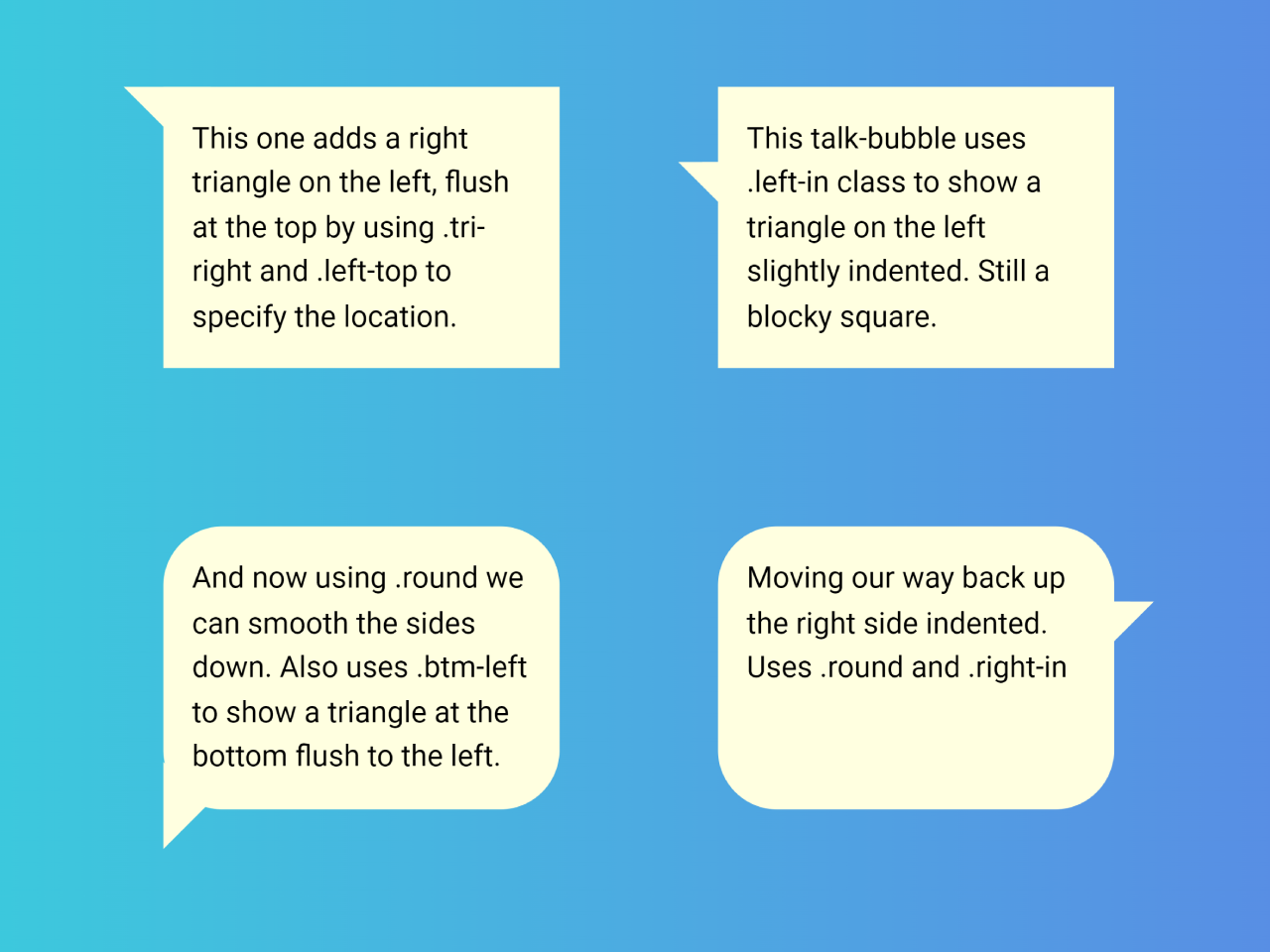
<p>This one adds a right triangle on the left, flush at the top by using .tri-right and .left-top to specify the location.</p>
</div>
</div>
<div class="talk-bubble tri-right left-in">
<div class="talktext">
<p>This talk-bubble uses .left-in class to show a triangle on the left slightly indented. Still a blocky square.</p>
</div>
</div>
<div class="talk-bubble tri-right round btm-left">
<div class="talktext">
<p>And now using .round we can smooth the sides down. Also uses .btm-left to show a triangle at the bottom flush to the left.</p>
</div>
</div>
<div class="talk-bubble tri-right border round btm-left-in">
<div class="talktext">
<p>Now we add a border and it looks like a comic. Uses .border .round and .btm-left-in</p>
</div>
</div>
<div class="talk-bubble tri-right border btm-right-in">
<div class="talktext">
<p>Now flipped the other way and square. Uses .border and .btm-right-in</p>
</div>
</div>
<div class="talk-bubble tri-right btm-right">
<div class="talktext">
<p>Flush to the bottom right. Uses .btm-right only.</p>
</div>
</div>
<div class="talk-bubble tri-right round right-in">
<div class="talktext">
<p>Moving our way back up the right side indented. Uses .round and .right-in</p>
</div>
</div>
<div class="talk-bubble tri-right round border right-top">
<div class="talktext">
<p>And finally on the right flush at the top. Uses .round .border and .right-top</p>
</div>
</div>
2. The CSS code in the provided snippet defines the appearance of your speech bubbles. You can customize the bubble’s shape, border, and position by adding or modifying CSS classes.
For example, adding the “.round” class will give your bubble rounded corners, while “.border” adds a border to it.
/* General CSS Setup */
body{
  background-color: lightblue;
  font-family: "Ubuntu-Italic", "Lucida Sans", helvetica, sans;
}

/* container */
.container {
  padding: 5% 5%;
}

/* CSS talk bubble */
.talk-bubble {
	margin: 40px;
  display: inline-block;
  position: relative;
	width: 200px;
	height: auto;
	background-color: lightyellow;
}
.border{
  border: 8px solid #666;
}
.round{
  border-radius: 30px;
	-webkit-border-radius: 30px;
	-moz-border-radius: 30px;

}

/* Right triangle placed top left flush. */
.tri-right.border.left-top:before {
	content: ' ';
	position: absolute;
	width: 0;
	height: 0;
  left: -40px;
	right: auto;
  top: -8px;
	bottom: auto;
	border: 32px solid;
	border-color: #666 transparent transparent transparent;
}
.tri-right.left-top:after{
	content: ' ';
	position: absolute;
	width: 0;
	height: 0;
  left: -20px;
	right: auto;
  top: 0px;
	bottom: auto;
	border: 22px solid;
	border-color: lightyellow transparent transparent transparent;
}

/* Right triangle, left side slightly down */
.tri-right.border.left-in:before {
	content: ' ';
	position: absolute;
	width: 0;
	height: 0;
  left: -40px;
	right: auto;
  top: 30px;
	bottom: auto;
	border: 20px solid;
	border-color: #666 #666 transparent transparent;
}
.tri-right.left-in:after{
	content: ' ';
	position: absolute;
	width: 0;
	height: 0;
  left: -20px;
	right: auto;
  top: 38px;
	bottom: auto;
	border: 12px solid;
	border-color: lightyellow lightyellow transparent transparent;
}

/*Right triangle, placed bottom left side slightly in*/
.tri-right.border.btm-left:before {
	content: ' ';
	position: absolute;
	width: 0;
	height: 0;
	left: -8px;
  right: auto;
  top: auto;
	bottom: -40px;
	border: 32px solid;
	border-color: transparent transparent transparent #666;
}
.tri-right.btm-left:after{
	content: ' ';
	position: absolute;
	width: 0;
	height: 0;
	left: 0px;
  right: auto;
  top: auto;
	bottom: -20px;
	border: 22px solid;
	border-color: transparent transparent transparent lightyellow;
}

/*Right triangle, placed bottom left side slightly in*/
.tri-right.border.btm-left-in:before {
	content: ' ';
	position: absolute;
	width: 0;
	height: 0;
	left: 30px;
  right: auto;
  top: auto;
	bottom: -40px;
	border: 20px solid;
	border-color: #666 transparent transparent #666;
}
.tri-right.btm-left-in:after{
	content: ' ';
	position: absolute;
	width: 0;
	height: 0;
	left: 38px;
  right: auto;
  top: auto;
	bottom: -20px;
	border: 12px solid;
	border-color: lightyellow transparent transparent lightyellow;
}

/*Right triangle, placed bottom right side slightly in*/
.tri-right.border.btm-right-in:before {
	content: ' ';
	position: absolute;
	width: 0;
	height: 0;
  left: auto;
	right: 30px;
	bottom: -40px;
	border: 20px solid;
	border-color: #666 #666 transparent transparent;
}
.tri-right.btm-right-in:after{
	content: ' ';
	position: absolute;
	width: 0;
	height: 0;
  left: auto;
	right: 38px;
	bottom: -20px;
	border: 12px solid;
	border-color: lightyellow lightyellow transparent transparent;
}
/*
	left: -8px;
  right: auto;
  top: auto;
	bottom: -40px;
	border: 32px solid;
	border-color: transparent transparent transparent #666;
	left: 0px;
  right: auto;
  top: auto;
	bottom: -20px;
	border: 22px solid;
	border-color: transparent transparent transparent lightyellow;

/*Right triangle, placed bottom right side slightly in*/
.tri-right.border.btm-right:before {
	content: ' ';
	position: absolute;
	width: 0;
	height: 0;
  left: auto;
	right: -8px;
	bottom: -40px;
	border: 20px solid;
	border-color: #666 #666 transparent transparent;
}
.tri-right.btm-right:after{
	content: ' ';
	position: absolute;
	width: 0;
	height: 0;
  left: auto;
	right: 0px;
	bottom: -20px;
	border: 12px solid;
	border-color: lightyellow lightyellow transparent transparent;
}

/* Right triangle, right side slightly down*/
.tri-right.border.right-in:before {
	content: ' ';
	position: absolute;
	width: 0;
	height: 0;
  left: auto;
	right: -40px;
  top: 30px;
	bottom: auto;
	border: 20px solid;
	border-color: #666 transparent transparent #666;
}
.tri-right.right-in:after{
	content: ' ';
	position: absolute;
	width: 0;
	height: 0;
  left: auto;
	right: -20px;
  top: 38px;
	bottom: auto;
	border: 12px solid;
	border-color: lightyellow transparent transparent lightyellow;
}

/* Right triangle placed top right flush. */
.tri-right.border.right-top:before {
	content: ' ';
	position: absolute;
	width: 0;
	height: 0;
  left: auto;
	right: -40px;
  top: -8px;
	bottom: auto;
	border: 32px solid;
	border-color: #666 transparent transparent transparent;
}
.tri-right.right-top:after{
	content: ' ';
	position: absolute;
	width: 0;
	height: 0;
  left: auto;
	right: -20px;
  top: 0px;
	bottom: auto;
	border: 20px solid;
	border-color: lightyellow transparent transparent transparent;
}

/* talk bubble contents */
.talktext{
  padding: 1em;
	text-align: left;
  line-height: 1.5em;
}
.talktext p{
  /* remove webkit p margins */
  -webkit-margin-before: 0em;
  -webkit-margin-after: 0em;
}
To make your speech bubbles unique, adjust the CSS properties in the ".talk-bubble" and ".talktext" classes. You can change the background color, text alignment, padding, and more. Experiment with different styles until you achieve the desired look.
Use classes like ".tri-right," ".left-top," ".right-in," and others to position your speech bubbles as needed. For example, ".tri-right.left-top" will place a right triangle on the left side at the top of the bubble.
That’s all! hopefully, you have successfully created a Simple Speech Bubble in CSS. If you have any questions or suggestions, feel free to comment below.
Similar Code Snippets:
 HTML Table Row Color Based on Value
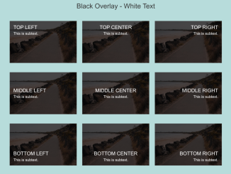 15+ Background Image With Text Overlay
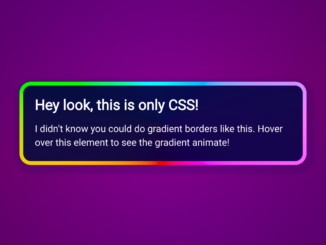 CSS Stylish Box with Animated Gradient Border
 Animated Gradient Text Using HTML CSS
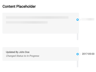 Content Placeholder Animation Using CSS
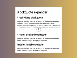 Expandable Blockquote in HTML CSS
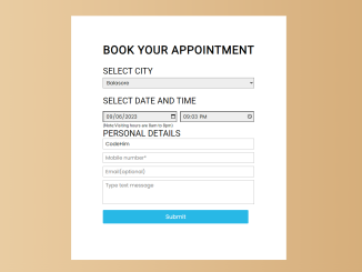 Appointment Booking Form in HTML CSS


I code and create web elements for amazing people around the world. I like work with new people. New people new Experiences.
I truly enjoy what I’m doing, which makes me more passionate about web development and coding. I am always ready to do challenging tasks whether it is about creating a custom CMS from scratch or customizing an existing system.