

This pure CSS code showcases a Candle Flame Animation created using HTML and CSS3 animation. The main functionality is to generate a realistic-looking candle flame using CSS3 animations. This animation is helpful for adding an eye-catching visual element to web pages without relying on external images or scripts.
You can use this code on your website’s landing page to create an attractive and interactive candle flame animation. It adds visual appeal, making your site more engaging.
How to Create Pure CSS Candle Flame Animation
1. Begin by setting up the HTML structure. Place the following code within the <body> tag of your HTML file:
<div class="holder">
  <div class="candle">
    <div class="blinking-glow"></div>
    <div class="thread"></div>
    <div class="glow"></div>
    <div class="flame"></div>
  </div>
</div>
2. Next, add the CSS code provided to your stylesheet or within <style> tags in the HTML file. This CSS code defines the styles and animations for the candle flame.
@import url('https://fonts.googleapis.com/css?family=Ubuntu:400,400i,700,700i');


*, *:before, *:after {
	margin: 0;
	padding: 0;
	word-break: break-all;
  box-sizing: border-box;
  scroll-behavior: smooth;
}

html {
  font-size: 10px;
}

body {
	font-family: 'Ubuntu', sans-serif;
	color: #6e6e6e;
	font-size: 1.6rem;
  background: black;
}

header, footer {
  display: block;
}

a, a:link, a:visited {
  text-decoration: none;
}

img {
	border: 0;
}

ul {
	list-style: none;
}

.center {
  width: 1170px;
  margin: 20px auto 0;
}

.holder {
  margin: 12rem auto 0;
  width: 150px;
  height: 400px;
  position: relative;
}

.holder *, .holder *:before, .holder *:after {
  position: absolute;
  content: "";
}
.cd__main{
   background: #000 !important;
}
.candle {
  bottom: 0;
  width: 150px;
  height: 300px;
  border-radius: 150px / 40px;
  box-shadow: inset 20px -30px 50px 0 rgba(0, 0, 0, 0.4), inset -20px 0 50px 0 rgba(0, 0, 0, 0.4);
  background: #190f02;
  background: -moz-linear-gradient(#e48825, #e78e0e, #833c03, #4c1a03 50%, #1c0900);
  background: -webkit-linear-gradient(#e48825, #e78e0e, #833c03, #4c1a03 50%, #1c0900);
  background: -o-linear-gradient(#e48825, #e78e0e, #833c03, #4c1a03 50%, #1c0900);
  background: -ms-linear-gradient(#e48825, #e78e0e, #833c03, #4c1a03 50%, #1c0900);
  background: linear-gradient(#e48825, #e78e0e, #833c03, #4c1a03 50%, #1c0900);
}

.candle:before {
  width: 100%;
  height: 40px;
  border-radius: 50%;
  border: 2px solid #d47401;
  background: #b86409;
  background: -moz-radial-gradient(#eaa121, #8e4901 45%, #b86409 80%);
  background: -webkit-radial-gradient(#eaa121, #8e4901 45%, #b86409 80%);
  background: -o-radial-gradient(#eaa121, #8e4901 45%, #b86409 80%);
  background: -ms-radial-gradient(#eaa121, #8e4901 45%, #b86409 80%);
  background: radial-gradient(#ffef80, #b86409 60%);
  background: radial-gradient(#eaa121, #8e4901 45%, #b86409 80%);
}

.candle:after {
  width: 34px;
  height: 10px;
  left: 50%;
  transform: translateX(-50%);
  border-radius: 50%;
  top: 14px;
  box-shadow: 0 0 20px 0 rgba(0, 0, 0, 0.5);
  background: -moz-radial-gradient(rgba(0, 0, 0, 0.6), transparent 45%);
  background: -webkit-radial-gradient(rgba(0, 0, 0, 0.6), transparent 45%);
  background: -o-radial-gradient(rgba(0, 0, 0, 0.6), transparent 45%);
  background: -ms-radial-gradient(rgba(0, 0, 0, 0.6), transparent 45%);
  background: radial-gradient(rgba(0, 0, 0, 0.6), transparent 45%);
}

.thread {
  width: 6px;
  height: 36px;
  top: -17px;
  left: 50%;
  z-index: 1;
  border-radius: 40% 40% 0 0;
  transform: translateX(-50%);
  background: #121212;
  background: -moz-linear-gradient(#d6994a, #4b232c, #121212, black, #e8bb31 90%);
  background: -webkit-linear-gradient(#d6994a, #4b232c, #121212, black, #e8bb31 90%);
  background: -o-linear-gradient(#d6994a, #4b232c, #121212, black, #e8bb31 90%);
  background: -ms-linear-gradient(#d6994a, #4b232c, #121212, black, #e8bb31 90%);
  background: linear-gradient(#d6994a, #4b232c, #121212, black, #e8bb31 90%);
}

.flame {
  width: 24px;
  height: 120px;
  left: 50%;
  transform-origin: 50% 100%;
  transform: translateX(-50%);
  bottom: 100%;
  border-radius: 50% 50% 20% 20%;
  background: rgba(255, 255, 255, 1);
  background: -moz-linear-gradient(white 80%, transparent);
  background: -webkit-linear-gradient(white 80%, transparent);
  background: -o-linear-gradient(white 80%, transparent);
  background: -ms-linear-gradient(white 80%, transparent);
  background: linear-gradient(white 80%, transparent);
  animation: moveFlame 6s linear infinite, enlargeFlame 5s linear infinite;
}

.flame:before {
  width: 100%;
  height: 100%;
  border-radius: 50% 50% 20% 20%;
  box-shadow: 0 0 15px 0 rgba(247, 93, 0, .4), 0 -6px 4px 0 rgba(247, 128, 0, .7);
}

@keyframes moveFlame {
  0%, 100% {
    transform: translateX(-50%) rotate(-2deg);
  }
  50% {
    transform: translateX(-50%) rotate(2deg);
  }
}

@keyframes enlargeFlame {
  0%, 100% {
    height: 120px;
  }
  50% {
    height: 140px;
  }
}

.glow {
  width: 26px;
  height: 60px;
  border-radius: 50% 50% 35% 35%;
  left: 50%;
  top: -48px;
  transform: translateX(-50%);
  background: rgba(0, 133, 255, .7);
  box-shadow: 0 -40px 30px 0 #dc8a0c, 0 40px 50px 0 #dc8a0c, inset 3px 0 2px 0 rgba(0, 133, 255, .6), inset -3px 0 2px 0 rgba(0, 133, 255, .6);
}

.glow:before {
  width: 70%;
  height: 60%;
  left: 50%;
  transform: translateX(-50%);
  bottom: 0;
  border-radius: 50%;
  background: rgba(0, 0, 0, 0.35);
}

.blinking-glow {
  width: 100px;
  height: 180px;
  left: 50%;
  top: -55%;
  transform: translateX(-50%);
  border-radius: 50%;
  background: #ff6000;
  -webkit-filter: blur(50px);
  -moz-filter: blur(60px);
  -o-filter: blur(60px);
  -ms-filter: blur(60px);
  filter: blur(60px);
  animation: blinkIt .1s infinite;
}

@keyframes blinkIt {
  50% { opacity: .8;}
}
You can customize the appearance of the flame by tweaking the CSS properties within the .flame, .glow, and .blinking-glow classes. Adjust colors, sizes, or animation durations to match your website’s design.
With just a few lines of HTML and CSS, you can create an attractive visual element that captivates your audience. Customize it to suit your website’s style, and enjoy the benefits of a more visually appealing and efficient webpage.
That’s all! hopefully, you have successfully created Candle Flame Animation on your website. If you have any questions or suggestions, feel free to comment below.
Similar Code Snippets:
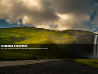
 Background Attachment in CSS
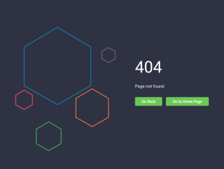
- 404 Error Page Template in HTML CSS
- CSS Stylish Box with Animated Gradient Border

I code and create web elements for amazing people around the world. I like work with new people. New people new Experiences.
I truly enjoy what I’m doing, which makes me more passionate about web development and coding. I am always ready to do challenging tasks whether it is about creating a custom CMS from scratch or customizing an existing system.