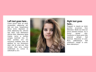
Are you looking to neatly align text around a centered image on your webpage? This “Wrap Text Around Centered Image CSS” code does exactly that. It utilizes CSS to create a container that centers an image, allowing text to flow around it harmoniously. This method improves the visual presentation of your content.
It’s particularly useful for blog posts, or product descriptions where you want to center images and wrap text around them, improving visual styling and readability.
How to Wrap Text Around Centered Image Using HTML & CSS
1. First, create the HTML structure for your content. You’ll need a container to hold your text and image. Here’s a sample HTML code snippet:
<div class="container">
        <div class="text left">
            <h2>Left text goes here...</h2>
                <p> Lorem ipsum dolor sit amet, consectetur adipiscing elit. Sed non risus. Suspendisse lectus tortor, dignissim sit amet, adipiscing nec, ultricies sed, dolor. Cras elementum ultrices diam. Maecenas ligula massa, varius a, semper congue, euismod non, mi. Proin porttitor, orci nec nonummy molestie, enim est eleifend mi, non fermentum diam nisl sit amet erat. Duis semper. Duis arcu, massa scelerisque ac, cursus et, sollicitudin a, orci.</p>
        </div>
        <div class="image-container">
            <img src="your-image-url.jpg" alt="Centered Image" class="centered-image">
        </div>
        <div class="text right">
            <h2>Right text goes here...</h2>
           <p>Praesent in mauris eu tortor porttitor accumsan. Duis bibendum. Morbi non erat non ipsum pharetra tempus. Du is iaculis laoreet odio. Vestibulum id ligula porta felis euismod semper. Sed euismod. Maecenas id ante. Nunc pellentesque. Sed vestibulum. Integer in ante. Nunc elementum. </p>
        </div>
    </div>
Replace "your-image-url.jpg" with the URL of your image.
2. Next, let’s apply the necessary CSS styles to achieve the desired effect. We’ll center the image and make sure the text flows around it. Here’s the CSS code:
.container {
    display: flex;
    justify-content: center;
    align-items: flex-start;
}

.text {
    flex: 1;
    padding: 20px;
}

.image-container {
    text-align: center;
}

.image-container img {
    max-width: 320px;
    height: auto;
    display: block;
    margin: 0 auto;
}

p {
    text-align: justify;
}
Feel free to customize the CSS styles to match your website’s design and image dimensions. You can adjust the max-width property to control the maximum image size.
That’s all! hopefully, you have successfully wrapped text around the centered image. This technique is great for blog posts, articles, or product descriptions. If you have any questions or suggestions, feel free to comment below.
Similar Code Snippets:

I code and create web elements for amazing people around the world. I like work with new people. New people new Experiences.
I truly enjoy what I’m doing, which makes me more passionate about web development and coding. I am always ready to do challenging tasks whether it is about creating a custom CMS from scratch or customizing an existing system.

