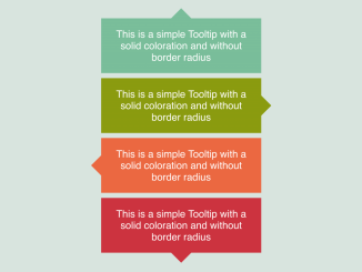
This CSS code snippet helps you to design box with an arrow for the tooltip component. Each tooltip has a defined color and shape without border-radius. It helps display information interactively by pointing to relevant elements.
Basically, this code provides basic styling for the tooltip component, which you can integrate in your tooltip project to make it functional. It enhances user experience by providing helpful information or explanations when users hover over specific content. These tooltips can be customized in color, direction, and shape, making them versatile for various design needs.
How to Create Tooltip Box With Arrow in CSS
1. Begin by setting up the HTML structure. Use <div> elements with the class “tooltip” and additional directional classes like “top,” “right,” “left,” or “bottom” to determine the arrow’s direction within the tooltip.
<div class="tooltip top" style="--c: #79bd9a;">This is a simple Tooltip with a solid coloration and without border radius </div>
<div class="tooltip right" style="--c: #8a9b0f;">This is a simple Tooltip with a solid coloration and without border radius </div>
<div class="tooltip left" style="--c: #eb6841;">This is a simple Tooltip with a solid coloration and without border radius </div>
<div class="tooltip bottom">This is a simple Tooltip with a solid coloration and without border radius </div>
2. In the CSS section, define the styles for the tooltips and arrow pointers. The variables --b (base) and --h (height) control the arrow’s dimensions. Customize the colors, font size, padding, and other properties according to your design preferences.
For each directional class (top, right, left, bottom), define the clip-path property within the CSS. Clip-path shapes the arrow by specifying coordinates.
.tooltip {
  /* triangle dimension */
  --b: 2em; /* base */
  --h: 1em; /* height*/

  border-image: fill 0//var(--h)
    conic-gradient(var(--c,#CC333F) 0 0);
 margin: 5px;
}
.bottom {
  clip-path:
    polygon(0 100%,0 0,100% 0,100% 100%,
      calc(50% + var(--b)/2) 100%,
      50% calc(100% + var(--h)),
      calc(50% - var(--b)/2) 100%);
}
.top {
  clip-path:
    polygon(0 0,0 100%,100% 100%,100% 0,
      calc(50% + var(--b)/2) 0,
      50% calc(-1*var(--h)),
      calc(50% - var(--b)/2) 0);
}
.right {
  clip-path:
    polygon(100% 100%,0 100%,0 0,100% 0,
      100% calc(50% - var(--b)/2),
      calc(100% + var(--h)) 50%,
      100% calc(50% + var(--b)/2));
}
.left {
  clip-path:
    polygon(0 100%,100% 100%,100% 0,0 0,
      0 calc(50% - var(--b)/2),
      calc(-1*var(--h)) 50%,
      0 calc(50% + var(--b)/2));
}

body {
  margin: 0;
  min-height: 100vh;
  display: grid;
  place-content: center;
  grid-template-columns: auto auto;
  gap: 30px;
  text-align: center;
  background: #f2f2f2;
}
.tooltip {
  color: #fff;
  font-size: 20px;
  font-weight: 500;
  font-family: sans-serif;
  padding: 1em;
  max-width: 25ch;
}
Feel free to customize colors, dimensions, and other properties by adjusting the variables and styles to match your project’s design.
That’s all! hopefully, you have successfully created Tooltip Box With Arrow In Css. If you have any questions or suggestions, feel free to comment below.
Similar Code Snippets:

I code and create web elements for amazing people around the world. I like work with new people. New people new Experiences.
I truly enjoy what I’m doing, which makes me more passionate about web development and coding. I am always ready to do challenging tasks whether it is about creating a custom CMS from scratch or customizing an existing system.

