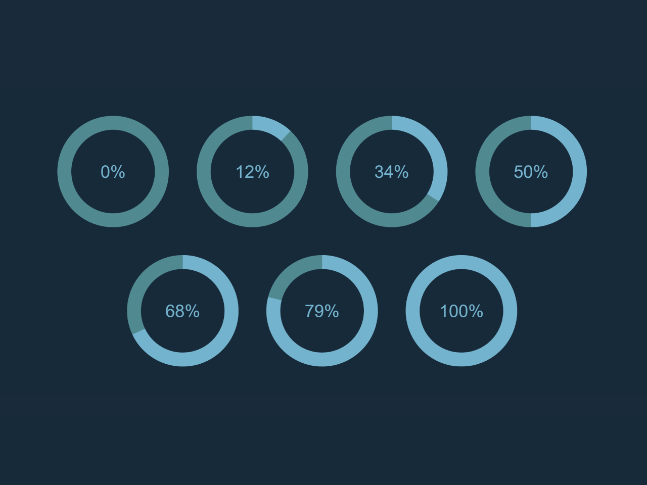

This Pure CSS Percentage Circle code creates circular progress indicators with different percentages. It uses CSS transformations to achieve this visual effect. You can use it to display progress or completion percentages in a visually appealing way.
Similarly, you can integrate this code into web applications, dashboards, or websites to visually represent progress, completion levels, or stats. It enhances user experience by providing a clear and engaging way to display data. The code is easy to integrate and customize to match your design preferences.
How to Create Pure CSS Percentage Circle
1. Begin by creating the HTML structure for your percentage circles. You can place them within a container div. Each circle will be represented by a div element with a unique class for the percentage it represents.
<div class="circle-container">

  <div class="circle percentage-0">
    <span>0%</span>
    <div class="percentage-bar"></div>
  </div>

  <div class="circle percentage-12">
    <span>12%</span>
    <div class="percentage-bar"></div>
  </div>

  <div class="circle percentage-34">
    <span>34%</span>
    <div class="percentage-bar"></div>
  </div>

  <div class="circle percentage-50">
    <span>50%</span>
    <div class="percentage-bar"></div>
  </div>

  <div class="circle percentage-68">
    <span>68%</span>
    <div class="percentage-bar"></div>
  </div>

  <div class="circle percentage-79">
    <span>79%</span>
    <div class="percentage-bar"></div>
  </div>

  <div class="circle percentage-100">
    <span>100%</span>
    <div class="percentage-bar"></div>
  </div>

</div>
2. Next, add the necessary CSS styles to create the percentage circles. The following CSS code contains styles for the circles, percentage text, and animations. Make sure to include this CSS code in your project.
* {
  margin: 0;
  padding: 0;
}

html, body {
  width: 100%;
  height: 100%;
}
.cd__main{
   background: #172A3A !important;
}

body {
  display: flex;
  align-items: center;
  background-color: #172A3A;
}

.circle-container {
  display: flex;
  justify-content: center;
  flex-flow: row wrap;
  width: 100%;
}
.circle-container .circle {
  margin: 20px;
}

/* configuration */
/* mixin */
/* placeholder */
.circle.percentage-100 .percentage-bar:after, .circle.percentage-99 .percentage-bar:after, .circle.percentage-98 .percentage-bar:after, .circle.percentage-97 .percentage-bar:after, .circle.percentage-96 .percentage-bar:after, .circle.percentage-95 .percentage-bar:after, .circle.percentage-94 .percentage-bar:after, .circle.percentage-93 .percentage-bar:after, .circle.percentage-92 .percentage-bar:after, .circle.percentage-91 .percentage-bar:after, .circle.percentage-90 .percentage-bar:after, .circle.percentage-89 .percentage-bar:after, .circle.percentage-88 .percentage-bar:after, .circle.percentage-87 .percentage-bar:after, .circle.percentage-86 .percentage-bar:after, .circle.percentage-85 .percentage-bar:after, .circle.percentage-84 .percentage-bar:after, .circle.percentage-83 .percentage-bar:after, .circle.percentage-82 .percentage-bar:after, .circle.percentage-81 .percentage-bar:after, .circle.percentage-80 .percentage-bar:after, .circle.percentage-79 .percentage-bar:after, .circle.percentage-78 .percentage-bar:after, .circle.percentage-77 .percentage-bar:after, .circle.percentage-76 .percentage-bar:after, .circle.percentage-75 .percentage-bar:after, .circle.percentage-74 .percentage-bar:after, .circle.percentage-73 .percentage-bar:after, .circle.percentage-72 .percentage-bar:after, .circle.percentage-71 .percentage-bar:after, .circle.percentage-70 .percentage-bar:after, .circle.percentage-69 .percentage-bar:after, .circle.percentage-68 .percentage-bar:after, .circle.percentage-67 .percentage-bar:after, .circle.percentage-66 .percentage-bar:after, .circle.percentage-65 .percentage-bar:after, .circle.percentage-64 .percentage-bar:after, .circle.percentage-63 .percentage-bar:after, .circle.percentage-62 .percentage-bar:after, .circle.percentage-61 .percentage-bar:after, .circle.percentage-60 .percentage-bar:after, .circle.percentage-59 .percentage-bar:after, .circle.percentage-58 .percentage-bar:after, .circle.percentage-57 .percentage-bar:after, .circle.percentage-56 .percentage-bar:after, .circle.percentage-55 .percentage-bar:after, .circle.percentage-54 .percentage-bar:after, .circle.percentage-53 .percentage-bar:after, .circle.percentage-52 .percentage-bar:after, .circle.percentage-51 .percentage-bar:after {
  position: absolute;
  content: "";
  -webkit-clip-path: inset(0 0 0 50%);
          clip-path: inset(0 0 0 50%);
  transform: rotate(0deg);
  width: 120px;
  height: 120px;
  border: 20px solid #74B3CE;
  background: transparent;
  border-radius: 100%;
  transition: width 0.2s ease-out, height 0.2s ease-out, border-width 0.2s ease-out;
}

.circle.percentage-100 .percentage-bar, .circle.percentage-99 .percentage-bar, .circle.percentage-98 .percentage-bar, .circle.percentage-97 .percentage-bar, .circle.percentage-96 .percentage-bar, .circle.percentage-95 .percentage-bar, .circle.percentage-94 .percentage-bar, .circle.percentage-93 .percentage-bar, .circle.percentage-92 .percentage-bar, .circle.percentage-91 .percentage-bar, .circle.percentage-90 .percentage-bar, .circle.percentage-89 .percentage-bar, .circle.percentage-88 .percentage-bar, .circle.percentage-87 .percentage-bar, .circle.percentage-86 .percentage-bar, .circle.percentage-85 .percentage-bar, .circle.percentage-84 .percentage-bar, .circle.percentage-83 .percentage-bar, .circle.percentage-82 .percentage-bar, .circle.percentage-81 .percentage-bar, .circle.percentage-80 .percentage-bar, .circle.percentage-79 .percentage-bar, .circle.percentage-78 .percentage-bar, .circle.percentage-77 .percentage-bar, .circle.percentage-76 .percentage-bar, .circle.percentage-75 .percentage-bar, .circle.percentage-74 .percentage-bar, .circle.percentage-73 .percentage-bar, .circle.percentage-72 .percentage-bar, .circle.percentage-71 .percentage-bar, .circle.percentage-70 .percentage-bar, .circle.percentage-69 .percentage-bar, .circle.percentage-68 .percentage-bar, .circle.percentage-67 .percentage-bar, .circle.percentage-66 .percentage-bar, .circle.percentage-65 .percentage-bar, .circle.percentage-64 .percentage-bar, .circle.percentage-63 .percentage-bar, .circle.percentage-62 .percentage-bar, .circle.percentage-61 .percentage-bar, .circle.percentage-60 .percentage-bar, .circle.percentage-59 .percentage-bar, .circle.percentage-58 .percentage-bar, .circle.percentage-57 .percentage-bar, .circle.percentage-56 .percentage-bar, .circle.percentage-55 .percentage-bar, .circle.percentage-54 .percentage-bar, .circle.percentage-53 .percentage-bar, .circle.percentage-52 .percentage-bar, .circle.percentage-51 .percentage-bar {
  -webkit-clip-path: none;
          clip-path: none;
}

/* percentage circle style */
.circle {
  width: 160px;
  height: 160px;
  cursor: default;
}
.circle span {
  position: absolute;
  display: block;
  vertical-align: middle;
  width: 160px;
  height: 160px;
  text-align: center;
  color: #74B3CE;
  line-height: 160px;
  font-size: 25px;
  font-family: Helvetica, Arial, Geneva, sans-serif;
  transition: font-size 0.2s ease-out;
}
.circle:before {
  position: absolute;
  content: "";
  background-color: transparent;
  width: 120px;
  height: 120px;
  border: 20px solid #508991;
  background: transparent;
  border-radius: 100%;
  transition: width 0.2s ease-out, height 0.2s ease-out, border-width 0.2s ease-out;
}
.circle .percentage-bar {
  width: 160px;
  height: 160px;
  position: absolute;
  -webkit-clip-path: inset(0 0 0 50%);
          clip-path: inset(0 0 0 50%);
}
.circle .percentage-bar:before {
  position: absolute;
  content: "";
  -webkit-clip-path: inset(0 50% 0 0);
          clip-path: inset(0 50% 0 0);
  transform: rotate(0deg);
  width: 120px;
  height: 120px;
  border: 20px solid #74B3CE;
  background: transparent;
  border-radius: 100%;
  transition: width 0.2s ease-out, height 0.2s ease-out, border-width 0.2s ease-out;
}
.circle:hover:before {
  width: 140px;
  height: 140px;
  border-width: 10px;
}
.circle:hover span {
  font-size: 45px;
}
.circle:hover .percentage-bar:before, .circle:hover .percentage-bar:after {
  width: 140px;
  height: 140px;
  border-width: 10px;
}
.circle.percentage-1 .percentage-bar:before {
  transform: rotate(3.6deg);
}
.circle.percentage-2 .percentage-bar:before {
  transform: rotate(7.2deg);
}
.circle.percentage-3 .percentage-bar:before {
  transform: rotate(10.8deg);
}
.circle.percentage-4 .percentage-bar:before {
  transform: rotate(14.4deg);
}
.circle.percentage-5 .percentage-bar:before {
  transform: rotate(18deg);
}
.circle.percentage-6 .percentage-bar:before {
  transform: rotate(21.6deg);
}
.circle.percentage-7 .percentage-bar:before {
  transform: rotate(25.2deg);
}
.circle.percentage-8 .percentage-bar:before {
  transform: rotate(28.8deg);
}
.circle.percentage-9 .percentage-bar:before {
  transform: rotate(32.4deg);
}
.circle.percentage-10 .percentage-bar:before {
  transform: rotate(36deg);
}
.circle.percentage-11 .percentage-bar:before {
  transform: rotate(39.6deg);
}
.circle.percentage-12 .percentage-bar:before {
  transform: rotate(43.2deg);
}
.circle.percentage-13 .percentage-bar:before {
  transform: rotate(46.8deg);
}
.circle.percentage-14 .percentage-bar:before {
  transform: rotate(50.4deg);
}
.circle.percentage-15 .percentage-bar:before {
  transform: rotate(54deg);
}
.circle.percentage-16 .percentage-bar:before {
  transform: rotate(57.6deg);
}
.circle.percentage-17 .percentage-bar:before {
  transform: rotate(61.2deg);
}
.circle.percentage-18 .percentage-bar:before {
  transform: rotate(64.8deg);
}
.circle.percentage-19 .percentage-bar:before {
  transform: rotate(68.4deg);
}
.circle.percentage-20 .percentage-bar:before {
  transform: rotate(72deg);
}
.circle.percentage-21 .percentage-bar:before {
  transform: rotate(75.6deg);
}
.circle.percentage-22 .percentage-bar:before {
  transform: rotate(79.2deg);
}
.circle.percentage-23 .percentage-bar:before {
  transform: rotate(82.8deg);
}
.circle.percentage-24 .percentage-bar:before {
  transform: rotate(86.4deg);
}
.circle.percentage-25 .percentage-bar:before {
  transform: rotate(90deg);
}
.circle.percentage-26 .percentage-bar:before {
  transform: rotate(93.6deg);
}
.circle.percentage-27 .percentage-bar:before {
  transform: rotate(97.2deg);
}
.circle.percentage-28 .percentage-bar:before {
  transform: rotate(100.8deg);
}
.circle.percentage-29 .percentage-bar:before {
  transform: rotate(104.4deg);
}
.circle.percentage-30 .percentage-bar:before {
  transform: rotate(108deg);
}
.circle.percentage-31 .percentage-bar:before {
  transform: rotate(111.6deg);
}
.circle.percentage-32 .percentage-bar:before {
  transform: rotate(115.2deg);
}
.circle.percentage-33 .percentage-bar:before {
  transform: rotate(118.8deg);
}
.circle.percentage-34 .percentage-bar:before {
  transform: rotate(122.4deg);
}
.circle.percentage-35 .percentage-bar:before {
  transform: rotate(126deg);
}
.circle.percentage-36 .percentage-bar:before {
  transform: rotate(129.6deg);
}
.circle.percentage-37 .percentage-bar:before {
  transform: rotate(133.2deg);
}
.circle.percentage-38 .percentage-bar:before {
  transform: rotate(136.8deg);
}
.circle.percentage-39 .percentage-bar:before {
  transform: rotate(140.4deg);
}
.circle.percentage-40 .percentage-bar:before {
  transform: rotate(144deg);
}
.circle.percentage-41 .percentage-bar:before {
  transform: rotate(147.6deg);
}
.circle.percentage-42 .percentage-bar:before {
  transform: rotate(151.2deg);
}
.circle.percentage-43 .percentage-bar:before {
  transform: rotate(154.8deg);
}
.circle.percentage-44 .percentage-bar:before {
  transform: rotate(158.4deg);
}
.circle.percentage-45 .percentage-bar:before {
  transform: rotate(162deg);
}
.circle.percentage-46 .percentage-bar:before {
  transform: rotate(165.6deg);
}
.circle.percentage-47 .percentage-bar:before {
  transform: rotate(169.2deg);
}
.circle.percentage-48 .percentage-bar:before {
  transform: rotate(172.8deg);
}
.circle.percentage-49 .percentage-bar:before {
  transform: rotate(176.4deg);
}
.circle.percentage-50 .percentage-bar:before {
  transform: rotate(180deg);
}
.circle.percentage-51 .percentage-bar:before {
  transform: rotate(183.6deg);
}
.circle.percentage-52 .percentage-bar:before {
  transform: rotate(187.2deg);
}
.circle.percentage-53 .percentage-bar:before {
  transform: rotate(190.8deg);
}
.circle.percentage-54 .percentage-bar:before {
  transform: rotate(194.4deg);
}
.circle.percentage-55 .percentage-bar:before {
  transform: rotate(198deg);
}
.circle.percentage-56 .percentage-bar:before {
  transform: rotate(201.6deg);
}
.circle.percentage-57 .percentage-bar:before {
  transform: rotate(205.2deg);
}
.circle.percentage-58 .percentage-bar:before {
  transform: rotate(208.8deg);
}
.circle.percentage-59 .percentage-bar:before {
  transform: rotate(212.4deg);
}
.circle.percentage-60 .percentage-bar:before {
  transform: rotate(216deg);
}
.circle.percentage-61 .percentage-bar:before {
  transform: rotate(219.6deg);
}
.circle.percentage-62 .percentage-bar:before {
  transform: rotate(223.2deg);
}
.circle.percentage-63 .percentage-bar:before {
  transform: rotate(226.8deg);
}
.circle.percentage-64 .percentage-bar:before {
  transform: rotate(230.4deg);
}
.circle.percentage-65 .percentage-bar:before {
  transform: rotate(234deg);
}
.circle.percentage-66 .percentage-bar:before {
  transform: rotate(237.6deg);
}
.circle.percentage-67 .percentage-bar:before {
  transform: rotate(241.2deg);
}
.circle.percentage-68 .percentage-bar:before {
  transform: rotate(244.8deg);
}
.circle.percentage-69 .percentage-bar:before {
  transform: rotate(248.4deg);
}
.circle.percentage-70 .percentage-bar:before {
  transform: rotate(252deg);
}
.circle.percentage-71 .percentage-bar:before {
  transform: rotate(255.6deg);
}
.circle.percentage-72 .percentage-bar:before {
  transform: rotate(259.2deg);
}
.circle.percentage-73 .percentage-bar:before {
  transform: rotate(262.8deg);
}
.circle.percentage-74 .percentage-bar:before {
  transform: rotate(266.4deg);
}
.circle.percentage-75 .percentage-bar:before {
  transform: rotate(270deg);
}
.circle.percentage-76 .percentage-bar:before {
  transform: rotate(273.6deg);
}
.circle.percentage-77 .percentage-bar:before {
  transform: rotate(277.2deg);
}
.circle.percentage-78 .percentage-bar:before {
  transform: rotate(280.8deg);
}
.circle.percentage-79 .percentage-bar:before {
  transform: rotate(284.4deg);
}
.circle.percentage-80 .percentage-bar:before {
  transform: rotate(288deg);
}
.circle.percentage-81 .percentage-bar:before {
  transform: rotate(291.6deg);
}
.circle.percentage-82 .percentage-bar:before {
  transform: rotate(295.2deg);
}
.circle.percentage-83 .percentage-bar:before {
  transform: rotate(298.8deg);
}
.circle.percentage-84 .percentage-bar:before {
  transform: rotate(302.4deg);
}
.circle.percentage-85 .percentage-bar:before {
  transform: rotate(306deg);
}
.circle.percentage-86 .percentage-bar:before {
  transform: rotate(309.6deg);
}
.circle.percentage-87 .percentage-bar:before {
  transform: rotate(313.2deg);
}
.circle.percentage-88 .percentage-bar:before {
  transform: rotate(316.8deg);
}
.circle.percentage-89 .percentage-bar:before {
  transform: rotate(320.4deg);
}
.circle.percentage-90 .percentage-bar:before {
  transform: rotate(324deg);
}
.circle.percentage-91 .percentage-bar:before {
  transform: rotate(327.6deg);
}
.circle.percentage-92 .percentage-bar:before {
  transform: rotate(331.2deg);
}
.circle.percentage-93 .percentage-bar:before {
  transform: rotate(334.8deg);
}
.circle.percentage-94 .percentage-bar:before {
  transform: rotate(338.4deg);
}
.circle.percentage-95 .percentage-bar:before {
  transform: rotate(342deg);
}
.circle.percentage-96 .percentage-bar:before {
  transform: rotate(345.6deg);
}
.circle.percentage-97 .percentage-bar:before {
  transform: rotate(349.2deg);
}
.circle.percentage-98 .percentage-bar:before {
  transform: rotate(352.8deg);
}
.circle.percentage-99 .percentage-bar:before {
  transform: rotate(356.4deg);
}
.circle.percentage-100 .percentage-bar:before {
  transform: rotate(360deg);
}
You can customize the appearance of the circles by adjusting the CSS properties like colors, sizes, and fonts. Feel free to modify these styles to match your project’s design.
That’s all! hopefully, you have successfully created percentage circle using pure CSS. If you have any questions or suggestions, feel free to comment below.
Similar Code Snippets:
 9+ Simple Speech Bubble in CSS
- Full Screen Video Background with Text Overlay
- CSS Glass Effect For div Element
- Animated Gradient Text Using HTML CSS
- FAQ Page Design in HTML with Source Code
- Pure CSS Candle Flame Animation
- Wrap Text Around Centered Image CSS


I code and create web elements for amazing people around the world. I like work with new people. New people new Experiences.
I truly enjoy what I’m doing, which makes me more passionate about web development and coding. I am always ready to do challenging tasks whether it is about creating a custom CMS from scratch or customizing an existing system.