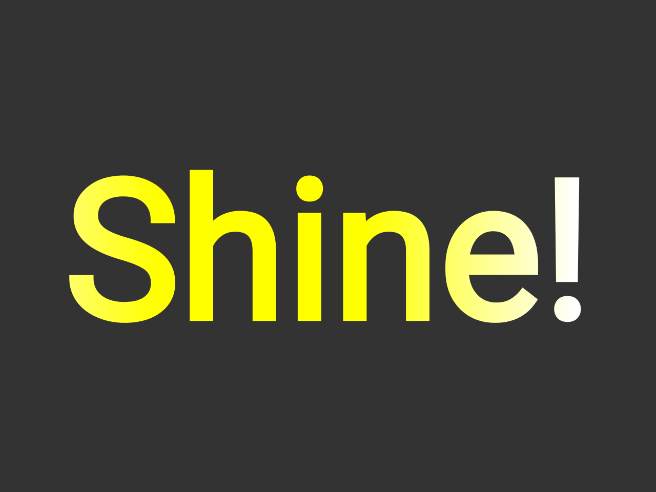

This code creates an Animated Gradient Text using HTML and CSS. It applies a shining effect to text elements. The “shine” animation continuously moves a gradient background across the text. This code is helpful for adding eye-catching text effects to your website.
You can use this code on your website’s headings or banners to grab users’ attention. It enhances visual appeal and engagement by adding dynamic gradient effects to text. This draws focus to important messages and makes your website more captivating.
How to Create Animated Gradient Text Using HTML CSS
1. First of all, load the Normalize CSS by adding the following CDN link into the head tag of your HTML document.
<link rel="stylesheet" href="https://cdnjs.cloudflare.com/ajax/libs/normalize/5.0.0/normalize.min.css">
2. After that, create the HTML structure for your text element. In this example, we’ll use an <h1> tag with a class of “linear-wipe.” You can replace this with any text element you want to animate.
<h1 class="linear-wipe">Shine!</h1>
3. Now, let’s define the CSS styles that will make the magic happen. First, ensure your HTML and body elements have the appropriate styles for positioning and background color.
The core of this effect lies in the “linear-wipe” class. It uses a linear gradient background and applies the gradient as a text fill. The animation is done using keyframes.
html {
  height: 100%;
}

body {
  background: #333;
  text-align: center;
  min-height: 100%;
  display: flex;
  justify-content: center;
  align-items: center;
}

.linear-wipe {
  text-align: center;
  background: linear-gradient(to right, #FFF 20%, #FF0 40%, #FF0 60%, #FFF 80%);
  background-size: 200% auto;
  color: #000;
  background-clip: text;
  text-fill-color: transparent;
  -webkit-background-clip: text;
  -webkit-text-fill-color: transparent;
  -webkit-animation: shine 1s linear infinite;
          animation: shine 1s linear infinite;
font-size: 20vw;
}
@-webkit-keyframes shine {
  to {
    background-position: 200% center;
  }
}
@keyframes shine {
  to {
    background-position: 200% center;
  }
}
Feel free to customize the gradient colors and animation duration by adjusting the CSS properties within the “.linear-wipe” class. Once you’re satisfied with the look, simply copy and paste the HTML and CSS code into your website’s files.
That’s all! hopefully, you have successfully created an Animated Gradient Text Using HTML CSS. If you have any questions or suggestions, feel free to comment below.
Similar Code Snippets:

- HTML Code for Resume with Picture
- Social Icons with Circular Profile Pic in CSS


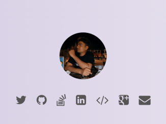
I code and create web elements for amazing people around the world. I like work with new people. New people new Experiences.
I truly enjoy what I’m doing, which makes me more passionate about web development and coding. I am always ready to do challenging tasks whether it is about creating a custom CMS from scratch or customizing an existing system.