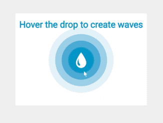
This code snippet helps you to create circle wave animation using CSS keyframes. You can integrate these waves to any circular element and show waves animation on hover events. Basically, this CSS code provides a basic concept of creating wave animation around a circle. Anyhow, you can further customize it to get the desired output.
How to Create CSS Circle Animation
1. First of all, create the div element with a class name "container". Place 4 div elements inside it with the class name "circle" and "delay1" to "delay4" for waves. You can create these divs inside your existing circular element on which you want to apply these waves animation.
<div class="container">
    <div class="circle delay1"></div>
    <div class="circle delay2"></div>
    <div class="circle delay3"></div>
    <div class="circle delay4"></div>
</div>
2. After that, create basic CSS styles for the container and circle as follows:
.container {
  position: relative;
  display: block;
  width: 80px;
  margin: 60px auto;
}
.container:hover .delay1 {
  -webkit-animation: waves 2.5s linear;
          animation: waves 2.5s linear;
  -webkit-animation-delay: 0.1s;
          animation-delay: 0.1s;
}
.container:hover .delay2 {
  -webkit-animation: waves 2.5s linear 0.7s forwards;
          animation: waves 2.5s linear 0.7s forwards;
}
.container:hover .delay3 {
  -webkit-animation: waves 2.5s linear 1.3s forwards;
          animation: waves 2.5s linear 1.3s forwards;
}
.container:hover .delay4 {
  -webkit-animation: waves 2.5s linear 1.9s forwards;
          animation: waves 2.5s linear 1.9s forwards;
}

.svg-box {
  position: relative;
  z-index: 10;
}

.svg-box:hover {
  -webkit-animation: bloop 1s linear;
          animation: bloop 1s linear;
}

.circle {
  display: block;
  height: 60px;
  width: 60px;
  border-radius: 50%;
  background: #0194c7;
  margin: 10px;
  transition: 5s ease;
  position: absolute;
  top: 0px;
}
3. Finally, define the CSS animation keyframes for waves and done.
@-webkit-keyframes waves {
  0% {
    transform: scale(1);
    opacity: 1;
  }
  100% {
    transform: scale(4);
    opacity: 0;
  }
}
@-webkit-keyframes bloop {
  0% {
    transform: scale3d(1, 1, 1);
  }
  30% {
    transform: scale3d(1.25, 0.75, 1);
  }
  40% {
    transform: scale3d(0.75, 1.25, 1);
  }
  50% {
    transform: scale3d(1.15, 0.85, 1);
  }
  65% {
    transform: scale3d(0.95, 1.05, 1);
  }
  75% {
    transform: scale3d(1.05, 0.95, 1);
  }
  100% {
    transform: scale3d(1, 1, 1);
  }
}
@keyframes bloop {
  0% {
    transform: scale3d(1, 1, 1);
  }
  30% {
    transform: scale3d(1.25, 0.75, 1);
  }
  40% {
    transform: scale3d(0.75, 1.25, 1);
  }
  50% {
    transform: scale3d(1.15, 0.85, 1);
  }
  65% {
    transform: scale3d(0.95, 1.05, 1);
  }
  75% {
    transform: scale3d(1.05, 0.95, 1);
  }
  100% {
    transform: scale3d(1, 1, 1);
  }
}
That’s all! hopefully, you have successfully integrated this circular waves animation into your project. If you have any questions or suggestions, let me know by comment below.
Similar Code Snippets:

I code and create web elements for amazing people around the world. I like work with new people. New people new Experiences.
I truly enjoy what I’m doing, which makes me more passionate about web development and coding. I am always ready to do challenging tasks whether it is about creating a custom CMS from scratch or customizing an existing system.

