
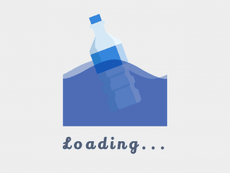
This simple CSS code snippet helps you to create a floating Bottle on Water animation. It uses a bottle image and CSS wave animation to float the bottle on water with up and down transitions.
How to Create a Floating Bottle on Water Animation in CSS
1. Create the HTML structure for the image container as follows:
<div class="imgContainer"><img class="wave" src="https://i.pinimg.com/originals/64/91/54/6491542a239217a7d44bfba368cd06c8.png" alt=""/><img class="bottle" src="https://i.pinimg.com/originals/67/19/71/6719713708a3a22081b18e9a520c85e8.png" alt=""/><img class="wave delay" src="https://i.pinimg.com/originals/64/91/54/6491542a239217a7d44bfba368cd06c8.png" alt=""/><img class="wave delay" src="https://i.pinimg.com/originals/64/91/54/6491542a239217a7d44bfba368cd06c8.png" alt=""/></div>
<h1>Loading...</h1>
2. Add the following CSS styles for the bottle animation.
@import url("https://fonts.googleapis.com/css?family=Lily+Script+One&display=swap");
html, body {
  padding: 0;
  margin: 0;
}

body {
  display: flex;
  justify-content: center;
  align-items: center;
  flex-direction: column;
  width: 100%;
  height: 100vh;
  background-color: #ddd;
}

h1 {
  font-size: 2em;
  font-family: "Lily Script One";
  color: #505e77;
  letter-spacing: 7px;
}

.imgContainer {
  position: relative;
  width: 200px;
  height: 220px;
  overflow: hidden;
  margin: 10px auto;
}
.imgContainer img.bottle {
  width: 50%;
  position: absolute;
  left: 50%;
  transform: translate(-50%, 0);
  bottom: 18px;
  -webkit-animation: floating 1.75s ease-in-out infinite alternate;
          animation: floating 1.75s ease-in-out infinite alternate;
}
.imgContainer img.wave {
  -webkit-animation: wave 2.3s linear infinite;
          animation: wave 2.3s linear infinite;
  -webkit-animation-delay: -0.2s;
          animation-delay: -0.2s;
  position: absolute;
  bottom: 0;
  width: 200%;
}
.imgContainer img.wave.delay {
  -webkit-animation-duration: 3.5s;
          animation-duration: 3.5s;
}

@-webkit-keyframes wave {
  0% {
    transform: translateX(0%);
  }
  100% {
    transform: translateX(-50%);
  }
}

@keyframes wave {
  0% {
    transform: translateX(0%);
  }
  100% {
    transform: translateX(-50%);
  }
}
@-webkit-keyframes floating {
  from {
    transform: translate(-50%, 10px);
  }
  to {
    transform: translate(-50%, -10px);
  }
}
@keyframes floating {
  from {
    transform: translate(-50%, 10px);
  }
  to {
    transform: translate(-50%, -10px);
  }
}
That’s all! hopefully, you have successfully created a floating bottle on water animation using CSS. If you have any questions or suggestions, feel free to comment below.
Similar Code Snippets:

I code and create web elements for amazing people around the world. I like work with new people. New people new Experiences.
I truly enjoy what I’m doing, which makes me more passionate about web development and coding. I am always ready to do challenging tasks whether it is about creating a custom CMS from scratch or customizing an existing system.


how to add this css code and html code in spring mvc ,using eclipse ide
Hi Vignesh!
Simply copy the CSS code, open your jsp file and paste it between the <style>and </style> tag. Similarly, copy the HTML code and paste it where you want to display this animated loader.