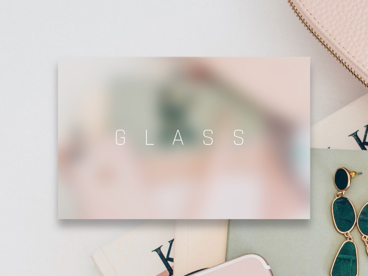

This code creates a “CSS Glass Effect” for a div element. It applies a blurred glass overlay with a drop shadow to an image background, giving it a stylish appearance. This effect is helpful for enhancing the visual appeal of your website or application’s elements.
You can use this code to add an attractive glass effect to elements on your website, such as headers or sections, enhancing their aesthetics. This effect helps create a modern and visually appealing design, making your content more engaging to visitors. It’s easy to implement and can elevate the overall look and feel of your web pages.
How to Create CSS Glass Effect For Div Element
1. Copy and paste the following HTML code into your web page where you want to apply the glass effect:
<div class="drop-shadow">
<div class="glass"></div>
  <span>GLASS</span>
  </div>
This code creates a container with a glass effect that you can customize and place your content within.
2. Next, you need to include the CSS styles. Make sure to include the following CSS code in your stylesheet or within a <style> tag in the HTML document:
@import url("https://fonts.googleapis.com/css?family=Rajdhani:300&display=swap");
body, html {
  height: 100%;
  margin: 0;
  padding: 0;
}

body{
  display: flex;
  justify-content: center;
  align-items: center;
  background-image: url("your-background-image-url.jpg");
  background-size: cover;
  background-position: center;
  font-family: "Rajdhani", sans-serif;
   min-height: 720px;
}

*, *:before, *:after {
  box-sizing: border-box;
}

.glass {
  height: 100%;
  width: 100%;
  background-image: url("your-background-image-url.jpg");
  background-size: cover;
  background-position: center;
  -webkit-clip-path: inset(10em);
          clip-path: inset(10em);
  filter: blur(20px);
  display: flex;
  justify-content: center;
  align-items: center;
  text-align: center;
}

.drop-shadow {
  height: 100%;
  width: 100%;
  filter: drop-shadow(0px 20px 10px rgba(0, 0, 0, 0.3));
  display: flex;
  justify-content: center;
  align-items: center;
}
.drop-shadow:before {
  display: block;
  content: "";
  position: absolute;
  top: 10em;
  height: calc(100% - 20em);
  width: calc(100% - 20em);
  border-top: 2px solid rgba(225, 225, 225, 0.2);
  border-left: 1px solid rgba(225, 225, 225, 0.1);
  border-right: 1px solid rgba(225, 225, 225, 0.3);
  z-index: 2;
}
.drop-shadow > span {
  position: absolute;
  z-index: 5;
  color: white;
  font-size: 4em;
  letter-spacing: 0.75em;
  padding-left: 0.375em;
}

@media (max-width: 980px) {
  .glass {
    -webkit-clip-path: inset(5em);
            clip-path: inset(5em);
  }

  .drop-shadow:before {
    top: 5em;
    width: calc(100% - 10em);
  }
  .drop-shadow > span {
    font-size: 4em;
  }
}
@media (max-width: 640px) {
  .drop-shadow > span {
    font-size: 2em;
  }
}
Replace "your-background-image-url.jpg" with the URL of the background image you want to use. You can also customize other CSS properties like colors and fonts as needed.
That’s all! hopefully, you have successfully created the CSS Glass Effect. If you have any questions or suggestions, feel free to comment below۔
Similar Code Snippets:
 CSS Squishy Button With Smooth Transition
- Pricing Table with CSS Switch Toggle
- 404 Error Page Template in HTML CSS
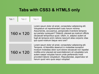
- Tabs with CSS3 & HTML5 Only
- Circular Scroll Indicator Using Pure CSS
- Animating Grid-column on Hover Using CSS
- FAQ Page Design in HTML with Source Code
- HTML5 Canvas Examples with Source Code

I code and create web elements for amazing people around the world. I like work with new people. New people new Experiences.
I truly enjoy what I’m doing, which makes me more passionate about web development and coding. I am always ready to do challenging tasks whether it is about creating a custom CMS from scratch or customizing an existing system.