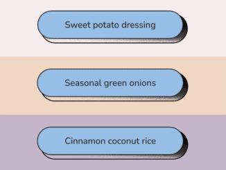
This HTML & CSS code snippet helps you to create grainy buttons design on your website. It styles buttons with hover effects. The “button” class is used for styling buttons. It helps in creating visually appealing buttons with CSS.
You can use this code on your website’s navigation menu or for call-to-action buttons. It enhances user experience by adding visually engaging hover effects. It provides a modern and stylish design to your website’s buttons.
How to Create Grainy Buttons Design Using CSS
1. First of all, load the Reset CSS and Google Fonts by adding the following CDN link into the head tag of your HTML document.
<link rel="stylesheet" href="https://cdnjs.cloudflare.com/ajax/libs/meyer-reset/2.0/reset.min.css"> <link rel='stylesheet' href='https://fonts.googleapis.com/css2?family=Nunito:wght@500&display=swap'>
2. Set up the HTML structure for your buttons. Use unordered lists (ul) and list items (li) to organize your buttons. Each button will be represented by an anchor (a) tag nested within a list item.
<ul class="list">
	<li class="list__item">
		<a href="#" class="button">
			<span>
				Sweet potato dressing
			</span>
		</a>
	</li>
	<li class="list__item">
		<a href="#" class="button">
			<span>
				Seasonal green onions
			</span>
		</a>
	</li>
	<li class="list__item">
		<a href="#" class="button">
			<span>
				Cinnamon coconut rice
			</span>
		</a>
	</li>
</ul>
3. Now, let’s dive into CSS to style our buttons. We’ll target the list items and anchor tags to apply the desired visual effects. Utilize properties like background-color, padding, border-radius, and positioning to create the button design.
html, body {
  height: 100%;
}

*, *::after {
  box-sizing: border-box;
}

body{
  font: 500 100%/1 "Nunito", sans-serif;
  background-color: #272420;
}

.list__item {
  color: #272420;
  height: auto;
  min-height: 33vh;
  padding: 40px 60px;
  display: grid;
  place-items: center;
  position: relative;
  background-color: #F3EDED;
}
.list__item:hover {
  background-position: 0% 100%;
}
.list__item:nth-child(2) {
  background-color: #F0D7C2;
}
.list__item:nth-child(3) {
  background-color: #C5B5CA;
}

.button {
  background-color: inherit;
  font-size: 1.2rem;
  line-height: 1;
  color: currentColor;
  text-decoration: none;
  display: block;
  position: relative;
  text-align: center;
}
.button span {
  background-color: #97BEE6;
  display: inherit;
  padding: 1em 3em;
  border: 2px solid currentColor;
  border-radius: 2em;
  position: relative;
  z-index: 1;
  transform: translate(-0.4rem, -0.4rem);
  transition: 0.2s ease-in-out;
}
.button::after {
  content: "";
  display: block;
  width: 100%;
  height: 100%;
  border-radius: 2em;
  position: absolute;
  top: 0;
  left: 0;
  border: 2px solid currentColor;
  background-color: inherit;
  pointer-events: none;
  mix-blend-mode: darken;
  filter: contrast(1200%) brightness(100%) saturate(0.25);
  overflow: hidden;
  background: linear-gradient(182deg, currentColor, currentColor 25%, rgba(0, 0, 0, 0) 100%), url("data:image/svg+xml,%3Csvg viewBox='0 0 400 75' xmlns='http://www.w3.org/2000/svg'%3E%3Cfilter id='noiseFilter'%3E%3CfeTurbulence type='fractalNoise' baseFrequency='7' numOctaves='3' stitchTiles='stitch'/%3E%3C/filter%3E%3Crect width='100%25' height='100%25' filter='url(%23noiseFilter)'/%3E%3C/svg%3E");
}
.button:hover span {
  transform: translate(0px, 0px);
  transition: 0.2s ease-in-out;
}
That’s all! hopefully, you have successfully created Grainy Buttons Design Using CSS. If you have any questions or suggestions, feel free to comment below.
Similar Code Snippets:

I code and create web elements for amazing people around the world. I like work with new people. New people new Experiences.
I truly enjoy what I’m doing, which makes me more passionate about web development and coding. I am always ready to do challenging tasks whether it is about creating a custom CMS from scratch or customizing an existing system.

