
This code creates CSS tabs using the details tag. It manages tab opening and closing interactions. It prevents accidental tab closures. Moreover, it enhances user experience for tab navigation.
You can use this code on websites needing tabbed content. It enhances user navigation experience. It’s flexible and easily customizable for various design needs.
How to Create CSS Tabs Based On The Details Tag
1. First of all, load the Google Fonts by adding the following CDN links into the head tag of your HTML document.
<link rel="preconnect" href="https://fonts.googleapis.com">
<link rel="preconnect" href="https://fonts.gstatic.com" crossorigin>
<link href="https://fonts.googleapis.com/css2?family=Libre+Franklin:ital,wght@0,100;0,200;0,300;0,400;0,500;0,600;0,700;0,800;0,900;1,100;1,200;1,300;1,400;1,500;1,600;1,700;1,800;1,900&display=swap" rel="stylesheet">
2. Create your HTML code. Each tab will be represented by a <details> element containing a <summary> and <div> for the tab content. Here’s a basic example:
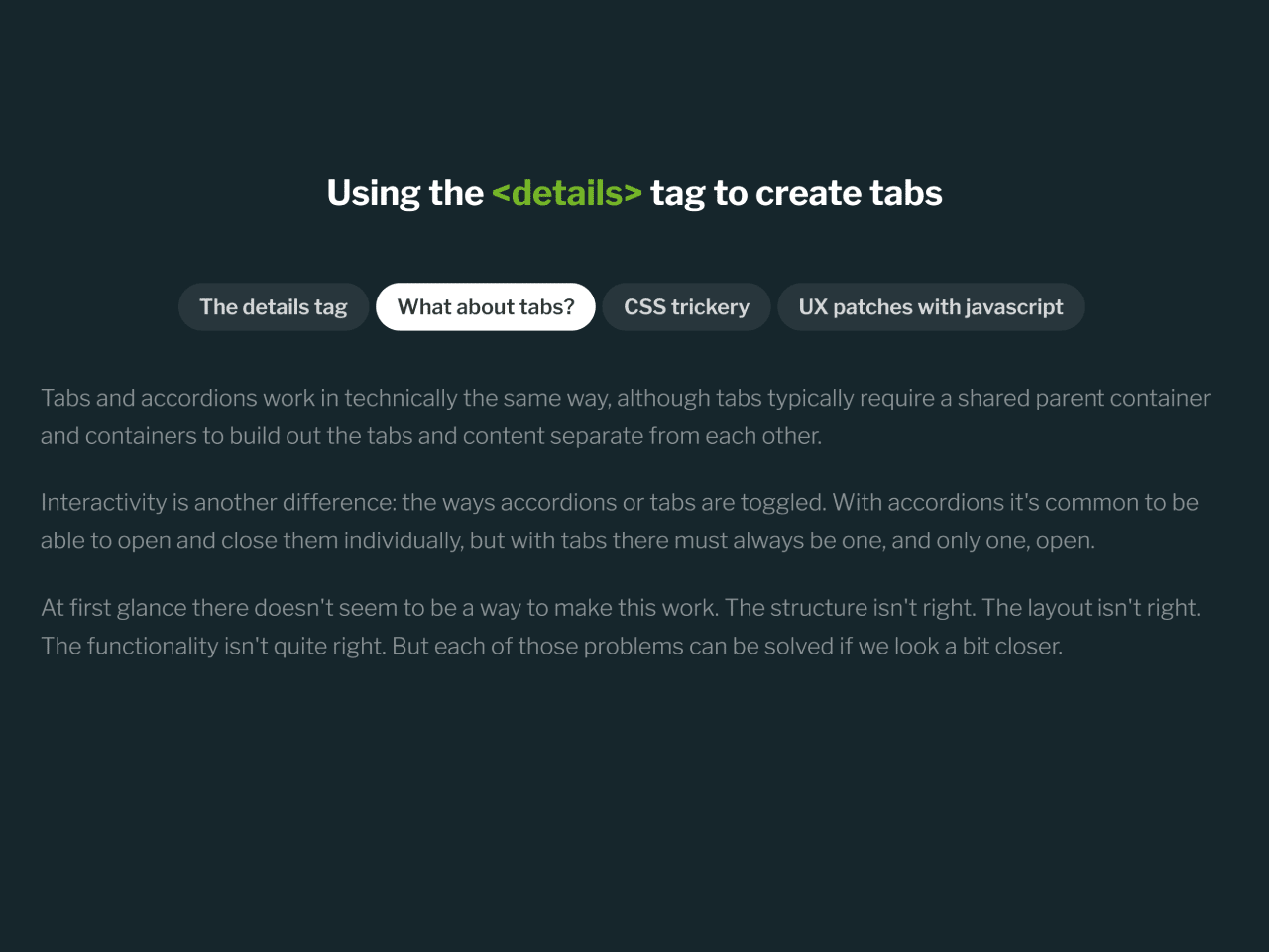
<h1>Using the <span><details></span> tag to create tabs</h1> <div class="details-tabs"> <details class="details-item" open> <!-- default first "tab" to open --> <summary class="details-tab">The details tag</summary> <div class="details-content"> <p>Imagine an <strong>accordion-like element</strong> with <strong>native keyboard support</strong> that doesn't require javascript for control.</p> <p>Enter the details tag.</p> <details> <summary>The details tag</summary> <p>This is a details tag with content</p> </details> <p>The details tag gives us a simple accordion with no scripts—that's great! But it feels like it could be something more...imagine if it could do tabs.</p> </div> </details> <details class="details-item"> <summary class="details-tab">What about tabs?</summary> <div class="details-content"> <p>Tabs and accordions work in technically the same way, although tabs typically require a shared parent container and containers to build out the tabs and content separate from each other.</p> <p>Interactivity is another difference: the ways accordions or tabs are toggled. With accordions it's common to be able to open and close them individually, but with tabs there must always be one, and only one, open.</p> <p>At first glance there doesn't seem to be a way to make this work. The structure isn't right. The layout isn't right. The functionality isn't quite right. But each of those problems can be solved if we look a bit closer.</p> </div> </details> <details class="details-item"> <summary class="details-tab">CSS trickery</summary> <div class="details-content"> <p>With a little help from the <strong>display: contents;</strong> property, we can transform a group of discrete details tags with tab and content area elements as children, into a group of the tab and content area elements from all the details elements mixed together.</p> <p>Say you had 3 small buckets of red and blue balls. The buckets can interact with each other or bang together, but the balls inside each bucket can't interact with the balls from the other buckets.</p> <p>You could think of what we are doing like pouring all of the small buckets into a larger bucket. Now all of the balls can interact with each other and we can organize them by color in the bigger bucket. With display: contents; it's as if the details tag isn't there at all—at least visually.</p> <p>Now that all the tab and content area elements can interact with each other in the flow of the page, we can use <strong>display: flex;</strong> and <strong>order</strong> to make the tabs flow nicely but also be separate from the content area.</p> <p>And that's what you see here! Open up the inspector and have a look.</p> </div> </details> <details class="details-item"> <summary class="details-tab">UX patches with javascript</summary> <div class="details-content"> <p>So you might have thought we could get by without any JS, but we need it a little. Luckily it's the type of script that you can write once and reuse without reconfiguration.</p> <p>The default functionality of the details tab means that it can be toggled open or closed. That's not what we want for tabs. Each details tag must be manually closed and then another opened. We want a tab to stay open and then close when another is picked.</p> <p>By watching for attribute changes and blocking keyboard and mouse input from toggling a details tab when a tab is open, we can emulate the expected tab behavior.</p> <p>Then it's just a matter of toggling the sibling details tags when another is selected.</p> </div> </details> </div>
3. Apply styles to your tabs to achieve the desired appearance. You can customize the colors, fonts, padding, and other properties to match your website’s design. Here’s a sample CSS code snippet:
body{
  font-family: "Libre Franklin", Arial, sans-serif;
  max-width: 50rem;
  margin: 4rem auto;
  background: #16262c !important;
  color: #ddd;
  padding: max(calc(50vh - 22rem), 1rem) 1rem 1rem;
  font-size: 18px;
}

h1 {
  margin-bottom: 2em;
  text-align: center;
  color: #fff;
}
h1 span {
  color: #77b728;
}

p {
  color: #ffffff7f;
  font-size: 1.2rem;
  line-height: 1.66;
  font-weight: 300;
  margin: 1rem 0 1.5rem;
}
p strong {
  color: #ddd;
  font-weight: 700;
}

.details-tab {
  padding: 0.5rem 1rem;
  font-size: 1.1rem;
  color: #ffffffcc;
  font-weight: 600;
  display: block;
  order: 0;
  background: #ffffff13;
  border-radius: 1.5rem;
  margin-right: 0.35rem;
  margin-bottom: 0.5rem;
  cursor: pointer;
  border: 2px solid transparent;
}
.details-tab:hover, .details-tab:focus {
  border-color: #fff;
}
.details-tab::-webkit-details-marker {
  display: none;
}

.details-tabs {
  position: relative;
  justify-content: center;
  display: flex;
  flex-wrap: wrap;
}

.details-content {
  order: 1;
  padding: 1rem;
  width: 100%;
}
.details-content details {
  margin: 1.5rem;
}
.details-content details summary {
  font-weight: 600;
}

.details-item {
  display: contents;
}
.details-item[open] > .details-tab {
  background: #fff;
  color: #333;
}
4. Now, load the jQuery by adding the following CDN link just before closing the body tag:
<script src='https://cdnjs.cloudflare.com/ajax/libs/jquery/3.7.1/jquery.min.js'></script>
5. Finally, add the following JavaScript code to your project. It manages tab interactions, prevents accidental closures, and enhances keyboard accessibility. Include the script at the end of your HTML document or in an external JavaScript file.
// $(selector).attrchange(): a call back function for when an attribute changes
//
// can return attribute changes for selector
(function($) {
  var MutationObserver = window.MutationObserver || window.WebKitMutationObserver || window.MozMutationObserver;

  $.fn.attrchange = function(callback) {
    if (MutationObserver) {
      var options = {
        subtree: false,
        attributes: true
      };

      var observer = new MutationObserver(function(mutations) {
        mutations.forEach(function(e) {
          callback.call(e.target, e.attributeName);
        });
      });

      return this.each(function() {
        observer.observe(this, options);
      });

    }
  }
})(jQuery);

// when one details opens, close the others
$('.details-item').attrchange(function(attribute){
  if(attribute == "open" && $(this).attr("open")) {
    $(this).siblings(".details-item").removeAttr("open");
  }
});

// keyboard: prevent closing the open details to emulate tabs
$('.details-tab').on("keydown", function(e) {
  if(e.keyCode == 32 || e.keyCode == 13) {
    if($(this).parent().attr("open")) {
      e.preventDefault();
    }
  }
});

// mouse: prevent closing the open details to emulate tabs
$('.details-tab').on("click", function(e) {
  if($(this).parent().attr("open")) {
    e.preventDefault();
  }
});
That’s all! hopefully, you have successfully created CSS tabs Based On The Details Tag. If you have any questions or suggestions, feel free to comment below.
Similar Code Snippets:
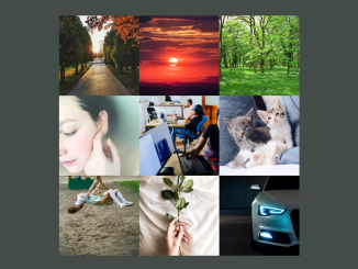 3x3 Image Grid In HTML and CSS
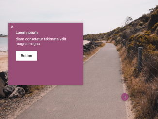 Responsive Image Hotspots Code with Demo
 Animating Grid-column on Hover Using CSS
 Confetti Animation in CSS on Button Click
 Curved Ribbon with Hover Effect Using CSS
 Simple HTML CSS Vertical Timeline
 Emoji Animation on Scroll Using CSS


I code and create web elements for amazing people around the world. I like work with new people. New people new Experiences.
I truly enjoy what I’m doing, which makes me more passionate about web development and coding. I am always ready to do challenging tasks whether it is about creating a custom CMS from scratch or customizing an existing system.