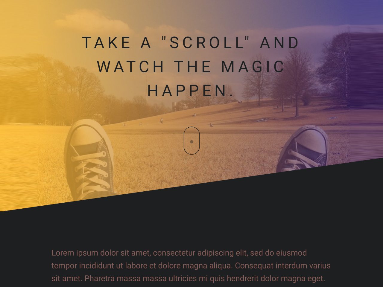

This HTML and CSS code snippet helps you to create a dynamic header with a background image and a skew effect on the scroll. It changes the skew of a diagonal polygon in response to your scrolling on the web page.
This code is helpful for enhancing the visual appeal of your website’s header, creating an engaging user experience.
How to Create Skew Header with Background Image in HTML and CSS
1. First of all, load the Normalize CSS by adding the following CDN link into the head tag of your HTML document.
<link rel="stylesheet" href="https://cdnjs.cloudflare.com/ajax/libs/normalize/5.0.0/normalize.min.css">
2. Create the HTML structure for your webpage. Include a section for the hero header and some content. Here’s a basic structure:
<!-- Hero Section -->
<section class="hero" id="hero">
  <!-- Gradient Background -->
  <div class="hero-grad"></div>
  <!-- /Gradient Background -->

  <!-- The SVG Diagonal Polygon (The important stuff) -->
  <svg class="hero-diagonal" xmlns="http://www.w3.org/2000/svg" viewBox="0 0 100 100" preserveAspectRatio="none">
    <polygon points="0,100 100,0 100,100"></polygon>
  </svg>
  <!-- /The SVG Diagonal Polygon -->

  <!-- Demo Heading -->
  <main class="hero-content">
    <h1 class="heading">
      Take a "scroll" and watch the magic happen.
    </h1>
    <div class='hero-scroll'><div/>
  </main>
  <!-- /Demo Heading -->
</section>
<!-- /Hero Section -->

<!-- Demo Content -->
<article class="content">
  <p>Lorem ipsum dolor sit amet, consectetur adipiscing elit, sed do eiusmod tempor incididunt ut labore et dolore magna aliqua. Consequat interdum varius sit amet. Pharetra massa massa ultricies mi quis hendrerit dolor magna eget. Sagittis aliquam malesuada bibendum arcu. Lorem ipsum dolor sit amet consectetur. Suspendisse ultrices gravida dictum fusce ut placerat orci nulla. Adipiscing bibendum est ultricies integer quis auctor. Scelerisque felis imperdiet proin fermentum leo vel. Morbi tincidunt augue interdum velit euismod in. Odio pellentesque diam volutpat commodo sed. Leo integer malesuada nunc vel risus. Ultricies lacus sed turpis tincidunt id aliquet risus feugiat. Amet nisl purus in mollis nunc sed. Aliquam nulla facilisi cras fermentum. Condimentum id venenatis a condimentum vitae sapien pellentesque habitant morbi. Feugiat in fermentum posuere urna nec.</p>
  <p>Lorem ipsum dolor sit amet, consectetur adipiscing elit, sed do eiusmod tempor incididunt ut labore et dolore magna aliqua. Consequat interdum varius sit amet. Pharetra massa massa ultricies mi quis hendrerit dolor magna eget. Sagittis aliquam malesuada bibendum arcu. Lorem ipsum dolor sit amet consectetur. Suspendisse ultrices gravida dictum fusce ut placerat orci nulla. Adipiscing bibendum est ultricies integer quis auctor. Scelerisque felis imperdiet proin fermentum leo vel. Morbi tincidunt augue interdum velit euismod in. Odio pellentesque diam volutpat commodo sed. Leo integer malesuada nunc vel risus. Ultricies lacus sed turpis tincidunt id aliquet risus feugiat. Amet nisl purus in mollis nunc sed. Aliquam nulla facilisi cras fermentum. Condimentum id venenatis a condimentum vitae sapien pellentesque habitant morbi. Feugiat in fermentum posuere urna nec.</p>
  <p>Lorem ipsum dolor sit amet, consectetur adipiscing elit, sed do eiusmod tempor incididunt ut labore et dolore magna aliqua. Consequat interdum varius sit amet. Pharetra massa massa ultricies mi quis hendrerit dolor magna eget. Sagittis aliquam malesuada bibendum arcu. Lorem ipsum dolor sit amet consectetur. Suspendisse ultrices gravida dictum fusce ut placerat orci nulla. Adipiscing bibendum est ultricies integer quis auctor. Scelerisque felis imperdiet proin fermentum leo vel. Morbi tincidunt augue interdum velit euismod in. Odio pellentesque diam volutpat commodo sed. Leo integer malesuada nunc vel risus. Ultricies lacus sed turpis tincidunt id aliquet risus feugiat. Amet nisl purus in mollis nunc sed. Aliquam nulla facilisi cras fermentum. Condimentum id venenatis a condimentum vitae sapien pellentesque habitant morbi. Feugiat in fermentum posuere urna nec.</p>
</article>
<!-- /Demo Content -->
3. Create a CSS file (styles.css) and style the hero section and the header elements. Here’s an example of CSS styles to get you started:
body {
  background-color: #1d1f20;
}

.hero {
  position: relative;
  background-image: url(https://picsum.photos/id/103/1900/900);
  background-size: cover;
  background-position: bottom center;
  border: 2vw solid #1d1f20;
}
.hero-grad {
  position: absolute;
  top: 0;
  left: 0;
  width: 100%;
  height: 100%;
  background-image: linear-gradient(90deg, rgba(253, 187, 45, 0.8) 0%, rgba(58, 28, 113, 0.67) 100%);
  z-index: 0;
}
.hero-diagonal {
  position: absolute;
  bottom: -0.5px;
  width: 100%;
  height: 12vw;
  z-index: 2;
  fill: #1d1f20;
}
.hero-content {
  position: relative;
  padding: 60px;
  padding-top: 10vw;
  padding-bottom: 10vw;
  z-index: 1;
  text-align: center;
}
.hero-content .heading {
  font-size: 40px;
  max-width: 700px;
  font-weight: 100;
  margin: 0 auto;
  color: #1d1f20;
  line-height: 1.5;
  letter-spacing: 8px;
  text-transform: uppercase;
  margin-bottom: 60px;
}
.hero-scroll {
  width: 40px;
  height: 70px;
  box-shadow: inset 0 0 0 1px #1d1f20;
  border-radius: 25px;
  position: relative;
  display: inline-block;
}
.hero-scroll:before {
  content: "";
  width: 8px;
  height: 8px;
  position: absolute;
  left: 50%;
  background: #1d1f20;
  margin-left: -4px;
  top: 8px;
  border-radius: 4px;
  animation-duration: 1.5s;
  animation-iteration-count: infinite;
  animation-name: scroll;
}

.content {
  width: 90%;
  max-width: 700px;
  font-size: 20px;
  color: #fff;
  margin: 0 auto;
  padding: 60px 0;
  line-height: 1.6;
}
.content p {
  margin-top: 0;
  margin-bottom: 60px;
  color: #885c56;
}

@keyframes scroll {
  0% {
    opacity: 1;
  }
  100% {
    opacity: 0;
    transform: translateY(46px);
  }
}
4. Finally, create a JavaScript file (script.js) and add the following code to create the scrolling effect:
var handleScroll = function() {
  // Get the height of the hero section
  var heroHeight = document.querySelector('#hero').offsetHeight;
  var diagonal = document.querySelector('.hero-diagonal polygon');
  // Calculate the skew value
  var skew = (window.scrollY / heroHeight) * 100;
  // Assign the skew value to the polygon points attr
  // The value needs to be set as an array
  diagonal.setAttribute('points', [0,100, 100, skew, 100,100]);
}
window.addEventListener("scroll", handleScroll);
That’s it! Hopefully, you’ve created a stylish skewed header with a dynamic background image using HTML, CSS, and JavaScript. You can further enhance and customize this design to fit your website’s unique needs. If you have any questions or suggestions, feel free to comment below.
Similar Code Snippets:

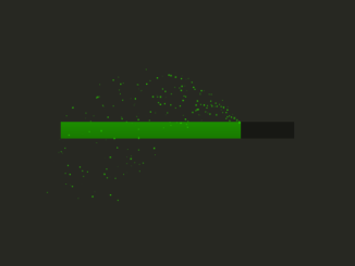
- HTML5 Canvas Loading Progress Bar Animation
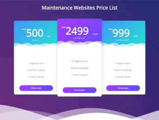
- Pricing Table Design Using HTML CSS
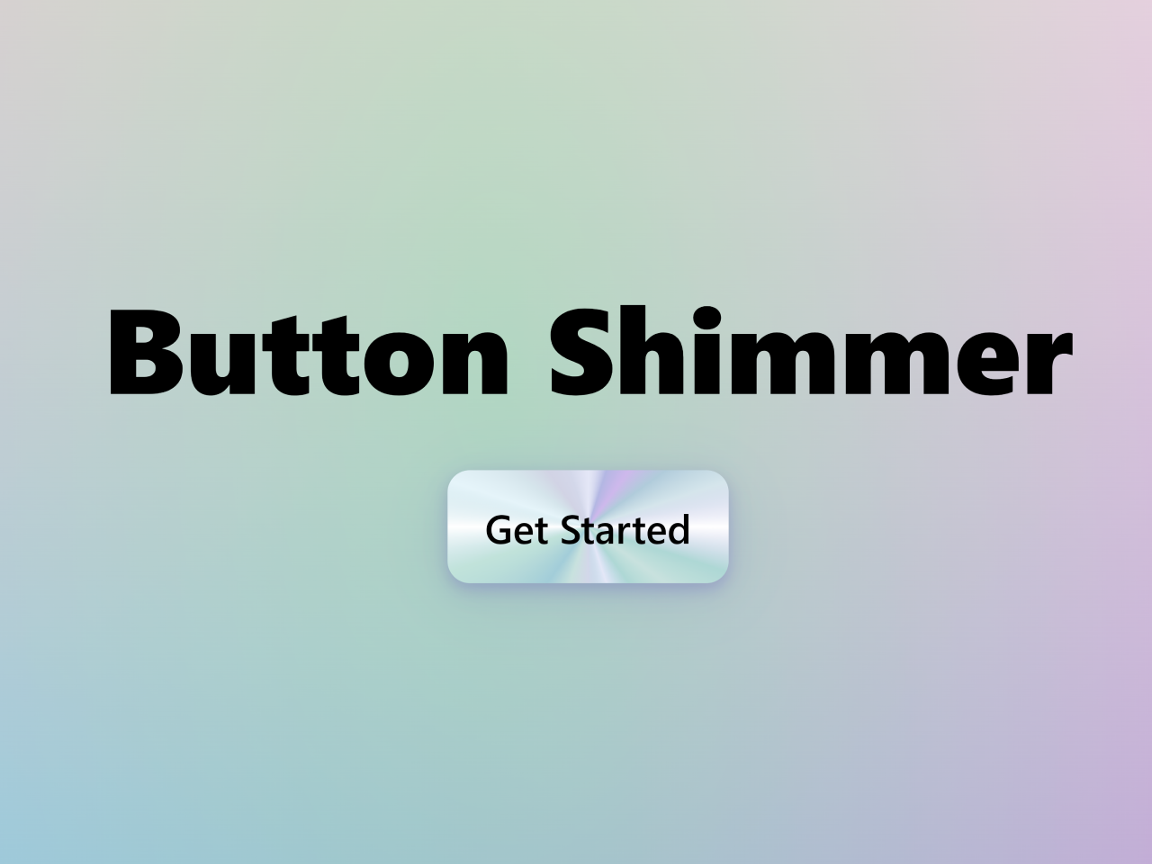
- Button Shimmer Effect on Hover Using CSS
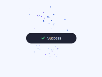
- Confetti Animation in CSS on Button Click


I code and create web elements for amazing people around the world. I like work with new people. New people new Experiences.
I truly enjoy what I’m doing, which makes me more passionate about web development and coding. I am always ready to do challenging tasks whether it is about creating a custom CMS from scratch or customizing an existing system.