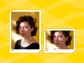
This HTML and CSS code snippet helps you to create stylish image frame on a webpage. It styles images inside figure tags, adding decorative frames. The CSS defines the frame’s appearance and sizing. This helps enhance image presentation on webpages.
You can use this code in web projects to showcase images attractively. It adds decorative frames, enhancing visual appeal. This can elevate the presentation of photo galleries or product showcases on websites.
How to Create Image Frames in HTML and CSS
1. Start by copying the following HTML code. Place your image URLs inside the <img> tags, and customize the <figcaption> text to suit your content. Repeat the <figure> section for each image you want to showcase.
<figure>
  <img src="https://assets.codepen.io/1506195/portrait-woman-unsplash.jpg" />
  <figcaption>Test</figcaption>
</figure>

<figure>
  <img src="https://assets.codepen.io/1506195/portrait-woman-unsplash.jpg" />
  <figcaption>Test</figcaption>
</figure>

<figure>
  <img src="https://assets.codepen.io/1506195/portrait-woman-unsplash.jpg" />
  <figcaption>Test</figcaption>
</figure>
2. Now, copy the following CSS into your stylesheet or HTML file within <style> tags. Adjust the CSS variables in the figure selector to alter the frame’s size and appearance. Modify the background property to change frame colors or gradients.
figure {
  --c: 50px;
  --p: 30px;
  --d: 10px;
  background: red;
  display: inline-block;
  padding: var(--p);
  background:
    radial-gradient(farthest-side at 0 0, #000, #0000) 0 0 / var(--c) var(--c),
    radial-gradient(farthest-side at 100% 100%, #000, #0000) 100% 100% / var(--c) var(--c),
    linear-gradient(#fff 0 0) 50% 50% / calc(100% - var(--p)) calc(100% - var(--p)),
    linear-gradient(#0000, #000 25% 75%, #0000) 50% 50% / calc(100% - var(--p)) calc(100% - var(--d)),
    linear-gradient(90deg, #0000, #000 25% 75%, #0000) 50% 50% / calc(100% - var(--d)) calc(100% - var(--p)),
    radial-gradient(farthest-side at 0 100%, #00000018, #0000) calc(100% - var(--d) * 0.5) calc(var(--d) * 0.5) / var(--d) var(--d),
    radial-gradient(farthest-side at 100% 0, #00000018, #0000) calc(var(--d) * 0.5) calc(100% - var(--d) * 0.5) / var(--d) var(--d)
    ;
  background-repeat: no-repeat;
  clip-path: polygon(0 var(--c), var(--c) 0, 100% 0, 100% calc(100% - var(--c)), calc(100% - var(--c)) 100%, 0 100%);
}

/* demo */
figure:nth-of-type(1) img {
  width: 300px;
}

figure:nth-of-type(2) img {
  width: 300px;
  height: 200px;
}

figure:nth-of-type(3) img {
  width: 300px;
  aspect-ratio: 1;
}

body {
  background:
    repeating-linear-gradient(30deg, #fff2 0 10%, #fff0 0 24%),
    repeating-linear-gradient(-23deg, #fff2 0 4%, #fff0 0 14%)
    gold !important;
}

img {
  object-fit: cover;
}
The CSS code targets the <figure> elements, so ensure your image frames are enclosed within these tags. Optionally, adjust the demo styling at the end of the CSS to fit your specific image dimensions. Apply specific styles to individual images by using figure:nth-of-type(n) img selectors, adjusting widths, heights, or aspect ratios as needed.
That’s all! hopefully, you have successfully created an Image Frame In HTML and CSS. If you have any questions or suggestions, feel free to comment below.
Similar Code Snippets:

I code and create web elements for amazing people around the world. I like work with new people. New people new Experiences.
I truly enjoy what I’m doing, which makes me more passionate about web development and coding. I am always ready to do challenging tasks whether it is about creating a custom CMS from scratch or customizing an existing system.

