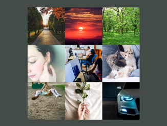
This code creates a grid of 3×3 image containers using HTML and CSS. The core functionality lies in structuring the grid layout for showcasing images. It’s perfect for presenting images in an organized manner on your web page.
You can integrate this code to showcase your photography, design work, or art in a grid layout on your portfolio website.
How to Create a 3×3 Image Grid In HTML and CSS
1. First of all, load the Normalize CSS by adding the following CDN link into the head tag of your HTML document. It ensures a consistent rendering of elements across different browsers.
<link rel="stylesheet" href="https://cdnjs.cloudflare.com/ajax/libs/normalize/5.0.0/normalize.min.css">
2. Next, construct the HTML structure for our 3×3 image grid. This code section defines the container and individual image boxes within the grid. We use the “game-board” class for the grid container and “box” class for each image box. You can replace the image sources and alt text with your own content.
<div class="game-board">
  <div class="box"><img src="https://source.unsplash.com/200x200/?natural" alt="Image Grid"> </div>
  <div class="box"><img src="https://source.unsplash.com/200x200/?sunset" alt="Image Grid"></div>
  <div class="box"><img src="https://source.unsplash.com/200x200/?trees" alt="Image Grid"></div>
  <div class="box"><img src="https://source.unsplash.com/200x200/?beauty" alt="Image Grid"></div>
  <div class="box"><img src="https://source.unsplash.com/200x200/?tech" alt="Image Grid"></div>
  <div class="box"><img src="https://source.unsplash.com/200x200/?cat" alt="Image Grid"></div>
  <div class="box"><img src="https://source.unsplash.com/200x200/?girl" alt="Image Grid"></div>
  <div class="box"><img src="https://source.unsplash.com/200x200/?rose" alt="Image Grid"></div>
  <div class="box"><img src="https://source.unsplash.com/200x200/?car" alt="Image Grid"></div>
</div>
3. Finally, style our 3×3 image grid using CSS. This code snippet defines the grid layout, box styling, and overall appearance. It ensures that the images are displayed in a visually appealing grid format.
.game-board {
  display: grid;
  grid-template-rows: 200px 200px 200px;
  grid-template-columns: 200px 200px 200px;
}

body {
  display: flex;
  justify-content: center;
}

.box {
  background: #444;
  border: 1px solid #555;
  display: flex;
  align-items: center;
  justify-content: center;
  color: #AAA;
}
That’s all! hopefully, you have successfully created a 3×3 image grid on your website. If you have any questions or suggestions, feel free to comment below.
Similar Code Snippets:

I code and create web elements for amazing people around the world. I like work with new people. New people new Experiences.
I truly enjoy what I’m doing, which makes me more passionate about web development and coding. I am always ready to do challenging tasks whether it is about creating a custom CMS from scratch or customizing an existing system.

