
This code enables the “Slide Image on Hover Using a CSS Transition” effect. The images smoothly shift on hover, revealing additional information below. This functionality is helpful for creating interactive and visually appealing image displays on websites. The code utilizes CSS transitions to smoothly animate the sliding motion, enhancing the user experience.
How to Slide Image On Hover Using a CSS Transition
1. First of all, make sure to include the necessary libraries (Modernizr JS and Normalize CSS) by adding the following code within the <head> tags of your HTML file.
<script src="https://cdnjs.cloudflare.com/ajax/libs/modernizr/2.8.3/modernizr.min.js" type="text/javascript"></script>
<link rel="stylesheet" href="https://cdnjs.cloudflare.com/ajax/libs/normalize/5.0.0/normalize.min.css">
2. Insert the following HTML code into the body of your document, adjusting image sources and content as needed.
<div id="slidingWindow" ontouchstart="">
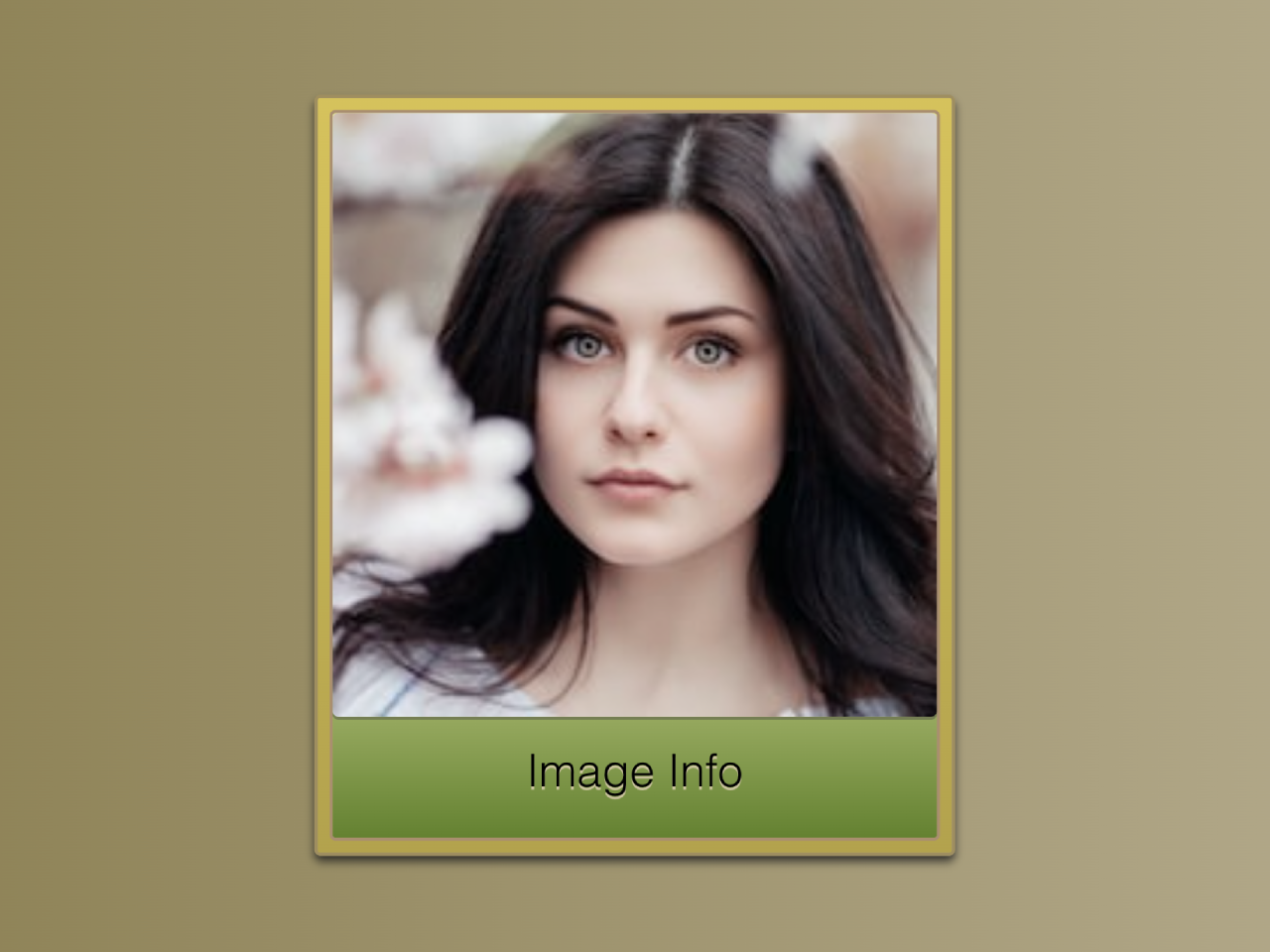
<div class="slidingSection"><img src="https://source.unsplash.com/200x200/?girl" />
<p>Image Info</p></div>
<div class="slidingSection"><img src="https://source.unsplash.com/200x200/?cat" />
<p>Other Image Info</p></div>
</div>
3. Now, copy and paste the following CSS code into your stylesheet or within a <style> tag in the document’s head.
The magic happens in the CSS section named .slidingSection. This class defines the sliding behavior on hover. The transform property is responsible for the horizontal translation, creating a smooth sliding effect. Feel free to tweak the values for a faster or slower transition.
#slidingWindow {
  display: flex;
  margin: 1em 4em;
  overflow: hidden;
  width: 210px;
  height: 250px;
  border: 1px solid #9f8e60;
  background-image: url('data:image/svg+xml;base64,PD94bWwgdmVyc2lvbj0iMS4wIiBlbmNvZGluZz0idXRmLTgiPz4gPHN2ZyB2ZXJzaW9uPSIxLjEiIHhtbG5zPSJodHRwOi8vd3d3LnczLm9yZy8yMDAwL3N2ZyI+PGRlZnM+PGxpbmVhckdyYWRpZW50IGlkPSJncmFkIiBncmFkaWVudFVuaXRzPSJvYmplY3RCb3VuZGluZ0JveCIgeDE9IjAuNSIgeTE9IjAuMCIgeDI9IjAuNSIgeTI9IjEuMCI+PHN0b3Agb2Zmc2V0PSIwJSIgc3RvcC1jb2xvcj0iI2Q2YzI1YyIvPjxzdG9wIG9mZnNldD0iMTAwJSIgc3RvcC1jb2xvcj0iI2IzYTI0ZCIvPjwvbGluZWFyR3JhZGllbnQ+PC9kZWZzPjxyZWN0IHg9IjAiIHk9IjAiIHdpZHRoPSIxMDAlIiBoZWlnaHQ9IjEwMCUiIGZpbGw9InVybCgjZ3JhZCkiIC8+PC9zdmc+IA==');
  background-size: 100%;
  background-image: linear-gradient(to bottom, #d6c25c, #b3a24d);
  box-shadow: 0 2px 3px rgba(31, 31, 31, 0.8);
}

#slidingWindow,
.slidingSection,
img {
  border-radius: 2px;
}

.slidingSection {
  margin: 4px;
  background-image: url('data:image/svg+xml;base64,PD94bWwgdmVyc2lvbj0iMS4wIiBlbmNvZGluZz0idXRmLTgiPz4gPHN2ZyB2ZXJzaW9uPSIxLjEiIHhtbG5zPSJodHRwOi8vd3d3LnczLm9yZy8yMDAwL3N2ZyI+PGRlZnM+PGxpbmVhckdyYWRpZW50IGlkPSJncmFkIiBncmFkaWVudFVuaXRzPSJvYmplY3RCb3VuZGluZ0JveCIgeDE9IjAuNSIgeTE9IjAuMCIgeDI9IjAuNSIgeTI9IjEuMCI+PHN0b3Agb2Zmc2V0PSI2MCUiIHN0b3AtY29sb3I9IiNkZWUwOWUiLz48c3RvcCBvZmZzZXQ9IjEwMCUiIHN0b3AtY29sb3I9IiM2NDgxMzEiLz48L2xpbmVhckdyYWRpZW50PjwvZGVmcz48cmVjdCB4PSIwIiB5PSIwIiB3aWR0aD0iMTAwJSIgaGVpZ2h0PSIxMDAlIiBmaWxsPSJ1cmwoI2dyYWQpIiAvPjwvc3ZnPiA=');
  background-size: 100%;
  background-image: linear-gradient(to bottom, #dee09e 60%, #648131);
  width: 200px;
  min-width: 200px;
  height: 240px;
  text-align: center;
  border: 1px solid #a98e70;
  transform: translate3d(0, 0, 0);
  transition: transform 450ms linear;
}

#slidingWindow:hover > .slidingSection {
  transform: translate3d(-210px, 0, 0);
  transition: transform 450ms linear;
}

img {
  display: block;
  width: 200px;
  height: 200px;
  border: 0;
  outline: 0;
  vertical-align: middle;
  box-shadow: 0 1px 0 rgba(64, 64, 64, 0.4);
}

p {
  position: relative;
  margin-top: 0.65em;
  font-family: sans-serif;
  text-shadow: 0 1px 0 #c9c29c;
}

body {
  min-height: 100%;
  background: #f5cfa3;
}
Adjust the styles, image sources, and content according to your preferences. You can modify the dimensions, colors, and transition duration to match your website’s design.
That’s all! hopefully, you have successfully created a feature to slide images on hover using the transition property in CSS. If you have any questions or suggestions, feel free to comment below.
Similar Code Snippets:
 SMS Conversation UI Using HTML CSS
- Stylish FAQs Template In HTML CSS
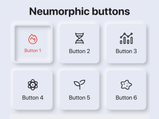
- Neumorphic Buttons with Icons Using CSS
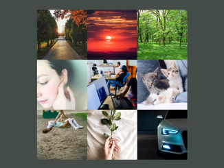
- 3x3 Image Grid In HTML and CSS


I code and create web elements for amazing people around the world. I like work with new people. New people new Experiences.
I truly enjoy what I’m doing, which makes me more passionate about web development and coding. I am always ready to do challenging tasks whether it is about creating a custom CMS from scratch or customizing an existing system.