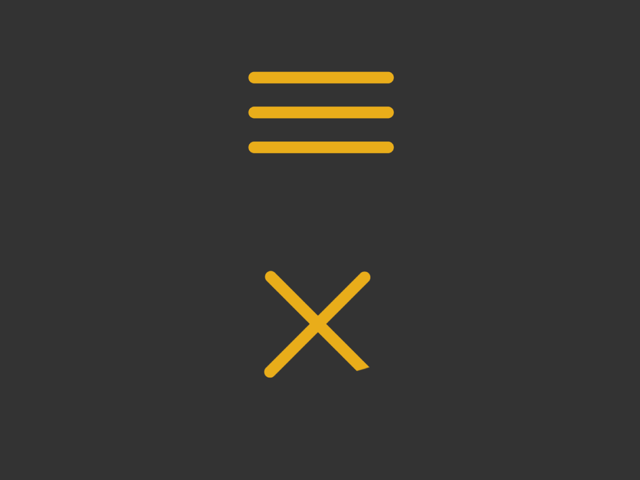
This code creates a hamburger-to-cross animation in CSS. The HTML sets up a navigation button, while the CSS styles the button and defines the animation properties. The JavaScript adds interactivity, toggling the ‘opened’ class on the button click, triggering the animation. Useful for enhancing user experience with a stylish navigation icon transition.
You can integrate this animated hamburger button to toggle the menu visibility. Furthermore, you can customize the size and color of the hamburger button according to your needs.
How to Create Hamburger Button with Cross Animation in CSS
1. In your HTML file, create a navigation button using the following code. Ensure the button has the necessary classes for styling and functionality. Place it where you want to show toggle button for your navigation.
<nav>
  <button class="nav-toggle">
    <span class="bar-top"></span>
    <span class="bar-mid"></span>
    <span class="bar-bot"></span>
  </button>
</nav>
2. In your CSS file, customize the appearance and animation properties of the navigation button. Adjust the colors, sizes, and transition durations to match your website’s design.
nav {
  height: 100vh;
}

.nav-toggle {
  position: relative;
  padding: 10px;
  background: transparent;
  border: 1px solid transparent;
  margin: 7px 0;
  top: 50%;
  left: 50%;

  /*
   * FOR PRESENTATION ONLY
   * Centers everything, remove for
   * practical purposes.
  */
  -webkit-transform(-50%, -50%);
          transform: translate(-50%, -50%);
}

.nav-toggle:focus {
  outline-width: 0;
}

.nav-toggle [class*='bar-'] {
  background: #E8AD1A;
  display: block;
  -webkit-transform: rotate(0deg);
          transform: rotate(0deg);
  -webkit-transition: .2s ease all;
          transition: .2s ease all;

  /*
   * ENLARGED FOR PRESENTATION
   * Keep these values at the same proportion
   * for it to look correct
  */
  border-radius: 8px;
  height: 8px;
  width: 100px;
  margin-bottom: 16px;

  /*
   * Practical values:
   * border-radius: 2px;
   * height: 2px;
   * width: 25px;
   * margin-bottom: 4px;
  */
}

.nav-toggle .bar-bot {
  margin-bottom: 0;
}

.opened .bar-top {
  -webkit-transform: rotate(45deg);
          transform: rotate(45deg);
  -webkit-transform-origin: 15% 15%;
          transform-origin: 15% 15%;
}
.opened .bar-mid {
  opacity: 0;
}
.opened .bar-bot {
  -webkit-transform: rotate(45deg);
          transform: rotate(-45deg);
  -webkit-transform-origin: 15% 95%;
          transform-origin: 15% 95%;
}
3. Finally, add the following JavaScript code to enable the toggle functionality. This script listens for a click on the navigation button and toggles the ‘opened’ class, triggering the animation.
(function () {
  var toggle = document.querySelector('.nav-toggle');

  toggle.addEventListener('click', function(e) {
    this.classList.toggle('opened');
  });
})();
That’s all! hopefully, you have successfully created an animated hamburger button for your navigation menu. If you have any questions or suggestions, feel free to comment below.
Similar Code Snippets:

I code and create web elements for amazing people around the world. I like work with new people. New people new Experiences.
I truly enjoy what I’m doing, which makes me more passionate about web development and coding. I am always ready to do challenging tasks whether it is about creating a custom CMS from scratch or customizing an existing system.

