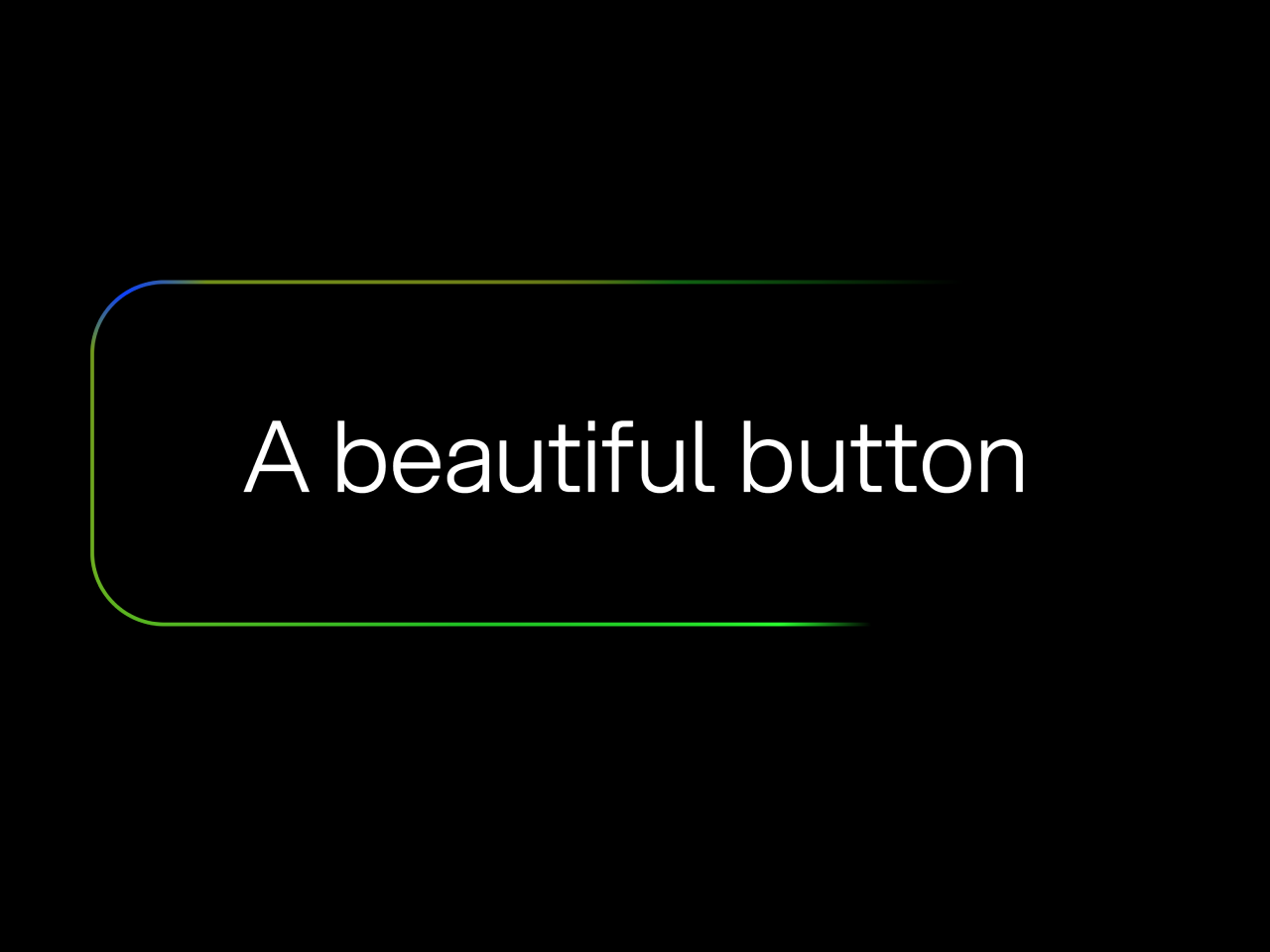

This HTML & CSS code snippet helps you to create an animated button with shimmering Border Gradient Effect. The button features three rotating gradient rings in bright blue, green, and red hues. The animation adds a dynamic touch, making the button visually appealing. Customizable properties allow you to control the gradient angles, background colors, and border size.
Enhance your web design with this stylish and eye-catching CSS effect, perfect for buttons or interactive elements.
How to Create Shimmering Animated Border Gradient Effect in CSS
1. First of all, copy and paste the following HTML and CSS code into your project. Place the HTML code where you want the animated button.
<button>
	<div>
		A beautiful button
	</div>
</button>
2. Now, style the button using the following CSS styles. Adjust the color scheme and styling according to your design preferences. Find the :root section in the CSS code, where you can modify the --bright-blue, --bright-green, and --bright-red variables to change the gradient colors.
Additionally, adjust other variables like --border-size and --border-radius for the desired button appearance.
/* The secret sauce that enables gradient rotation. NOTE: does not work in all browsers. https://caniuse.com/?search=%40property */
@property --border-angle-1 {
	syntax: "<angle>";
	inherits: true;
	initial-value: 0deg;
}

@property --border-angle-2 {
	syntax: "<angle>";
	inherits: true;
	initial-value: 90deg;
}

@property --border-angle-3 {
	syntax: "<angle>";
	inherits: true;
	initial-value: 180deg;
}


/* sRGB color. */
:root {
	--bright-blue: rgb(0, 100, 255);
	--bright-green: rgb(0, 255, 0);
	--bright-red: rgb(255, 0, 0);
	--background: black;
	--foreground: white;
	--border-size: 2px;
	--border-radius: 0.75em;
}

/* Display-P3 color, when supported. */
@supports (color: color(display-p3 1 1 1)) {
	:root {
		--bright-blue: color(display-p3 0 0.2 1);
		--bright-green: color(display-p3 0.4 1 0);
		--bright-red: color(display-p3 1 0 0);
	}
}

@keyframes rotateBackground {
	to { --border-angle-1: 360deg; }
}

@keyframes rotateBackground2 {
	to { --border-angle-2: -270deg; }
}

@keyframes rotateBackground3 {
	to { --border-angle-3: 540deg; }
}

body {
	background: var(--background) !important;
	color: var(--foreground);
	min-height: 100dvh;
	display: grid;
	place-content: center;
	margin: 0;
	font-family: "Aspekta";
}

button {
	--border-angle-1: 0deg;
	--border-angle-2: 90deg;
	--border-angle-3: 180deg;
	color: inherit;
	font-size: calc(0.8rem + 4vmin);
	font-family: inherit;
	border: 0;
	padding: var(--border-size);
	display: flex;
	width: max-content;
	border-radius: var(--border-radius);
	background-color: transparent;
	background-image: conic-gradient(
			from var(--border-angle-1) at 10% 15%,
			transparent,
			var(--bright-blue) 10%,
			transparent 30%,
			transparent
		),
		conic-gradient(
			from var(--border-angle-2) at 70% 60%,
			transparent,
			var(--bright-green) 10%,
			transparent 60%,
			transparent
		),
		conic-gradient(
			from var(--border-angle-3) at 50% 20%,
			transparent,
			var(--bright-red) 10%,
			transparent 50%,
			transparent
		);
	animation:
		rotateBackground 3s linear infinite,
		rotateBackground2 8s linear infinite,
		rotateBackground3 13s linear infinite;
}

/* Change this background to transparent to see how the gradient works */
button div {
	background: var(--background);
	padding: 1em 1.5em;
	border-radius: calc(var(--border-radius) - var(--border-size));
	color: var(--foreground);
}

@font-face {
	font-family: "Aspekta";
	font-weight: normal;
	src: url("https://assets.codepen.io/240751/Aspekta-300.woff2") format("woff2");
}
Experiment with the background transparency by changing the background property inside the button div selector. Setting it to transparent reveals the underlying gradient effect.
That’s all! hopefully, you have successfully created a shimmering animated button on your website. If you have any questions or suggestions, feel free to comment below.
Similar Code Snippets:
 Background Parallax Effect on Mouse Move
- CSS Text Shadow Animation on Mouse Move
- CSS Rainbow Effect Animation
- 45+ CSS3 Image Hover Effects
- Fade In On Scroll Using CSS and JavaScript

I code and create web elements for amazing people around the world. I like work with new people. New people new Experiences.
I truly enjoy what I’m doing, which makes me more passionate about web development and coding. I am always ready to do challenging tasks whether it is about creating a custom CMS from scratch or customizing an existing system.