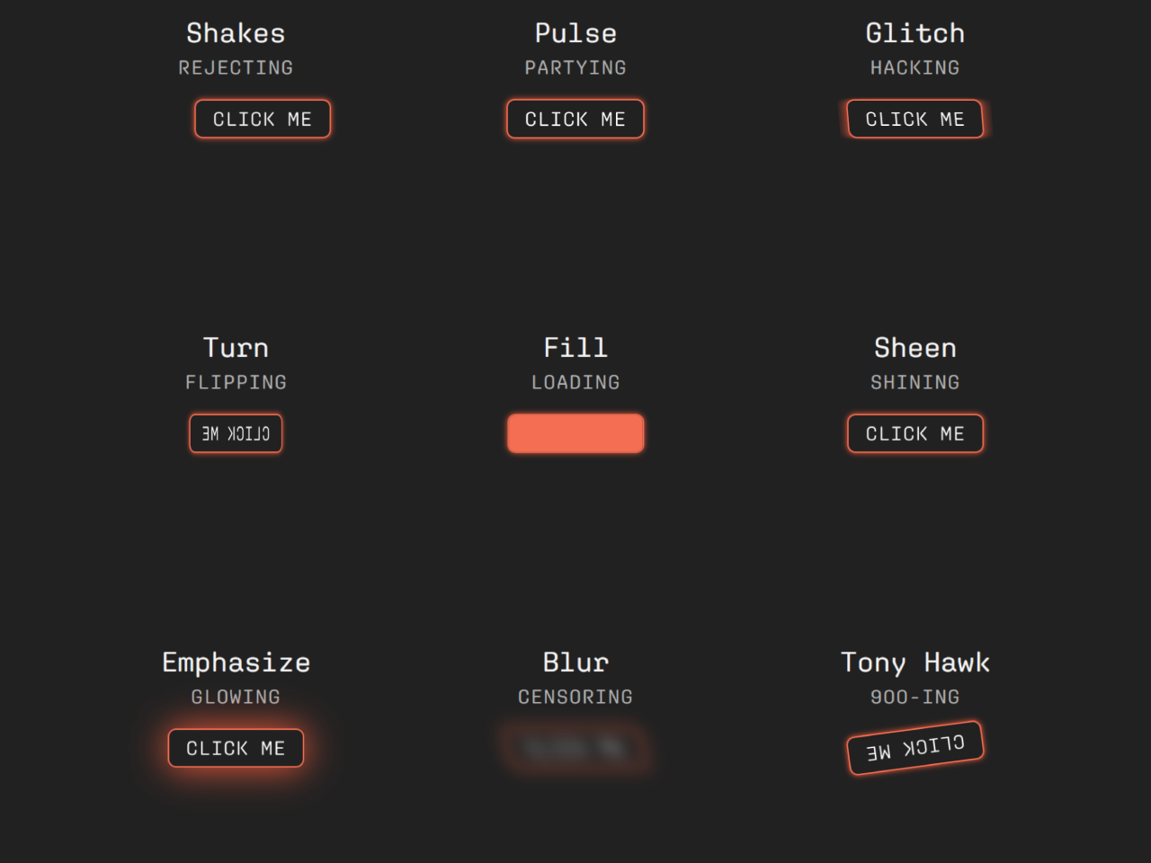

This CSS library offers a variety of dynamic effects like shaking, pulsing, glitching, flipping, and more effects for buttons. Seamlessly integrate animations by adding a straightforward “anim” attribute to your button elements. Enhance user experience and engagement with these eye-catching animations
How to Create CSS Button Animation Library
1. First of all, load the Reset CSS and Typekit CSS by adding the following CDN links into the head tag of your HTML document.
<link rel="stylesheet" href="https://cdnjs.cloudflare.com/ajax/libs/meyer-reset/2.0/reset.min.css">
<link rel='stylesheet' href='https://use.typekit.net/htw6kjt.css'>
<link rel='stylesheet' href='https://raw.githubusercontent.com/argyleink/open-props/ce8c2d30c5be41c7bf00feb28894e1cd8744814f/src/props.easing.css'>
2. Create the HTML structure for your buttons. Each button is encapsulated within a <section> element, containing a heading (<h2>) and a description (<p>). The button itself has an “anim” attribute, specifying the desired animation effect.
<main>
<article>
<section>
<div>
<h2>Shakes</h2>
<p>Rejecting</p>
</div>
<div>
<button anim="shake">CLICK ME</button>
</div>
</section>
<section>
<div>
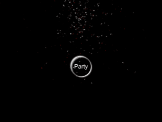
<h2>Pulse</h2>
<p>Partying</p>
</div>
<div>
<button anim="pulse">CLICK ME</button>
</div>
</section>
<section>
<div>
<h2>Glitch</h2>
<p>Hacking</p>
</div>
<div>
<button anim="glitch">CLICK ME</button>
</div>
</section>
<section>
<div>
<h2>Turn</h2>
<p>Flipping</p>
</div>
<div>
<button anim="flip">CLICK ME</button>
</div>
</section>
<section>
<div>
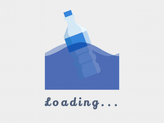
<h2>Fill</h2>
<p>Loading</p>
</div>
<div>
<button anim="fill">Click me</button>
</div>
</section>
<section>
<div>
<h2>Sheen</h2>
<p>Shining</p>
</div>
<div>
<button anim="sheen">Click me</button>
</div>
</section>
<section>
<div>
<h2>Emphasize</h2>
<p>Glowing</p>
</div>
<div>
<button anim="glow">Click me</button>
</div>
</section>
<section>
<div>
<h2>Blur</h2>
<p>Censoring</p>
</div>
<div>
<button anim="blur">CLICK ME</button>
</div>
</section>
<section>
<div>
<h2>Tony Hawk</h2>
<p>900-ing</p>
</div>
<div>
<button anim="tonyhawk">CLICK ME</button>
</div>
</section>
</article>
<article>
<section>
<div>
<h2>Shakes</h2>
<p>Rejecting</p>
</div>
<div>
<button anim="shake">CLICK ME</button>
</div>
</section>
</article>
<article>
<section>
<div>
<h2>Pulse</h2>
<p>Partying</p>
</div>
<div>
<button anim="pulse">CLICK ME</button>
</div>
</section>
</article>
<article>
<section>
<div>
<h2>Glitch</h2>
<p>Hacking</p>
</div>
<div>
<button anim="glitch">CLICK ME</button>
</div>
</section>
</article>
<article>
<section>
<div>
<h2>Turn</h2>
<p>Flipping</p>
</div>
<div>
<button anim="flip">CLICK ME</button>
</div>
</section>
</article>
<article>
<section>
<div>
<h2>Fill</h2>
<p>Loading</p>
</div>
<div>
<button anim="fill">Click me</button>
</div>
</section>
</article>
<article>
<section>
<div>
<h2>Sheen</h2>
<p>Shining</p>
</div>
<div>
<button anim="sheen">Click me</button>
</div>
</section>
</article>
<article>
<section>
<div>
<h2>Emphasize</h2>
<p>Glowing</p>
</div>
<div>
<button anim="glow">Click me</button>
</div>
</section>
</article>
<article>
<section>
<div>
<h2>Blur</h2>
<p>Censoring</p>
</div>
<div>
<button anim="blur">CLICK ME</button>
</div>
</section>
</article>
<article>
<section>
<div>
<h2>Tony Hawk</h2>
<p>900-ing</p>
</div>
<div>
<button anim="tonyhawk">CLICK ME</button>
</div>
</section>
</article>
</main>
3. Copy the entire CSS code into your stylesheet. This code not only defines the animations but also sets the overall styling for your buttons and layout.
@import "https://unpkg.com/open-props@1.6.17/easings.min.css";

@keyframes shake {
  50% {
    transform: translate3d(20px, 0, 0);
  }
}

@keyframes flip {
  100% {
    transform: rotateY(180deg);
  }
}

@keyframes pulse {
  50% {
    transform: scale(1.5);
  }
}

@keyframes glitch {
  50% {
    transform: skew(180deg);
  }
}

@keyframes fill {
  50% {
    transform: translateX(-5%);
  }
}

@keyframes sheen {
  100% {
    transform: rotateZ(60deg) translate(1em, -9em);
  }
}

@keyframes glow {
  50% {
    box-shadow: 0 0 40px hsl(12, 100%, 60%);
  }
}

@keyframes tonyhawk {
  50%,
  100% {
    transform: rotate(900deg);
  }
}

@keyframes blur {
  50% {
    filter: blur(20px);
    transform: skew(45deg);
  }
}

[anim="shake"]:not(.toggled) {
  animation: shake var(--ease-elastic-in-1) 300ms infinite alternate;
}

[anim="pulse"]:not(.toggled) {
  animation: pulse var(--ease-elastic-in-1) 400ms infinite alternate;
}

[anim="glitch"]:not(.toggled) {
  animation: glitch var(--ease-elastic-in-1) 6ms infinite;
}

[anim="tonyhawk"]:not(.toggled) {
  animation: tonyhawk var(--ease-elastic-in-1) 600ms infinite;
}

[anim="flip"]:not(.toggled) {
  animation: flip var(--ease-elastic-in-1) 600ms infinite alternate;
}

[anim="fill"]:not(.toggled)::after {
  animation: fill var(--ease-spring-1) 8000ms infinite;
}

[anim="sheen"]:not(.toggled)::after {
  animation: sheen var(--ease-elastic-in-1) 1s infinite;
}

[anim="glow"]:not(.toggled) {
  animation: glow var(--ease-elastic-in-1) 600ms infinite alternate;
}

[anim="blur"]:not(.toggled) {
  animation: blur var(--ease-elastic-in-1) 1s infinite alternate;
}

[anim="fill"]::after {
  content: "";
  color: var(--black);
  position: absolute;
  display: flex;
  justify-content: center;
  align-items: center;
  font-size: 0.75rem;
  height: 100%;
  width: 200%;
  inset: 0;
  transform: translateX(-400px);
  background-color: hsl(12, 90%, 63%);
}

[anim="sheen"]::after {
  content: "";
  position: absolute;
  top: -50%;
  right: -50%;
  bottom: -50%;
  left: -50%;
  background: var(--red-sheen);
  transform: rotateZ(60deg) translate(-5em, 7.5em);
}

:root {
  --black: hsl(0, 0%, 13%);
  --dark: hsl(12, 32%, 2%);
  --gray: hsl(0, 0%, 70%);
  --white: hsl(0, 0%, 96%);
  --red: hsl(12, 90%, 63%);
  --red-shadow: hsl(12, 100%, 60%);
  --red-sheen: linear-gradient(
    to bottom,
    hsl(12, 90%, 43%),
    hsla(12, 40%, 70%, 0.5) 50%,
    hsl(12, 93%, 23%)
  );
}


div:has(h2 + p) {
  display: grid;
  gap: 8px;
}

h2 {
  font-size: 1.25rem;
}

h2 + p {
  text-transform: uppercase;
  letter-spacing: 0.06em;
  color: var(--gray);
  font-size: 0.875rem;
}

main {
  max-width: 880px;
  margin: 0 auto;
  display: grid !important;
  grid-template-columns: 1fr;
  justify-content: center;
  align-items: center;
}

article {
  display: flex;
  flex-wrap: wrap;
  gap: 64px;
  align-items: center;
  justify-content: center;
  min-height: 100dvh;
  position: relative;
  padding-block: 32px;

  &::after {
    content: "";
    width: 100%;
    position: absolute;
    height: 1px;
    bottom: 0;
    background-image: linear-gradient(45deg, var(--red), transparent 70%);
  }
}

section {
  display: flex;
  flex-direction: column;
  gap: 16px;
  flex-basis: 180px;
  justify-content: center;
  align-items: center;
  text-align: center;
}

section {
  color: var(--white);
  font-family: "aglet-mono-variable", sans-serif;
  font-variation-settings: "wght" 400;
}

* {
  font-family: inherit;
  box-sizing: border-box;
}

button {
  all: unset;
  background-color: var(--black);
  padding: 6px 12px;
  border-radius: 6px;
  font-size: 0.875rem;
  text-transform: uppercase;
  letter-spacing: 0.04em;
  border: 1px solid var(--red);
  box-shadow: 0 0 4px var(--red-shadow);
  cursor: pointer;
  perspective: 1000px;
  position: relative;
  overflow: hidden;
}

.blurry {
  position: relative;
  transform-style: preserve-3d;
}

.blurry::before {
  content: "";
  position: absolute;
  inset: 0px;
  transform: translate3d(0px, 0px, -1px);
  background: var(--red-shadow);
  filter: blur(6px);
}
4. Finally, include the JavaScript code at the end of your HTML document, just before the closing </body> tag. This code initializes the animations and toggles the “toggled” class on button click.
let anims = [...document.querySelectorAll("[anim]")];
console.log(anims);
let click = (el, cb) => el.addEventListener("click", cb);
let toggle = (el) => el.classList.toggle("toggled");
let clickTog = (el) => click(el, () => toggle(el));
anims.map(clickTog);
Feel free to customize the HTML content, experiment with different animations, or adjust the styling to fit your project’s theme. Test your buttons and witness the engaging animations in action!
That’s all! hopefully, you have successfully created the CSS Button Animation Library. If you have any questions or suggestions, feel free to comment below.
Similar Code Snippets:
 CSS Heartbeat Animation Code with Demo
- Change Text Automatically in JavaScript
- Fade In On Scroll Using CSS and JavaScript
- Background Parallax Effect on Mouse Move
- CSS Background Blur Effect
- Shimmering Animated Border Gradient Effect in CSS
- CSS Text Color Change Animation


I code and create web elements for amazing people around the world. I like work with new people. New people new Experiences.
I truly enjoy what I’m doing, which makes me more passionate about web development and coding. I am always ready to do challenging tasks whether it is about creating a custom CMS from scratch or customizing an existing system.