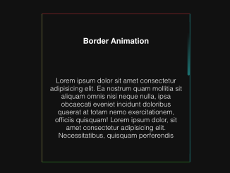
This CSS Glowing Border Animation code creates an animated glowing border effect on a specified HTML element. The core role of the animated-border-box-glow class is to add a glowing border animation. It works by using CSS properties like blur, gradients, and keyframes to create a visually appealing glow around the specified HTML element.
This code is helpful for enhancing the visual appeal of your web page or specific elements by adding an eye-catching animated border glow effect. You can apply this effect to buttons, call-to-action elements, or featured content.
How to Create CSS Glowing Border Animation
1. Begin by creating the HTML structure where you want to apply the glowing border animation. You can use this code on buttons, containers, or other HTML elements. Place your target element within a parent container, as shown in the following code:
<div class="center-box">
  <!-- START Box -->
  <div class="animated-border-box-glow"></div>
  <div class="animated-border-box">
    <!-- Inside the Box -->
  </div>
  <!-- END -->
</div>
2. Next, you need to add the CSS code to your website. The CSS styles provided in the code create the glowing border effect. The key parts to note are the .animated-border-box-glow class and the @keyframes rotate animation. These are responsible for the glowing border effect.
/*// Glow Border Animation //*/
.cd__main{
   background: #000 !important;
}
.animated-border-box, .animated-border-box-glow{
  max-height: 200px;
  max-width: 250px;
  height: 100%;
  width: 100%;
  position: absolute;
  overflow: hidden;
  z-index: 0;
  /* Border Radius */
	border-radius: 10px;
}

.animated-border-box-glow{
  overflow: hidden;
  /* Glow Blur */
  filter: blur(20px);
}

.animated-border-box:before, .animated-border-box-glow:before {
  content: '';
  z-index: -2;
  text-align: center;
	top: 50%;
	left: 50%;
	transform: translate(-50%, -50%) rotate(0deg);
  position: absolute;
	width: 99999px;
	height: 99999px;
	background-repeat: no-repeat;
	background-position: 0 0;
  /*border color, change middle color*/
	background-image: conic-gradient(rgba(0,0,0,0), #1976ed, rgba(0,0,0,0) 25%);
  /* change speed here */
	animation: rotate 4s linear infinite;
}

.animated-border-box:after {
	content: '';
	position: absolute;
	z-index: -1;
  /* border width */
	left: 5px;
	top: 5px;
  /* double the px from the border width left */
	width: calc(100% - 10px);
	height: calc(100% - 10px);
  /*bg color*/
	background: #292a2e;
  /*box border radius*/
	border-radius: 7px;
}

@keyframes rotate {
	100% {
		transform: translate(-50%, -50%) rotate(1turn);
	}
}

/*// Border Animation END//*/


/*// Ignore This //*/
body {
  margin: 0px;
}

.center-box{
  height: 100vh;
  display: flex;
  justify-content: center;
  align-items: center;
  background-color: #1D1E22;
}
You can customize the glowing border animation by adjusting properties in the CSS code. Modify filter, animation, and other CSS properties to achieve the desired glow effect, color, and animation speed.
Assign the .animated-border-box-glow class to the HTML element you want to animate. For example, if you want to apply the animation to a button, your HTML would look like this:
<button class="animated-border-box-glow">Click Me</button>
That’s all! hopefully, you have successfully created a glowing border animation. If you have any questions or suggestions, feel free to comment below.
Similar Code Snippets:

I code and create web elements for amazing people around the world. I like work with new people. New people new Experiences.
I truly enjoy what I’m doing, which makes me more passionate about web development and coding. I am always ready to do challenging tasks whether it is about creating a custom CMS from scratch or customizing an existing system.

