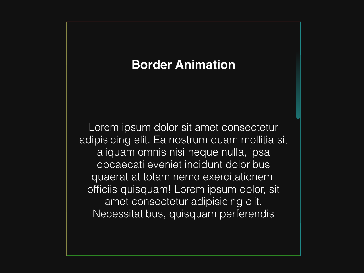

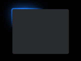
This CSS code snippet helps you to create border animation with an infinite loop. It showcases continuous border animations. The borders animate in an infinite loop, giving a dynamic visual effect to the card element. This feature enhances the visual appeal of webpage elements.
You can use this animation in webpage designs, especially for showcasing content. It adds engaging visual dynamics, enhancing user interaction.
How to Create Border Animation CSS Infinite
1. First of all, create an HTML element, like <div> or <article>, and assign it a class (e.g., class="card"). Inside this element, include content you want to display within the animated border.
<article class="card">
  <h3>Border Animation</h3>
  <p>
    Lorem ipsum dolor sit amet consectetur adipisicing elit. Ea nostrum quam
    mollitia sit aliquam omnis nisi neque nulla, ipsa obcaecati eveniet
    incidunt doloribus quaerat at totam nemo exercitationem, officiis
    quisquam! Lorem ipsum dolor, sit amet consectetur adipisicing elit.
    Necessitatibus, quisquam perferendis
  </p>
  <span class="top"></span>
  <span class="right"></span>
  <span class="bottom"></span>
  <span class="left"></span>
</article>
2. After that, copy the following CSS code into your stylesheet or HTML file within <style> tags. Customize the .card class to suit your design needs, adjusting width, height, colors, and content alignment.
*,
::before,
::after {
  margin: 0;
  padding: 0;
  box-sizing: border-box;
}

body {
  display: flex;
  justify-content: center;
  align-items: center;
  height: 100vh;
  background-color: #111111;
}

.card {
  position: relative;
  width: 300px;
  height: 300px;
  color: #fff;
  background: transparent;
  overflow: hidden;
  border-top: 1px solid rgba(255, 49, 49, 0.5);
  border-right: 1px solid rgba(0, 255, 255, 0.5);
  border-bottom: 1px solid rgba(57, 255, 20, 0.5);
  border-left: 1px solid rgba(255, 255, 113, 0.5);
  font-family: sans-serif;
  display: flex;
  flex-direction: column;
  justify-content: space-around;
  align-items: center;
  padding: 1em;
}

p {
  font-size: 0.95rem;
  text-align: center;
}

span {
  position: absolute;
  border-radius: 100vmax;
}

.top {
  top: 0;
  left: 0;
  width: 0;
  height: 5px;
  background: linear-gradient(
    90deg,
    transparent 50%,
    rgba(255, 49, 49, 0.5),
    rgb(255, 49, 49)
  );
}

.bottom {
  right: 0;
  bottom: 0;
  height: 5px;
  background: linear-gradient(
    90deg,
    rgb(57, 255, 20),
    rgba(57, 255, 20, 0.5),
    transparent 50%
  );
}

.right {
  top: 0;
  right: 0;
  width: 5px;
  height: 0;
  background: linear-gradient(
    180deg,
    transparent 30%,
    rgba(0, 255, 255, 0.5),
    rgb(0, 255, 255)
  );
}

.left {
  left: 0;
  bottom: 0;
  width: 5px;
  height: 0;
  background: linear-gradient(
    180deg,
    rgb(255, 255, 113),
    rgba(255, 255, 113, 0.5),
    transparent 70%
  );
}

.top {
  animation: animateTop 3s ease-in-out infinite;
}

.bottom {
  animation: animateBottom 3s ease-in-out infinite;
}

.right {
  animation: animateRight 3s ease-in-out infinite;
}

.left {
  animation: animateLeft 3s ease-in-out infinite;
}

@keyframes animateTop {
  25% {
    width: 100%;
    opacity: 1;
  }

  30%,
  100% {
    opacity: 0;
  }
}

@keyframes animateBottom {
  0%,
  50% {
    opacity: 0;
    width: 0;
  }

  75% {
    opacity: 1;
    width: 100%;
  }

  76%,
  100% {
    opacity: 0;
  }
}

@keyframes animateRight {
  0%,
  25% {
    opacity: 0;
    height: 0;
  }

  50% {
    opacity: 1;
    height: 100%;
  }

  55%,
  100% {
    height: 100%;
    opacity: 0;
  }
}

@keyframes animateLeft {
  0%,
  75% {
    opacity: 0;
    bottom: 0;
    height: 0;
  }

  100% {
    opacity: 1;
    height: 100%;
  }
}
The .top, .right, .bottom, and .left classes define individual border animations. Feel free to modify the gradients, positions, and animation timings within these classes to change the border animation style.
Furthermore, the @keyframes section controls the animation behavior. Adjust the percentages in each @keyframes rule to modify the border animation effects.
That’s all! hopefully, you have successfully created an animated border using CSS keyframes. If you have any questions or suggestions, feel free to comment below.
Similar Code Snippets:
 Multi Layer Parallax Effect in JavaScript
- 3D Tilt Effect on Hover Using Vanilla JS
- 45+ CSS3 Image Hover Effects
- CSS Glowing Border Animation
- CSS Text Shadow Animation on Mouse Move
- Success Check Animation CSS


I code and create web elements for amazing people around the world. I like work with new people. New people new Experiences.
I truly enjoy what I’m doing, which makes me more passionate about web development and coding. I am always ready to do challenging tasks whether it is about creating a custom CMS from scratch or customizing an existing system.