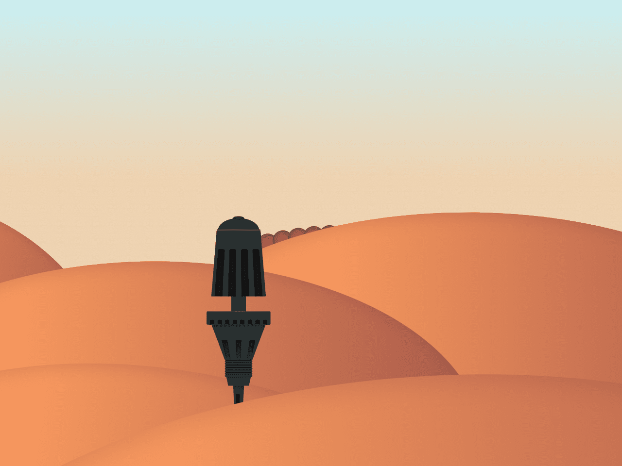

This code creates an animation of a dune thumper using pure CSS. The animation mimics the movement of a thumper machine on desert sand. It uses various CSS properties like `transform` and `animation` to achieve the effect. The purpose of this code is to demonstrate how complex animations can be created using only CSS, without relying on JavaScript.
How to Create Dune Thumper Animation Using Pure CSS
1. First, create a new HTML file and name it index.html. Then, copy and paste the following HTML code into your file. This code sets up the basic structure of our animation, including elements for dunes, clouds, thumper machine, and sand particles.
<main class="center-cols">
  <div class="w1 worm center-rows">
    <div class="cloud"></div>
    <div class="cloud"></div>
    <div class="cloud"></div>
    <div class="cloud"></div>
    <div class="cloud"></div>
    <div class="cloud"></div>
    <div class="cloud"></div>
    <div class="cloud"></div>
    <div class="cloud"></div>
    <div class="cloud"></div>
  </div>

  <div class="w2 worm center-rows">
    <div class="cloud"></div>
    <div class="cloud"></div>
    <div class="cloud"></div>
    <div class="cloud"></div>
    <div class="cloud"></div>
    <div class="cloud"></div>
    <div class="cloud"></div>
    <div class="cloud"></div>
    <div class="cloud"></div>
    <div class="cloud"></div>
  </div>

  <div class="dune dune5"></div>
  <div class="dune dune4"></div>
  <div class="dune dune3"></div>
  <div class="dune dune2"></div>

  <div class="thumper center-cols">
    <div class="extender center-cols">
      <div class="clip"></div>
      <div class="bridge"></div>
    </div>

    <div class="head center-cols">
      <div class="tip center-cols">
        <div class="end"></div>
      </div>
      <div class="cylinder center-cols">
        <div class="bezels">
          <div class="bezel"></div>
          <div class="bezel"></div>
          <div class="bezel"></div>
          <div class="bezel"></div>
        </div>
      </div>
    </div>

    <div class="base center-cols">
      <div class="lip center-cols">
        <div class="bezels">
          <div class="bezel"></div>
          <div class="bezel"></div>
          <div class="bezel"></div>
          <div class="bezel"></div>
          <div class="bezel"></div>
          <div class="bezel"></div>
          <div class="bezel"></div>
          <div class="bezel"></div>
        </div>
      </div>
      <div class="cone center-cols">
        <div class="bezels center-rows">
          <div class="bezel"></div>
          <div class="bezel"></div>
          <div class="bezel"></div>
        </div>
      </div>
      <div class="threads center-cols">
        <div class="thread"></div>
        <div class="thread"></div>
        <div class="thread"></div>
        <div class="thread"></div>
        <div class="thread"></div>
        <div class="thread"></div>
        <div class="thread"></div>
      </div>
      <div class="tail"></div>
    </div>
    <div class="spike center-cols">
      <div class="bezel"></div>
    </div>
  </div>

  <div class="dust center-rows">
    <div class="particle"></div>
    <div class="particle"></div>
    <div class="particle"></div>
    <div class="particle"></div>
    <div class="particle"></div>
    <div class="particle"></div>
    <div class="particle"></div>
    <div class="particle"></div>
    <div class="particle"></div>
    <div class="particle"></div>
    <div class="particle"></div>
    <div class="particle"></div>
    <div class="particle"></div>
    <div class="particle"></div>
  </div>

  <div class="dune dune1"></div>
</main>
2. Next, create a new CSS file and name it styles.css. Copy and paste the following CSS code into your file. This CSS code contains all the necessary styles to bring our animation to life. It includes definitions for dune shapes, cloud movements, thumper machine components, and sand particle animations.
:root {
  --thumper-base: #2a3333;
  --thumper-shadow-a: #141414a0;
  --thumper-shadow: #151515;
  --thumper-highlight: #5f605b80;
  --thumper-dark: #0e0e0e;
  --sand-light: #f5965e;
  --sand-dark: #a75a4b;
}

* {
  padding: 0;
  margin: 0;
  box-sizing: border-box;
}

.center-cols {
  display: flex;
  justify-content: center;
  align-items: center;
  flex-direction: column;
}

.center-rows {
  display: flex;
  justify-content: center;
  align-items: center;
}

main {
  position: relative;
  overflow: hidden;
  height: 100vh;
  width: 100vw;
  background: linear-gradient(#c1f4ff 1%, #eed2b1 30%);
}

.dune {
  position: absolute;
  background: linear-gradient(
    90deg,
    var(--sand-light) 30%,
    var(--sand-dark) 100%
  );
  border-radius: 100%;
  box-shadow: inset 10px 10px 50px rgba(0, 0, 0, 0.1);
  width: 2100px;
}

.dune1 {
  aspect-ratio: 2;
  scale: 1;
  translate: 200px 628px;
  rotate: -5deg;
}

.dune2 {
  aspect-ratio: 2;
  translate: -300px 400px;
  scale: 0.6;
  rotate: 8deg;
}

.dune3 {
  aspect-ratio: 1.8;
  translate: -300px 230px;
  scale: 0.6;
  rotate: 0deg;
}

.dune4 {
  aspect-ratio: 1.2;
  translate: -800px 100px;
  scale: 0.4;
  rotate: 10deg;
}

.dune5 {
  aspect-ratio: 2;
  translate: 300px 100px;
  scale: 0.6;
}

.thumper {
  position: absolute;
  scale: 0.7;
  transform: translate(-200px, -210px);

  .head {
    position: absolute;
    animation: thump 1.8s infinite ease-in-out;

    .tip {
      position: absolute;
      width: 114px;
      height: 70px;
      background-color: var(--thumper-base);
      border-radius: 100%;

      .end {
        position: absolute;
        height: 10px;
        width: 30px;
        border-radius: 100%;
        background-color: var(--thumper-base);
        box-shadow: inset 0 0 6px 1px var(--thumper-shadow-a);
        transform: translateY(-35px);
      }
    }

    .cylinder {
      position: absolute;
      width: 150px;
      height: 180px;
      background-color: var(--thumper-base);
      translate: 0px 88px;
      clip-path: polygon(10% 0%, 90% 0%, 100% 100%, 0% 100%);
      border-top: 5px solid var(--thumper-highlight);
      box-shadow: inset 0 0 3px 1px var(--thumper-shadow-a);
      justify-content: flex-end;
      border-radius: 0 0 2px 2px;

      .bezels {
        display: flex;
        justify-content: space-evenly;
        align-items: center;
        width: 100%;
        perspective: 300px;
        transform-style: preserve-3d;

        .bezel {
          height: 140px;
          width: 20px;
          background-color: var(--thumper-shadow);
          transform: rotateX(20deg);
          border-radius: 5px 5px 0 0;
          box-shadow: inset 0px 6px 6px black;
        }
      }
    }
  }

  .extender {
    position: absolute;
    transform: translateY(127px);

    .clip {
      height: 40px;
      width: 50px;
      background-color: var(--thumper-base);
      border-bottom: 2px solid var(--thumper-shadow);
      box-shadow: inset 0 -5px 6px var(--thumper-shadow-a);
      border-radius: 0 0 2px 2px;
    }

    .bridge {
      height: 60px;
      width: 40px;
      background-color: var(--thumper-base);
      border-top: 2px solid var(--thumper-highlight);
      box-shadow: inset 0 5px 6px var(--thumper-shadow-a);
    }
  }

  .base {
    position: absolute;
    transform: translateY(193px);

    .lip {
      position: absolute;
      width: 176px;
      height: 34px;
      background-color: var(--thumper-base);
      justify-content: flex-end;
      border-radius: 3px;
      overflow: hidden;
      border-top: 3px solid var(--thumper-highlight);

      .bezels {
        display: flex;
        justify-content: space-evenly;
        align-items: center;
        width: 100%;

        .bezel {
          height: 14px;
          width: 12px;
          background-color: var(--thumper-shadow);
          border-radius: 3px 3px 0 0;
          box-shadow: inset 0px 2px 3px black;
        }
      }
    }

    .cone {
      height: 100px;
      width: 150px;
      background-color: var(--thumper-base);
      transform: translateY(67px);
      clip-path: polygon(0% 0%, 100% 0%, 75% 100%, 25% 100%);
      box-shadow: inset 0px 6px 10px var(--thumper-shadow-a);
      justify-content: flex-end;

      .bezels {
        width: 100%;
        perspective: 700px;
        transform-style: preserve-3d;
        gap: 18px;

        .bezel {
          height: 260px;
          width: 14px;
          background: linear-gradient(
            180deg,
            var(--thumper-shadow),
            var(--thumper-base)
          );
          border-radius: 200px 200px 0 0;
          box-shadow: inset 0px 6px 6px var(--thumper-dark);
          transform: translateY(107px) rotateX(-69deg);
        }
      }
    }

    .threads {
      position: absolute;
      height: 45px;
      width: 72px;
      background-color: var(--thumper-shadow);
      transform: translateY(139px);
      justify-content: space-between;
      border-top: 2px solid var(--thumper-shadow);

      .thread {
        background-color: var(--thumper-base);
        height: 4px;
        width: 76px;
        border-radius: 2px;
      }
    }

    .tail {
      position: absolute;
      height: 26px;
      width: 68px;
      background-color: var(--thumper-base);
      transform: translateY(174px);
      box-shadow: inset 0px 3px 3px var(--thumper-shadow-a);
      clip-path: polygon(0% 0%, 100% 0%, 92% 100%, 8% 100%);
    }
  }

  .spike {
    position: absolute;
    height: 300px;
    width: 30px;
    background-color: var(--thumper-base);
    clip-path: polygon(0% 0%, 100% 0%, 50% 100%);
    transform: translateY(528px);
    box-shadow: inset 0px 6px 10px var(--thumper-shadow-a);
    perspective: 800px;

    .bezel {
      height: 250px;
      width: 10px;
      background-color: var(--thumper-shadow);
      clip-path: polygon(0% 0%, 100% 0%, 50% 100%);
      transform: translateX(-2px);
      border-radius: 2px;
      box-shadow: inset 0px 6px 6px black;
    }
  }
}

.dust {
  position: absolute;
  rotate: -12deg;
  translate: -140px 170px;

  .particle {
    aspect-ratio: 1;
    width: 14px;
    background-color: var(--sand-light);
    box-shadow: inset 0 0 5px var(--sand-dark);
    border-radius: 9999px;
    animation: sand-wave 1.8s infinite ease-in-out;
  }

  .particle:nth-child(7),
  .particle:nth-child(8) {
    animation-delay: 0.55s;
  }
  .particle:nth-child(6),
  .particle:nth-child(9) {
    animation-delay: 0.6s;
  }
  .particle:nth-child(5),
  .particle:nth-child(10) {
    animation-delay: 0.65s;
  }
  .particle:nth-child(4),
  .particle:nth-child(11) {
    animation-delay: 0.7s;
  }
  .particle:nth-child(3),
  .particle:nth-child(12) {
    animation-delay: 0.75s;
  }
  .particle:nth-child(2),
  .particle:nth-child(13) {
    animation-delay: 0.8s;
  }
  .particle:nth-child(1),
  .particle:nth-child(14) {
    animation-delay: 0.85s;
  }
}

.worm {
  position: absolute;
  translate: 50px -146px;
  rotate: -11deg;

  .cloud {
    aspect-ratio: 1;
    width: 40px;
    background-color: var(--sand-dark);
    box-shadow: inset 0 0 10px var(--thumper-shadow-a);
    border-radius: 9999px;
    animation: worm 14s infinite ease-in-out;
    margin-right: -10px;
  }
}

.w1 {
  .cloud:nth-child(1) {
    animation-delay: 2s;
  }
  .cloud:nth-child(2) {
    animation-delay: 2.1s;
  }
  .cloud:nth-child(3) {
    animation-delay: 2.2s;
  }
  .cloud:nth-child(4) {
    animation-delay: 2.3s;
  }
  .cloud:nth-child(5) {
    animation-delay: 2.4s;
  }
  .cloud:nth-child(6) {
    animation-delay: 2.5s;
  }
  .cloud:nth-child(7) {
    animation-delay: 2.6s;
  }
  .cloud:nth-child(8) {
    animation-delay: 2.7s;
  }
  .cloud:nth-child(9) {
    animation-delay: 2.8s;
  }
  .cloud:nth-child(10) {
    animation-delay: 2.9s;
  }
}

.w2 {
  .cloud:nth-child(10) {
    animation-delay: 9s;
  }
  .cloud:nth-child(9) {
    animation-delay: 9.1s;
  }
  .cloud:nth-child(8) {
    animation-delay: 9.2s;
  }
  .cloud:nth-child(7) {
    animation-delay: 9.3s;
  }
  .cloud:nth-child(6) {
    animation-delay: 9.4s;
  }
  .cloud:nth-child(5) {
    animation-delay: 9.5s;
  }
  .cloud:nth-child(4) {
    animation-delay: 9.6s;
  }
  .cloud:nth-child(3) {
    animation-delay: 9.7s;
  }
  .cloud:nth-child(2) {
    animation-delay: 9.8s;
  }
  .cloud:nth-child(1) {
    animation-delay: 9.9s;
  }
}

@keyframes thump {
  0%,
  60% {
    transform: translateY(0);
  }
  25%,
  50% {
    transform: translateY(-100px);
  }
}

@keyframes sand-wave {
  25%,
  40% {
    transform: translateY(0);
  }
  30% {
    transform: translateY(-20px);
  }
}

@keyframes worm {
  0%,
  43%,
  57% {
    transform: translateY(0);
  }
  50% {
    transform: translateY(-34px);
  }
}
In the CSS code, you’ll notice the @keyframes rules which define animations for various components of the dune thumper. These keyframes determine how each element moves and transforms over time to create the desired effect.
Feel free to customize the animation according to your preferences. You can adjust the duration, delay, or easing functions of the keyframes to create different visual effects. You can also modify colors, sizes, and shapes to match your desired aesthetic.
That’s all! hopefully, you have successfully created Dune Thumper Animation Using Pure Css. If you have any questions or suggestions, feel free to comment below.
Similar Code Snippets:
 Pixel Background Animation in JavaScript
- Star Trails Animation On Mousemove in JavaScript
- CSS Background Blur Effect
- 45+ CSS3 Image Hover Effects
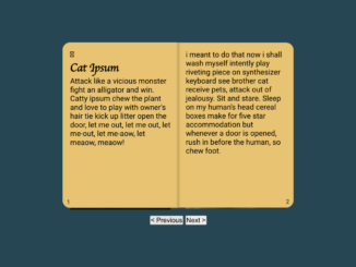
- 3D Booklet Animation Effect Using CSS
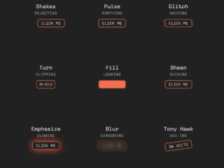
- CSS Button Animation Library
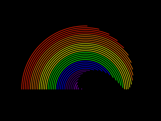
- CSS Rainbow Effect Animation


I code and create web elements for amazing people around the world. I like work with new people. New people new Experiences.
I truly enjoy what I’m doing, which makes me more passionate about web development and coding. I am always ready to do challenging tasks whether it is about creating a custom CMS from scratch or customizing an existing system.