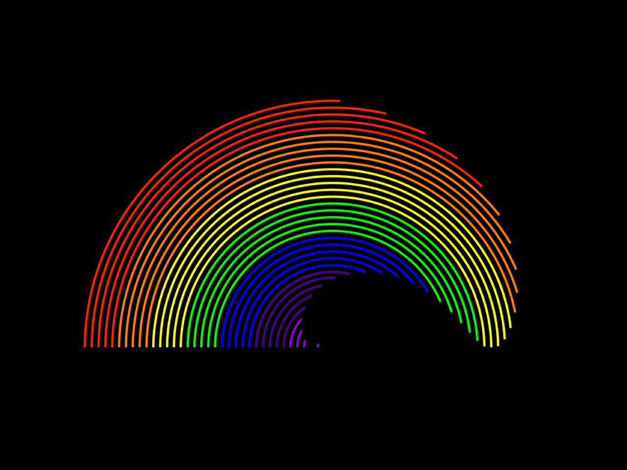

This CSS code snippet helps you to create a rainbow effect animation. It uses CSS3 keyframes for the rotation of vibrant colors in a circular pattern. You can integrate this code into your project to create a rainbow-like loading spinner or background animation.
How to Create Rainbow Effect Animation Using HTML & CSS
1. First, integrate the HTML structure into your project. The code includes a container div with nested elements representing rotating circles. Customize the structure based on where you want to incorporate the rainbow effect.
<div class="team">
            <div class="cap">
                <div class="c0 c1"></div>
                <div class="c0 c2"></div>
                <div class="c0 c3"></div>
                <div class="c0 c4"></div>
                <div class="c0 c5"></div>
                <div class="c0 c6"></div>
                <div class="c0 c7"></div>
                <div class="c0 c8"></div>
                <div class="c0 c9"></div>
                <div class="c0 c10"></div>
                <div class="c0 c11"></div>
                <div class="c0 c12"></div>
                <div class="c0 c13"></div>
                <div class="c0 c14"></div>
                <div class="c0 c15"></div>
                <div class="c0 c16"></div>
                <div class="c0 c17"></div>
                <div class="c0 c18"></div>
                <div class="c0 c19"></div>
                <div class="c0 c20"></div>
                <div class="c0 c10"></div>
                <div class="c0 c21"></div>
                <div class="c0 c22"></div>
                <div class="c0 c23"></div>
                <div class="c0 c24"></div>
                <div class="c0 c25"></div>
                <div class="c0 c26"></div>
                <div class="c0 c27"></div>
                <div class="c0 c28"></div>
                <div class="c0 c29"></div>
                <div class="c0 c30"></div>
                <div class="c0 c31"></div>
                <div class="c0 c32"></div>
                <div class="c0 c33"></div>
                <div class="c0 c34"></div>
                <div class="c0 c35"></div>
                <div class="cvr"></div>
            </div>
        </div>
2. Now, Add the following CSS code to your stylesheet (between <style> tag or external CSS file). This code defines the appearance, size, and animation properties of each circle. Adjust the colors and sizes as needed to suit your project.
* {
    margin:0;
    padding:0;
}
@media (max-width:425px){
    .team .cap {
        transform:scale(0.9);
    }
}
.team {
    width:100vw;
    height:100vh;
    background-color:#000;
    display:flex;
    justify-content:center;
    align-items:center;
}
.team .cap {
    width:450px;
    height:450px;
    background-color:transparent;
    display:flex;
    justify-content:center;
    align-items:center;
}
.team .cap .cvr {
    width:450px;
    height:225px;
    background-color:#000;
    z-index:99;
    position:relative;
    top:112px;
}
.team .cap .c0 {
    position:absolute;
    background-color:transparent;
    border-radius:50%;
    border-width:2.5px;
    border-style:solid;
    border-color:transparent;
    transform:rotateZ(135deg);
}
.team .cap .c1 {
    width:25px;
    height:25px;
    border-top-color:#9400D3;
    border-right-color:#9400D3;
    animation:spin 2s ease-out 3.5s infinite alternate;
}
.team .cap .c2 {
    width:37px;
    height:37px;
    border-top-color:#9400D3;
    border-right-color:#9400D3;
    animation:spin 2s ease-out 3.4s infinite alternate;
}
.team .cap .c3 {
    width:49px;
    height:49px;
    border-top-color:#9400D3;
    border-right-color:#9400D3;
    animation:spin 2s ease-out 3.3s infinite alternate;
}
.team .cap .c4 {
    width:61px;
    height:61px;
    border-top-color:#9400D3;
    border-right-color:#9400D3;
    animation:spin 2s ease-out 3.2s infinite alternate;
}
.team .cap .c5 {
    width:73px;
    height:73px;
    border-top-color:#9400D3;
    border-right-color:#9400D3;
    animation:spin 2s ease-out 3.1s infinite alternate;
}
.team .cap .c6 {
    width:85px;
    height:85px;
    border-top-color:#4B0082;
    border-right-color:#4B0082;
    animation:spin 2s ease-out 3s infinite alternate;
}
.team .cap .c7 {
    width:97px;
    height:97px;
    border-top-color:#4B0082;
    border-right-color:#4B0082;
    animation:spin 2s ease-out 2.9s infinite alternate;
}
.team .cap .c8 {
    width:109px;
    height:109px;
    border-top-color:#4B0082;
    border-right-color:#4B0082;
    animation:spin 2s ease-out 2.8s infinite alternate;
}
.team .cap .c9 {
    width:121px;
    height:121px;
    border-top-color:#4B0082;
    border-right-color:#4B0082;
    animation:spin 2s ease-out 2.7s infinite alternate;
}
.team .cap .c10 {
    width:132px;
    height:132px;
    border-top-color:#4B0082;
    border-right-color:#4B0082;
    animation:spin 2s ease-out 2.6s infinite alternate;
}
.team .cap .c11 {
    width:144px;
    height:144px;
    border-top-color:#0000FF;
    border-right-color:#0000FF;
    animation:spin 2s ease-out 2.5s infinite alternate;
}
.team .cap .c12 {
    width:156px;
    height:156px;
    border-top-color:#0000FF;
    border-right-color:#0000FF;
    animation:spin 2s ease-out 2.4s infinite alternate;
}
.team .cap .c13 {
    width:168px;
    height:168px;
    border-top-color:#0000FF;
    border-right-color:#0000FF;
    animation:spin 2s ease-out 2.3s infinite alternate;
}
.team .cap .c14 {
    width:180px;
    height:180px;
    border-top-color:#0000FF;
    border-right-color:#0000FF;
    animation:spin 2s ease-out 2.2s infinite alternate;
}
.team .cap .c15 {
    width:192px;
    height:192px;
    border-top-color:#0000FF;
    border-right-color:#0000FF;
    animation:spin 2s ease-out 2.1s infinite alternate;
}
.team .cap .c16 {
    width:204px;
    height:204px;
    border-top-color:#00FF00;
    border-right-color:#00FF00;
    animation:spin 2s ease-out 2s infinite alternate;
}
.team .cap .c17 {
    width:216px;
    height:216px;
    border-top-color:#00FF00;
    border-right-color:#00FF00;
    animation:spin 2s ease-out 1.9s infinite alternate;
}
.team .cap .c18 {
    width:228px;
    height:228px;
    border-top-color:#00FF00;
    border-right-color:#00FF00;
    animation:spin 2s ease-out 1.8s infinite alternate;
}
.team .cap .c19 {
    width:240px;
    height:240px;
    border-top-color:#00FF00;
    border-right-color:#00FF00;
    animation:spin 2s ease-out 1.7s infinite alternate;
}
.team .cap .c20 {
    width:252px;
    height:252px;
    border-top-color:#00FF00;
    border-right-color:#00FF00;
    animation:spin 2s ease-out 1.6s infinite alternate;
}
.team .cap .c21 {
    width:264px;
    height:264px;
    border-top-color:#FFFF00;
    border-right-color:#FFFF00;
    animation:spin 2s ease-out 1.5s infinite alternate;
}
.team .cap .c22 {
    width:276px;
    height:276px;
    border-top-color:#FFFF00;
    border-right-color:#FFFF00;
    animation:spin 2s ease-out 1.4s infinite alternate;
}
.team .cap .c23 {
    width:288px;
    height:288px;
    border-top-color:#FFFF00;
    border-right-color:#FFFF00;
    animation:spin 2s ease-out 1.3s infinite alternate;
}
.team .cap .c24 {
    width:300px;
    height:300px;
    border-top-color:#FFFF00;
    border-right-color:#FFFF00;
    animation:spin 2s ease-out 1.2s infinite alternate;
}
.team .cap .c25 {
    width:312px;
    height:312px;
    border-top-color:#FFFF00;
    border-right-color:#FFFF00;
    animation:spin 2s ease-out 1.1s infinite alternate;
}
.team .cap .c26 {
    width:324px;
    height:324px;
    border-top-color:#FF7F00;
    border-right-color:#FF7F00;
    animation:spin 2s ease-out 1s infinite alternate;
}
.team .cap .c27 {
    width:336px;
    height:336px;
    border-top-color:#FF7F00;
    border-right-color:#FF7F00;
    animation:spin 2s ease-out 0.9s infinite alternate;
}
.team .cap .c28 {
    width:348px;
    height:348px;
    border-top-color:#FF7F00;
    border-right-color:#FF7F00;
    animation:spin 2s ease-out 0.8s infinite alternate;
}
.team .cap .c29 {
    width:360px;
    height:360px;
    border-top-color:#FF7F00;
    border-right-color:#FF7F00;
    animation:spin 2s ease-out 0.7s infinite alternate;
}
.team .cap .c30 {
    width:372px;
    height:372px;
    border-top-color:#FF7F00;
    border-right-color:#FF7F00;
    animation:spin 2s ease-out 0.6s infinite alternate;
}
.team .cap .c31 {
    width:384px;
    height:384px;
    border-top-color:#FF0000;
    border-right-color:#FF0000;
    animation:spin 2s ease-out 0.5s infinite alternate;
}
.team .cap .c32 {
    width:396px;
    height:396px;
    border-top-color:#FF0000;
    border-right-color:#FF0000;
    animation:spin 2s ease-out 0.4s infinite alternate;
}
.team .cap .c33 {
    width:408px;
    height:408px;
    border-top-color:#FF0000;
    border-right-color:#FF0000;
    animation:spin 2s ease-out 0.3s infinite alternate;
}
.team .cap .c34 {
    width:420px;
    height:420px;
    border-top-color:#FF0000;
    border-right-color:#FF0000;
    animation:spin 2s ease-out 0.2s infinite alternate;
}
.team .cap .c35 {
    width:432px;
    height:432px;
    border-top-color:#FF0000;
    border-right-color:#FF0000;
    animation:spin 2s ease-out 0.1s infinite alternate;
}
@keyframes spin {
    0% {transform:rotateZ(135deg);}
    100% {transform:rotateZ(315deg);}
}
Feel free to customize the number and size of the circles. Adjust the colors to your preference by modifying the border colors in each circle class. Experiment with the animation duration and speeds if desired.
That’s all! hopefully, you have successfully created Rainbow Effect Animation on your web/app project. You can experiment with colors, sizes, and animation speeds to tailor the effect to your specific project requirements. If you have any questions or suggestions, feel free to comment below.
Similar Code Snippets:
 Multi Layer Parallax Effect in JavaScript
- Split Image on Hover Using CSS
- CSS Button Animation Library
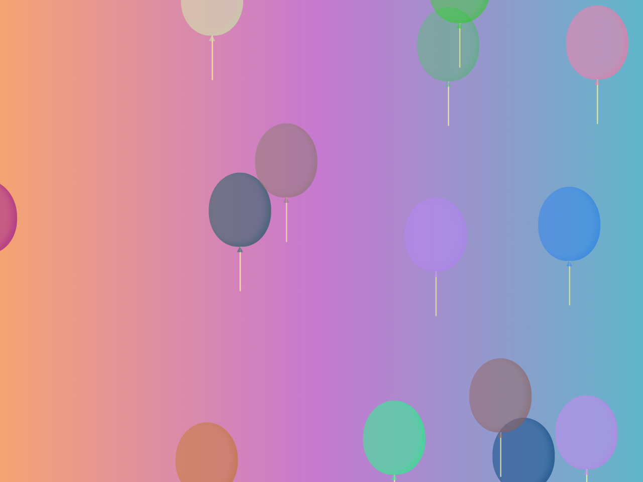
- Floating Balloons HTML Code
- CSS Text Shadow Animation on Mouse Move
- 3D Tilt Effect on Hover Using Vanilla JS
- Border Animation using CSS with Infinite Loop

I code and create web elements for amazing people around the world. I like work with new people. New people new Experiences.
I truly enjoy what I’m doing, which makes me more passionate about web development and coding. I am always ready to do challenging tasks whether it is about creating a custom CMS from scratch or customizing an existing system.