

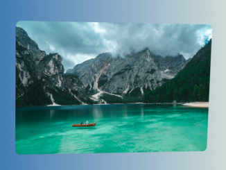
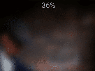
This code snippet creates a CSS background blur effect for an image. The effect is achieved by applying a blur filter to the image and then transitioning the blur amount to 0 when the user hovers over a text element.
You can apply this effect to your website’s hero section for a sleek and attention-grabbing introduction. Moreover, you can customize the code with additional CSS according to your needs.
How to Create CSS Background Blur Effect
1. Begin by integrating the following HTML code into your webpage’s body. Customize the section and add your desired content between the <h2> tags. The image source can be modified to suit your design preferences.
<body>
    <section>

        <h2>PARİS</h2>
        <img src=https://images.unsplash.com/photo-1609901142579-80703d2436f4?crop=entropy&cs=srgb&fm=jpg&ixid=MXwxNDU4OXwwfDF8cmFuZG9tfHx8fHx8fHw&ixlib=rb-1.2.1&q=85>
        <br>
    </section>

</body>
2. Embed the following CSS code to infuse style and functionality. This code creates a background blur effect on hover. The section h2 class triggers a smooth transition, enhancing the visual experience. Adjust the font, color, and positioning according to your needs.
*
{
    margin: 0;
    padding: 0;
    box-sizing: border-box;
    font-family: poppins;

}
section{
    position: relative;
    width: 100%;
    height: 100vh;
    overflow: hidden;
    display: flex;
    justify-content: center;

}
section h2{
    position: relative;
    margin-top: 24vh;
    font-size: 13vw;
    color: white;
    font-weight: 800;
    z-index: 2;
    transition: 2s;
}
span{
    font-size: 2vw;

}

section h2:hover{
filter: blur(10px);
transform: scale(1.2);

}

section img{
position: absolute;
top: -20px;
left: -20%;
width: 140%;
height: 140%;
pointer-events: none;
filter: blur(20px);
transition: 2s;
}
section h2:hover ~ img{
top:0px;
left: 0px;
width: 100%;
height: 100%;
filter: blur(0px);

}
Update the blur effect to your liking by modifying the values in the filter: blur() property within the section h2:hover and section img sections. Experiment with different pixel values to achieve the desired level of blur. Tweak other properties like transform and transition for a personalized touch.
That’s all! hopefully, you have successfully created a CSS background Blur Effect on your website. If you have any questions or suggestions, feel free to comment below.
Similar Code Snippets:

- Tilt Image On Hover Using CSS and JavaScript
- Trophy Animation Using HTML & CSS
- Typing and Deleting Effect with JavaScript
- Synthwave Rain Effect Using CSS


I code and create web elements for amazing people around the world. I like work with new people. New people new Experiences.
I truly enjoy what I’m doing, which makes me more passionate about web development and coding. I am always ready to do challenging tasks whether it is about creating a custom CMS from scratch or customizing an existing system.