
This HTML & CSS code snippet helps you to create a visually engaging 3D booklet animation effect with pages that turn realistically. The FlipBook class, powered by JavaScript, seamlessly handles page transitions. Easily navigate through content using the ‘Next’ and ‘Previous’ buttons. The CSS styling ensures a sleek and stylish presentation, while the HTML structure organizes content into a dynamic flipbook format.
How to Create 3d Booklet Animation Effect Using CSS
1. First of all, load the Prefixfree JS by adding the following CDN link into the head tag of your HTML document.
<script src="https://cdnjs.cloudflare.com/ajax/libs/prefixfree/1.0.7/prefixfree.min.js"></script>
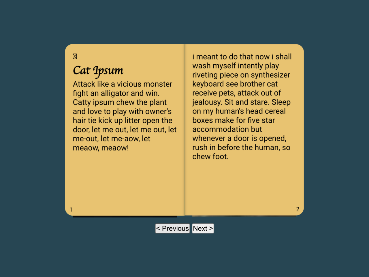
2. Create the necessary HTML elements. The code includes a div with the class “flipbook,” containing pages organized as leaves. Customize the content within each leaf according to your needs, and don’t forget to include navigation buttons.
<div class="flipbook centered" id="flipbook"> <div class="leaf"> <div class="page front title external" style="background-color:#e76f51;"> <h1>Flip Book</h1> <em>A lil dive into 3d css</em> </div> <div class="page back" style="background-color:#2a9d8f;"> <div class="pageNumber">i</div> <img src="https://picsum.photos/200/301" alt="" style="width:100%"> </div> </div> <div class="leaf"> <div class="page front" style="background-color:#2a9d8f;"> <div class="pageNumber">ii</div> <h2>Contents</h2> <div class="contents-row"> <div class="text">Cat Ipsum</div> <div class="spacer"></div> <div class="text">1</div> </div> <div class="contents-row"> <div class="text">Lorum Ipsum</div> <div class="spacer"></div> <div class="text">3</div> </div> </div> <div class="page back" style="background-color:#e9c46a;"> <div class="pageNumber">1</div> <h2>Cat Ipsum</h2> <p> Attack like a vicious monster fight an alligator and win. Catty ipsum chew the plant and love to play with owner's hair tie kick up litter open the door, let me out, let me out, let me-out, let me-aow, let meaow, meaow! </p> </div> </div> <div class="leaf"> <div class="page front" style="background-color:#e9c46a;"> <div class="pageNumber">2</div> i meant to do that now i shall wash myself intently play riveting piece on synthesizer keyboard see brother cat receive pets, attack out of jealousy. Sit and stare. Sleep on my human's head cereal boxes make for five star accommodation but whenever a door is opened, rush in before the human, so chew foot. </div> <div class="page back" style="background-color:#f4a261;"> <div class="pageNumber">3</div> <h2>Lorum Ipsum</h2> <p> Lorem ipsum dolor sit amet, consectetur adipiscing elit. Nam aliquet sagittis fringilla. Duis consequat nisl dui, non dignissim metus mattis vitae. Vivamus eget mi eu purus sollicitudin gravida. </p> </div> </div> <div class="leaf"> <div class="page front" style="background-color:#f4a261;"> <div class="pageNumber">4</div> <p> Nulla vulputate porta orci eu scelerisque. Aliquam erat volutpat. Nullam efficitur magna vitae augue finibus, id bibendum sem dignissim. Nam sit amet erat metus. Curabitur dignissim diam porttitor mauris cursus ultrices. Nulla et consectetur risus. Integer in rhoncus turpis. Suspendisse potenti. </p> </div> <div class="page back external" style="background-color:#e76f51;"> <img src="https://picsum.photos/200/300" alt="" style="width:100%"> </div> </div> </div> <div class="controls centered"> <button id="prevPage">< Previous</button> <button id="nextPage">Next ></button> </div>
3. Now, copy the CSS code to ensure your flipbook looks polished and visually appealing. This code provides styles for the flipbook, leaves, pages, and other elements. Customize the colors, fonts, and dimensions to match your website’s theme.
body {
  display: block !important;
  min-height: 100vh;
  margin: 0;
  max-height: 100vh;
  overflow: hidden;
  background-color: #264653 !important;
}

* {
  box-sizing: border-box;
}

.centered {
  margin: auto;
  width: max-content;
}

.flipbook {
  margin: 3em auto;
  width: 400px;
  height: 300px;
  position: relative;
  transform-style: preserve-3d;
  perspective: 1000px;
}
.flipbook .leaf {
  position: absolute;
  transform-style: preserve-3d;
  height: 100%;
  width: 50%;
  background-color: #fff;
  left: 50%;
  transition: transform 1s;
  transform: rotate3d(0, 1, 0, 0deg);
  transform-origin: left 0px;
}
.flipbook .leaf .page {
  transform-style: preserve-3d;
  position: absolute;
  width: 100%;
  height: 100%;
  top: 0;
}
.flipbook .leaf .page.front {
  transform: rotate3d(0, 1, 0, 0deg) translate3d(0, 0, 0.1px);
}
.flipbook .leaf .page.front:not(.external) {
  box-shadow: inset 5px 0px 5px -5px #0005;
}
.flipbook .leaf .page.back {
  transform: rotate3d(0, 1, 0, 180deg) translate3d(0, 0, 0.1px);
}
.flipbook .leaf .page.back:not(.external) {
  box-shadow: inset -5px 0px 5px -5px #0005;
}
.disabled {
  user-select: none;
  opacity: 0.6;
}

.title {
  text-align: center;
  width: 100%;
  padding: 0em !important;
  padding-top: 2em;
}

.page {
  padding: 1em;
}
.page.front {
  border-radius: 0em 1em 1em 0;
}
.page.back {
  border-radius: 1em 0em 0em 1em;
}

.leaf {
  background-color: #0000 !important;
}

.pageNumber {
  font-size: 0.75em;
  position: absolute;
  bottom: 0.5em;
}

.front .pageNumber {
  right: 0.75em;
}

.back .pageNumber {
  left: 0.75em;
}

.contents-row {
  display: flex;
  flex-flow: row nowrap;
}
.contents-row .spacer {
  flex: 1 1;
  height: 1em;
  border-bottom: 1px dashed #000;
}
.contents-row .text {
  flex: 0 0 auto;
}

h1, h2, h3 {
  font-family: cursive;
}

body[onload] {
  /*Cheesing the preview*/
  transform: scale(1.5);
  transform-origin: center top;
}
body[onload] .leaf:nth-child(1) {
  transform: rotate3d(0, 1, 0, -128deg) !important;
}
body[onload] .leaf:nth-child(2) {
  transform: rotate3d(0, 1, 0, -70deg) !important;
}
body[onload] .leaf:nth-child(3) {
  transform: rotate3d(0, 1, 0, -40deg) !important;
}
body[onload] div.leaf:nth-child(4) > div:nth-child(1) {
  background-color: #e76f51;
}
4. Finally, include the JavaScript code in your project to enable interactive page flipping. This script defines a FlipBook class that handles page transitions smoothly. Make sure to place this script at the end of your HTML body or within a DOMContentLoaded event listener.
class FlipBook{
	constructor(bookElem){
		this.elems={
			book:bookElem,
			leaves:bookElem.querySelectorAll(".leaf"),
			buttons:{
				next:document.getElementById("nextPage"),
				prev:document.getElementById("prevPage")
			}
		};
		this.setupEvents();
		this.currentPagePosition = 0;
		this.turnPage(0);
	}
	setPagePosition(page,position,index){
		var transform = "";

		transform = "translate3d(0,0,"+((position<0?1:-1)*Math.abs(index))+"px)"

		if(position<0){
			 transform+="rotate3d(0,1,0,-180deg)";
			page.classList.add("turned")
		}else{
			page.classList.remove("turned")
		}
		if(page.style.transform != transform){
			page.style.transform = transform;
		}
	}
	turnPage(delta){
		this.currentPagePosition+=delta;
		if(this.currentPagePosition < 0){
			this.currentPagePosition = 0;
			return;
		}
		if(this.currentPagePosition > this.elems.leaves.length){
			this.currentPagePosition = this.elems.leaves.length;
			return;
		}
		this.elems.leaves.forEach((page,index)=>{
			var pageNumber = index;
			this.setPagePosition(page,pageNumber-this.currentPagePosition,index);
		});

		if(this.currentPagePosition == 0){
			this.elems.buttons.prev.setAttribute("disabled","disabled");
		}else
		if(this.currentPagePosition == this.elems.leaves.length){
			this.elems.buttons.next.setAttribute("disabled","disabled");
		}else{
			this.elems.buttons.next.removeAttribute("disabled");
			this.elems.buttons.prev.removeAttribute("disabled");
		}
	}
	setupEvents(){
		document.getElementById("nextPage").addEventListener("click",()=>{
			this.turnPage(1);
		});
		document.getElementById("prevPage").addEventListener("click",()=>{
			this.turnPage(-1);
		});

	}
}

var flipBook = new FlipBook(document.getElementById("flipbook"));
That’s all! hopefully, you have successfully created a 3D Booklet animation effect using CSS. If you have any questions or suggestions, feel free to comment below.
Similar Code Snippets:


I code and create web elements for amazing people around the world. I like work with new people. New people new Experiences.
I truly enjoy what I’m doing, which makes me more passionate about web development and coding. I am always ready to do challenging tasks whether it is about creating a custom CMS from scratch or customizing an existing system.