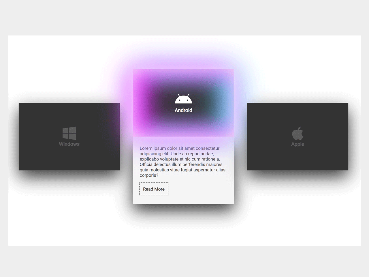

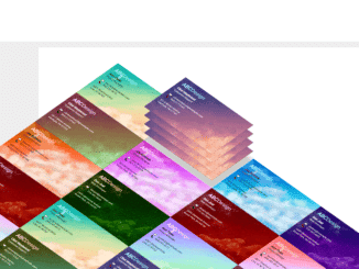
This CSS code snippet helps you to create expandable card with neon glow effect. The card displays only thumbnail in the normal condition and shows details on hover event. When hover event triggered, the thumbnail slide up with neon color glowing animation and card expanded to display summary and read more button.
How to Create CSS Expandable Card with Neon Glow
1. In first step, create the HTML structure for cards as follows:
 <div class="container">
     <div class="card">
       <div class="face face1">
         <div class="content">
            <i class="fab fa-windows"></i>
           <h3>Windows</h3>
         </div>
       </div>
       <div class="face face2">
         <div class="content">
           <p> Lorem ipsum dolor sit amet consectetur adipisicing elit. Unde ab repudiandae, explicabo voluptate et hic cum ratione a. Officia delectus illum perferendis maiores quia molestias vitae fugiat aspernatur alias corporis?</p>
           <a href="#" type="button">Read More</a>
         </div>
       </div>
    </div>

    <div class="card">
       <div class="face face1">
         <div class="content">
      <i class="fab fa-android"></i>               <h3>Android</h3>
         </div>
       </div>
       <div class="face face2">
         <div class="content">
           <p> Lorem ipsum dolor sit amet consectetur adipisicing elit. Unde ab repudiandae, explicabo voluptate et hic cum ratione a. Officia delectus illum perferendis maiores quia molestias vitae fugiat aspernatur alias corporis?</p>
           <a href="#" type="button">Read More</a>
         </div>
       </div>
    </div>


    <div class="card">
       <div class="face face1">
         <div class="content">
           <i class="fab fa-apple"></i>
            <h3>Apple</h3>
         </div>
       </div>
       <div class="face face2">
         <div class="content">
           <p> Lorem ipsum dolor sit amet consectetur adipisicing elit. Unde ab repudiandae, explicabo voluptate et hic cum ratione a. Officia delectus illum perferendis maiores quia molestias vitae fugiat aspernatur alias corporis?</p>
           <a href="#" type="button">Read More</a>
         </div>
       </div>
    </div>

  </div>
  <script src="https://kit.fontawesome.com/95a02bd20d.js"></script>
2. After that, style the cards using the following CSS:
body{
  display:flex;
  margin:0;
  padding:0;
  min-height: 100vh;
  background: #444;
  justify-content: center;
  align-items: center;
  font-family: arial;
}

.container{
  width: 1000px;
  position: relative;
  display: flex;
  justify-content: space-between;
  flex-wrap:wrap;

}

.container .card{
  position: relative;
}

.container .card .face{
  width:300px;
  height: 200px;
  transition:.4s;

}

.container .card .face.face1{
  position: relative;
  background: #333;
  display: flex;
  justify-content: center;
  align-content:center;
  align-items: center;
  z-index: 1;
  transform: translateY(100px);
}

.container .card:hover .face.face1{
  transform: translateY(0);
  box-shadow:
    inset 0 0 60px whitesmoke,
    inset 20px 0 80px #f0f,
    inset -20px 0 80px #0ff,
    inset 20px 0 300px #f0f,
    inset -20px 0 300px #0ff,
    0 0 50px #fff,
    -10px 0 80px #f0f,
    10px 0 80px #0ff;

}


.container .card .face.face1 .content{
  opacity: .2;
  transition:  0.5s;
  text-align: center;


}

.container .card:hover .face.face1 .content{
  opacity: 1;

}

.container .card .face.face1 .content i{
  font-size: 3em;
  color: white;
  display: inline-block;

}

.container .card .face.face1 .content h3{
  font-size: 1em;
  color: white;
  text-align: center;


}

.container .card .face.face1 .content a{
   transition: .5s;
}

.container .card .face.face2{
   position: relative;
   background: whitesmoke;
   display: flex;
   align-items: center;
   justify-content: center;
   padding: 20px;
  box-sizing: border-box;
  box-shadow: 0 20px 50px rgba(0,0,0,.8);
  transform: translateY(-100px);
}

.container .card:hover .face.face2{
    transform: translateY(0);


}

.container .card .face.face2 .content p, a{
  font-size: 10pt;
  margin: 0 ;
  padding: 0;
  color:#333;
}

.container .card .face.face2 .content a{
  text-decoration:none;
  color: black;
  box-sizing: border-box;
  outline : 1px dashed #333;
  padding: 10px;
  margin: 15px 0 0;
  display: inline-block;
}

.container .card .face.face2 .content a:hover{
  background: #333 ;
  color: whitesmoke;
  box-shadow: inset 0px 0px 10px rgba(0,0,0,0.5);
}
That’s all! hopefully, you have successfully created expandable card with neon glowing effect. If you have any questions or suggestions, feel free to comment below.
Similar Code Snippets:

- FAQ Page Design in HTML with Source Code
- Toggle Button in CSS With Stretchable Elastic Effect
- Pure CSS Candle Flame Animation
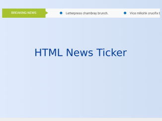
- Horizontal News Scroller HTML Code
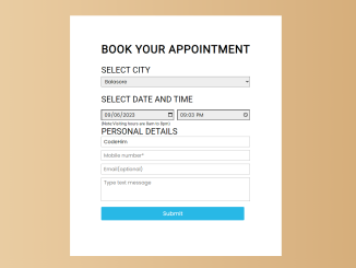
- Appointment Booking Form in HTML CSS
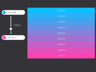
- HTML5 Hex Color Picker with Mixer


I code and create web elements for amazing people around the world. I like work with new people. New people new Experiences.
I truly enjoy what I’m doing, which makes me more passionate about web development and coding. I am always ready to do challenging tasks whether it is about creating a custom CMS from scratch or customizing an existing system.