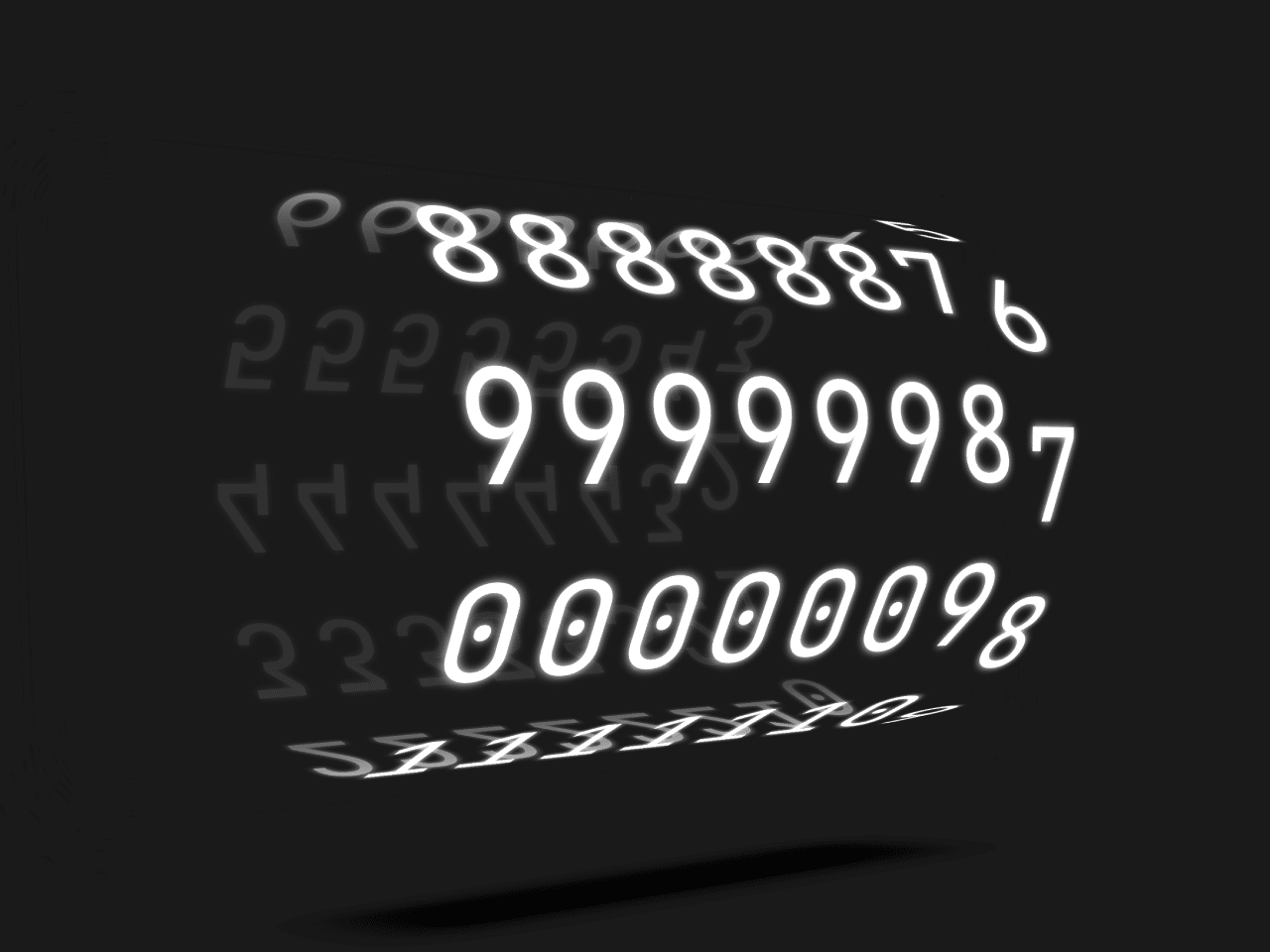

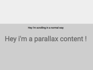
This code creates a 3D counter animation using CSS3. It displays numbers rotating in three-dimensional space. The animation simulates a countdown timer. It helps visualize countdowns or timers on web pages.
You can use this code in websites to add dynamic and visually appealing countdown timers. It enhances user experience by providing engaging animations. This can be applied to event pages, product launches, or promotions to create excitement.
How to Create 3d Counter Animation Using CSS3
1. Begin by setting up the HTML structure. Define a container div with the class “holder” and include nested divs with unique IDs for each digit place (e.g., “ones”, “tens”, “hundreds”). Each nested div should contain individual digit divs from 0 to 9.
<div class="holder">
	<div id="tenmillions" class="reel">
		<div>9</div>
		<div>8</div>
		<div>7</div>
		<div>6</div>
		<div>5</div>
		<div>4</div>
		<div>3</div>
		<div>2</div>
		<div>1</div>
		<div>0</div>
	</div>
	<div id="millions" class="reel">
		<div>9</div>
		<div>8</div>
		<div>7</div>
		<div>6</div>
		<div>5</div>
		<div>4</div>
		<div>3</div>
		<div>2</div>
		<div>1</div>
		<div>0</div>
	</div>
	<div id="hundredthousands" class="reel">
		<div>9</div>
		<div>8</div>
		<div>7</div>
		<div>6</div>
		<div>5</div>
		<div>4</div>
		<div>3</div>
		<div>2</div>
		<div>1</div>
		<div>0</div>
	</div>
	<div id="tenthousands" class="reel">
		<div>9</div>
		<div>8</div>
		<div>7</div>
		<div>6</div>
		<div>5</div>
		<div>4</div>
		<div>3</div>
		<div>2</div>
		<div>1</div>
		<div>0</div>
	</div>
	<div id="thousands" class="reel">
		<div>9</div>
		<div>8</div>
		<div>7</div>
		<div>6</div>
		<div>5</div>
		<div>4</div>
		<div>3</div>
		<div>2</div>
		<div>1</div>
		<div>0</div>
	</div>
	<div id="hundreds" class="reel">
		<div>9</div>
		<div>8</div>
		<div>7</div>
		<div>6</div>
		<div>5</div>
		<div>4</div>
		<div>3</div>
		<div>2</div>
		<div>1</div>
		<div>0</div>
	</div>
	<div id="tens" class="reel">
		<div>9</div>
		<div>8</div>
		<div>7</div>
		<div>6</div>
		<div>5</div>
		<div>4</div>
		<div>3</div>
		<div>2</div>
		<div>1</div>
		<div>0</div>
	</div>
	<div id="ones" class="reel">
		<div>9</div>
		<div>8</div>
		<div>7</div>
		<div>6</div>
		<div>5</div>
		<div>4</div>
		<div>3</div>
		<div>2</div>
		<div>1</div>
		<div>0</div>
	</div>
</div>
2. Next, style the container div and digit divs using CSS. Apply perspective and transform properties to create a 3D effect. Customize the font, size, and colors to match your website’s design. Utilize keyframes to define animations for each digit place.
@import url("https://fonts.googleapis.com/css2?family=JetBrains+Mono&display=swap");
body {
  height: 100vh;
  margin: 0;
  display: grid !important;
  place-items: center;
  font-family: "JetBrains Mono", monospace;
  text-shadow: 0 0 5px white;
  perspective: 1000px;
  perspective-origin: calc(50% - 0) calc(50% - 0);
  background: #191919 !important;
  color: white;
}

.holder {
  width: 350px;
  height: 200px;
  display: flex;
  align-items: center;
  justify-content: center;
  flex-direction: row;
  justify-content: space-between;
  transform-style: preserve-3d;
  animation: hold 30s infinite ease-in-out;
}

.holder:after {
  content: "";
  width: 600px;
  height: 300px;
  left: -150px;
  top: -50px;
  position: absolute;
  background: rgba(25, 25, 25, 0.9);
  filter: blur(20px);
}

.holder:before {
  content: "";
  width: 340px;
  height: 100px;
  left: 0;
  top: 50px;
  position: absolute;
  background: black;
  transform: translateY(230px) rotateX(90deg);
  filter: blur(20px);
}

@keyframes hold {
  0%, 100% {
    transform: rotateY(-30deg) rotateX(-2deg);
  }
  50% {
    transform: rotateY(38deg) rotateX(8deg);
  }
}
.reel {
  position: relative;
  transform-style: preserve-3d;
}

.reel div {
  position: absolute;
  text-align: center;
  width: 50px;
  height: 100px;
  font-size: 72px;
  line-height: 100px;
  animation: fade 10s infinite linear;
}

.reel div:nth-child(1) {
  --left: 0px;
  transform: translate(-50%, -50%) rotateX(0deg) translateZ(154px);
  animation-delay: 0s;
}

.reel div:nth-child(2) {
  --left: 50px;
  transform: translate(-50%, -50%) rotateX(36deg) translateZ(154px);
  animation-delay: 1s;
}

.reel div:nth-child(3) {
  --left: 100px;
  transform: translate(-50%, -50%) rotateX(72deg) translateZ(154px);
  animation-delay: 2s;
}

.reel div:nth-child(4) {
  --left: 150px;
  transform: translate(-50%, -50%) rotateX(108deg) translateZ(154px);
  animation-delay: 3s;
}

.reel div:nth-child(5) {
  --left: 200px;
  transform: translate(-50%, -50%) rotateX(144deg) translateZ(154px);
  animation-delay: 4s;
}

.reel div:nth-child(6) {
  --left: 250px;
  transform: translate(-50%, -50%) rotateX(180deg) translateZ(154px);
  animation-delay: 5s;
}

.reel div:nth-child(7) {
  --left: 300px;
  transform: translate(-50%, -50%) rotateX(216deg) translateZ(154px);
  animation-delay: 6s;
}

.reel div:nth-child(8) {
  --left: 350px;
  transform: translate(-50%, -50%) rotateX(252deg) translateZ(154px);
  animation-delay: 7s;
}

.reel div:nth-child(9) {
  --left: 400px;
  transform: translate(-50%, -50%) rotateX(288deg) translateZ(154px);
  animation-delay: 8s;
}

.reel div:nth-child(10) {
  --left: 450px;
  transform: translate(-50%, -50%) rotateX(324deg) translateZ(154px);
  animation-delay: 9s;
}

* {
  -webkit-touch-callout: none;
  -webkit-user-select: none;
  -khtml-user-select: none;
  -moz-user-select: none;
  -ms-user-select: none;
  user-select: none;
}

#ones {
  animation: increment-ones 10s infinite ease-in;
}

#tens {
  animation: increment-tens 100s infinite ease-in;
}

#hundreds {
  animation: increment-hund 1000s infinite ease-in;
}

#thousands {
  animation: increment-thou 10000s infinite ease-in;
}

#tenthousands {
  animation: increment-tenthou 100000s infinite ease-in;
}

#hundredthousands {
  animation: increment-hunthou 1000000s infinite ease-in;
}

#millions {
  animation: increment-million 10000000s infinite ease-in;
}

#tenmillions {
  animation: increment-tenmillion 10000000s infinite ease-in;
}

@keyframes increment-ones {
  0% {
    transform: rotateX(0);
  }
  10% {
    transform: rotateX(-36deg);
  }
  20% {
    transform: rotateX(-72deg);
  }
  30% {
    transform: rotateX(-108deg);
  }
  40% {
    transform: rotateX(-144deg);
  }
  50% {
    transform: rotateX(-180deg);
  }
  60% {
    transform: rotateX(-216deg);
  }
  70% {
    transform: rotateX(-252deg);
  }
  80% {
    transform: rotateX(-288deg);
  }
  90% {
    transform: rotateX(-324deg);
  }
  100% {
    transform: rotateX(-360deg);
  }
}
@keyframes increment-tens {
  0%, 9% {
    transform: rotateX(0);
  }
  100% {
    transform: rotateX(-360deg);
  }
  10%, 19% {
    transform: rotateX(-36deg);
  }
  20%, 29% {
    transform: rotateX(-72deg);
  }
  30%, 39% {
    transform: rotateX(-108deg);
  }
  40%, 49% {
    transform: rotateX(-144deg);
  }
  50%, 59% {
    transform: rotateX(-180deg);
  }
  60%, 69% {
    transform: rotateX(-216deg);
  }
  70%, 79% {
    transform: rotateX(-252deg);
  }
  80%, 89% {
    transform: rotateX(-288deg);
  }
  90%, 99% {
    transform: rotateX(-324deg);
  }
}
@keyframes increment-hund {
  0%, 9.9% {
    transform: rotateX(0);
  }
  100% {
    transform: rotateX(-360deg);
  }
  10%, 19.9% {
    transform: rotateX(-36deg);
  }
  20%, 29.9% {
    transform: rotateX(-72deg);
  }
  30%, 39.9% {
    transform: rotateX(-108deg);
  }
  40%, 49.9% {
    transform: rotateX(-144deg);
  }
  50%, 59.9% {
    transform: rotateX(-180deg);
  }
  60%, 69.9% {
    transform: rotateX(-216deg);
  }
  70%, 79.9% {
    transform: rotateX(-252deg);
  }
  80%, 89.9% {
    transform: rotateX(-288deg);
  }
  90%, 99.9% {
    transform: rotateX(-324deg);
  }
}
@keyframes increment-thou {
  0%, 9.99% {
    transform: rotateX(0);
  }
  100% {
    transform: rotateX(-360deg);
  }
  10%, 19.99% {
    transform: rotateX(-36deg);
  }
  20%, 29.99% {
    transform: rotateX(-72deg);
  }
  30%, 39.99% {
    transform: rotateX(-108deg);
  }
  40%, 49.99% {
    transform: rotateX(-144deg);
  }
  50%, 59.99% {
    transform: rotateX(-180deg);
  }
  60%, 69.99% {
    transform: rotateX(-216deg);
  }
  70%, 79.99% {
    transform: rotateX(-252deg);
  }
  80%, 89.99% {
    transform: rotateX(-288deg);
  }
  90%, 99.99% {
    transform: rotateX(-324deg);
  }
}
@keyframes increment-tenthou {
  0%, 9.999% {
    transform: rotateX(0);
  }
  100% {
    transform: rotateX(-360deg);
  }
  10%, 19.999% {
    transform: rotateX(-36deg);
  }
  20%, 29.999% {
    transform: rotateX(-72deg);
  }
  30%, 39.999% {
    transform: rotateX(-108deg);
  }
  40%, 49.999% {
    transform: rotateX(-144deg);
  }
  50%, 59.999% {
    transform: rotateX(-180deg);
  }
  60%, 69.999% {
    transform: rotateX(-216deg);
  }
  70%, 79.999% {
    transform: rotateX(-252deg);
  }
  80%, 89.999% {
    transform: rotateX(-288deg);
  }
  90%, 99.999% {
    transform: rotateX(-324deg);
  }
}
@keyframes increment-hunthou {
  0%, 9.9999% {
    transform: rotateX(0);
  }
  100% {
    transform: rotateX(-360deg);
  }
  10%, 19.9999% {
    transform: rotateX(-36deg);
  }
  20%, 29.9999% {
    transform: rotateX(-72deg);
  }
  30%, 39.9999% {
    transform: rotateX(-108deg);
  }
  40%, 49.9999% {
    transform: rotateX(-144deg);
  }
  50%, 59.9999% {
    transform: rotateX(-180deg);
  }
  60%, 69.9999% {
    transform: rotateX(-216deg);
  }
  70%, 79.9999% {
    transform: rotateX(-252deg);
  }
  80%, 89.9999% {
    transform: rotateX(-288deg);
  }
  90%, 99.9999% {
    transform: rotateX(-324deg);
  }
}
@keyframes increment-million {
  0%, 9.99999% {
    transform: rotateX(0);
  }
  100% {
    transform: rotateX(-360deg);
  }
  10%, 19.99999% {
    transform: rotateX(-36deg);
  }
  20%, 29.99999% {
    transform: rotateX(-72deg);
  }
  30%, 39.99999% {
    transform: rotateX(-108deg);
  }
  40%, 49.99999% {
    transform: rotateX(-144deg);
  }
  50%, 59.99999% {
    transform: rotateX(-180deg);
  }
  60%, 69.99999% {
    transform: rotateX(-216deg);
  }
  70%, 79.99999% {
    transform: rotateX(-252deg);
  }
  80%, 89.99999% {
    transform: rotateX(-288deg);
  }
  90%, 99.99999% {
    transform: rotateX(-324deg);
  }
}
@keyframes increment-tenmillion {
  0%, 9.999999% {
    transform: rotateX(0);
  }
  100% {
    transform: rotateX(-360deg);
  }
  10%, 19.999999% {
    transform: rotateX(-36deg);
  }
  20%, 29.999999% {
    transform: rotateX(-72deg);
  }
  30%, 39.999999% {
    transform: rotateX(-108deg);
  }
  40%, 49.999999% {
    transform: rotateX(-144deg);
  }
  50%, 59.999999% {
    transform: rotateX(-180deg);
  }
  60%, 69.999999% {
    transform: rotateX(-216deg);
  }
  70%, 79.999999% {
    transform: rotateX(-252deg);
  }
  80%, 89.999999% {
    transform: rotateX(-288deg);
  }
  90%, 99.999999% {
    transform: rotateX(-324deg);
  }
}
3. Load the jQuery by adding the following CDN link before closing the body tag:
<script src='https://cdnjs.cloudflare.com/ajax/libs/jquery/3.6.0/jquery.min.js'></script>
4. Optionally, you can use JavaScript to dynamically update the digits based on a specific countdown. Implement JavaScript to calculate the time difference between the current date and the target date. Then, manipulate the CSS properties of the digit divs accordingly.
// tried to make it count down to a specifiy date but introducing JS to pure CSS timer caused more problems that is was worth. Hence JS abandoned.

/*var date1 = new Date(); // current date
var date2 = new Date("02/27/2024"); // mm/dd/yyyy format
var timeDiff = Math.abs(date2.getTime() - date1.getTime()); // in miliseconds
var timeDiffInSecond = Math.ceil(timeDiff / 1000); // in second

//alert(timeDiffInSecond);
var str = timeDiffInSecond.toString();

console.log(str);

for (var i = 0; i < str.length; ++i) {
	var chr = str.charAt(i);
	console.log(chr);

	var tm = parseInt(chr);
	console.log("tm " + tm);
	$(".holder .reel:nth-child(" + (i + 1) + ")")
		.children("div")
		.each(function () {
			//$(this).html((tm + 10) % 10);
			$(this).css("transform", "translate(-50%, -50%) rotateX(" + ((tm + 10) % 10) + " * 36deg) translateZ(154px)");
			tm--;
		});
}
That’s all! hopefully, you have successfully created a 3D Counter Animation Using CSS3. If you have any questions or suggestions, feel free to comment below.
Similar Code Snippets:
 CSS Text Color Change Animation
- 45+ CSS3 Image Hover Effects
- CSS Button Animation Library
- CSS Rainbow Effect Animation
- 3D Tilt Effect on Hover Using Vanilla JS


I code and create web elements for amazing people around the world. I like work with new people. New people new Experiences.
I truly enjoy what I’m doing, which makes me more passionate about web development and coding. I am always ready to do challenging tasks whether it is about creating a custom CMS from scratch or customizing an existing system.