
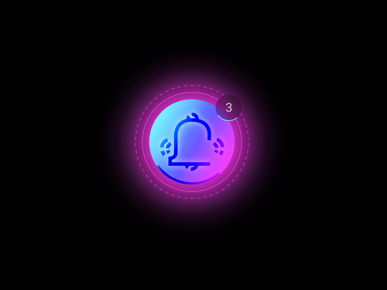
This code creates an animated notification bell icon using SVG and CSS3. It displays a bell button. When hovered over, it enlarges and shakes. When clicked, it activates a notification animation. The bell icon provides visual cues for notifications.
You can use this code on your website or web application to enhance user experience. It provides a visually appealing notification system, alerting users to new updates or messages. With its animated effects, it creates an engaging interaction that captures users’ attention effectively.
How to Create Animated Notification Bell Icon Using SVG and CSS3
1. First of all, load the Google Fonts by adding the following CDN links into the head tag of your HTML document.
<link rel="preconnect" href="https://fonts.googleapis.com">
<link rel="preconnect" href="https://fonts.gstatic.com" crossorigin>
<link href="https://fonts.googleapis.com/css2?family=Architects+Daughter&family=Roboto+Mono:ital,wght@0,100..700;1,100..700&display=swap" rel="stylesheet">
2. Set up the HTML structure. You’ll need a button element to represent the notification bell icon. Inside the button element, you’ll include the SVG code for the bell icon, along with any additional elements for notifications.
<button type="button">
	<i>
		<svg viewBox="0 0 56 50" fill="none" xmlns="http://www.w3.org/2000/svg">
			<path d="M9.3999 44.0002V39.2102C9.3999 39.2102 14.2299 38.9702 14.2299 34.3802V19.1002C14.2299 19.1002 14.1799 6.43018 27.8599 6.43018C39.9199 6.43018 42.8599 13.4302 42.8599 18.6402V35.2302C42.8599 35.2302 42.4999 39.2302 47.6599 39.2302V44.0002H9.3999Z" stroke="black" stroke-width="3" stroke-dasharray="0,0,109.7099609375,27.427490234374993">
				<animate attributeType="XML" attributeName="stroke-dasharray" repeatCount="indefinite" dur="1.4705882352941178s" values="0,0,109.7099609375,27.427490234374993;
          0,27.427490234374993,109.7099609375,0;
          109.7099609375,27.427490234374993,0,0" keyTimes="0; 0.19999999999999996; 1"></animate>
			</path>
			<path d="M32.24 6.78998V5.46998C32.24 4.47807 31.846 3.52679 31.1446 2.8254C30.4432 2.12402 29.4919 1.72998 28.5 1.72998C27.5081 1.72998 26.5568 2.12402 25.8554 2.8254C25.154 3.52679 24.76 4.47807 24.76 5.46998V6.66998" stroke="black" stroke-width="3" stroke-dasharray="0,0,11.415697479248047,2.853924369812011">
				<animate attributeType="XML" attributeName="stroke-dasharray" repeatCount="indefinite" dur="1.4705882352941178s" values="0,0,11.415697479248047,2.853924369812011;
          0,2.853924369812011,11.415697479248047,0;
          11.415697479248047,2.853924369812011,0,0" keyTimes="0; 0.19999999999999996; 1"></animate>
			</path>
			<path d="M32.33 44C32.275 45.1738 31.77 46.2812 30.92 47.0925C30.0699 47.9037 28.94 48.3563 27.7649 48.3563C26.5899 48.3563 25.46 47.9037 24.6099 47.0925C23.7599 46.2812 23.2549 45.1738 23.2 44" stroke="black" stroke-width="3" stroke-dasharray="0,0,11.143664550781251,2.785916137695312">
				<animate attributeType="XML" attributeName="stroke-dasharray" repeatCount="indefinite" dur="1.4705882352941178s" values="0,0,11.143664550781251,2.785916137695312;
          0,2.785916137695312,11.143664550781251,0;
          11.143664550781251,2.785916137695312,0,0" keyTimes="0; 0.19999999999999996; 1"></animate>
			</path>
			<path d="M46.5 26.4902C47.2034 26.7872 47.8233 27.2522 48.3053 27.8444C48.7874 28.4366 49.1168 29.138 49.2649 29.887C49.4129 30.6361 49.375 31.4101 49.1545 32.1411C48.934 32.8721 48.5376 33.538 48 34.0802" stroke="black" stroke-width="3" stroke-dasharray="0,0,7.293882751464844,1.8234706878662106">
				<animate attributeType="XML" attributeName="stroke-dasharray" repeatCount="indefinite" dur="1.4705882352941178s" values="0,0,7.293882751464844,1.8234706878662106;
          0,1.8234706878662106,7.293882751464844,0;
          7.293882751464844,1.8234706878662106,0,0" keyTimes="0; 0.19999999999999996; 1"></animate>
			</path>
			<path d="M49.3 23C50.5062 23.5068 51.5697 24.3017 52.3973 25.315C53.2249 26.3283 53.7913 27.5292 54.0469 28.8123C54.3026 30.0954 54.2396 31.4216 53.8636 32.6747C53.4875 33.9279 52.8099 35.0696 51.89 36" stroke="black" stroke-width="3" stroke-dasharray="0,0,12.497595977783204,3.1243989944458">
				<animate attributeType="XML" attributeName="stroke-dasharray" repeatCount="indefinite" dur="1.4705882352941178s" values="0,0,12.497595977783204,3.1243989944458;
          0,3.1243989944458,12.497595977783204,0;
          12.497595977783204,3.1243989944458,0,0" keyTimes="0; 0.19999999999999996; 1"></animate>
			</path>
			<path d="M9.99992 26.7402C9.29398 27.0343 8.67126 27.4976 8.1867 28.0892C7.70214 28.6808 7.37062 29.3826 7.22141 30.1327C7.07219 30.8827 7.10985 31.6579 7.33108 32.39C7.5523 33.122 7.95028 33.7884 8.48992 34.3302" stroke="black" stroke-width="3" stroke-dasharray="0,0,7.304747772216797,1.8261869430541988">
				<animate attributeType="XML" attributeName="stroke-dasharray" repeatCount="indefinite" dur="1.4705882352941178s" values="0,0,7.304747772216797,1.8261869430541988;
          0,1.8261869430541988,7.304747772216797,0;
          7.304747772216797,1.8261869430541988,0,0" keyTimes="0; 0.19999999999999996; 1"></animate>
			</path>
			<path d="M7.17011 23.2598C5.96393 23.7666 4.90046 24.5615 4.07288 25.5748C3.2453 26.5881 2.67887 27.7889 2.42324 29.072C2.1676 30.3552 2.23056 31.6814 2.6066 32.9345C2.98263 34.1876 3.66026 35.3294 4.58011 36.2598" stroke="black" stroke-width="3" stroke-dasharray="0,0,12.497511291503907,3.1243778228759758">
				<animate attributeType="XML" attributeName="stroke-dasharray" repeatCount="indefinite" dur="1.4705882352941178s" values="0,0,12.497511291503907,3.1243778228759758;
          0,3.1243778228759758,12.497511291503907,0;
          12.497511291503907,3.1243778228759758,0,0" keyTimes="0; 0.19999999999999996; 1"></animate>
			</path>
		</svg>
	</i>
	<span>
		<p>
			3
		</p>
		<svg viewBox="0 0 74 74" fill="none" xmlns="http://www.w3.org/2000/svg">
			<circle cx="37" cy="37" r="36" stroke="#7afffb" stroke-width="2" stroke-dasharray="0,0,0,0,0,225.8292694091797">
				<animate attributeType="XML" attributeName="stroke-dasharray" repeatCount="indefinite" dur="5.43653642049062s" values="0,0,0,0,0,225.8292694091797;
          0,0,0,45.59790218816986,89.0355628446701,91.19580437633972;
          0,0,75.27642313639323,0,150.55284627278647,225.8292694091797;
          0,0,150.55284627278647,0,75.27642313639323,225.8292694091797;
          0,0,188.19105784098306,37.63821156819662,0,0;
          0,225.8292694091797,0,75.27642313639323,0,225.8292694091797" keyTimes="0; 0.16666666666666666; 0.3333; 0.6666; 0.8333; 1" begin="0.935907495683864s"></animate>
			</circle>
		</svg>
	</span>
	<svg viewBox="0 0 74 74" fill="none" xmlns="http://www.w3.org/2000/svg">
		<circle cx="37" cy="37" r="36" stroke="black" stroke-width="2" stroke-dasharray="0,0,0,0,0,225.8292694091797">
			<animate attributeType="XML" attributeName="stroke-dasharray" repeatCount="indefinite" dur="5.43653642049062s" values="0,0,0,0,0,225.8292694091797;
          0,0,0,45.59790218816986,89.0355628446701,91.19580437633972;
          0,0,75.27642313639323,0,150.55284627278647,225.8292694091797;
          0,0,150.55284627278647,0,75.27642313639323,225.8292694091797;
          0,0,188.19105784098306,37.63821156819662,0,0;
          0,225.8292694091797,0,75.27642313639323,0,225.8292694091797" keyTimes="0; 0.16666666666666666; 0.3333; 0.6666; 0.8333; 1" begin="0.935907495683864s"></animate>
		</circle>
	</svg>
</button>

<aside>
	hover & click me
</aside>
3. Next, define the CSS styles to create the visual effects and animations for the notification bell icon. This includes styles for button animation, hover effects, and notification animations.
* {
	box-sizing: border-box;
}

body {
	position: relative;
	display: flex;
	flex-direction: column;
	align-items: center;
	justify-content: center;
	width: 100vw;
	height: 100vh;
	margin: 0;
	background: black !important;
	color: #ccc;
}

button {
	position: relative;
	width: 100px;
	height: 100px;
	background-image: linear-gradient(
		120deg,
		#7afffb,
		#79fcff,
		#75eaff,
		#6eccff,
		#67a4ff,
		#5f73ff,
		#7156ff,
		#9b4eff,
		#c547ff,
		#e940ff,
		#ff3cfc,
		#ff3bf2
	);
	background-position: top left;
	background-size: 100%;
	box-shadow: 0px 0px 400px rgba(255, 59, 242, 1),
		0px 0px 200px rgba(255, 59, 242, 0.75), 0px 0px 100px rgba(255, 59, 242, 0.5),
		0px 0px 50px rgba(255, 59, 242, 0.35), 0px 0px 25px rgba(255, 59, 242, 0.2);
	border-radius: 100%;
	border: none;
	margin: 0;
	padding: 15px;
	display: flex;
	flex-direction: column;
	align-items: center;
	justify-content: center;
	cursor: pointer;
	transition: all 0.3s ease;
}

button:hover {
	box-shadow: 0px 0px 400px rgba(122, 255, 251, 1),
		0px 0px 200px rgba(122, 255, 251, 0.75),
		0px 0px 100px rgba(122, 255, 251, 0.5), 0px 0px 50px rgba(122, 255, 251, 0.35),
		0px 0px 25px rgba(122, 255, 251, 0.2);
	padding: 20px;
	background-size: 180%;
	transition: all 0.3s ease;
}

button:active {
	transform: scale(0.9);
	transition: all 0.05s ease;
}

button::before {
	position: absolute;
	width: calc(100% + 20px);
	height: calc(100% + 20px);
	border: 1px solid rgba(255, 59, 242, 0.8);
	border-radius: 100%;
	pointer-events: none;
	content: "";
	transition: all 0.3s ease;
}

button:hover::before {
	border: 1px solid rgba(122, 255, 251, 0.6);
	width: calc(100% + 40px);
	height: calc(100% + 40px);
	transition: all 0.3s ease;
}

button:active::before {
	width: calc(100% + 20px);
	height: calc(100% + 20px);
	transition: all 0.07s ease;
}

button::after {
	position: absolute;
	width: calc(100% + 40px);
	height: calc(100% + 40px);
	border: 2px dashed rgba(255, 59, 242, 0.4);
	box-shadow: 0px 0px 100px rgba(122, 255, 251, 0.1);
	border-radius: 100%;
	pointer-events: none;
	animation: rotate 30s linear infinite;
	content: "";
	transition: all 0.3s ease;
}

@keyframes rotate {
	to {
		transform: rotateZ(-360deg);
	}
}

button:hover::after {
	border: 2px dashed rgba(122, 255, 251, 0.3);
	width: calc(100% + 80px);
	height: calc(100% + 80px);
	transition: all 0.3s ease;
}

button:active::after {
	width: calc(100% + 40px);
	height: calc(100% + 40px);
	transition: all 0.07s ease;
}

button > svg {
	position: absolute;
	top: 0;
	left: 0;
	width: 100%;
	height: 100%;
	z-index: 2;
	mix-blend-mode: overlay;
	transition: all 0.3s ease;
	z-index: 1;
}

button i {
	width: 100%;
	height: 100%;
	display: flex;
	flex-direction: column;
	align-items: center;
	justify-content: center;
}

button i svg {
	position: relative;
	width: 100%;
	height: auto;
	filter: drop-shadow(0px 0px 5px white);
	mix-blend-mode: overlay;
}

button:hover i svg {
	animation: shake 0.5s linear infinite;
}

@keyframes shake {
	0% {
		transform: rotate(0deg);
	}
	25% {
		transform: rotate(15deg);
	}
	75% {
		transform: rotate(-15deg);
	}
}

button span {
	position: absolute;
	top: -7px;
	right: -11px;
	width: 40px;
	height: 40px;
	border-radius: 100%;
	background-color: rgba(0, 0, 0, 0.3);
	backdrop-filter: blur(5px);
	color: white;
	display: flex;
	flex-direction: column;
	align-items: center;
	justify-content: center;
	transition: all 0.3s ease;
	z-index: 2;
}

button:hover span {
	background-color: #333;
	transition: all 0.3s ease;
}

button span p {
	font: normal normal 400 14pt / 2cap "Roboto Mono", monospace;
	color: #ccc;
	margin: 0;
	position: relative;
	left: 1px;
}

button span svg {
	position: absolute;
	top: 0;
	left: 0;
	width: 100%;
	height: 100%;
}

aside {
	position: absolute;
	font: normal normal 900 14pt / 2cap "Architects Daughter", cursive;
	bottom: 10%;
	color: #777;
	transition: all 0.3s ease;
}

button:hover ~ aside {
	opacity: 0;
	transition: all 0.3s ease;
}

@media (max-height: 270px) {
	aside {
		display: none;
	}
}
That’s all! hopefully, you have successfully created an Animated Notification Bell Icon in your web/app project. If you have any questions or suggestions, feel free to comment below.
Similar Code Snippets:
 3D Thumbnail Hover Effects
- Typing and Deleting Effect with JavaScript
- CSS Rainbow Effect Animation
- Tilt Image On Hover Using CSS and JavaScript
- CSS Text Overflow Scroll Animation
- Border Animation using CSS with Infinite Loop


I code and create web elements for amazing people around the world. I like work with new people. New people new Experiences.
I truly enjoy what I’m doing, which makes me more passionate about web development and coding. I am always ready to do challenging tasks whether it is about creating a custom CMS from scratch or customizing an existing system.