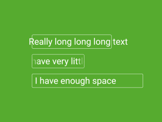
This code creates a CSS text overflow scroll animation. The animation is applied to text that is too long to fit within its container. The text scrolls from left to right and then back again, repeating infinitely.
The animation is created using the CSS @keyframes rule. The @keyframes rule defines the animation steps. In this case, the animation steps are to move the text to the left edge of the container, then to the right edge of the container, and then back to the left edge of the container.
How to Create Text Overflow Scroll Animation Using CSS
1. First, create the HTML structure for scrolling text on the desired section of your website. Customize the content within the <span> tags to suit your needs.
<div class="center">
  <div id="one" class="text-container">
    <span>Really long long long text</span>
  </div>

  <div id="two" class="text-container">
    <span>I have very little space</span>
    <div class="fader fader-left"></div>
    <div class="fader fader-right"></div>
  </div>

  <div id="three" class="text-container">
    <span>I have enough space</span>
  </div>
</div>
2. Copy the CSS code and link it to your HTML file. Include it in the head section between <style> tags or link an external CSS file.
* {
  box-sizing: border-box;
}

#one {
  width: 70%;
}

#two {
  width: 40%;
  padding-left: 20px;
  padding-right: 15px;
  overflow: hidden;
}

#three {
  width: 100%;
}

.center {
  display: grid;
  gap: 20px;
  position: absolute;
  top: 50%;
  left: 50%;
  -webkit-transform: translate(-50%, -50%);
  transform: translate(-50%, -50%);
}

.text-container {
  padding: 5px 10px;
  min-width: 0;
  font-size: 2rem;
  color: #fff;
  white-space: nowrap;
  overflow: visible;
  position: relative;
  border: 1px solid #fff;
  border-radius: 5px;
}
.text-container span {
  display: inline-block;
}
.text-container .animate {
  position: relative;
  animation: leftright 3s infinite alternate ease-in-out;
}

@keyframes leftright {
  0%, 20% {
    transform: translateX(0%);
    left: 0%;
  }
  80%, 100% {
    transform: translateX(-100%);
    left: 100%;
  }
}
.fader {
  position: absolute;
  top: 0;
  height: 100%;
  width: 25px;
}
.fader.fader-left {
  left: 0;
  background: linear-gradient(to left, transparent, #56ab2f);
}
.fader.fader-right {
  right: 0;
  background: linear-gradient(to right, transparent, #56ab2f);
}

@media (max-width: 450px) {
  .center {
    width: 100%;
    padding: 20px;
  }
}
If you want to change the animation duration, modify the @keyframes leftright section in the CSS code. Adjust the 3s duration to your preferred timing.
3. Finally, place the JavaScript code at the end of your HTML file, just before the closing </body> tag. This ensures that the script runs after the HTML and CSS have loaded.
// 1
let container1 = document.querySelector("#one");
let text1 = document.querySelector("#one span");

if (container1.clientWidth < text1.clientWidth) {
  text1.classList.add("animate");
}

// 2
let container2 = document.querySelector("#two");
let text2 = document.querySelector("#two span");

if (container2.clientWidth < text2.clientWidth) {
  text2.classList.add("animate");
}

// 3
let container3 = document.querySelector("#two");
let text3 = document.querySelector("#two span");

if (container3.clientWidth < text3.clientWidth) {
  text3.classList.add("animate");
}
That’s all! hopefully, you have successfully created a Text Overflow Scroll animation on your website. If you have any questions or suggestions, feel free to comment below.
Similar Code Snippets:

I code and create web elements for amazing people around the world. I like work with new people. New people new Experiences.
I truly enjoy what I’m doing, which makes me more passionate about web development and coding. I am always ready to do challenging tasks whether it is about creating a custom CMS from scratch or customizing an existing system.


