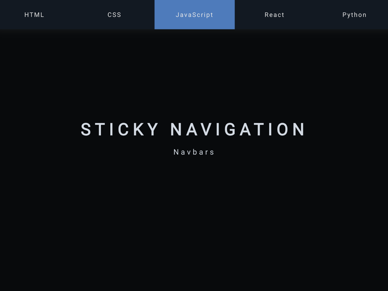

This code ensures your website’s navigation bar stays at the top while scrolling. It utilizes JavaScript to detect scroll position, adding a 'sticky' class to the navigation bar when needed. This functionality enhances user experience, providing easy access to navigation options as visitors explore your content.
You can integrate this navbar into your web projects to keep navigation bars fixed. It improves user experience by providing easy access to navigation options.
How to Create Keep Navigation Bar On Top When Scrolling
1. Start with the HTML structure for your header and main content sections. Place your navigation items within the <nav> element and your content within <main> wrapped in appropriate sections (<section>).
<header id="header">
        <h1>Sticky Navigation</h1>
        <p>Navbars</p>
        <nav class="tabs-container">
            <a href="#" class="tab">HTML</a>
            <a href="#" class="tab">CSS</a>
            <a href="#" class="tab">JavaScript</a>
            <a href="#" class="tab">React</a>
            <a href="#" class="tab">Python</a>
        </nav>
    </header>

    <main>
        <section class="section">
            <h1>HTML</h1>
            <p>Learn about HTML</p>
        </section>
        <section class="section">
            <h1>HTML</h1>
            <p>Learn about HTML</p>
        </section>
    </main>
2. Now, apply styles to create the layout and appearance of your header, navigation, and content sections. Ensure the header has a fixed height and appropriate styling for the navigation.
*{
            margin: 0;
            padding: 0;
            box-sizing: border-box;
        }
        html , body{
            height: 100%;
            width: 100%;
        }
        #header{
            height: 100vh;
            display: flex;
            flex-direction: column;
            justify-content: center;
            align-items: center;
            padding-inline: 20px;
            position: relative;
            text-align: center;
        }
        h1{
            font-size: 40px;
            letter-spacing: 10px;
            text-transform: uppercase;
            margin-bottom: 20px;
        }
        p{
            font-size: 18px;
            letter-spacing: 5px;
        }
        .tabs-container{
            position: absolute;
            bottom: 0;
            display: flex;
            width: 100%;
            height: 70px;
            background-color: #121922;
            box-shadow: 0 0 20px rgba(111, 111, 111, 0.2);
        }
        .sticky{
            position: fixed;
            top: 0;
        }
        .tabs-container a{
            text-decoration: none;
            color: #e8e8e8;
            display: flex;
            justify-content: center;
            align-items: center;
            flex: 1;
            letter-spacing: 2px;
            transition: all 0.3s ease;
        }
        .tabs-container a:hover{
            background-color: #4c79bd;
        }
        .section{
            height: 100vh;
            display: flex;
            flex-direction: column;
            justify-content: center;
            align-items: center;
        }
3. Finally, add the following JavaScript code to your project to make the navigation bar stick to the top when scrolling. It listens for the scroll event and adds/removes the “sticky” class based on the scroll position relative to the navigation bar.
const nav=document.querySelector('.tabs-container')
        const offset=nav.offsetTop

        window.addEventListener('scroll',function(){
            if(window.scrollY >= offset){
                nav.classList.add("sticky")
            }else{
                nav.classList.remove("sticky")
            }
        })
That’s all! hopefully, you have successfully created a sticky navigation menu on your website. If you have any questions or suggestions, feel free to comment below.
Similar Code Snippets:


I code and create web elements for amazing people around the world. I like work with new people. New people new Experiences.
I truly enjoy what I’m doing, which makes me more passionate about web development and coding. I am always ready to do challenging tasks whether it is about creating a custom CMS from scratch or customizing an existing system.