
This code showcases Material Design Typography in CSS. It styles text sizes and weights, creating a structured typographic hierarchy. The CSS defines various text classes for different font sizes, weights, and line heights. This implementation helps maintain consistent and visually appealing text styles throughout a web page.
You can use this code for styling text on your website or web application. It helps create a consistent and visually appealing typographic hierarchy, making your text look neat and organized. One major benefit is that it implements Material Design principles, providing a modern and user-friendly look to your content.
How to Create Material Design Typography In CSS
1. First of all, load the Google Fonts by adding the following CDN link into the head tag of your HTML document.
<link href="https://fonts.googleapis.com/css?family=RobotoDraft:regular,bold,italic,thin,light,bolditalic,black,medium&lang=en" rel="stylesheet" type="text/css">
2. Utilize the HTML structure to implement Material Design Typography classes within your content:
<div class="header-section">
<div class="container">
<h3 class="text-display-2">Material Design Type in CSS</h3>
<h4 class="text-headline">
<a href="https://github.com/liabru/material-design-type">github</a> /
<a href="https://www.google.com/design/spec/style/typography.html">specification</a>
</h4>
<h4 class="text-subhead"><a href="http://brm.io">@liabru</a></h4>
<h4 class="text-caption">(an unofficial implementation)</h4>
</div>
</div>
<div class="light-section">
<div class="container">
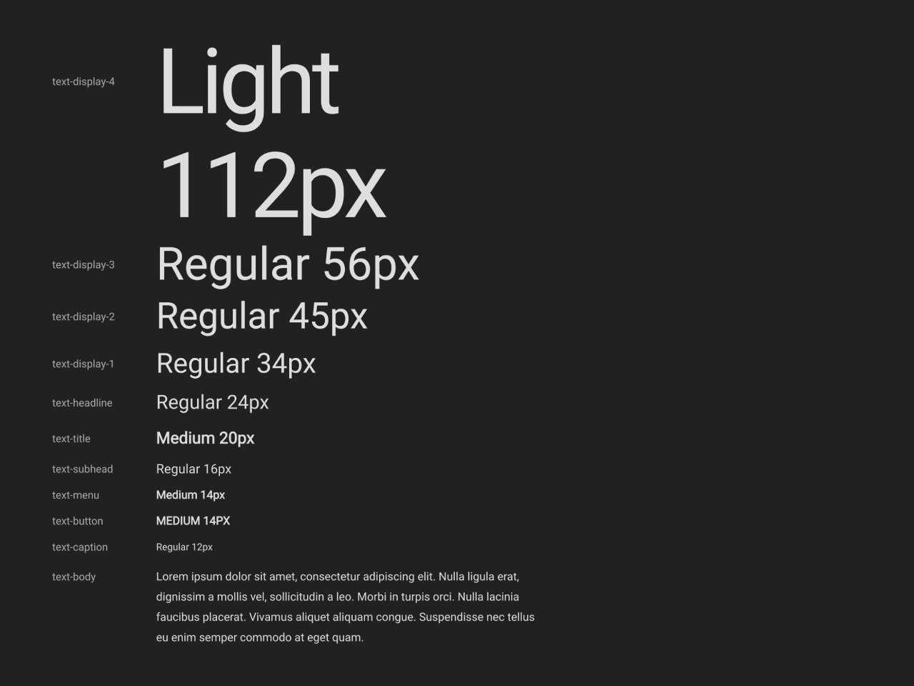
<h1 class="text-display-4">Light 112px</h1>
<h2 class="text-display-3">Regular 56px</h2>
<h3 class="text-display-2">Regular 45px</h3>
<h4 class="text-display-1">Regular 34px</h4>
<h2 class="text-headline">Regular 24px</h2>
<h3 class="text-title">Medium 20px</h3>
<h4 class="text-subhead">Regular 16px</h4>
<div class="text-menu">Medium 14px</div>
<div class="text-button">Medium 14px</div>
<div class="text-caption">Regular 12px</div>
<p class="text-body">Lorem ipsum dolor sit amet, consectetur adipiscing elit. Nulla ligula erat, dignissim a mollis vel, sollicitudin a leo. Morbi in turpis orci. Nulla lacinia faucibus placerat. Vivamus aliquet aliquam congue. Suspendisse nec tellus eu enim semper commodo at eget quam.</p>
</div>
</div>
<div class="dark-section">
<div class="container">
<h1 class="text-display-4">Light 112px</h1>
<h2 class="text-display-3">Regular 56px</h2>
<h3 class="text-display-2">Regular 45px</h3>
<h4 class="text-display-1">Regular 34px</h4>
<h2 class="text-headline">Regular 24px</h2>
<h3 class="text-title">Medium 20px</h3>
<h4 class="text-subhead">Regular 16px</h4>
<div class="text-menu">Medium 14px</div>
<div class="text-button">Medium 14px</div>
<div class="text-caption">Regular 12px</div>
<p class="text-body">Lorem ipsum dolor sit amet, consectetur adipiscing elit. Nulla ligula erat, dignissim a mollis vel, sollicitudin a leo. Morbi in turpis orci. Nulla lacinia faucibus placerat. Vivamus aliquet aliquam congue. Suspendisse nec tellus eu enim semper commodo at eget quam.</p>
</div>
</div>
<div class="light-section show-grid">
<div class="container">
<h1 class="text-display-4">Light 112px</h1>
<h2 class="text-display-3">Regular 56px</h2>
<h3 class="text-display-2">Regular 45px</h3>
<h4 class="text-display-1">Regular 34px</h4>
<h2 class="text-headline">Regular 24px</h2>
<h3 class="text-title">Medium 20px</h3>
<h4 class="text-subhead">Regular 16px</h4>
<div class="text-menu">Medium 14px</div>
<div class="text-button">Medium 14px</div>
<div class="text-caption">Regular 12px</div>
<p class="text-body">Lorem ipsum dolor sit amet, consectetur adipiscing elit. Nulla ligula erat, dignissim a mollis vel, sollicitudin a leo. Morbi in turpis orci. Nulla lacinia faucibus placerat. Vivamus aliquet aliquam congue. Suspendisse nec tellus eu enim semper commodo at eget quam.</p>
</div>
</div>
3. The following CSS contains classes for various text styles. Apply these classes to your HTML elements as needed:
/*

    by @liabru
    based on material design typography

    http://brm.io/material-design-type
    https://github.com/liabru/material-design-type
    https://www.google.com/design/spec/style/typography.html

*/

/**
 * The MIT License (MIT)
 *
 * Copyright (c) 2014 Liam Brummitt
 *
 * Permission is hereby granted, free of charge, to any person obtaining a copy
 * of this software and associated documentation files (the "Software"), to deal
 * in the Software without restriction, including without limitation the rights
 * to use, copy, modify, merge, publish, distribute, sublicense, and/or sell
 * copies of the Software, and to permit persons to whom the Software is
 * furnished to do so, subject to the following conditions:
 *
 * The above copyright notice and this permission notice shall be included in
 * all copies or substantial portions of the Software.
 *
 * THE SOFTWARE IS PROVIDED "AS IS", WITHOUT WARRANTY OF ANY KIND, EXPRESS OR
 * IMPLIED, INCLUDING BUT NOT LIMITED TO THE WARRANTIES OF MERCHANTABILITY,
 * FITNESS FOR A PARTICULAR PURPOSE AND NONINFRINGEMENT. IN NO EVENT SHALL THE
 * AUTHORS OR COPYRIGHT HOLDERS BE LIABLE FOR ANY CLAIM, DAMAGES OR OTHER
 * LIABILITY, WHETHER IN AN ACTION OF CONTRACT, TORT OR OTHERWISE, ARISING FROM,
 * OUT OF OR IN CONNECTION WITH THE SOFTWARE OR THE USE OR OTHER DEALINGS IN
 * THE SOFTWARE.
 */


body {
    font-family: 'RobotoDraft', sans-serif;
    -webkit-font-smoothing: antialiased;
    -webkit-text-size-adjust: 100%;
}

.text-display-4 {
    font-size: 112px;
    font-weight: 300;
    line-height: 128px;
    letter-spacing: -5px;
}

.text-display-3 {
    font-size: 56px;
    font-weight: 400;
    line-height: 64px;
}

.text-display-2 {
    font-size: 45px;
    font-weight: 400;
    line-height: 64px;
}

.text-display-1 {
    font-size: 34px;
    font-weight: 400;
    line-height: 52px;
}

.text-headline {
    font-size: 24px;
    font-weight: 400;
    line-height: 44px;
}

.text-title {
    font-size: 20px;
    font-weight: 600;
    line-height: 44px;
}

.text-subhead {
    font-size: 16px;
    font-weight: 400;
    line-height: 32px;
}

.text-body {
    font-size: 14px;
    font-weight: 400;
    line-height: 25px;
}

.text-caption {
    font-size: 12px;
    font-weight: 400;
    line-height: 32px;
}

.text-menu {
    font-size: 14px;
    font-weight: 600;
    line-height: 32px;
}

.text-button {
    font-size: 14px;
    text-transform: uppercase;
    font-weight: 600;
    line-height: 32px;
}

/* demo page styles */

body {
    margin: 0 auto;
    background: #e8eaf6;
    max-width: 1024px;
}

.container {
    max-width: 800px;
    margin: 0 auto;
    padding: 48px 8%;
}

h1, h2, h3, h4 {
    margin: 0;
}

p {
    max-width: 40em;
    margin: 8px 0;
}

a:link, a:visited, a:hover, a:active {
    color: #dedede;
    text-decoration: none;
}

.header-section {
    background-color: #5677fc;
    color: #dedede;
}

.header-section .text-display-2 {
    color: #fafafa;
}

.light-section {
    background: #f9f9f9;
    color: #1b1b1b;
}

.dark-section {
    background: #212121;
    color: #dedede;
}

@media all and (min-width: 520px) {
    .header-section,
    .light-section,
    .dark-section {
        padding-left: 128px;
    }
}

.show-grid {
    position: relative;
}

.show-grid:before {
    display: block;
    content: ' ';
    z-index: 99999;
    top: 0;
    left: 0;
    right: 0;
    bottom: 0;
    position: absolute;
    pointer-events: none;
    background-size: 4px 4px;
    background-image: repeating-linear-gradient(0deg, transparent, rgba(255,0,0,0.3) 1px, transparent 1px, transparent 4px);
}

/* show class names */

.text-display-4:before,
.text-display-3:before,
.text-display-2:before,
.text-display-1:before,
.text-headline:before,
.text-title:before,
.text-subhead:before,
.text-body:before,
.text-caption:before,
.text-menu:before,
.text-button:before {
    font-size: 13px;
    font-weight: 300;
    color: #aaa;
    letter-spacing: 0;
    display: none;
    float: left;
    text-transform: none;
}

@media all and (min-width: 520px) {
    .text-display-4:before,
    .text-display-3:before,
    .text-display-2:before,
    .text-display-1:before,
    .text-headline:before,
    .text-title:before,
    .text-subhead:before,
    .text-body:before,
    .text-caption:before,
    .text-menu:before,
    .text-button:before {
        display: block;
        margin-left: -128px;
    }
}

.text-display-4:before {
    content: 'text-display-4';
    line-height: 126px;
}

.text-display-3:before {
    content: 'text-display-3';
    line-height: 65px;
}

.text-display-2:before {
    content: 'text-display-2';
    line-height: 65px;
}

.text-display-1:before {
    content: 'text-display-1';
    line-height: 53px;
}

.text-headline:before {
    content: 'text-headline';
    line-height: 45px;
}

.text-title:before {
    content: 'text-title';
    line-height: 45px;
}

.text-subhead:before {
    content: 'text-subhead';
    line-height: 32px;
}

.text-body:before {
    content: 'text-body';
    line-height: 25px;
}

.text-caption:before {
    content: 'text-caption';
    line-height: 32px;
}

.text-menu:before {
    content: 'text-menu';
    line-height: 32px;
}

.text-button:before {
    content: 'text-button';
    line-height: 32px;
}
By following these steps, you can effectively implement Material Design Typography in CSS within your web project while maintaining consistency and visual appeal across your text elements.
That’s all! hopefully, you have successfully integrated this Material Design Typography into your project. If you have any questions or suggestions, feel free to comment below.
Similar Code Snippets:
 Flight Reservation Form HTML Code
- Material Design Flip Card On Click
- Vertical Timeline Using Material Design
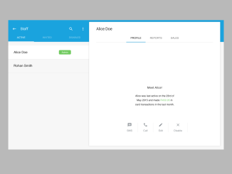
- Material Design Team Member Profile UI
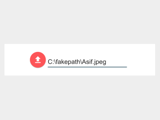
- Material Design File Upload Input
- Material Design Toggle Button Using CSS
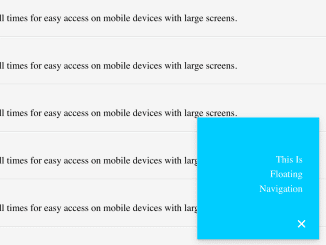
- Material Design Nav Bar with Hover Dropdown

I code and create web elements for amazing people around the world. I like work with new people. New people new Experiences.
I truly enjoy what I’m doing, which makes me more passionate about web development and coding. I am always ready to do challenging tasks whether it is about creating a custom CMS from scratch or customizing an existing system.