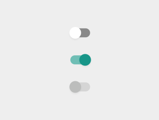
This code snippet helps you to create a Material Design style toggle button using CSS. It uses checkboxes and labels. The buttons have different states: unchecked, checked, and disabled. The CSS styling applies different colors and effects based on these states. This method provides visually appealing toggle buttons for UI design purposes.
How to Create Material Design Toggle Button Using CSS
1. First of all, ensure you have a reset CSS file linked in the header of your HTML file. Use the following CDN link:
<link rel="stylesheet" href="https://cdnjs.cloudflare.com/ajax/libs/meyer-reset/2.0/reset.min.css">
2. In your HTML file, set up the structure for the toggle buttons using div elements, input elements of type checkbox, and corresponding labels. Here’s a sample structure:
<div class="cntr">
  <div class="row press">
    <input type="checkbox" id="unchecked" class="cbx hidden"/>
    <label for="unchecked" class="lbl"></label>
  </div>
  <div class="row press">
    <input type="checkbox" id="checked" class="cbx hidden" checked/>
    <label for="checked" class="lbl"></label>
  </div>
   <div class="row">
    <input type="checkbox" id="unchecked_disabled" class="cbx hidden" disabled/>
    <label for="unchecked_disabled" class="lbl"></label>
  </div>
</div>
3. Apply the following CSS styles to create the Material Design effect. This CSS includes styles for different button states like checked, unchecked, and disabled. It applies transitions and color changes for a visually appealing effect.
.lbl {
  position: relative;
  display: block;
  height: 20px;
  width: 44px;
  background: #898989;
  border-radius: 100px;
  cursor: pointer;
  transition: all 0.3s ease;
}
.lbl:after {
  position: absolute;
  left: -2px;
  top: -3px;
  display: block;
  width: 26px;
  height: 26px;
  border-radius: 100px;
  background: #fff;
  box-shadow: 0px 3px 3px rgba(0,0,0,0.05);
  content: '';
  transition: all 0.3s ease;
}
.lbl:active:after {
  transform: scale(1.15, 0.85);
}
.cbx:checked ~ label {
  background: #6fbeb5;
}
.cbx:checked ~ label:after {
  left: 20px;
  background: #179588;
}
.cbx:disabled ~ label {
  background: #d5d5d5;
  pointer-events: none;
}
.cbx:disabled ~ label:after {
  background: #bcbdbc;
}
.cntr {
  position: absolute;
  top: 50%;
  left: 50%;
  transform: translate(-50%, -50%);
}
.press {
  margin-bottom: 40px;
}
.hidden {
  display: none;
}
You can customize the appearance of the toggle buttons by adjusting the CSS properties such as colors, sizes, or animations according to your design preferences.
Implement these toggle buttons within your website or application where needed, providing users with a clean and intuitive interface element.
That’s all! hopefully, you have successfully created the Material Design like Toggle Buttons on your website. If you have any questions or suggestions, feel free to comment below.
Similar Code Snippets:

I code and create web elements for amazing people around the world. I like work with new people. New people new Experiences.
I truly enjoy what I’m doing, which makes me more passionate about web development and coding. I am always ready to do challenging tasks whether it is about creating a custom CMS from scratch or customizing an existing system.

