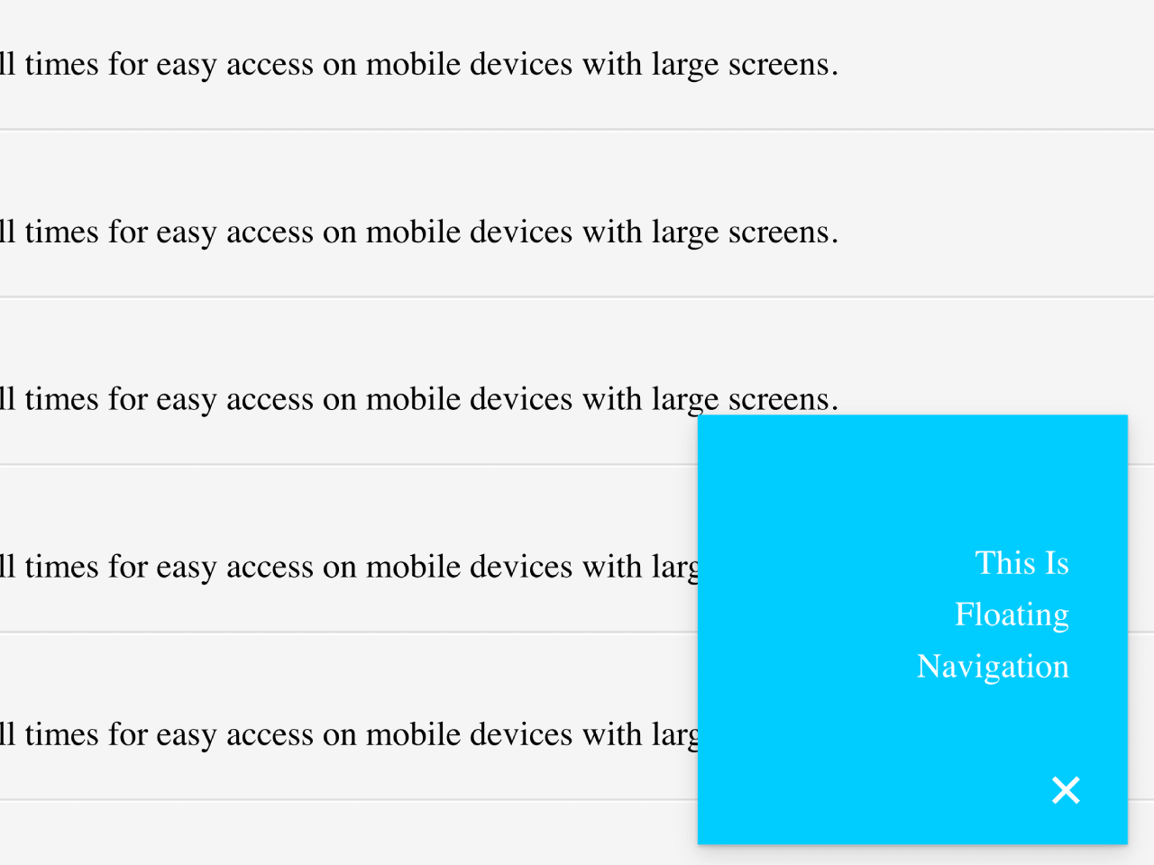

This code creates a floating navigation bar with Material Design styling. It’s fixed to the bottom-right, expanding on click. It helps users easily access navigation options while browsing content. The bar collapses when the main content is clicked.
How to Create a Floating Navigation Bar Using Material Design
1. First of all, load the Google Fonts and Reset CSS by adding the following CDN links into the head tag of your HTML document.
<link href='https://fonts.googleapis.com/css?family=Roboto:300,400,700' rel='stylesheet' type='text/css'>
<link rel="stylesheet" href="https://cdnjs.cloudflare.com/ajax/libs/meyer-reset/2.0/reset.min.css">
2. Set up your HTML file. You’ll need a basic HTML structure that includes the necessary elements:
<nav class="float-nav closed">
  <ul>
    <li><a href="#">This Is</a></li>
    <li><a href="#">Floating</a></li>
    <li><a href="#">Navigation</a></li>
  </ul>
  <a class="toggle" href="#">+</a>
</nav>
<section class="main-content">
  <ul>
    <li>
      <h3>Floating Navigation</h3>
      <p>A Material Design inspired navigation module that stays at the bottom of the screen at all times for easy access on mobile devices with large screens.</p>
    </li>
    <li>
      <h3>Floating Navigation</h3>
      <p>A Material Design inspired navigation module that stays at the bottom of the screen at all times for easy access on mobile devices with large screens.</p>
    </li>
    <li>
      <h3>Floating Navigation</h3>
      <p>A Material Design inspired navigation module that stays at the bottom of the screen at all times for easy access on mobile devices with large screens.</p>
    </li>
    <li>
      <h3>Floating Navigation</h3>
      <p>A Material Design inspired navigation module that stays at the bottom of the screen at all times for easy access on mobile devices with large screens.</p>
    </li>
    <li>
      <h3>Floating Navigation</h3>
      <p>A Material Design inspired navigation module that stays at the bottom of the screen at all times for easy access on mobile devices with large screens.</p>
    </li>
    <li>
      <h3>Floating Navigation</h3>
      <p>A Material Design inspired navigation module that stays at the bottom of the screen at all times for easy access on mobile devices with large screens.</p>
    </li>
    <li>
      <h3>Floating Navigation</h3>
      <p>A Material Design inspired navigation module that stays at the bottom of the screen at all times for easy access on mobile devices with large screens.</p>
    </li>
    <li>
      <h3>Floating Navigation</h3>
      <p>A Material Design inspired navigation module that stays at the bottom of the screen at all times for easy access on mobile devices with large screens.</p>
    </li>
    <li>
      <h3>Floating Navigation</h3>
      <p>A Material Design inspired navigation module that stays at the bottom of the screen at all times for easy access on mobile devices with large screens.</p>
    </li>
    <li>
      <h3>Floating Navigation</h3>
      <p>A Material Design inspired navigation module that stays at the bottom of the screen at all times for easy access on mobile devices with large screens.</p>
    </li>
    <li>
      <h3>Floating Navigation</h3>
      <p>A Material Design inspired navigation module that stays at the bottom of the screen at all times for easy access on mobile devices with large screens.</p>
    </li>
  </ul>
</section>
3. Ensure you have the necessary CSS styles defined in your custom stylesheet (your-custom-styles.css). You can adjust the colors, dimensions, and positioning to suit your design preferences.
html { box-sizing: border-box; }
*, *:before, *:after { box-sizing: inherit; }

body { font: 100%/1.375em 'Roboto', sans-serif; }


h3 {
  margin-bottom: 0.917em;
  font-weight: 700; font-size: 150%;
}

a { text-decoration: none; }

.float-nav {
  position: fixed; z-index: 1;
  bottom: 1.375em; right: 1.375em;
  overflow: hidden;
  width: 200px; height: 200px;
  padding: 1.375em;
  text-align: right;
  background: #0cf;
  border: 5px solid #0cf;
  box-shadow:
    0 1px 2px rgba(0,0,0,0.2),
    0 4px 10px rgba(0,0,0,0.15);
  transition: all 300ms cubic-bezier(.6,-0.3,.3,1.3);
}
.float-nav.closed {
  width: 0; height: 0;
  border: 5px solid #fff;
  border-radius: 50%;
}

.float-nav a {
  display: inline-block;
  color: #fff;
}
.float-nav > a { -webkit-tap-highlight-color: rgba(0,0,0,0); }

.float-nav .toggle {
  position: absolute;
  bottom: 0; right: 0;
  width: 1.375em; height: 1.375em;
  font-size: 200%; line-height: 1.375em;
  font-weight: 300; text-align: center;
  transform: rotate(45deg);
  transform-origin: 50%;
  transition: all 300ms;
}
.float-nav.closed .toggle {
  transform: rotate(0);
}

.float-nav ul {
  position: absolute;
  bottom: 4.125em; right: 1.375em;
  opacity: 1;
  transition: all 300ms;
}
.float-nav.closed ul { opacity: 0; }

.float-nav li {
  padding: 0.25em 0; margin-bottom: 0;
  transition: all 600ms; }
.float-nav.closed li { margin-bottom: 1.375em; }

.main-content {
  position: absolute;
  top: 0; bottom: 0;
  width: 100%;
  overflow-x: hidden;
  overflow-y: scroll;
  -webkit-overflow-scrolling: touch;
}
.main-content li {
  padding: 1.375em;
  background: #f5f5f5;
  border-top: 1px solid rgba(255,255,255,0.8);
  border-bottom: 1px solid rgba(0,0,0,0.1);
}
4. Now, load the jQuery by adding the following script before closing the body tag:
<script src='//cdnjs.cloudflare.com/ajax/libs/jquery/2.1.3/jquery.min.js'></script>
5. Finally, include the JavaScript code in a separate file (your-javascript-file.js). This code adds functionality to the floating navigation bar and the main content area:
var floatNav = $('.float-nav'),
    mainContent = $('.main-content');

floatNav.on('click', function(e) {
  $(this).toggleClass('closed');
  e.stopPropagation();
  e.preventDefault();
});

mainContent.on('click', function() {
  if (!floatNav.hasClass('closed')) floatNav.addClass('closed');
});
By following these steps and customizing the styles and content to your needs, you can easily implement a floating navigation bar in your web project.
That’s all! hopefully, you have successfully created a Floating Navigation Bar on your website. If you have any questions or suggestions, feel free to comment below.
Similar Code Snippets:
 Material Design Interface Transition Effect
- Material Design Nav Bar with Hover Dropdown
- Material Design Team Member Profile UI
- Material Design Tiles Layout
- Material Design Typography in CSS
- Material Design Flip Card On Click
- Material UI Alarm Clock App Interface
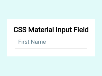
- Material Design Input Field Using CSS
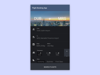
- Flight Reservation Form HTML Code

I code and create web elements for amazing people around the world. I like work with new people. New people new Experiences.
I truly enjoy what I’m doing, which makes me more passionate about web development and coding. I am always ready to do challenging tasks whether it is about creating a custom CMS from scratch or customizing an existing system.