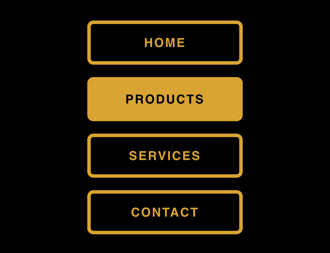

This code creates CSS3 buttons with an interactive hover effect. It styles a navigation menu with animated hover effects. These buttons change color and size on hover, adding interactivity. It’s useful for enhancing user experience on navigation menus.
You can use this code for website navigation menus. It adds engaging hover effects, enhancing user interaction.
How to Create CSS3 Buttons With Interactive Hover Effect
1. Start by setting up the HTML structure. Use <nav> and <ul> tags for the navigation menu. Inside <ul>, create list items <li> for each menu item. For example:
<nav>
  <ul>
    <li>
      home
      <span></span><span></span><span></span><span></span>
    </li>
    <li>
      products
      <span></span><span></span><span></span><span></span>
    </li>
    <li>
      services
      <span></span><span></span><span></span><span></span>
    </li>
    <li>
      contact
      <span></span><span></span><span></span><span></span>
    </li>
  </ul>
</nav>
2. Apply CSS styles to create the interactive hover effects. Define styles for the navigation (nav), list items (nav ul li), and their spans (nav ul li span). Use properties like border, color, transition, and transform to create the effects. Example:
body {
    margin: 0;
    height: 100vh;
    display: flex;
    align-items: center;
    justify-content: center;
    background-color: black;
}

nav ul {
    list-style-type: none;
    margin: 0;
    padding: 0;
}

nav ul li {
    --c: goldenrod;
    color: var(--c);
    font-size: 16px;
    border: 0.3em solid var(--c);
    border-radius: 0.5em;
    width: 12em;
    height: 3em;
    text-transform: uppercase;
    font-weight: bold;
    font-family: sans-serif;
    letter-spacing: 0.1em;
    text-align: center;
    line-height: 3em;
    position: relative;
    overflow: hidden;
    z-index: 1;
    transition: 0.5s;
    margin: 1em;
}

nav ul li span {
    position: absolute;
    width: 25%;
    height: 100%;
    background-color: var(--c);
    transform: translateY(150%);
    border-radius: 50%;
    left: calc((var(--n) - 1) * 25%);
    transition: 0.5s;
    transition-delay: calc((var(--n) - 1) * 0.1s);
    z-index: -1;
}

nav ul li:hover {
    color: black;
}

nav ul li:hover span {
    transform: translateY(0) scale(2);
}

nav ul li span:nth-child(1) {
    --n: 1;
}

nav ul li span:nth-child(2) {
    --n: 2;
}

nav ul li span:nth-child(3) {
    --n: 3;
}

nav ul li span:nth-child(4) {
    --n: 4;
}
Utilize the :hover pseudo-class in CSS to create effects when users hover over list items. Adjust properties like color, transform, and transition within nav ul li:hover and nav ul li:hover span to create the desired hover effects.
Remember to customize colors, sizes, and animations according to your website’s design. Test the buttons across different browsers for compatibility. This code provides a foundation for creating interactive buttons, allowing customization to suit your website’s style and needs.
That’s all! hopefully, you have successfully integrated these CSS3 Buttons on your website. If you have any questions or suggestions, feel free to comment below.
Similar Code Snippets:
 Padlock Toggle Switch in CSS
- Simple Messaging Ui in HTML CSS with Example
- Multi Step Wizard Progress Bar in HTML CSS
- Pure CSS Candle Flame Animation
- Curved Ribbon with Hover Effect Using CSS
- Ecommerce Website Header Design
- Pricing Table Design Using HTML CSS
- Full Screen Video Background in HTML5


I code and create web elements for amazing people around the world. I like work with new people. New people new Experiences.
I truly enjoy what I’m doing, which makes me more passionate about web development and coding. I am always ready to do challenging tasks whether it is about creating a custom CMS from scratch or customizing an existing system.