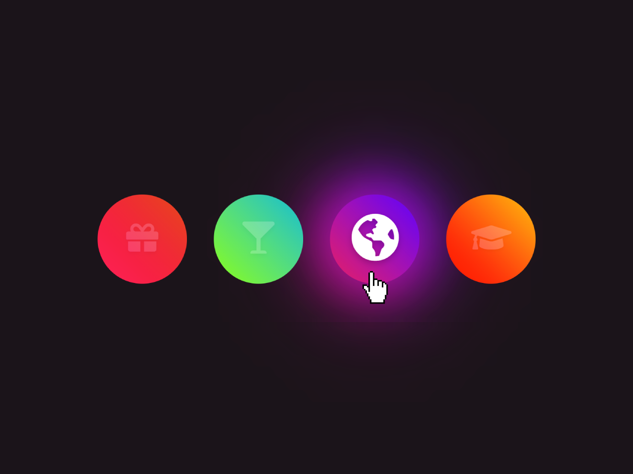

This HTML & CSS code snippet helps you to create circular buttons with linear gradient glowing effects on button hover. Each button is adorned with a unique linear-gradient, adding a pop of color.
Two pseudo-elements (before and after) create the glowing effect for each button. These elements position themselves absolutely over the button, showcasing a blurred background. When users hover over a button, the pseudo-elements’ opacity increases, producing the captivating glowing effect.
How to Create Linear Gradient Glowing Button Using CSS
1. First of all, ensure you have Font Awesome linked in your HTML’s <head> section by adding the following line:
<link rel="stylesheet" href="https://use.fontawesome.com/releases/v5.7.2/css/all.css">
2. Create an unordered list (<ul>) containing list items (<li>), each representing a button. Customize the href attribute within the <a> tags for your specific links.
<ul>
  <li><a href=""><i class="fas fa-gift"></i></a></li>
  <li><a href=""><i class="fas fa-glass-martini"></i></a></li>
  <li><a href=""><i class="fas fa-globe-americas"></i></a></li>
  <li><a href=""><i class="fas fa-graduation-cap"></i></a></li>
</ul>
3. Copy and paste the following CSS code into your stylesheet. This code defines the button styles, including size, color, and the captivating glowing effect on hover.
body{
    margin: 0;
    padding: 0;
    display: flex;
    justify-content: center;
    align-items: center;
    min-height: 100vh;
    background: #1b141a;
}
ul{
    margin: 0;
    padding: 0;
    display: flex;
}
ul li{
    position: relative;
    list-style: none;
    width: 100px;
    height: 100px;
    margin: 0 2px;
    border-radius: 50%;
    box-sizing: border-box;

}
ul li:before,
ul li:after{
    content: '';
    position: absolute;
    top: 0;
    left: 0;
    width: 100%;
    height: 100%;
    background: #000;
    border-radius: 50%;
    filter: blur(20px);
    opacity: 0;
    transition: 1s;
    z-index: 1;
}
ul li:after{
    filter: blur(40px);
}
ul li:hover:before,
ul li:hover:after{
    opacity: 1;
}
ul li a{
    position: absolute;
    top: 10px;
    left: 10px;
    right: 10px;
    bottom: 10px;
    text-align: center;
    line-height: 80px;
    color: #fff;
    background: #000;
    font-size: 36px;
    border-radius: 50%;
    z-index: 2;
}
ul li a .fas{
    text-shadow: 0 2px 5px rgba(0,0,0,.2);
    transition: 0.5s;
    transform: rotateY(0deg) scale(0.8);
    opacity: 0.2;
}
ul li a:hover .fas{
    opacity: 1 !important;
    transform: scale(1.2);

}

ul li:nth-child(1) a,
ul li:nth-child(1):before,
ul li:nth-child(1):after{
    background: linear-gradient(45deg, #ff0057, #e64a19) !important;
   color: #fff !important;
}
ul li:nth-child(2) a,
ul li:nth-child(2):before,
ul li:nth-child(2):after{
    background: linear-gradient(45deg, #89ff00, #00bcd4) !important;
   color: #fff !important;
}
ul li:nth-child(3) a,
ul li:nth-child(3):before,
ul li:nth-child(3):after{
    background: linear-gradient(45deg, #e91e63, #5d02ff) !important;
   color: #fff !important;
}
ul li:nth-child(4) a,
ul li:nth-child(4):before,
ul li:nth-child(4):after{
    background: linear-gradient(45deg, #ff0000, #ffc107) !important;
   color: #fff !important;
}
Modify the linear gradients for each button by adjusting the colors in the CSS code. Locate the sections that start with ul li:nth-child(n) and customize the gradient values to your preference.
That’s all! hopefully, you have successfully created the linear gradient glowing buttons on your website. If you have any questions or suggestions, feel free to comment below.
Similar Code Snippets:
 Blog Comment Section Design
- Customer Testimonials in HTML CSS
- International Airline Ticket in HTML CSS
- HTML Code for Resume with Picture
- Animated Gradient Text Using HTML CSS
- Infinite Scrolling Animation CSS


I code and create web elements for amazing people around the world. I like work with new people. New people new Experiences.
I truly enjoy what I’m doing, which makes me more passionate about web development and coding. I am always ready to do challenging tasks whether it is about creating a custom CMS from scratch or customizing an existing system.