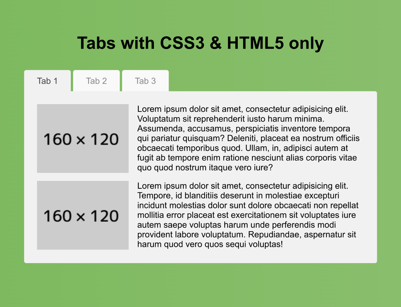

Tabs provide a clean way to organize and present content on your website. With this easy-to-use code, you can implement tabs without the need for JavaScript. This code creates tabs using only HTML5 and CSS3. Tabs switch content when clicked. The tabs are styled with CSS for a better visual presentation. This helps organize content into sections that users can easily navigate.
You can use this code to organize content neatly into tabs on your website. One major benefit is offering users a clear and structured way to access different sections of information.
How to Create Tabs With CSS3 & HTML5 Only
1. First of all, create the HTML structure for your tabs. Include the tab headers and corresponding content sections. Insert your desired content within the content sections for each tab. You can include text, images, lists, or any other HTML elements you want to display.
Moreover, duplicate the structure to create additional tabs.
<!--Título-->
	<h1>Tabs with CSS3 & HTML5 only</h1>
	<!--Contenedor-->
	<div id="container">
		<!--Pestaña 1 activa por defecto-->
	    <input id="tab-1" type="radio" name="tab-group" checked="checked" />
	    <label for="tab-1">Tab 1</label>
	    <!--Pestaña 2 inactiva por defecto-->
	    <input id="tab-2" type="radio" name="tab-group" />
	    <label for="tab-2">Tab 2</label>
	    <!--Pestaña 3 inactiva por defecto-->
	    <input id="tab-3" type="radio" name="tab-group" />
	    <label for="tab-3">Tab 3</label>
	    <!--Contenido a mostrar/ocultar-->
	    <div id="content">
	    	<!--Contenido de la Pestaña 1-->
	        <div id="content-1">
	            <p class="left"><img src="http://ximg.es/160x120" alt="">Lorem ipsum dolor sit amet, consectetur adipisicing elit. Voluptatum sit reprehenderit iusto harum minima. Assumenda, accusamus, perspiciatis inventore tempora qui pariatur quisquam? Deleniti, placeat ea nostrum officiis obcaecati temporibus quod. Ullam, in, adipisci autem at fugit ab tempore enim ratione nesciunt alias corporis vitae quo quod nostrum itaque vero iure?</p>
	            <p class="left last"><img src="http://ximg.es/160x120" alt="">Lorem ipsum dolor sit amet, consectetur adipisicing elit. Tempore, id blanditiis deserunt in molestiae excepturi incidunt molestias dolor sunt dolore obcaecati non repellat mollitia error placeat est exercitationem sit voluptates iure autem saepe voluptas harum unde perferendis modi provident labore voluptatum. Repudiandae, aspernatur sit harum quod vero quos sequi voluptas!</p>
	        </div>
	        <!--Contenido de la Pestaña 2-->
	        <div id="content-2">
	            <p class="column-left"><img src="http://ximg.es/200x150" alt="">Lorem ipsum dolor sit amet, consectetur adipisicing elit. Illum, est, nisi enim voluptates dicta quibusdam recusandae eveniet provident non at nostrum nesciunt laudantium omnis aliquam debitis magni expedita cumque tempore.</p>
            	<p class="column-right"><img src="http://ximg.es/200x150" alt="">Lorem ipsum dolor sit amet, consectetur adipisicing elit. Sed, molestiae, officia repellendus quasi cumque dolor eius deserunt possimus aliquid neque nam assumenda veniam soluta enim commodi aperiam reprehenderit quia incidunt.</p>
	        </div>
	        <!--Contenido de la Pestaña 3-->
	        <div id="content-3">
	        	<p>Lorem ipsum dolor sit amet, consectetur adipisicing elit. Facilis, aperiam, enim odit placeat minus ab vero molestiae ad fugit maiores eaque saepe debitis assumenda ut ipsam eius sit repellendus dolore.</p>
	        	<ul>
	        		<li>Lorem ipsum dolor sit amet, consectetur adipisicing elit. Repudiandae, in magni illo dolore dicta vero.</li>
	        		<li>Lorem ipsum dolor sit amet, consectetur adipisicing elit. Corrupti, minus, aspernatur voluptatem doloribus labore modi.</li>
	        		<li>Lorem ipsum dolor sit amet, consectetur adipisicing elit. Tempora, exercitationem quia id accusamus beatae sunt? Dolorum mollitia sint debitis delectus.</li>
	        	</ul>
	        	<p>Lorem ipsum dolor sit amet, consectetur adipisicing elit. Facilis, accusantium, provident ab quo sed blanditiis perspiciatis distinctio aut voluptatibus cum odio quaerat iure vel dolorum fugit explicabo suscipit tenetur. Sed!</p>
	        </div>
	    </div>
	</div>
2. Use CSS to style the tabs and their corresponding content. Style the appearance of tabs, manage their transitions, and control the visibility of content. Adjust the CSS properties to match your website’s design.
* {
	font-family: Arial, sans;
	margin: 0;
	padding: 0;
	box-sizing: border-box;
	-moz-box-sizing: border-box;
}

h1 {
	margin: 1em 0;
	text-align: center;
}

#container {
    margin: 0 auto;
    width: 50%;  /* Ancho del contenedor */
}

#container input {
	height: 2.5em;
	visibility: hidden;
}

#container label {
	background: #f9f9f9;  /* Fondo de las pestañas */
	border-radius: .25em .25em 0 0;
	color: #888;  /* Color del texto de las pestañas */
	cursor: pointer;
	display: block;
	float: left;
	font-size: 1em;  /* Tamaño del texto de las pestañas */
	height: 2.5em;
	line-height: 2.5em;
	margin-right: .25em;
	padding: 0 1.5em;
	text-align: center;
}

#container input:hover + label {
	background: #ddd;  /* Fondo de las pestañas al pasar el cursor por encima */
	color: #666;  /* Color del texto de las pestañas al pasar el cursor por encima */
}

#container input:checked + label {
	background: #f1f1f1;  /* Fondo de las pestañas al presionar */
	color: #444; /* Color de las pestañas al presionar */
	position: relative;
	z-index: 6;
	/*
	-webkit-transition: .1s;
	-moz-transition: .1s;
	-o-transition: .1s;
	-ms-transition: .1s;
	*/
}

#content {
	background: #f1f1f1;  /* Fondo del contenido */
	border-radius: 0 .25em .25em .25em;
	min-height: 20em;  /* Alto del contenido */
	position: relative;
	width: 100%;
	z-index: 5;
}

#content div {
	opacity: 0;
	padding: 1.5em;
	position: absolute;
	z-index: -100;
	/*
	transition: all linear 0.1s;
	*/
}

#content-1 p {
	clear: both;
	margin-bottom: 1em;
}
#content-1 p.left img {
	float: left;
	margin-right: 1em;
}
#content-1 p.last {
	margin-bottom: 0;
}

#content-2 p {
	float: left;
	width: 48.5%;
}
#content-2 p.column-right {
	margin-left: 3%;
}
#content-2 p img {
	display: block;
	margin: 0 auto 1em auto;
}
#content-3 p,
#content-3 ul {
	margin-bottom: 1em;
}
#content-3 ul {
	margin-left: 2em;
}

#container input#tab-1:checked ~ #content #content-1,
#container input#tab-2:checked ~ #content #content-2,
#container input#tab-3:checked ~ #content #content-3 {
    opacity: 1;
    z-index: 100;
}

input.visible {
  visibility: visible !important;
}
That’s all! hopefully, you have successfully created Tabs With CSS3 & Html5 Only. If you have any questions or suggestions, feel free to comment below.
Similar Code Snippets:

I code and create web elements for amazing people around the world. I like work with new people. New people new Experiences.
I truly enjoy what I’m doing, which makes me more passionate about web development and coding. I am always ready to do challenging tasks whether it is about creating a custom CMS from scratch or customizing an existing system.