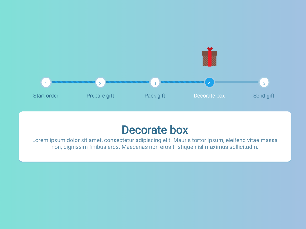

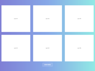
A Multi-Step Wizard Progress Bar is a valuable user interface element for guiding users through complex processes in a step-by-step manner. This HTML and CSS code helps you to create a multi-step wizard progress bar. It comes with a visual progress bar with multiple steps, each represented by a label.
It visually tracks progress as users move through a multi-step process, such as an online order, by highlighting the current step. This code helps users easily understand where they are in a multi-step task.
How to Create Multi-Step Wizard Progress Bar In HTML CSS
1. First, create the basic structure for your multi-step wizard progress bar:
<div class='progress'>
  <div class='progress_inner'>
    <div class='progress_inner__step'>
      <label for='step-1'>Start order</label>
    </div>
    <div class='progress_inner__step'>
      <label for='step-2'>Prepare gift</label>
    </div>
    <div class='progress_inner__step'>
      <label for='step-3'>Pack gift</label>
    </div>
    <div class='progress_inner__step'>
      <label for='step-4'>Decorate box</label>
    </div>
    <div class='progress_inner__step'>
      <label for='step-5'>Send gift</label>
    </div>
    <input checked='checked' id='step-1' name='step' type='radio'>
    <input id='step-2' name='step' type='radio'>
    <input id='step-3' name='step' type='radio'>
    <input id='step-4' name='step' type='radio'>
    <input id='step-5' name='step' type='radio'>
    <div class='progress_inner__bar'></div>
    <div class='progress_inner__bar--set'></div>
    <div class='progress_inner__tabs'>
      <div class='tab tab-0'>
        <h1>Start order</h1>
        <p>Lorem ipsum dolor sit amet, consectetur adipiscing elit. Mauris tortor ipsum, eleifend vitae massa non, dignissim finibus eros. Maecenas non eros tristique nisl maximus sollicitudin.</p>
      </div>
      <div class='tab tab-1'>
        <h1>Prepare gift</h1>
        <p>Lorem ipsum dolor sit amet, consectetur adipiscing elit. Mauris tortor ipsum, eleifend vitae massa non, dignissim finibus eros. Maecenas non eros tristique nisl maximus sollicitudin.</p>
      </div>
      <div class='tab tab-2'>
        <h1>Pack gift</h1>
        <p>Lorem ipsum dolor sit amet, consectetur adipiscing elit. Mauris tortor ipsum, eleifend vitae massa non, dignissim finibus eros. Maecenas non eros tristique nisl maximus sollicitudin.</p>
      </div>
      <div class='tab tab-3'>
        <h1>Decorate box</h1>
        <p>Lorem ipsum dolor sit amet, consectetur adipiscing elit. Mauris tortor ipsum, eleifend vitae massa non, dignissim finibus eros. Maecenas non eros tristique nisl maximus sollicitudin.</p>
      </div>
      <div class='tab tab-4'>
        <h1>Send gift</h1>
        <p>Lorem ipsum dolor sit amet, consectetur adipiscing elit. Mauris tortor ipsum, eleifend vitae massa non, dignissim finibus eros. Maecenas non eros tristique nisl maximus sollicitudin.</p>
      </div>
    </div>
    <div class='progress_inner__status'>
      <div class='box_base'></div>
      <div class='box_lid'></div>
      <div class='box_ribbon'></div>
      <div class='box_bow'>
        <div class='box_bow__left'></div>
        <div class='box_bow__right'></div>
      </div>
      <div class='box_item'></div>
      <div class='box_tag'></div>
      <div class='box_string'></div>
    </div>
  </div>
</div>
Customize the above HTML code with the actual data that you want to show on your website. Copy and paste it in your HTML code where you want to display multi-step progressbar.
2. Now, create a CSS file (e.g., styles.css) and define the styles for your progress bar. You can copy the provided CSS code and paste it into your styles.css file. In your HTML file (index.html), link the CSS file within the <head> section:
@import url("https://fonts.googleapis.com/css?family=Nunito:400,900");

body .progress_inner #step-1:checked + input + input + input + input + div + div + div + div > .box_base, body .progress_inner #step-5:checked + div + div + div + div > .box_base, body .progress_inner #step-4:checked + input + div + div + div + div > .box_base, body .progress_inner #step-3:checked + input + input + div + div + div + div > .box_base, body .progress_inner #step-2:checked + input + input + input + div + div + div + div > .box_base {
  top: 50%;
  left: 0px;
  opacity: 1;
}
body .progress_inner #step-1:checked + input + input + input + input + div + div + div + div > .box_item, body .progress_inner #step-5:checked + div + div + div + div > .box_item, body .progress_inner #step-4:checked + input + div + div + div + div > .box_item, body .progress_inner #step-3:checked + input + input + div + div + div + div > .box_item, body .progress_inner #step-2:checked + input + input + input + div + div + div + div > .box_item {
  top: -30px;
  left: 0px;
  opacity: 0;
}

body .progress_inner #step-2:checked + input + input + input + div + div + div + div > .box_lid, body .progress_inner #step-5:checked + div + div + div + div > .box_lid, body .progress_inner #step-4:checked + input + div + div + div + div > .box_lid {
  top: -20px;
  left: 0px;
  opacity: 0;
}
body .progress_inner #step-2:checked + input + input + input + div + div + div + div > .box_item, body .progress_inner #step-5:checked + div + div + div + div > .box_item, body .progress_inner #step-4:checked + input + div + div + div + div > .box_item {
  top: -10px;
  left: 0px;
  opacity: 1;
}

body .progress_inner #step-3:checked + input + input + div + div + div + div > .box_item, body .progress_inner #step-5:checked + div + div + div + div > .box_item, body .progress_inner #step-4:checked + input + div + div + div + div > .box_item {
  top: 10px;
  left: 0px;
  opacity: 1;
}
body .progress_inner #step-3:checked + input + input + div + div + div + div > .box_lid, body .progress_inner #step-5:checked + div + div + div + div > .box_lid, body .progress_inner #step-4:checked + input + div + div + div + div > .box_lid {
  top: -1px;
  left: 0px;
  opacity: 1;
}
body .progress_inner #step-3:checked + input + input + div + div + div + div > .box_ribbon, body .progress_inner #step-5:checked + div + div + div + div > .box_ribbon, body .progress_inner #step-4:checked + input + div + div + div + div > .box_ribbon {
  top: 70%;
  left: 0px;
  opacity: 0;
}
body .progress_inner #step-3:checked + input + input + div + div + div + div > .box_bow, body .progress_inner #step-5:checked + div + div + div + div > .box_bow, body .progress_inner #step-4:checked + input + div + div + div + div > .box_bow {
  top: 0px;
  left: 0px;
  opacity: 0;
}

body .progress_inner #step-4:checked + input + div + div + div + div > .box_ribbon, body .progress_inner #step-5:checked + div + div + div + div > .box_ribbon {
  top: 50%;
  left: 0px;
  opacity: 1;
}
body .progress_inner #step-4:checked + input + div + div + div + div > .box_bow, body .progress_inner #step-5:checked + div + div + div + div > .box_bow {
  top: -10px;
  left: 0px;
  opacity: 1;
}

body .progress_inner #step-5:checked + div + div + div + div > .box_tag {
  top: 10px;
  left: 20px;
  opacity: 1;
}
body .progress_inner #step-5:checked + div + div + div + div > .box_string {
  top: 10px;
  left: 20px;
  opacity: 1;
}

* {
  box-sizing: border-box;
}

body .progress_inner__status .box_string, body .progress_inner__status .box_tag, body .progress_inner__status .box_bow__right, body .progress_inner__status .box_bow__left, body .progress_inner__status .box_bow, body .progress_inner__status .box_ribbon, body .progress_inner__status .box_item, body .progress_inner__status .box_base, body .progress_inner, body .progress_inner__step:before {
  position: absolute;
  left: 0;
  right: 0;
  top: 50%;
  transform: translateY(-50%);
  margin: auto;
}

body .progress_inner__bar--set, body .progress_inner__bar {
  height: 6px;
  left: 10%;
  background: repeating-linear-gradient(45deg, #1ea4ec, #1ea4ec 4px, #1f8bc5 4px, #1f8bc5 10px);
  transition: width 800ms cubic-bezier(0.915, 0.015, 0.3, 1.005);
  border-radius: 6px;
  width: 0;
  position: relative;
  z-index: -1;
}

body .progress_inner__step:before {
  width: 30px;
  height: 30px;
  color: #70afd0;
  background: white;
  line-height: 30px;
  border: 3px solid #a6cde2;
  font-size: 12px;
  top: 3px;
  border-radius: 100%;
  transition: all 0.4s;
  cursor: pointer;
  pointer-events: none;
}

body .progress_inner__step {
  width: 20%;
  font-size: 14px;
  padding: 0 10px;
  transition: all 0.4s;
  float: left;
  text-align: center;
  position: relative;
}
body .progress_inner__step label {
  padding-top: 50px;
  top: -20px;
  display: block;
  position: relative;
  cursor: pointer;
}
body .progress_inner__step:hover {
  color: white;
}
body .progress_inner__step:hover:before {
  color: white;
  background: #1ea4ec;
}

body {
  font-family: "Nunito", sans-serif;
  background: #a6cde2;
  color: #2e6c8e;
  text-align: center;
  font-weight: 900;
}
body .progress_inner {
  height: 200px;
  width: 700px;
}
body .progress_inner #step-5:checked + div {
  width: 80%;
}
body .progress_inner #step-5:checked + div + div + div > .tab:nth-of-type(5) {
  opacity: 1;
  top: 0;
}
body .progress_inner #step-5:checked + div + div + div + div {
  right: 10%;
}
body .progress_inner #step-4:checked + input + div {
  width: 60%;
}
body .progress_inner #step-4:checked + input + div + div + div > .tab:nth-of-type(4) {
  opacity: 1;
  top: 0;
}
body .progress_inner #step-4:checked + input + div + div + div + div {
  right: 30%;
}
body .progress_inner #step-3:checked + input + input + div {
  width: 40%;
}
body .progress_inner #step-3:checked + input + input + div + div + div > .tab:nth-of-type(3) {
  opacity: 1;
  top: 0;
}
body .progress_inner #step-3:checked + input + input + div + div + div + div {
  right: 50%;
}
body .progress_inner #step-2:checked + input + input + input + div {
  width: 20%;
}
body .progress_inner #step-2:checked + input + input + input + div + div + div > .tab:nth-of-type(2) {
  opacity: 1;
  top: 0;
}
body .progress_inner #step-2:checked + input + input + input + div + div + div + div {
  right: 70%;
}
body .progress_inner #step-1:checked + input + input + input + input + div {
  width: 0%;
}
body .progress_inner #step-1:checked + input + input + input + input + div + div + div > .tab:nth-of-type(1) {
  opacity: 1;
  top: 0;
}
body .progress_inner #step-1:checked + input + input + input + input + div + div + div + div {
  right: 90%;
}
body .progress_inner__step:nth-of-type(1):before {
  content: "1";
}
body .progress_inner__step:nth-of-type(2):before {
  content: "2";
}
body .progress_inner__step:nth-of-type(3):before {
  content: "3";
}
body .progress_inner__step:nth-of-type(4):before {
  content: "4";
}
body .progress_inner__step:nth-of-type(5):before {
  content: "5";
}
body .progress_inner__bar--set {
  width: 80%;
  top: -6px;
  background: #70afd0;
  position: relative;
  z-index: -2;
}
body .progress_inner__tabs .tab {
  opacity: 0;
  position: absolute;
  top: 40px;
  text-align: center;
  margin-top: 80px;
  box-shadow: 0px 2px 1px #80b7d5;
  padding: 30px;
  background: white;
  border-radius: 10px;
  transition: all 0.2s;
}
body .progress_inner__tabs .tab h1 {
  margin: 0;
}
body .progress_inner__tabs .tab p {
  font-weight: 400;
  opacity: 0.8;
}
body .progress_inner__status {
  width: 40px;
  height: 40px;
  top: -80px;
  transition: right 800ms cubic-bezier(0.915, 0.015, 0.3, 1.005);
  transform: translateX(50%);
  position: absolute;
}
body .progress_inner__status div {
  opacity: 0;
  transition: all 600ms cubic-bezier(0.915, 0.015, 0.3, 1.005);
  transition-delay: 300ms;
}
body .progress_inner__status div {
  position: absolute;
}
body .progress_inner__status .box_base {
  background: repeating-linear-gradient(45deg, #986c5d, #986c5d 2px, #775144 2px, #775144 4px);
  width: 36px;
  height: 40px;
  z-index: 1;
  border-radius: 1px;
}
body .progress_inner__status .box_lid {
  width: 40px;
  height: 13.3333333333px;
  background: #775144;
  z-index: 2;
  border-radius: 1px;
  top: 0;
}
body .progress_inner__status .box_item {
  width: 20px;
  height: 20px;
  background: #be69d2;
  z-index: 0;
  border-radius: 4px;
  transform: rotate(45deg);
}
body .progress_inner__status .box_ribbon {
  width: 10px;
  height: 42px;
  background: #ee0f29;
  z-index: 4;
  border-radius: 1px;
}
body .progress_inner__status .box_bow__right, body .progress_inner__status .box_bow__left {
  width: 6px;
  height: 10px;
  background: #be0c21;
  position: absolute;
  z-index: 3;
  opacity: 1;
  border-radius: 1px;
}
body .progress_inner__status .box_bow {
  top: -6px;
  z-index: 1;
  transition-delay: 500ms;
}
body .progress_inner__status .box_bow__left {
  left: 6px;
  transform: rotate(45deg);
}
body .progress_inner__status .box_bow__right {
  left: -4px;
  transform: rotate(-45deg);
}
body .progress_inner__status .box_tag {
  width: 20px;
  height: 10px;
  background: #487ac7;
  z-index: 4;
  transform: rotate(-10deg) translateX(-40px) translateY(0px);
  border-radius: 2px;
  transition-delay: 500ms;
}
body .progress_inner__status .box_string {
  width: 17px;
  height: 2px;
  background: #343434;
  z-index: 4;
  transform: rotate(-39deg) translateX(-22px) translateY(-12px);
}
body .progress_inner input[type=radio] {
  display: none;
}
That’s all! hopefully, you have successfully created the Multi-Step Wizard Progress Bar. If you have any questions or suggestions, feel free to comment below.
Similar Code Snippets:
 Social Icons with Circular Profile Pic in CSS
- Show List Description on Hover Using CSS
- CSS Star Rating Radio Buttons
- Circle Loader Animation CSS
- CSS Image Glow Transparent PNG


I code and create web elements for amazing people around the world. I like work with new people. New people new Experiences.
I truly enjoy what I’m doing, which makes me more passionate about web development and coding. I am always ready to do challenging tasks whether it is about creating a custom CMS from scratch or customizing an existing system.